Knowledge is one of the most valuable assets in any organization. However, many businesses still lose critical knowledge every year due to employee attrition, poor documentation, and unstructured processes. As a result, teams repeat mistakes, productivity drops, and decision-making suffers.
That is exactly where a Knowledge Preservation KPI Dashboard in Power BI becomes essential.
In this in-depth and SEO-friendly guide, you will learn what a Knowledge Preservation KPI Dashboard in Power BI is, why organizations need it, how it works, and how each dashboard page supports better decision-making. Moreover, you will explore its advantages, best practices, real-world use cases, and frequently asked questions. By the end of this article, you will clearly understand how this ready-to-use Power BI dashboard helps organizations protect institutional knowledge and drive long-term success.
Click to Purchases Knowledge Preservation KPI Dashboard in Power BI
What Is a Knowledge Preservation KPI Dashboard in Power BI?
A Knowledge Preservation KPI Dashboard in Power BI is a structured and interactive analytics tool designed to track, measure, and monitor key metrics related to organizational knowledge.
Instead of relying on scattered Excel files, emails, or undocumented processes, this dashboard consolidates all knowledge-related KPIs into a single Power BI file. As a result, leaders, HR teams, L&D managers, and process owners gain instant visibility into how effectively the organization captures, transfers, and retains knowledge.
This dashboard focuses on KPIs such as documentation coverage, knowledge transfer completion, process adherence, training effectiveness, and continuity readiness. Consequently, organizations can identify gaps early and take corrective action before knowledge loss impacts performance.
Why Is Knowledge Preservation So Critical for Organizations?
Knowledge preservation directly impacts operational continuity, productivity, and long-term growth. However, many organizations underestimate its importance until a key employee leaves or a critical process breaks.
Here is why knowledge preservation matters more than ever:
-
Employee turnover continues to rise across industries
-
Organizations adopt new tools and systems frequently
-
Remote and hybrid work increases dependency on documentation
-
Compliance and audit requirements demand traceability
-
Institutional memory often sits with individuals, not systems
Because of these challenges, organizations need a measurable and data-driven approach. That is why a Knowledge Preservation KPI Dashboard in Power BI plays a vital role.
How Does a Knowledge Preservation KPI Dashboard in Power BI Work?
This dashboard uses Excel as a data source and Power BI for visualization and analysis. You simply update your KPI data in Excel, refresh the Power BI file, and instantly view updated insights.
The dashboard uses three structured Excel worksheets:
-
Input_Actual – Actual KPI values (MTD and YTD)
-
Input_Target – Target KPI values (MTD and YTD)
-
KPI Definition – KPI master data and definitions
Once you load this data into Power BI, the dashboard calculates performance metrics automatically. As a result, teams save time, reduce errors, and focus on insights instead of manual reporting.
Click to Purchases Knowledge Preservation KPI Dashboard in Power BI
What Are the Key Features of the Knowledge Preservation KPI Dashboard in Power BI?
This ready-to-use dashboard comes with thoughtfully designed pages and interactive elements. Each feature supports clarity, consistency, and decision-making.
🔹 Centralized KPI Tracking
Track all knowledge preservation KPIs in one structured Power BI dashboard.
🔹 MTD and YTD Performance Monitoring
Analyze month-to-date and year-to-date performance side by side.
🔹 Target vs Actual Comparison
Instantly identify which KPIs meet targets and which ones miss them.
🔹 Previous Year Benchmarking
Compare current performance with previous year values for trend analysis.
🔹 Interactive Slicers
Filter data by Month and KPI Group for focused analysis.
🔹 Visual KPI Status Indicators
Use red and green arrow icons to highlight performance gaps instantly.
What Pages Are Included in the Knowledge Preservation KPI Dashboard in Power BI?
This dashboard includes three well-structured pages, each serving a specific purpose.
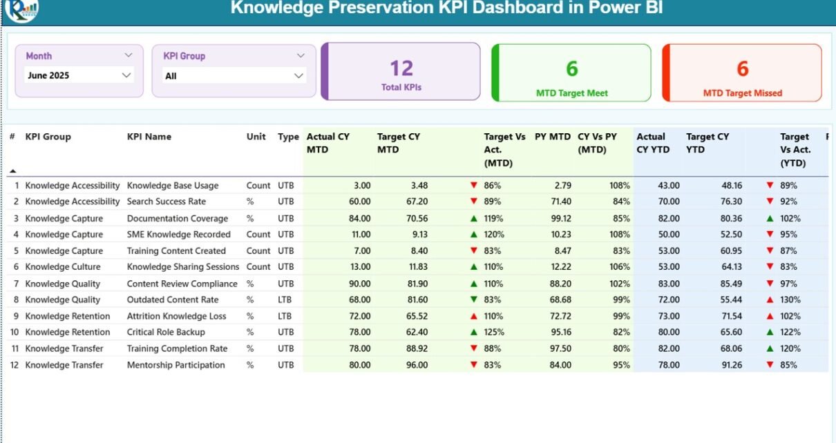
1) What Does the Summary Page Show?

The Summary Page acts as the central control panel of the dashboard.
Key Elements on the Summary Page
Top-Level Slicers
-
Month slicer
-
KPI Group slicer
These slicers allow users to filter KPIs dynamically and focus on specific periods or categories.
KPI Cards
-
Total KPIs Count
-
MTD Target Met Count
-
MTD Target Missed Count
These cards provide a quick snapshot of overall knowledge performance.
Detailed KPI Performance Table
The summary page also includes a detailed table with the following columns:
-
KPI Number – Sequence number of each KPI
-
KPI Group – Category or group of the KPI
-
KPI Name – Name of the KPI
-
Unit – Unit of measurement
-
Type – KPI type (LTB or UTB)
Performance Metrics (MTD)
-
Actual CY MTD – Current year actual MTD value
-
Target CY MTD – Current year target MTD value
-
MTD Icon – Red ▼ or Green ▲ indicator
-
Target vs Actual (MTD) – Actual ÷ Target (%)
-
PY MTD – Previous year MTD value
-
CY vs PY (MTD) – Current MTD ÷ Previous MTD (%)
Performance Metrics (YTD)
-
Actual CY YTD – Current year actual YTD value
-
Target CY YTD – Current year target YTD value
-
YTD Icon – Red ▼ or Green ▲ indicator
-
Target vs Actual (YTD) – Actual ÷ Target (%)
-
PY YTD – Previous year YTD value
-
CY vs PY (YTD) – Current YTD ÷ Previous YTD (%)
Because of this structured layout, decision-makers can analyze performance without switching between multiple reports.
Click to Purchases Knowledge Preservation KPI Dashboard in Power BI
2) How Does the KPI Trend Page Help?
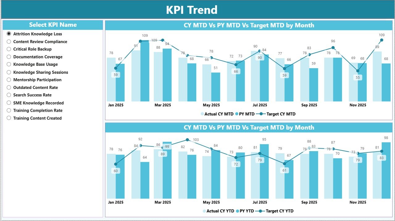
The KPI Trend Page focuses on time-based analysis for individual KPIs.
What Does This Page Include?
-
KPI Name Slicer on the left side
-
Two Combo Charts
What Do the Combo Charts Show?
-
MTD Trend Chart
-
Actual CY MTD
-
Target CY MTD
-
PY MTD
-
-
YTD Trend Chart
-
Actual CY YTD
-
Target CY YTD
-
PY YTD
-
These combo charts help users visualize trends, identify seasonality, and understand whether performance improves or declines over time.
3) What Is the KPI Definition Page Used For?
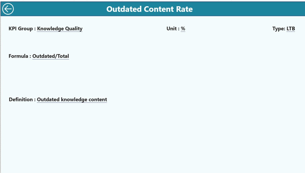
The KPI Definition Page acts as a drill-through and reference page.
Key Characteristics
-
Hidden from the main navigation
-
Accessible via drill-through from the Summary Page
-
Displays KPI Formula and Definition
This page ensures clarity and consistency across teams. Whenever a user needs to understand a KPI, they can drill through and view its definition instantly.
To return to the Summary Page, users simply click the Back button on the top-left corner.
What Excel Data Structure Does This Dashboard Use?
The dashboard uses a clean and structured Excel data model. Because of this approach, even non-technical users can maintain it easily.
1) Input_Actual Sheet
You enter:
-
KPI Name
-
Month (first date of the month)
-
MTD Actual Value
-
YTD Actual Value
2) Input_Target Sheet
You enter:
-
KPI Name
-
Month (first date of the month)
-
MTD Target Value
-
YTD Target Value
3) KPI Definition Sheet
You enter:
-
KPI Number
-
KPI Group
-
KPI Name
-
Unit
-
Formula
-
Definition
-
Type (LTB or UTB)
Once you update these sheets, you refresh the Power BI file to view updated results.
Click to Purchases Knowledge Preservation KPI Dashboard in Power BI
Advantages of Knowledge Preservation KPI Dashboard in Power BI
A Knowledge Preservation KPI Dashboard in Power BI delivers measurable value across departments.
✅ Improved Knowledge Visibility
Teams clearly see how well knowledge flows across the organization.
✅ Reduced Knowledge Loss
Organizations identify risks early and prevent critical knowledge gaps.
✅ Faster Decision-Making
Leaders access real-time insights instead of waiting for manual reports.
✅ Standardized KPI Measurement
All teams follow consistent definitions and formulas.
✅ Stronger Compliance Readiness
Audit trails and KPI history support regulatory requirements.
✅ Time Savings
Automation reduces manual reporting effort significantly.
Who Should Use a Knowledge Preservation KPI Dashboard in Power BI?
This dashboard supports multiple roles and industries.
-
HR and People Analytics Teams
-
Learning & Development Teams
-
Process Excellence and Quality Teams
-
IT and Knowledge Management Teams
-
Compliance and Risk Management Teams
-
Senior Leadership and Strategy Teams
Because of its flexibility, organizations across manufacturing, IT services, consulting, healthcare, and finance can benefit.
Click to Purchases Knowledge Preservation KPI Dashboard in Power BI
Best Practices for the Knowledge Preservation KPI Dashboard in Power BI
To maximize value, organizations should follow proven best practices.
✔️ Define KPIs Clearly
Always document KPI definitions, formulas, and ownership.
✔️ Use Consistent Data Entry
Maintain standardized KPI names across all Excel sheets.
✔️ Update Data Regularly
Update MTD and YTD data monthly without delay.
✔️ Review Missed Targets Proactively
Focus discussions on KPIs with red indicators.
✔️ Use Trend Analysis
Track trends instead of relying only on single-month performance.
✔️ Train Users on Drill-Through
Ensure users understand how to access KPI definitions.
How Does This Dashboard Improve Knowledge Governance?
Knowledge governance requires accountability, transparency, and measurement. This dashboard supports all three.
-
Assign KPI ownership through KPI Groups
-
Track progress against targets monthly
-
Benchmark performance year-over-year
-
Support audits with historical data
As a result, organizations shift from reactive knowledge management to proactive governance.
How Is This Dashboard Better Than Traditional Excel Reports?
Although Excel works well for data entry, it struggles with advanced visualization and interaction. Power BI solves these challenges.
Conclusion: Why You Should Use a Knowledge Preservation KPI Dashboard in Power BI
Knowledge drives innovation, efficiency, and resilience. However, without structured measurement, organizations lose knowledge silently.
A Knowledge Preservation KPI Dashboard in Power BI transforms raw KPI data into clear, actionable, and visual insights. It enables organizations to monitor MTD and YTD performance, compare targets and actuals, analyze trends, and standardize knowledge metrics across teams.
Because this dashboard uses Excel for data input and Power BI for analytics, it remains both powerful and easy to maintain. Ultimately, it helps organizations protect institutional knowledge, reduce risk, and build sustainable growth.
Click to Purchases Knowledge Preservation KPI Dashboard in Power BI
Frequently Asked Questions (FAQs)
❓ What is a Knowledge Preservation KPI Dashboard in Power BI?
It is an interactive Power BI dashboard that tracks and monitors KPIs related to knowledge retention, transfer, and continuity.
❓ Do I need advanced Power BI skills to use this dashboard?
No. You only need basic Excel skills to update the data and refresh the Power BI file.
❓ Can I customize KPIs in this dashboard?
Yes. You can add, modify, or remove KPIs using the KPI Definition sheet.
❓ How often should I update the data?
You should update KPI data monthly to ensure accurate MTD and YTD insights.
❓ Can this dashboard support audits?
Yes. It stores historical KPI data and supports compliance and audit requirements.
❓ Is this dashboard suitable for small organizations?
Absolutely. Both small and large organizations can use it effectively.
Click to Purchases Knowledge Preservation KPI Dashboard in Power BI
Visit our YouTube channel to learn step-by-step video tutorials