In today’s Knowledge Sharing and Collaboration Dashboard, teams must share Knowledge Sharing and Collaboration Dashboard and work together smoothly. However, many organizations still depend on emails, scattered spreadsheets, and disconnected tools. As a result, they lose valuable insights. Moreover, managers struggle to measure collaboration performance. Consequently, decision-making becomes slow and unclear.
So, how can you track knowledge sessions, measure satisfaction, evaluate collaboration types, and analyze department performance in one structured system?
The answer is simple.
You need a Knowledge Sharing and Collaboration Dashboard in Excel.
Click to Purchases Knowledge Sharing and Collaboration Dashboard in Excel
This ready-to-use Excel dashboard helps you monitor sessions, measure satisfaction scores, analyze departments, track collaboration types, and evaluate monthly trends — all in one place. Furthermore, it transforms raw data into visual insights that leaders can understand instantly.
In this complete guide, you will learn:
-
What a Knowledge Sharing and Collaboration Dashboard in Excel is
-
Why organizations need it
-
Detailed explanation of all 5 dashboard pages
-
Key performance indicators (KPIs) included
-
Advantages of Knowledge Sharing and Collaboration Dashboard in Excel
-
Best Practices for the Knowledge Sharing and Collaboration Dashboard in Excel
-
Frequently Asked Questions with Answers
Let us explore everything step by step.
What Is a Knowledge Sharing and Collaboration Dashboard in Excel?
A Knowledge Sharing and Collaboration Dashboard in Excel is a ready-to-use performance tracking system built inside Microsoft Excel. It allows organizations to monitor internal training sessions, collaboration initiatives, knowledge-sharing programs, and cross-functional activities.
Instead of checking multiple sheets manually, this dashboard centralizes everything. Therefore, managers can track:
-
Knowledge ratings
-
Satisfaction scores
-
Collaboration performance
-
Session duration
-
Session cost
-
Department-wise activity
-
Monthly trends
Moreover, it uses interactive slicers, KPI cards, and charts to provide real-time insights. As a result, leaders can quickly identify strong departments and areas that need improvement.
Why Do Organizations Need a Knowledge Sharing and Collaboration Dashboard?
Every organization wants better teamwork. However, without data, leaders cannot measure progress. Consequently, they rely on assumptions instead of facts.
Here is why organizations need this dashboard:
1. To Measure Knowledge Impact
Teams conduct training sessions regularly. However, managers often fail to measure their impact. This dashboard tracks knowledge rating and satisfaction scores. Therefore, organizations can understand whether sessions create real value.
2. To Improve Collaboration Culture
Collaboration drives innovation. Yet, without tracking collaboration type and performance, teams cannot improve. This dashboard evaluates collaboration score by department and type. As a result, leaders can strengthen teamwork.
3. To Monitor Department Performance
Some departments share knowledge actively. Others do not. Therefore, this dashboard highlights active and inactive teams. Consequently, management can encourage better participation.
4. To Track Monthly Trends
Performance changes every month. Therefore, organizations must analyze trends. The Month Analysis page shows session cost, total sessions, and satisfaction scores by month. Thus, decision-makers can identify seasonal patterns.
Key Features of Knowledge Sharing and Collaboration Dashboard in Excel
This dashboard includes powerful features that make analysis simple and effective.
1. Page Navigator
The Page Navigator sits on the left side. It allows users to switch between pages easily. Therefore, users can move from Overview to Department Analysis in one click.
What Are the 5 Pages of This Dashboard?
Click to Purchases Knowledge Sharing and Collaboration Dashboard in Excel
This Excel dashboard includes five interactive analytical pages. Each page focuses on a specific dimension of collaboration.
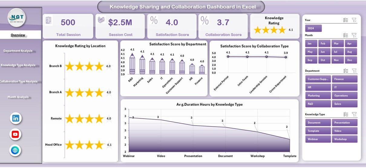
1️⃣ Overview Page – What Does It Show?
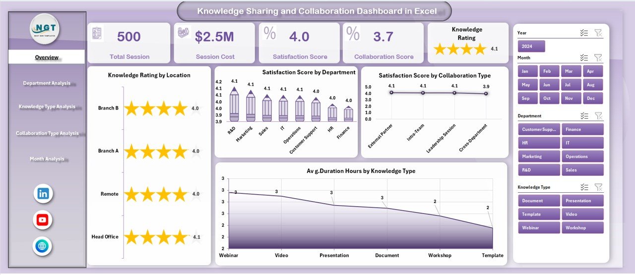
The Overview Page acts as the main control panel. It provides a high-level summary of knowledge-sharing performance.
KPI Cards
The page includes 4 KPI cards that display:
-
Total Sessions
-
Average Knowledge Rating
-
Average Satisfaction Score
-
Average Duration (Hours)
These cards provide quick insights. Therefore, users can understand performance instantly.
Charts Included
The Overview Page contains four key charts:
-
Knowledge Rating by Location
-
Satisfaction Score by Department
-
Satisfaction Score by Collaboration Type
-
Average Duration Hours by Knowledge Type
Additionally, the right-side slicer allows users to filter data dynamically. As a result, managers can analyze specific departments or locations quickly.
2️⃣ Department Analysis – How Do Departments Perform?
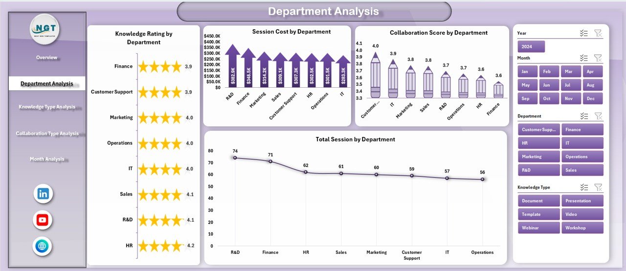
The Department Analysis page focuses on department-level performance.
Charts Included:
-
Knowledge Rating by Department
-
Total Sessions by Department
-
Satisfaction Score by Department Type
-
Collaboration Score by Department
This page helps leaders compare departments. For example, HR may show high satisfaction but low collaboration score. Meanwhile, IT may show strong collaboration but average ratings.
Therefore, management can take targeted action.
3️⃣ Knowledge Type Analysis – Which Knowledge Areas Perform Best?
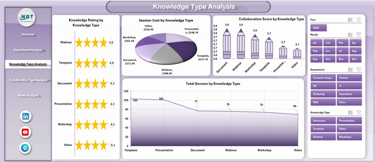
Organizations share different types of knowledge, such as:
-
Technical Knowledge
-
Soft Skills
-
Compliance Training
-
Product Training
-
Leadership Development
The Knowledge Type Analysis page measures performance by knowledge category.
Charts Included:
-
Knowledge Rating by Knowledge Type
-
Total Sessions by Knowledge Type
-
Satisfaction Score by Knowledge Type
-
Collaboration Score by Knowledge Type
As a result, managers can identify which training types generate the highest engagement.
Click to Purchases Knowledge Sharing and Collaboration Dashboard in Excel
4️⃣ Collaboration Type Analysis – Which Collaboration Method Works Best?
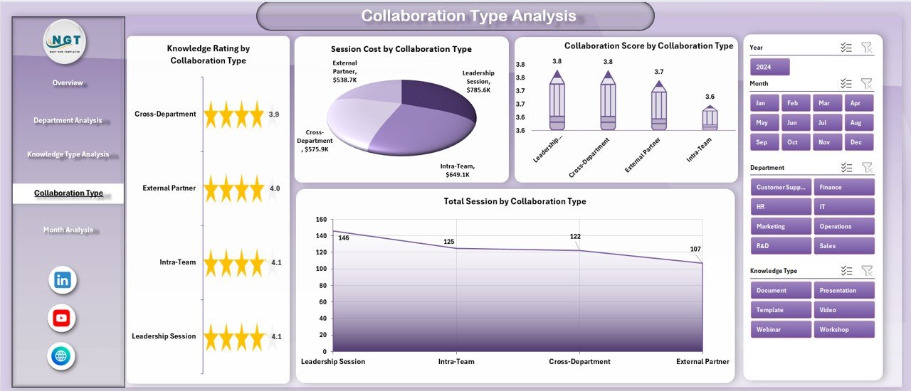
Teams collaborate in different ways:
-
Workshops
-
Webinars
-
Team Meetings
-
One-on-One Sessions
-
Cross-Functional Projects
The Collaboration Type Analysis page tracks performance across these methods.
Charts Included:
-
Knowledge Rating by Collaboration Type
-
Total Sessions by Collaboration Type
-
Satisfaction Score by Collaboration Type
-
Collaboration Score by Collaboration Type
Therefore, organizations can decide which collaboration format delivers the best results.
5️⃣ Month Analysis – How Does Performance Change Over Time?
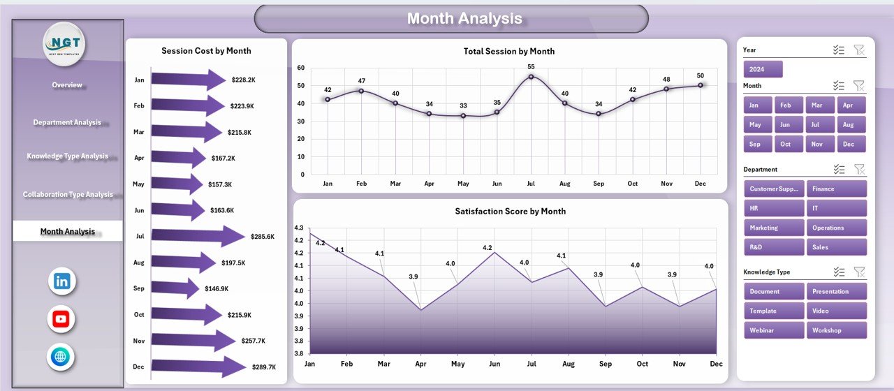
Trends matter. Therefore, this page analyzes performance monthly.
Charts Included:
-
Session Cost by Month
-
Total Sessions by Month
-
Satisfaction Score by Month
With this page, leaders can track:
-
Budget utilization
-
Growth in sessions
-
Improvement in satisfaction
Consequently, they can align training strategy with business goals.
What KPIs Are Included in This Dashboard?
This dashboard tracks powerful KPIs such as:
-
Total Sessions
-
Knowledge Rating
-
Satisfaction Score
-
Collaboration Score
-
Average Duration (Hours)
-
Session Cost
-
Sessions by Department
-
Sessions by Knowledge Type
-
Sessions by Collaboration Type
-
Monthly Performance Trends
These KPIs provide both operational and strategic insights.
How Does the Data Sheet Support the Dashboard?
The Data Sheet stores raw session-level data. Users enter:
-
Date
-
Department
-
Knowledge Type
-
Collaboration Type
-
Location
-
Session Duration
-
Session Cost
-
Satisfaction Score
-
Knowledge Rating
After entering data, charts update automatically. Therefore, users do not need manual calculations.
How Does the Support Sheet Help?
The Support Sheet manages:
-
Dropdown lists
-
Department names
-
Knowledge types
-
Collaboration categories
Therefore, it ensures data consistency. Moreover, it reduces manual errors.
Advantages of Knowledge Sharing and Collaboration Dashboard in Excel
Every organization benefits from structured collaboration tracking. Let us explore the key advantages.
1. Improves Decision-Making
Managers see real-time data. Therefore, they make faster decisions.
2. Encourages Accountability
Departments view their performance. As a result, they take ownership.
3. Enhances Employee Engagement
Tracking satisfaction scores motivates teams to improve session quality.
4. Optimizes Training Budget
Month Analysis shows session cost trends. Therefore, finance teams control expenses better.
5. Identifies High-Impact Knowledge Areas
Knowledge Type Analysis highlights top-performing training areas.
6. Strengthens Collaboration Culture
By tracking collaboration score, organizations promote teamwork.
Best Practices for the Knowledge Sharing and Collaboration Dashboard in Excel
To get maximum value, follow these best practices:
Click to Purchases Knowledge Sharing and Collaboration Dashboard in Excel
1. Update Data Regularly
Enter session data weekly or monthly. Therefore, charts stay accurate.
2. Standardize Knowledge Categories
Use fixed knowledge types. This ensures consistent analysis.
3. Review Monthly Trends
Conduct monthly review meetings using the Month Analysis page.
4. Set Performance Targets
Define target satisfaction scores and collaboration benchmarks.
5. Train Managers to Use the Dashboard
Explain slicers and filters clearly. Therefore, they use it confidently.
How Can This Dashboard Support Strategic Growth?
Knowledge sharing builds competitive advantage. However, growth requires measurement.
This dashboard supports growth by:
-
Identifying skill gaps
-
Improving training ROI
-
Encouraging cross-functional collaboration
-
Reducing redundant sessions
-
Aligning knowledge initiatives with business goals
Therefore, it transforms collaboration from a soft initiative into a measurable strategy.
Conclusion
Knowledge drives innovation. However, without measurement, organizations cannot improve collaboration. Therefore, businesses need structured systems.
The Knowledge Sharing and Collaboration Dashboard in Excel provides that structure. It centralizes session data. It tracks ratings and satisfaction. It analyzes departments and collaboration types. Moreover, it reveals monthly trends.
As a result, leaders gain clarity. Teams improve engagement. Organizations build stronger collaboration cultures.
If you want to transform knowledge sharing into measurable performance, this Excel dashboard offers the perfect solution.
Frequently Asked Questions with Answers
1. Can beginners use this dashboard?
Yes. The dashboard uses simple Excel features and slicers. Therefore, beginners can operate it easily.
2. Do I need advanced Excel skills?
No. You only need basic Excel knowledge to update the Data Sheet.
3. Can I customize the KPIs?
Yes. You can modify KPIs, departments, and knowledge types.
4. Does the dashboard update automatically?
Yes. Once you enter data, charts update instantly.
5. Can small organizations use this dashboard?
Absolutely. Both small and large organizations benefit from structured collaboration tracking.
6. How often should I review the dashboard?
You should review it monthly. However, weekly review improves monitoring.
7. Can I add more analytical pages?
Yes. You can expand it by adding more pivot charts.
Visit our YouTube channel to learn step-by-step video tutorials