The education industry continues to evolve rapidly. Language schools now manage multiple courses, trainers, students, locations, and performance metrics at the same time. However, without a structured reporting system, decision-making becomes slow and reactive. That is exactly where a Language Schools Dashboard in Power BI plays a critical role.
This detailed guide explains what a Language Schools Dashboard in Power BI is, why it matters, how it works, and how language institutes can use it to improve performance, profitability, and learner outcomes. In addition, this article explains each dashboard page in detail, highlights advantages, lists best practices, and answers the most frequently asked questions.
What Is a Language Schools Dashboard in Power BI?
Click to Purchases Language Schools Dashboard in Power BI
A Language Schools Dashboard in Power BI is an interactive, data-driven reporting solution designed to track academic, operational, and financial performance of language training institutes.
Instead of relying on scattered Excel files or manual reports, this dashboard centralizes all critical metrics into one Power BI file. As a result, school owners, administrators, and academic heads gain instant visibility into enrolment trends, course performance, trainer effectiveness, and monthly progress.
Moreover, Power BI transforms raw education data into visual insights using charts, cards, slicers, and comparisons. Because of this, decision-makers quickly identify strengths, gaps, and improvement areas.
Why Do Language Schools Need a Power BI Dashboard?
Language schools manage far more than student admissions. They monitor attendance, course completion, trainer performance, fees, and assessment scores. Without analytics, these insights remain hidden.
A Language Schools Dashboard in Power BI solves this problem by providing:
-
Real-time performance tracking
-
Data-driven academic planning
-
Better resource allocation
-
Improved student outcomes
Therefore, schools move from intuition-based decisions to data-backed strategies.
How Does a Language Schools Dashboard in Power BI Work?
The dashboard connects to structured data sources such as Excel, CSV, or databases. Once data loads into Power BI, the dashboard applies calculations, aggregations, and visualizations.
Because Power BI supports slicers, users filter data by:
-
City
-
Language Course
-
Course Level
-
Trainer Name
-
Month
As a result, the same dashboard answers multiple business and academic questions instantly.
Key Features of Language Schools Dashboard in Power BI
This dashboard contains 5 well-structured pages, each designed to answer specific operational questions. Let us explore each page in detail.
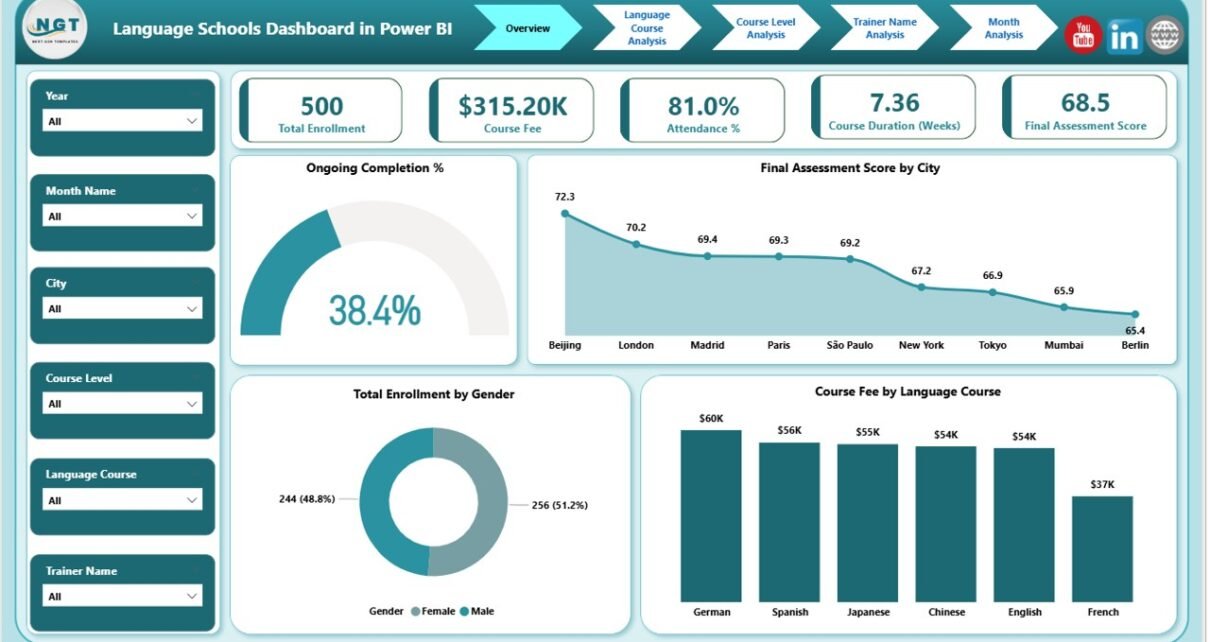
What Insights Does the Overview Page Provide?

The Overview Page serves as the central control panel of the dashboard. It provides a high-level snapshot of overall performance.
Key Elements on the Overview Page
This page includes interactive slicers and five powerful cards:
-
Ongoing Completion %
Shows how many students progress toward course completion. -
Final Assessment Score by City
Highlights academic performance across different cities. -
Total Enrolment by Gender
Displays gender-wise enrolment distribution. -
Course Fee by Language Course
Compares revenue contribution by language. -
High-Level Performance Cards
Provide instant KPIs for quick review.
Why Is the Overview Page Important?
Because decision-makers often need quick answers, the overview page delivers immediate clarity. It helps management identify trends without diving into detailed pages.
How Does Language Course Analysis Improve Decision-Making?
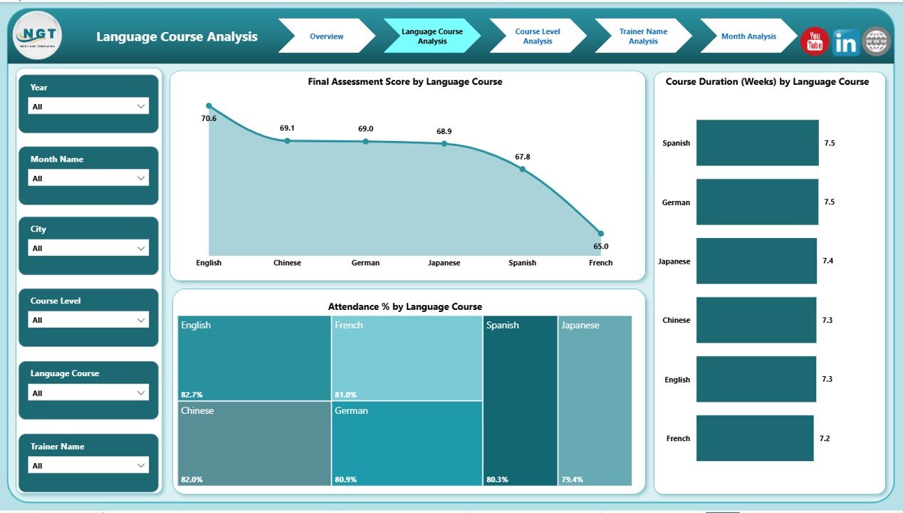
The Language Course Analysis Page focuses on course-level insights. This page answers a crucial question: Which language courses perform best?
Key Visuals in Language Course Analysis
This page includes slicers and three main charts:
-
Final Assessment Score by Language Course
Compares academic outcomes across languages. -
Course Duration by Language Course
Shows average training duration per language. -
Attendance % by Language Course
Tracks student engagement levels.
Why Language Course Analysis Matters
Click to Purchases Language Schools Dashboard in Power BI
Because different languages attract different learner profiles, this analysis helps schools:
-
Improve underperforming courses
-
Adjust course duration
-
Enhance engagement strategies
As a result, course quality improves consistently.
Why Is Course Level Analysis Critical for Academic Planning?
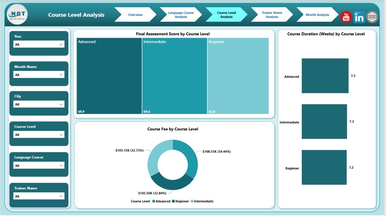
The Course Level Analysis Page dives deeper into beginner, intermediate, and advanced programs.
Charts Available in Course Level Analysis
This page includes:
-
Final Assessment Score by Course Level
Measures learning outcomes at each level. -
Course Duration by Course Level
Compares time investment across levels. -
Course Fee by Course Level
Highlights revenue contribution.
How Course Level Analysis Helps Schools
Because learner expectations vary by level, this page allows schools to:
-
Optimize curriculum design
-
Balance course duration
-
Adjust pricing strategies
Therefore, both academic quality and profitability improve.
How Does Trainer Name Analysis Improve Teaching Quality?
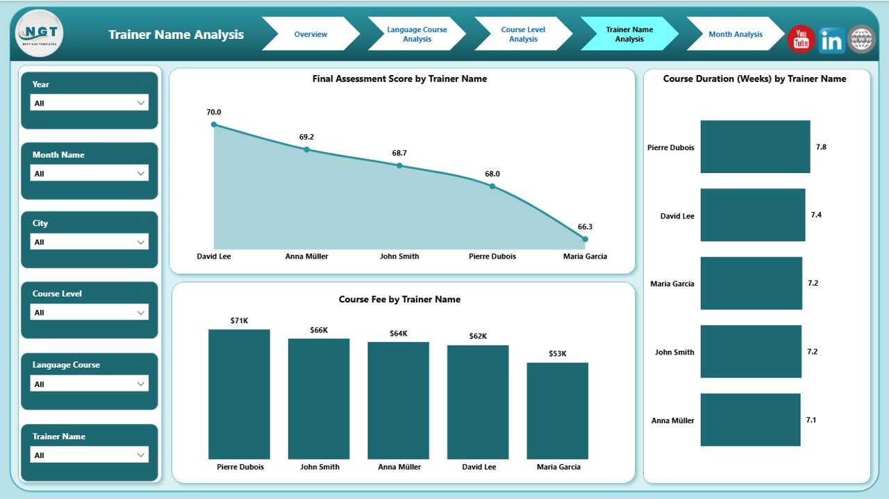
Trainers directly influence learning outcomes. Therefore, the Trainer Name Analysis Page plays a vital role.
Visuals in Trainer Name Analysis
This page contains:
-
Final Assessment Score by Trainer Name
Measures trainer effectiveness. -
Course Duration by Trainer Name
Shows pacing and delivery style. -
Course Fee by Trainer Name
Highlights revenue handled by each trainer.
Benefits of Trainer Name Analysis
This page helps schools:
-
Identify top-performing trainers
-
Design targeted training programs
-
Allocate courses efficiently
As a result, teaching quality improves while maintaining consistency.
Why Is Month Analysis Essential for Trend Monitoring?
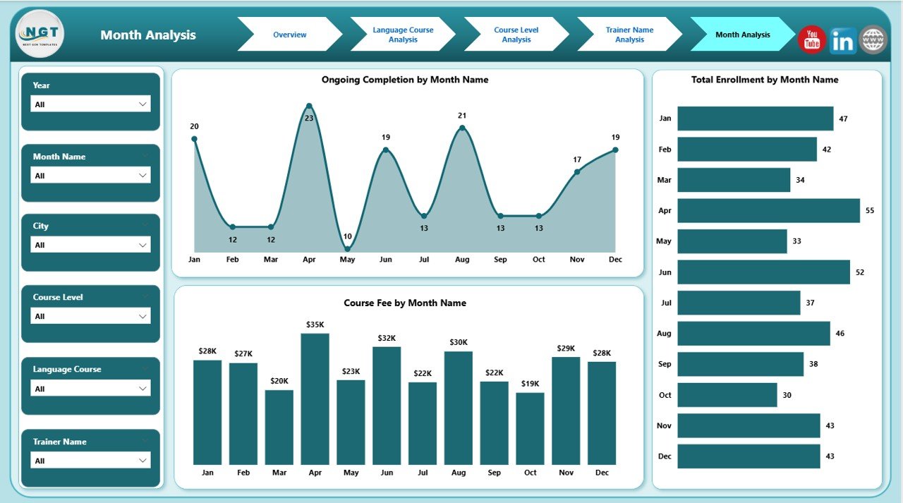
The Month Analysis Page tracks performance trends over time.
Key Metrics in Month Analysis
This page includes:
-
Ongoing Completion by Month
Tracks student progress trends. -
Total Enrolment by Month
Identifies seasonal patterns. -
Course Fee by Month
Shows revenue fluctuations.
Value of Month Analysis
Because education demand changes over time, this page helps schools:
-
Plan marketing campaigns
-
Forecast revenue
-
Allocate resources proactively
Thus, schools stay ahead of demand changes.
Advantages of Language Schools Dashboard in Power BI
Click to Purchases Language Schools Dashboard in Power BI
A well-designed dashboard delivers both academic and business benefits.
Key Advantages
-
📊 Centralized Reporting
All data lives in one interactive dashboard. -
⏱ Time Savings
Automated reporting replaces manual work. -
🎯 Better Academic Outcomes
Data-driven insights improve teaching quality. -
💰 Revenue Optimization
Fee analysis highlights growth opportunities. -
📈 Trend Visibility
Month-wise tracking supports planning.
Opportunities for Improvement Using This Dashboard
Even the best dashboards reveal gaps that create growth opportunities.
Improvement Opportunities
-
Optimize low-attendance courses
-
Improve trainers with lower assessment scores
-
Adjust course pricing by demand
-
Reduce long course durations without impacting quality
Therefore, the dashboard becomes a continuous improvement tool.
Best Practices for the Language Schools Dashboard in Power BI
To maximize value, schools should follow proven best practices.
Best Practices to Follow
-
Maintain clean and consistent data sources
-
Update data regularly
-
Use slicers instead of multiple dashboards
-
Focus on actionable KPIs
-
Review insights monthly with stakeholders
By following these practices, schools extract long-term value from the dashboard.
Who Should Use a Language Schools Dashboard in Power BI?
This dashboard suits multiple roles:
-
Language School Owners
-
Academic Directors
-
Operations Managers
-
Finance Teams
-
Education Consultants
Because of its flexibility, both small institutes and multi-city academies benefit equally.
How Does Power BI Enhance Language School Reporting?
Power BI offers interactive visuals, fast performance, and easy sharing. Therefore, users explore data without technical complexity.
In addition, Power BI integrates seamlessly with Excel, making it ideal for education organizations.
Conclusion: Why Language Schools Should Adopt Power BI Dashboards
A Language Schools Dashboard in Power BI transforms how education institutions monitor performance. Instead of guessing outcomes, schools rely on data-backed insights.
Because the dashboard covers enrolment, courses, trainers, levels, and monthly trends, decision-makers gain complete visibility. As a result, schools improve academic quality, optimize revenue, and scale confidently.
In today’s competitive education market, data-driven management is no longer optional. It is essential.
Frequently Asked Questions (FAQs)
What is a Language Schools Dashboard in Power BI used for?
It tracks enrolment, course performance, trainer effectiveness, attendance, and revenue using interactive visuals.
Can small language schools use this dashboard?
Yes, both small and large institutes can use it because Power BI scales easily.
Does this dashboard require technical knowledge?
No, users interact with slicers and visuals without technical skills.
Can we customize the dashboard for our school?
Yes, Power BI allows full customization based on your data structure.
How often should data be updated?
Ideally, schools should update data weekly or monthly for accurate insights.
Does this dashboard support multi-city analysis?
Yes, city-wise analysis is built into the overview and assessment pages.
Visit our YouTube channel to learn step-by-step video tutorials