In today’s fast-paced business world, marketing teams deal with massive volumes of data from campaigns, leads, channels, and budgets. Without proper organization, this data becomes overwhelming — making it hard to understand what’s working and where improvements are needed.
That’s where a Marketing Analytics Report in Excel comes in.
This powerful tool turns raw marketing data into meaningful insights, helping you make better decisions, track performance, and optimize campaigns — all within a familiar Excel environment.
In this article, we’ll explore what a Marketing Analytics Report is, its key features, advantages, best practices, and how it can transform your marketing operations.
Click to Purchases Marketing Analytics Report in Excel
What Is a Marketing Analytics Report in Excel?
A Marketing Analytics Report in Excel is a structured, data-driven dashboard that consolidates all key marketing metrics into one place. It helps marketing professionals evaluate campaign effectiveness, measure ROI, and visualize performance trends using dynamic charts, tables, and slicers.
Excel’s versatility makes it the perfect platform for analytics. With formulas, pivot tables, and built-in charts, you can turn raw data into actionable visuals — without needing complex software.
This ready-to-use Marketing Analytics Report Template allows marketing managers, analysts, and executives to:
-
Track performance across campaigns and channels.
-
Analyze conversion percentages and cost-to-revenue ratios.
-
Evaluate leads generated and performance by campaign managers.
-
Compare monthly trends in cost, revenue, and efficiency.
Structure of the Marketing Analytics Report in Excel
This report template has three main pages (plus a support sheet), each designed to provide a clear view of marketing performance from different angles.
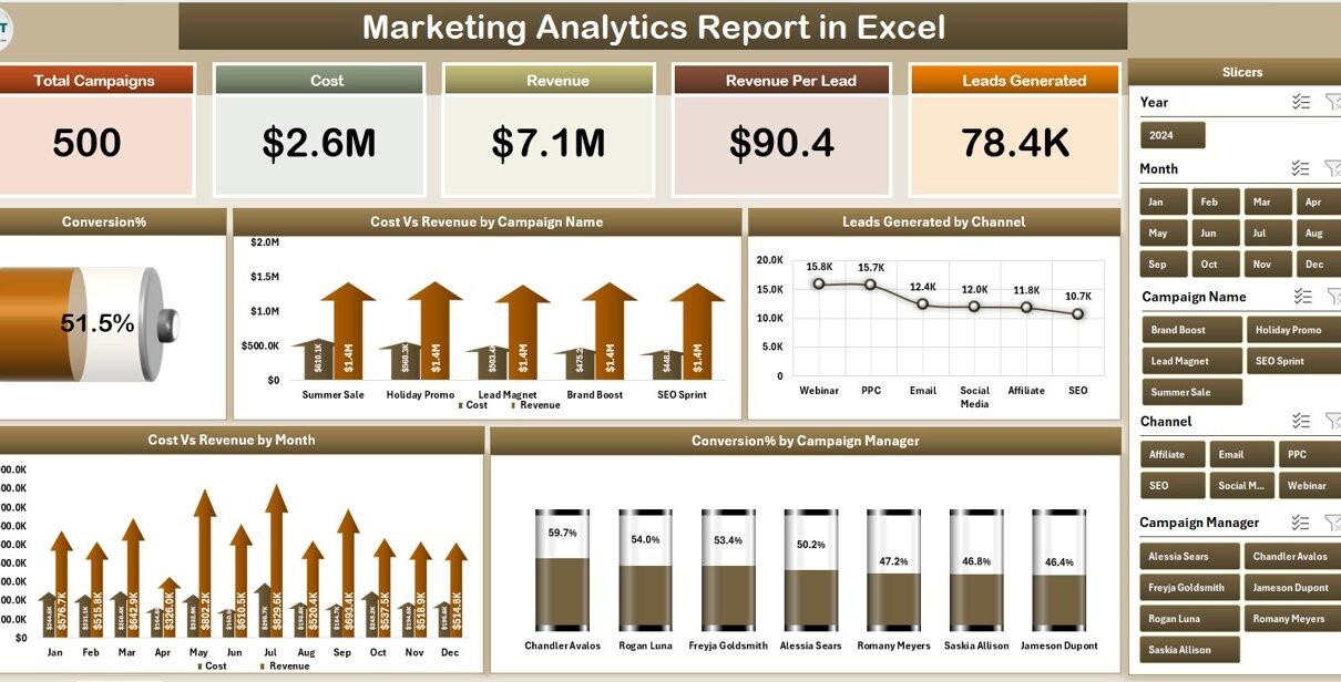
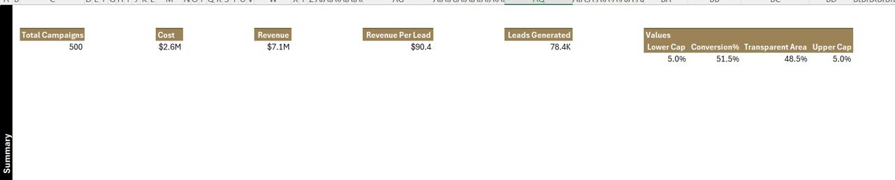
Summary Page – The Executive Overview
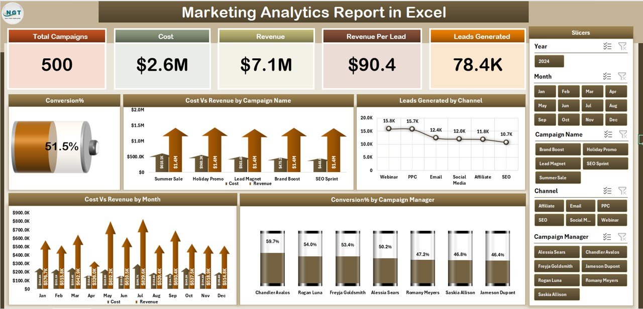
The Summary Page is the main dashboard. It offers a snapshot of marketing performance through five interactive cards and multiple charts.
Key elements include:
-
Top 5 KPI Cards:
These highlight metrics like Total Leads, Total Revenue, Total Cost, ROI, and Conversion Rate — instantly showing how well your marketing is performing. -
Right-Side Slicers:
Slicers allow quick filtering by campaign, channel, or month. You can view results for a single campaign or compare across multiple months.
Dynamic Charts:
📈 Conversion % – shows how efficiently leads are turning into customers.
💰 Cost vs. Revenue by Campaign Name – visualizes profitability per campaign.
📊 Leads Generated by Channel – reveals which platforms (e.g., social media, email, paid ads) bring the most leads.
📅 Cost vs. Revenue by Month – helps track seasonality or monthly performance shifts.
👥 Conversion % by Campaign Manager – identifies top and underperforming managers.
The summary page gives top-level insight for executives and marketing heads who need a quick overview without diving into raw data.
Report Page – The Detailed Analysis View
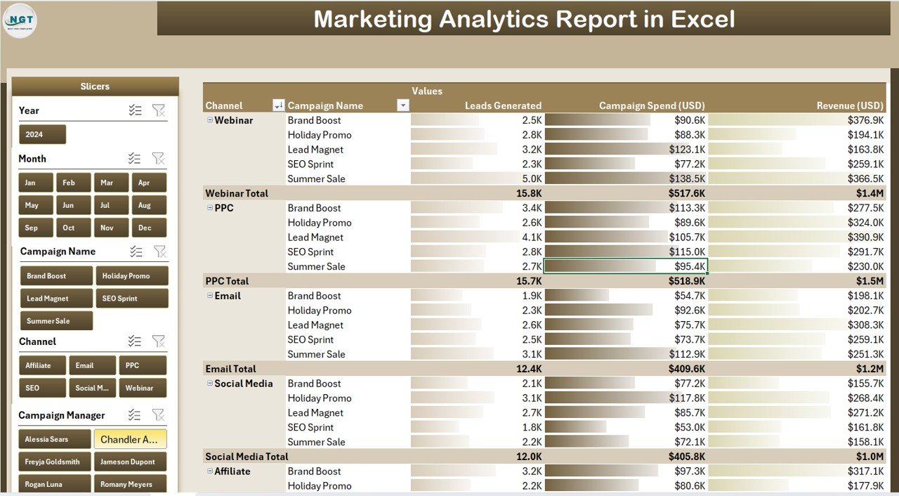
The Report Page provides an analytical breakdown of all the metrics displayed in the summary. It’s ideal for data analysts or team leads who want to explore specific trends or records.
Key components:
-
Left-Side Slicers:
Enable filtering by campaign name, manager, or month to customize the report view. -
Information Table:
Displays campaign details such as campaign name, start and end date, channel, leads, conversions, cost, revenue, ROI, and conversion rate.
This section helps identify patterns, outliers, or underperforming campaigns that need attention.
Example insights:
-
A campaign with high cost but low conversion may require creative or audience changes.
-
A channel with low spend but high conversion suggests strong ROI potential.
Data Sheet – The Foundation of Your Analytics
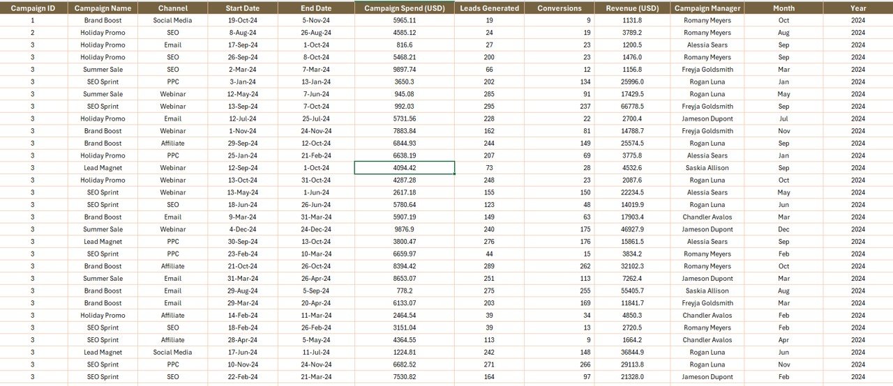
The Data Sheet is where all source data resides. It includes fields like:
Click to Purchases Marketing Analytics Report in Excel
-
Campaign Name
-
Campaign Manager
-
Channel
-
Leads Generated
-
Conversions
-
Cost (USD)
-
Revenue (USD)
-
Month
-
Region
The quality and accuracy of this data determine how reliable the dashboard insights are. The formulas and pivot tables across other sheets depend directly on this dataset.
Support Sheet – Simplifying Data Management
The Support Sheet contains the predefined lists used for drop-downs and slicers. For instance, it may include lists of campaign names, managers, and channels to maintain consistency throughout the report.
This sheet helps avoid data entry errors and ensures smooth functioning of slicers and validation lists in the other pages.
How Does the Marketing Analytics Report Work?
The report combines Excel’s analytical features — including formulas, conditional formatting, and pivot charts — to create an interactive reporting environment.
Core Excel Functions Used:
-
SUMIFS – to calculate campaign-specific totals.
-
AVERAGEIFS – to find average conversion rates per manager or channel.
-
IFERROR & INDEX MATCH – to fetch specific campaign metrics dynamically.
-
Pivot Tables & Pivot Charts – to visualize cost vs. revenue, conversions, and leads.
-
Slicers – to make filtering and data interaction seamless.
With these tools, users can simply update the data sheet each month, and the entire report refreshes automatically.
Benefits of Using a Marketing Analytics Report in Excel
Let’s look at the key advantages of using this Excel-based marketing analytics report.
1. Unified View of All Marketing KPIs
The report consolidates campaign data, costs, conversions, and ROI into a single visual dashboard — no need to switch between multiple spreadsheets.
2. Real-Time Insights
Since the report updates instantly when new data is entered, marketing teams always have access to real-time performance insights.
3. Easy to Customize
Users can easily modify charts, formulas, or visual styles to suit their company’s branding or specific analysis needs.
4. Cost-Effective Solution
Unlike premium analytics tools, this Excel report doesn’t require any software subscription. It delivers powerful insights with zero recurring costs.
5. Enhanced Decision-Making
By visualizing trends and identifying high- or low-performing campaigns, decision-makers can allocate budgets smarter and increase overall marketing ROI.
Practical Use Cases of the Marketing Analytics Report
This report is ideal for multiple scenarios across marketing departments:
-
Campaign Performance Analysis – Compare cost, leads, and ROI across campaigns.
-
Manager Evaluation – Identify which campaign managers achieve the best conversion rates.
-
Budget Optimization – Reallocate spending to channels delivering the highest ROI.
-
Monthly Reviews – Present visual reports in team meetings.
-
Executive Reporting – Offer C-level management an at-a-glance summary of marketing effectiveness.
Advantages of Marketing Analytics Report in Excel
A Marketing Analytics Report not only simplifies reporting but also empowers data-driven decision-making.
📊 Improves Visibility: Instantly see where your marketing stands across campaigns and channels.
🧭 Enhances Strategy: Use trend data to optimize targeting, timing, and spend.
🔍 Promotes Accountability: Assign responsibility by campaign or manager for clearer performance evaluation.
⏱️ Saves Time: Automated calculations and dashboards eliminate manual reporting effort.
💡 Supports Continuous Improvement: Regular tracking helps identify winning patterns and areas for growth.
How to Build a Marketing Analytics Report in Excel
Here’s a simple guide for creating a similar report from scratch:
-
Collect Your Marketing Data:
Gather campaign names, leads, conversions, cost, and revenue. -
Prepare the Data Sheet:
Structure it with clean headers and consistent data types (numbers, dates, text). -
Use Formulas to Calculate KPIs:
Add columns for ROI, conversion %, and cost per lead. -
Create Pivot Tables:
Build summary tables for cost vs. revenue, conversion by manager, and leads by channel. -
Insert Charts:
Use column, bar, or line charts to visualize performance trends. -
Add Slicers for Interactivity:
Connect slicers to pivots so users can filter data dynamically. -
Design the Summary Page:
Combine KPI cards, charts, and slicers into a visually appealing layout. -
Link Data Dynamically:
Use references so that updating one dataset refreshes all charts. -
Validate with Test Data:
Ensure formulas and filters work correctly before final use. -
Protect the Sheet:
Lock formulas and visuals to avoid accidental edits.
Click to Purchases Marketing Analytics Report in Excel
Best Practices for the Marketing Analytics Report in Excel
To make your report accurate, efficient, and visually appealing, follow these best practices:
✅ Keep Data Clean: Avoid duplicates, blanks, or inconsistent entries in your data sheet.
✅ Standardize Naming: Use consistent campaign and channel names to prevent formula errors.
✅ Use Conditional Formatting: Highlight performance gaps or target achievements visually.
✅ Update Regularly: Refresh the data at least monthly to keep insights current.
✅ Limit Manual Inputs: Automate as much as possible using formulas or drop-down lists.
✅ Add Notes or Comments: Clarify assumptions or definitions next to KPIs for context.
✅ Focus on Key Metrics: Don’t overcrowd the dashboard — keep only meaningful visuals.
Opportunities for Improvement
While Excel offers flexibility, it also has a few areas where teams can enhance performance:
📈 Automate Data Import: Link the data sheet to external sources (Google Ads, CRM) using Power Query.
💾 Add Historical Comparison: Maintain separate sheets for yearly comparisons.
🧩 Integrate Power BI: Combine Excel’s backend data with Power BI visuals for advanced storytelling.
🧮 Use Dynamic Formulas: Apply dynamic arrays or named ranges to simplify updates.
🎨 Enhance Visual Design: Add color themes, icons, and KPI cards for professional presentation.
Conclusion
A Marketing Analytics Report in Excel is more than just a spreadsheet — it’s a complete data visualization system for marketing teams.
It empowers businesses to analyze campaign data, monitor ROI, and make data-driven decisions — all without expensive tools or complex software.
Whether you’re managing paid ads, social media, or multi-channel campaigns, this Excel-based report helps you stay organized, informed, and ready to act.
By maintaining clean data, following best practices, and continuously refining visuals, you can transform Excel into your marketing command center.
Frequently Asked Questions (FAQs)
1. What is the purpose of a Marketing Analytics Report in Excel?
It helps consolidate and visualize key marketing metrics such as leads, conversions, cost, and revenue, enabling faster and smarter decision-making.
2. Who can use this Excel report?
Marketing managers, analysts, business owners, and executives can all use it to track performance, compare campaigns, and evaluate ROI.
3. How often should the report be updated?
Ideally, you should update it monthly. However, for high-frequency campaigns (like daily ads), you can update it weekly.
4. Can I connect Excel to live marketing data?
Yes. Using Power Query or APIs, you can connect Excel to platforms like Google Ads or Facebook Ads for real-time data refresh.
5. What are the most important metrics to include?
Include Conversion Rate, ROI, Cost per Lead, Leads Generated, and Revenue — these form the backbone of most marketing analyses.
6. Can small businesses use this template?
Absolutely. It’s designed for all scales — from startups to enterprises — without needing additional software costs.
Visit our YouTube channel to learn step-by-step video tutorials
Click to Purchases Marketing Analytics Report in Excel