In today’s fast-paced digital world, marketers rely heavily on data to make informed decisions. That’s where a Marketing Dashboard in Excel becomes a powerful tool. It helps track performance, measure ROI, identify trends, and visualize results. This guide will walk you through everything you need to know about creating and using a marketing dashboard in Excel.
What Is a Marketing Dashboard in Excel?
A Marketing Dashboard in Excel is a visual reporting tool that displays key marketing metrics and campaign data. It allows marketing teams to monitor performance in real time and make informed decisions quickly. From budget tracking to campaign performance, Excel dashboards provide a centralized overview.
Click to Purchases Marketing Dashboard in Excel
Why Should You Use a Marketing Dashboard in Excel?
There are countless benefits to using Excel dashboards for marketing analysis:
✅ Ease of use: Most marketers already know how to use Excel.
📊 Customizable: You can modify the dashboard layout, colors, and structure to fit your needs.
⏱️ Real-time analysis: With slicers and pivot tables, update your data with just a click.
💡 Data visualization: See charts, KPIs, and trends all in one place.
💼 Cost-effective: No expensive software required—just Excel.
Key Features of This Marketing Dashboard
This ready-to-use Marketing Dashboard in Excel includes five interactive pages with slicer-based navigation. Here’s a breakdown of each section:
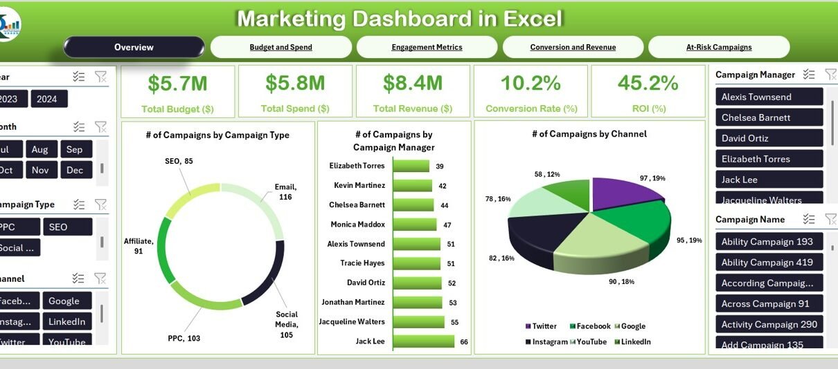
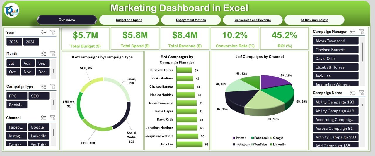
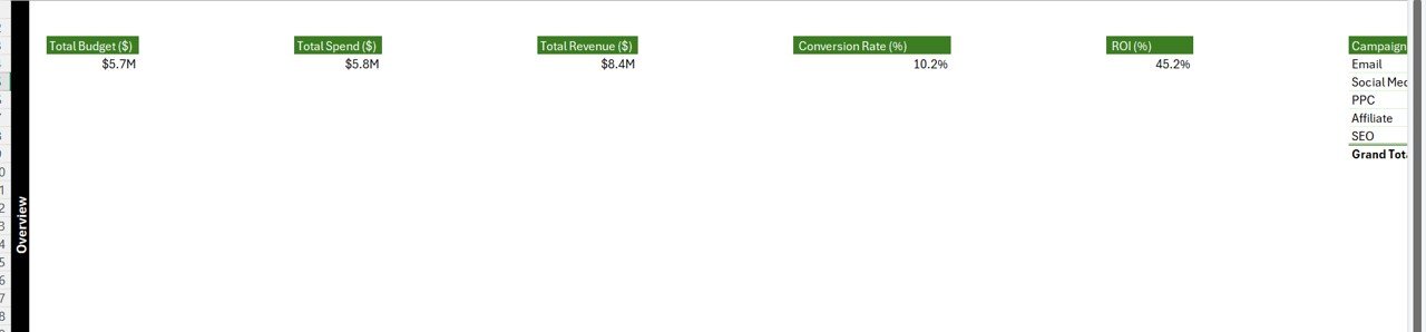
Overview Page
Click to Purchases Marketing Dashboard in Excel
This is the heart of the dashboard. It shows overall marketing campaign insights with:
- 6 slicers: Year, Month, Campaign Type, Channel, Campaign Manager, Campaign Name
- 5 KPI cards: Quick-glance stats like total campaigns, spend, revenue, etc.
3 Charts:
- Number of Campaigns by Campaign Type
- Number of Campaigns by Campaign Manager
- Number of Campaigns by Channel
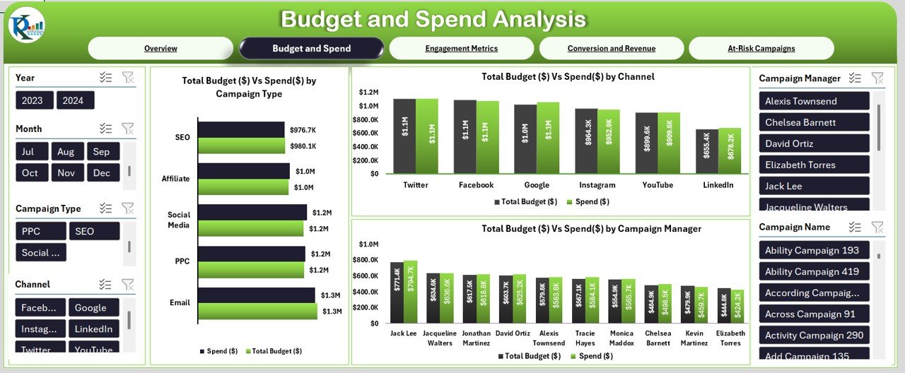
Budget and Spend Page
Click to Purchases Marketing Dashboard in Excel
Visualize financial efficiency with:
- 5 KPI cards
3 Comparison Charts:
- Total Budget ($) vs Spend ($) by Campaign Type
- Total Budget ($) vs Spend ($) by Channel
- Total Budget ($) vs Spend ($) by Campaign Manager
Engagement Metrics Page
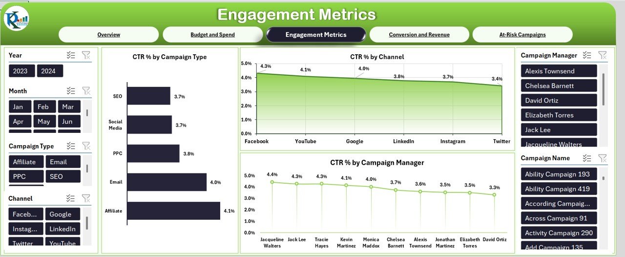
Measure interaction through click-through rates:
5 KPI cards
3 Charts:
- CTR (%) by Campaign Type
- CTR (%) by Channel
- CTR (%) by Campaign Manager
Click to Purchases Marketing Dashboard in Excel
Conversion and Revenue Page
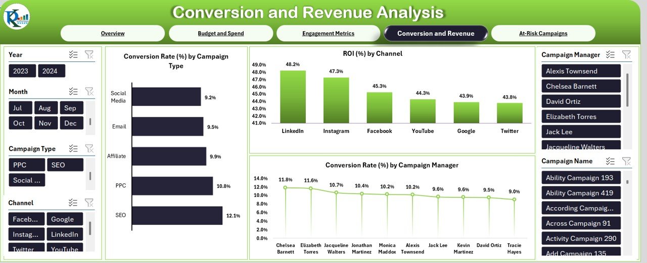
Analyze the effectiveness of your campaigns:
5 KPI cards
3 Charts:
- Conversion Rate (%) by Campaign Type
- ROI (%) by Channel
- Conversion Rate (%) by Campaign Manager
At-Risk Campaigns Page
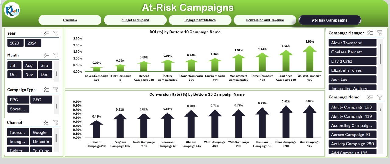
Spot underperforming campaigns quickly:
- 5 KPI cards
- 2 Charts:
- ROI (%) of Bottom 10 Campaigns
- Conversion Rate (%) of Bottom 10 Campaigns
Data Sheet Tab Explained
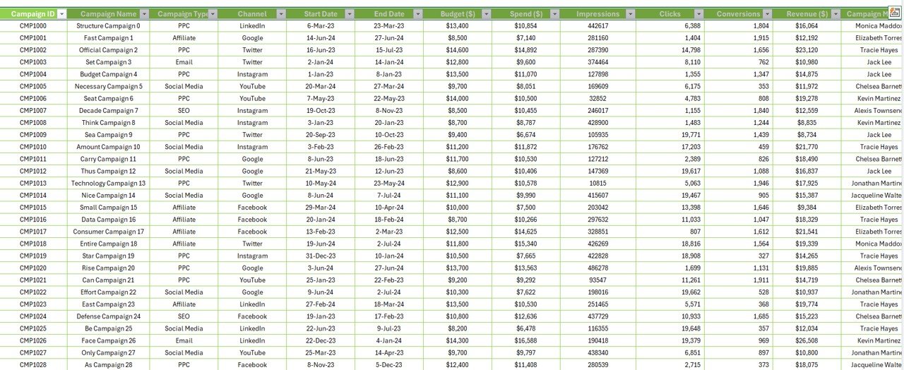
All raw data is entered in this sheet. Key fields include:
- ID
- Campaign Name
- Campaign Type
- Channel
- Start Date / End Date
- Budget ($), Spend ($)
- Impressions, Clicks, Conversions
- Revenue ($)
- Campaign Manager
This data drives the entire dashboard. Update regularly for real-time results.
Support Sheet Tab
You can ignore this sheet. It contains backend pivot tables and formulas. You may hide this tab to keep things tidy.
Advantages of Marketing Dashboard in Excel
Using Excel to build a marketing dashboard brings multiple benefits:
🔍 All-in-one view: You get a complete picture of all campaign activities.
⏳ Time-saving: Dashboards reduce time spent creating reports manually.
🌍 Better decisions: Visual trends help make smarter, data-driven decisions.
🔮 Flexible filtering: With slicers, analyze the data your way.
🚀 Scalable: Add more campaigns and metrics as your business grows.
Best Practices for the Marketing Dashboard in Excel
To make the most of your dashboard, follow these best practices:
- Keep it updated: Refresh your data frequently.
- Use slicers: Let users filter data easily.
- Avoid clutter: Display only essential KPIs.
- Color-code charts: Make insights pop visually.
- Check for errors: Ensure all formulas and pivots work correctly.
- Protect the layout: Lock cells and hide sheets to avoid accidental edits.
Common Mistakes to Avoid
Even experienced users can make missteps. Avoid these errors:
- Using too many metrics at once
- Forgetting to refresh pivot tables
- Making charts too complex to understand
- Ignoring user-friendly navigation
- Not labeling KPIs clearly
When Should You Use a Marketing Dashboard in Excel?
You should use it when:
- You run multiple campaigns across channels.
- You manage monthly or quarterly marketing budgets.
- You need to report to stakeholders.
- You want to identify which campaigns drive the most revenue.
- You aim to optimize ad spend across platforms.
Who Can Benefit From This Dashboard?
This Excel template is useful for:
- Digital Marketing Managers
- Campaign Analysts
- CMOs and Marketing Directors
- Social Media Managers
- PPC and SEO Teams
How to Customize the Dashboard for Your Brand?
Want to tailor the dashboard to match your company’s branding?
- Change chart colors to match brand colors
- Add your logo to the top banner
- Modify slicers based on your campaign dimensions
- Add new KPI cards if needed (e.g., Cost per Lead, Engagement Rate)
Tools and Formulas Used in This Dashboard
- Pivot Tables and Pivot Charts
- Slicers for interactivity
- SUMIFS, AVERAGEIFS for calculating KPIs
- Conditional Formatting for Up/Down Arrows
- Custom formatting for currency, dates, and percentages
Conclusion
A well-designed Marketing Dashboard in Excel simplifies performance tracking and boosts decision-making. It helps teams visualize what’s working and what’s not. Since Excel is both flexible and familiar, it’s a perfect tool for building powerful dashboards without learning new software. Just plug in your data and see the story unfold!
❓ Frequently Asked Questions (FAQs)
Q1. How do I update the dashboard monthly?
A: Just paste new data into the Data Sheet and refresh all pivot tables.
Q2. Can I track social media campaigns?
A: Yes. Include social channels in your “Channel” column and add CTR or engagement KPIs.
Q3. What if I need to add new KPIs?
A: Use formulas like SUMIFS in the data sheet, create new pivot tables, and link to new cards or charts.
Q4. Is it possible to use this dashboard in Google Sheets?
A: Technically yes, but slicers and pivot charts work best in Excel.
Q5. Do I need coding or VBA to use this?
A: Not at all. This dashboard uses standard Excel features—no macros or coding needed.
Click to Purchases Marketing Dashboard in Excel
Visit our YouTube channel to learn step-by-step video tutorials
Watch the step-by-step video tutorial: