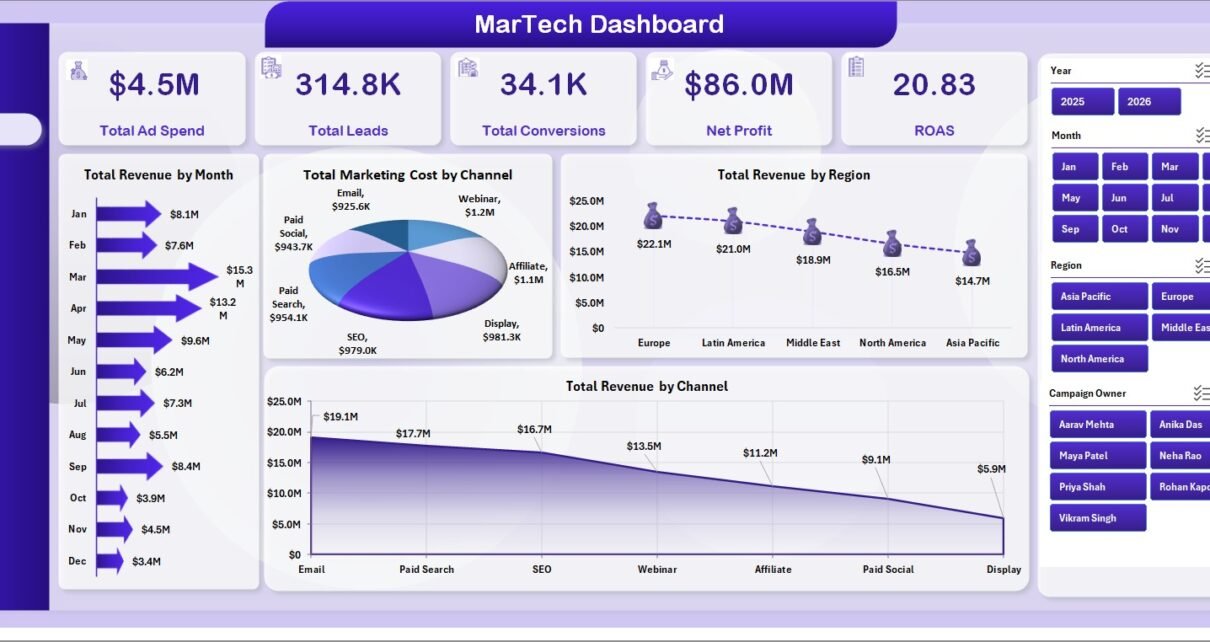
The MarTech Dashboard in Excel gives marketing teams a ready-to-use way to track ad spend, leads, conversions, revenue, net profit, ROAS, CTR, channel mix, regional performance, campaign owners, funnel stages, and monthly trends from one workbook. Marketing teams often spend 5-20 hours each month combining exports from ad platforms, CRM tools, and campaign sheets. This Excel dashboard reduces that reporting work by giving you structured pages, pivot-powered charts, KPI cards, and slicers that refresh after you update the Data Sheet.
Use it when you need a practical reporting layer for digital marketing, demand generation, agency reporting, paid media, content campaigns, and campaign ROI review without committing to another monthly SaaS subscription.
Key Features of MarTech Dashboard in Excel
- 5 KPI cards for Total Ad Spend, Total Leads, Total Conversions, Net Profit, and ROAS.
- 5 dashboard pages covering Overview, Channel Mix, Funnel, Regional, and Spend ROI.
- 20 chart views covering revenue, marketing cost, clicks, CTR, leads, conversions, status, regions, campaign owners, and audience segments.
- Multiple slicers for fast filtering across campaign dimensions.
- Data Sheet tab where you replace sample records with your own marketing data.
- Support Sheet tab with pivot tables that power the dashboard dynamically.
- No VBA required; it is built with native Excel tables, pivot tables, charts, and slicers.
Dashboard Pages Explanation
1. Overview Page
The Overview Page shows the executive summary of MarTech performance. At the top, the dashboard displays Total Ad Spend, Total Leads, Total Conversions, Net Profit, and ROAS so decision-makers can review marketing efficiency before going into detailed analysis.
Total Revenue by Month shows revenue movement across months. It helps you identify growth periods, weak months, and the timing of campaigns that produced stronger sales outcomes.
Total Marketing Cost by Channel compares cost by channel. It helps determine where budget is being consumed and which channels need cost control or deeper ROI checks.
Total Revenue by Region shows which markets are contributing the most revenue. It is useful for regional budget planning and sales alignment.
Total Revenue by Channel compares revenue generated by each marketing channel. It helps marketers move beyond surface metrics and connect channels to commercial results.
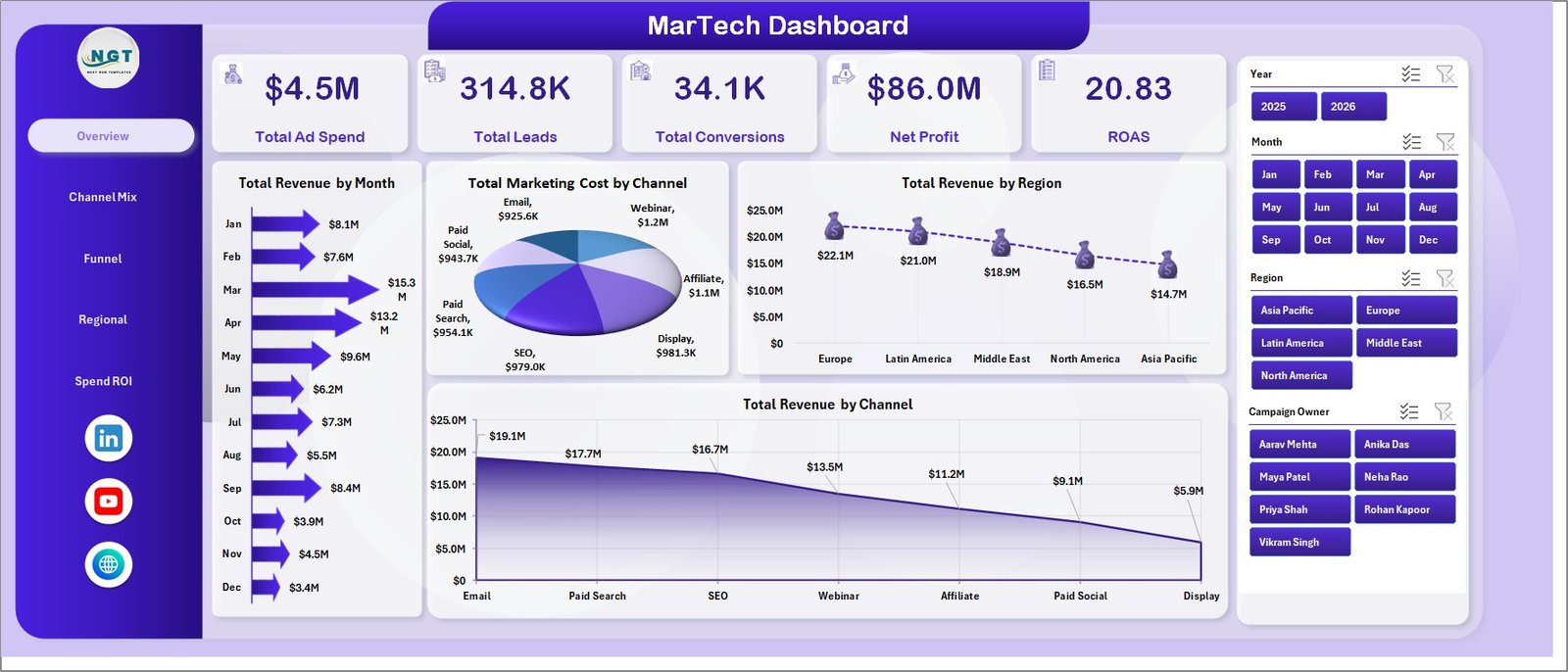
MarTech Dashboard in Excel
2. Channel Mix
The Channel Mix page focuses on performance across acquisition channels, devices, audience segments, and funnel stages. It helps answer which channels are attracting attention, which devices drive clicks, which audience segments generate profit, and where leads convert through the funnel.
CTR % by Channel compares click-through rate across channels so you can spot where messaging and targeting are strongest. A high CTR may indicate stronger audience fit, creative quality, or offer relevance.
Total Clicks by Device shows how clicks are distributed across desktop, mobile, tablet, or other devices. This helps marketers prioritize landing page testing and creative format decisions.
Net Profit by Audience Segment compares profitability by audience group. It helps prevent over-investing in segments that generate activity but weak margin.
Total Leads and Total Conversions by Funnel Stage compares lead movement against conversion outcomes by stage. It helps identify funnel leakage and areas where follow-up or offer changes may improve conversion.
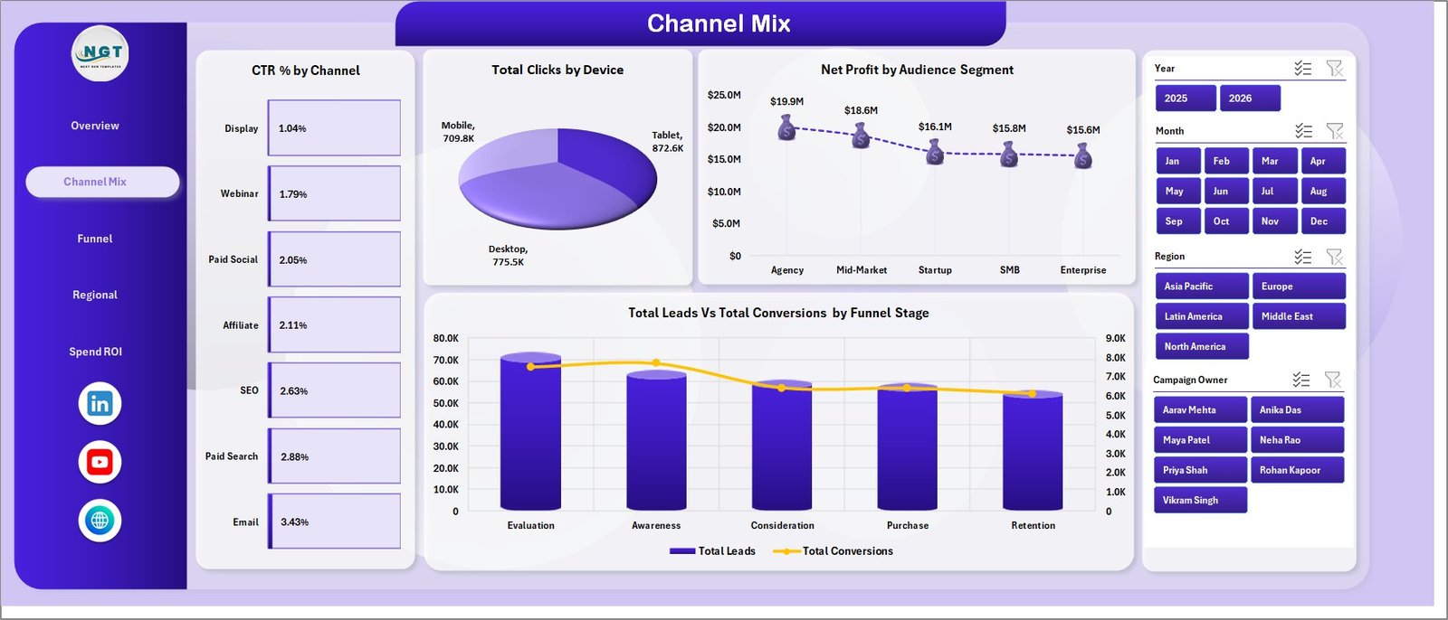
Channel Mix
3. Funnel
The Funnel page is built for conversion review. It helps marketing and sales teams evaluate whether leads are turning into conversions and whether campaign ownership, status, and regional investment are aligned with outcomes.
Lead Conversion % by Audience Segment shows which audience groups convert at stronger rates. Use this to refine targeting, lead scoring, and nurture campaigns.
Total Conversions by Campaign Owner compares campaign results by owner. It can support team reviews, workload planning, and campaign coaching.
Total Campaigns by Status shows the distribution of campaigns by status. It helps identify how many campaigns are active, completed, paused, planned, or under review.
Total Revenue and Total Marketing Cost by Region compares the return side and cost side by geography. This helps teams avoid judging regions only by spend or only by revenue.
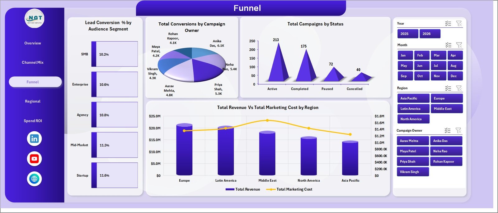
Funnel
4. Regional
The Regional page focuses on geographic and time-based marketing performance. It is useful for marketing teams that manage spend across different locations, territories, or target markets.
ROAS by Region compares return on ad spend by market. This helps identify regions where campaign investment is producing stronger returns.
Total Leads by Year shows annual lead generation volume. It is useful for long-term trend comparison and year-over-year planning.
Total Revenue by Quarter compares revenue across quarters. This supports quarterly business reviews and budget planning.
Total Ad Spend by Month shows monthly spending behavior. It helps teams spot overspending, planned campaign peaks, or underinvestment periods.
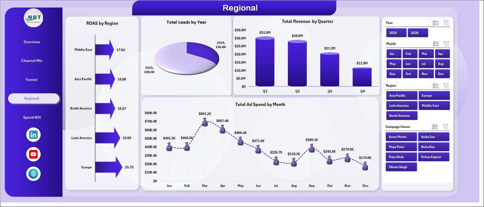
Regional
5. Spend ROI
The Spend ROI page connects revenue, ROAS, cost, campaign status, and profit trends. This page is especially useful for budget meetings and performance reviews.
Total Revenue by Campaign Owner compares revenue contribution by owner. It helps leaders see which campaigns or managers are driving measurable results.
ROAS by Quarter shows how advertising efficiency changes over time. If ROAS drops while spend rises, the team can review targeting, creative, or landing pages.
Total Marketing Cost by Status shows how budget is distributed across campaign statuses. It helps identify whether too much cost is tied to paused, planned, or low-return work.
Net Profit by Month tracks monthly profit after marketing costs. It gives a clearer picture than revenue alone because it accounts for spend efficiency.
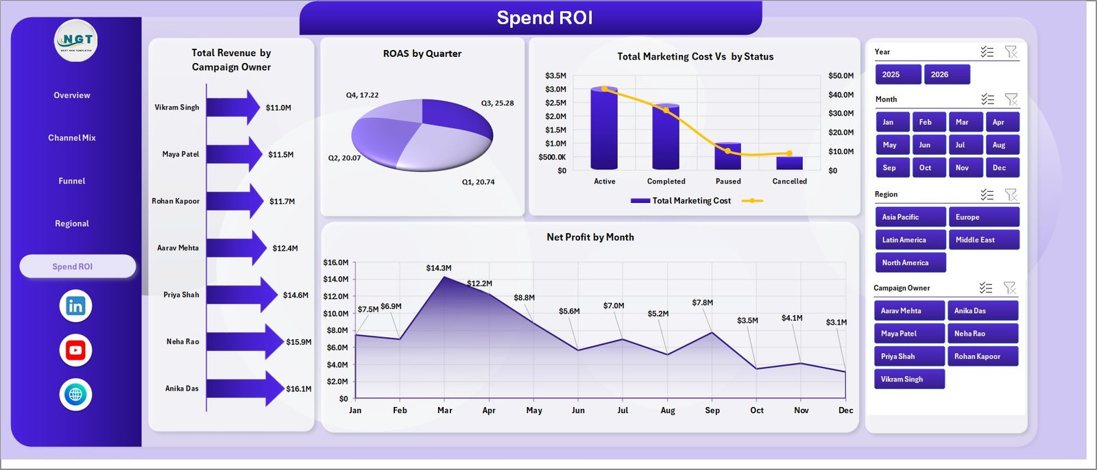
Spend ROI
6. Data Sheet Tab
The Data Sheet is the input table for the workbook. Add campaign records in the same format shown in the sample data. Keep the headers and structure unchanged so all pivot tables, cards, and charts continue to refresh correctly.

Data Sheet tab
7. Support Sheet
The Support Sheet contains the pivot tables used to create the dashboard dynamically. After updating the Data Sheet, go to the Data tab in the Excel Ribbon and click Refresh All. You can keep this sheet hidden during regular use.

Support sheet tab
MarTech Dashboard in Excel vs. Google Sheets vs. Paid CRM/SaaS – Feature Comparison
| Feature | MarTech Dashboard in Excel | Google Sheets Alternative | Paid Marketing SaaS |
|---|---|---|---|
| Cost | $17.99 one-time | Low tool cost plus setup time | $50-$500+ per user/month |
| Platform | Microsoft Excel | Browser spreadsheet | Cloud software |
| Setup time | Under 10 minutes | 30-90 minutes if built manually | Days or weeks |
| Real-time collaboration | Possible with OneDrive or SharePoint | Native collaboration | Usually included by paid seats |
| Mobile access | Limited through Excel mobile | Good through Google Sheets mobile | Usually included |
| Customizable fields | Fully editable workbook | Editable but formulas can break | Limited by vendor settings |
| Share with link | Possible through cloud storage | Built in | Built in with login controls |
| Year-1 cost at 5 users | $17.99 total | Low tool cost plus build time | $3,000-$30,000+ |
| ROAS and funnel reporting | Built in | Must be built | Depends on plan and integrations |
Who Should Use This Template
This dashboard is useful for digital marketing managers, MarTech analysts, demand generation teams, agency account managers, startup founders, marketing operations teams, and consultants who need repeatable campaign reporting in Excel.
It is not the right fit if you require live API imports from Google Ads, Meta Ads, HubSpot, Salesforce, or analytics platforms. In those cases, use this dashboard as a reporting workbook after exporting or preparing the data.
Real-World Use Cases
Aisha runs marketing operations for a B2B SaaS team. She updates campaign data weekly and uses the Overview page to brief leadership on ad spend, leads, conversions, profit, and ROAS.
Daniel manages reporting for a performance marketing agency. He duplicates the workbook for each client, updates the Data Sheet, and uses Channel Mix and Spend ROI pages for monthly review decks.
Priya is a founder managing paid acquisition herself. She uses the dashboard to decide whether to put more budget into search, social, email, or partner campaigns.
Advantages of MarTech Dashboard in Excel
- It keeps campaign reporting in a familiar Excel file.
- It separates executive, channel, funnel, regional, and ROI views.
- It avoids monthly SaaS fees for teams that only need structured reporting.
- It gives users full control over formulas, data, layout, and charts.
- It can be reused every month by refreshing the Data Sheet.
Opportunities for Improvement
This is a manual-entry Excel dashboard, so it does not automatically connect to ad platforms, CRMs, or analytics tools. Teams with large campaign volume may need a data warehouse or BI workflow before the data reaches Excel. The dashboard also depends on consistent data entry, so channel names, regions, statuses, dates, and owners should be standardized.
Best Practices
- Keep a backup copy before replacing sample data.
- Use consistent names for channels, regions, devices, owners, statuses, and audience segments.
- Refresh all pivots after every data update.
- Keep the Support Sheet hidden once the dashboard is ready for end users.
- Review ROAS and net profit together so revenue growth does not hide inefficient spend.
Microsoft also explains how to refresh PivotTable data here: Refresh PivotTable data.
Explore Relevant Templates
For related marketing reporting tools, explore Digital Marketing Campaign Dashboard in Excel, Influencer Campaign Dashboard in Excel, Social Media Performance Dashboard in Excel, and the new MarTech Dashboard in Excel.
Frequently Asked Questions
What is the MarTech Dashboard in Excel?
It is an Excel dashboard template for tracking marketing technology and campaign performance across ad spend, leads, conversions, revenue, profit, ROAS, funnel stages, channels, regions, and owners.
How many pages are included?
The workbook includes Overview, Channel Mix, Funnel, Regional, Spend ROI, Data Sheet, and Support Sheet tabs.
Does this dashboard require VBA or macros?
No. It uses Excel tables, pivot tables, charts, and slicers.
How do I refresh the dashboard?
After updating the Data Sheet, go to the Data tab in Excel and click Refresh All. This refreshes pivot tables and connected charts.
Can I hide the Support Sheet?
Yes. The Support Sheet powers the dashboard and can stay hidden during normal use.
Who is this dashboard best for?
It is best for marketing managers, MarTech analysts, agencies, founders, and teams that need repeatable campaign performance reporting in Excel.
About the Author
Built by PK – Microsoft Certified Professional with 15+ years of Excel, Google Sheets, and Power BI experience. Founder of NextGenTemplates, reaching 300K+ subscribers across YouTube channels. Every template is hand-built and tested before release.
Conclusion
The MarTech Dashboard in Excel is a practical reporting system for teams that want to understand ad spend, leads, conversions, revenue, profit, ROAS, funnel movement, channel mix, and regional performance without paying for a large SaaS platform. Update the Data Sheet, refresh the pivots, and use the dashboard pages to make cleaner marketing decisions.
For more Excel dashboard tutorials and template walkthroughs, visit YouTube.com/@PKAnExcelExpert.