Urban transportation systems handle millions of passengers every day. Therefore, metro and subway authorities must track performance, manage congestion, control costs, and improve service quality continuously. However, when teams rely on scattered reports, raw data tables, or static summaries, decision-making becomes slow and reactive.
That is exactly where a Metro and Subway Dashboard in Excel plays a critical role.
A Metro and Subway Dashboard in Excel helps transport authorities, planners, and operations teams monitor trips, passenger categories, revenue, congestion levels, energy consumption, and delays from one centralized and interactive Excel file. Moreover, this dashboard converts complex operational data into clear visuals that support faster and smarter decisions.
In this in-depth article, you will learn what a Metro and Subway Dashboard in Excel is, how it works, its features, advantages, best practices, and real-world use cases. By the end, you will clearly understand why this ready-to-use Excel dashboard is essential for modern metro and subway management.
Click to Purchases Metro and Subway Dashboard in Excel
What Is a Metro and Subway Dashboard in Excel?
A Metro and Subway Dashboard in Excel is a structured and interactive reporting tool built using Microsoft Excel. It visually tracks and analyzes key metro and subway performance metrics in one place.
Instead of checking multiple sheets, reports, or systems, users can view all important insights on dynamic dashboard pages. As a result, transport managers gain instant visibility into passenger movement, congestion, revenue, energy usage, and delays.
Moreover, Excel dashboards allow users to filter data by city, metro line, ticket type, passenger category, and time period. Consequently, decision-makers can drill down into details without technical complexity.
Why Do Metro and Subway Systems Need an Excel Dashboard?
Metro and subway operations generate massive amounts of data every day. However, raw data alone does not support action. Therefore, authorities need a structured system to analyze and visualize that data.
A Metro and Subway Dashboard in Excel helps because it:
-
Centralizes operational and passenger data
-
Highlights congestion and crowding risks
-
Tracks revenue and ticket trends
-
Monitors energy consumption and delays
-
Supports quick operational decisions
Furthermore, Excel remains widely used, cost-effective, and easy to update. Hence, many transport organizations prefer Excel dashboards over complex software.
Overview of the Metro and Subway Dashboard in Excel
This ready-to-use Metro and Subway Dashboard in Excel comes with five analytical pages and supporting data sheets. Additionally, it includes a Page Navigator that allows smooth navigation across all dashboard sections.
Each page focuses on a specific analytical area, ensuring clarity and ease of interpretation.
What Is the Page Navigator and Why Is It Important?
The Page Navigator sits on the left side of the dashboard. It allows users to switch between pages with a single click.
Because of this feature:
-
Users save time navigating the dashboard
-
Reports feel professional and structured
-
Non-technical users find the dashboard easy to use
Moreover, the Page Navigator improves user experience and dashboard adoption across teams.
Click to Purchases Metro and Subway Dashboard in Excel
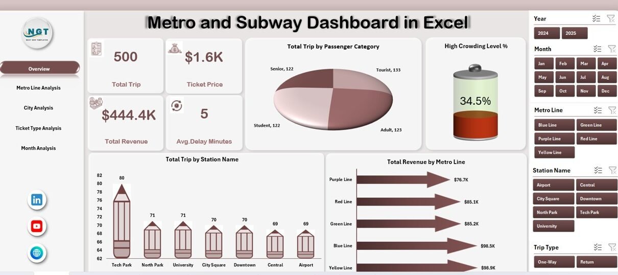
Overview Page – How Does It Summarize Metro Performance?
The Overview Page serves as the main landing page of the dashboard. It provides a high-level snapshot of metro and subway performance.
Key Elements of the Overview Page
On this page, users see:
-
Right-side slicer for quick filtering
-
Four KPI cards showing summary metrics
-
Four interactive charts for performance analysis
Charts on the Overview Page
The Overview Page includes the following charts:
-
Total Trips by Passenger Category
This chart shows how different passenger groups contribute to overall trips. -
High Crowding Level %
This chart highlights congestion intensity across the network. -
Total Trips by Station Name
This visualization identifies the busiest stations. -
Total Revenue by Metro Line
This chart helps track revenue contribution by each metro line.
Because of these visuals, managers can instantly identify demand patterns and pressure points.
Metro Line Analysis – How Do Different Lines Perform?
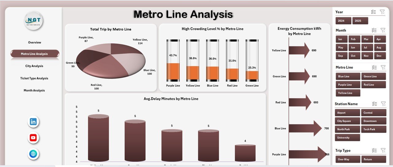
The Metro Line Analysis Page focuses on performance comparison across different metro lines.
What Can You Analyze on This Page?
This page includes:
-
Right-side slicer for filtering
-
Four detailed charts for line-level analysis
Charts Included in Metro Line Analysis
-
Total Trips by Metro Line
This chart shows passenger demand across each line. -
High Crowding Level % by Metro Line
This chart highlights congestion risk line-wise. -
Energy Consumption (kWh) by Metro Line
This visualization helps track energy usage and efficiency. -
Average Delay Minutes by Metro Line
This chart identifies reliability issues across lines.
Because of this page, operations teams can balance capacity, improve scheduling, and reduce delays effectively.
Click to Purchases Metro and Subway Dashboard in Excel
City Analysis – How Does Metro Usage Vary by City?
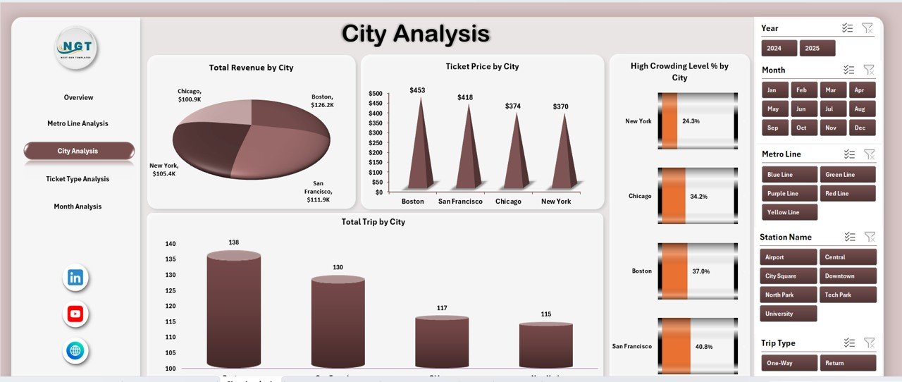
Many metro authorities operate across multiple cities. Therefore, understanding city-level performance becomes essential.
What Does the City Analysis Page Show?
This page includes:
-
Right-side slicer
-
Four charts focused on city-wise metrics
Charts in the City Analysis Page
-
Total Trips by City
This chart shows demand volume across cities. -
High Crowding Level % by City
This visualization identifies cities facing congestion challenges. -
Ticket Price by City
This chart compares pricing across cities. -
Total Trips by City (Trend or Distribution)
This helps analyze consistency or growth patterns.
As a result, planners can compare city performance and allocate resources more efficiently.
Ticket Type Analysis – Which Tickets Drive the Most Trips?
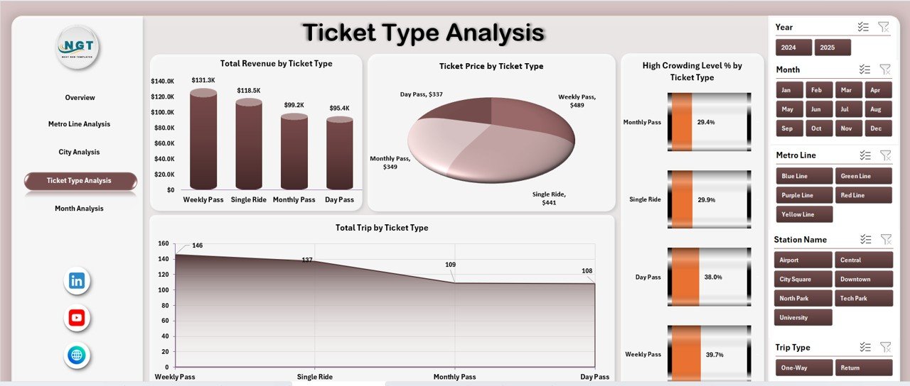
Ticketing strategies directly affect revenue and passenger behavior. Therefore, ticket-type analysis plays a vital role.
What Insights Does Ticket Type Analysis Provide?
This page includes:
-
Right-side slicer
-
Four ticket-based performance charts
Charts in the Ticket Type Analysis Page
-
Total Trips by Ticket Type
This chart shows which ticket types generate the most trips. -
High Crowding Level % by Ticket Type
This helps identify ticket categories linked to peak congestion. -
Ticket Price by Ticket Type
This chart compares pricing across ticket categories. -
Total Trips by Ticket Type (Distribution)
This visualization highlights usage patterns.
Because of this analysis, authorities can refine ticket pricing and promotions.
Month Analysis – How Does Performance Change Over Time?
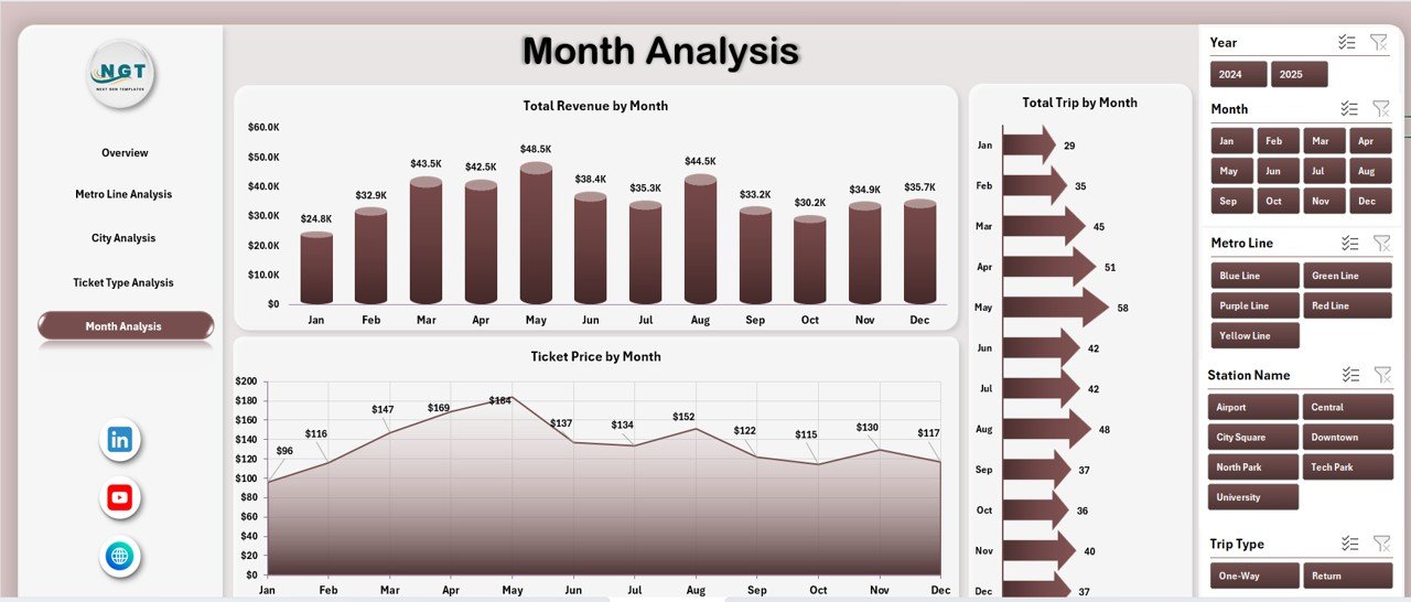
Seasonality affects metro and subway usage significantly. Therefore, time-based analysis becomes crucial.
What Does the Month Analysis Page Cover?
This page includes:
-
Right-side slicer
-
Monthly trend charts
Charts in the Month Analysis Page
-
Total Trips by Month
This chart shows monthly demand trends. -
Ticket Price by Month
This helps track fare changes over time. -
Total Trips by Month (Comparison)
This highlights growth or decline patterns.
As a result, teams can plan capacity, staffing, and maintenance schedules better.
Support Sheet and Data Sheet – Why Are They Important?
Click to Purchases Metro and Subway Dashboard in Excel
Behind every strong dashboard lies a well-structured data foundation.
Data Sheet
The Data Sheet stores raw metro and subway data such as:
-
Passenger category
-
Station name
-
Metro line
-
City
-
Ticket type
-
Trips
-
Revenue
-
Energy consumption
-
Delay minutes
Because data remains structured, dashboard updates stay smooth and accurate.
Support Sheet
The Support Sheet contains:
-
Helper calculations
-
Lookup tables
-
Intermediate metrics
As a result, the dashboard remains clean, fast, and scalable.
Advantages of Metro and Subway Dashboard in Excel
Using a Metro and Subway Dashboard in Excel delivers multiple benefits for transport authorities.
Key Advantages
-
✅ Centralized view of metro operations
-
✅ Clear visibility into congestion and crowding
-
✅ Better revenue and ticket analysis
-
✅ Improved energy consumption tracking
-
✅ Faster decision-making with slicers
-
✅ Easy to customize and update
-
✅ Cost-effective compared to complex software
Moreover, Excel dashboards work well for both strategic reviews and daily monitoring.
Who Can Use a Metro and Subway Dashboard in Excel?
This dashboard suits a wide range of stakeholders, including:
-
Metro operations managers
-
Transport planners
-
City authorities
-
Revenue and finance teams
-
Energy management teams
-
Policy makers
Because of its simplicity, both technical and non-technical users can use it confidently.
Best Practices for the Metro and Subway Dashboard in Excel
To get maximum value from your dashboard, follow these best practices.
1. Keep Data Clean and Consistent
Always use standardized station names, ticket types, and city names. This ensures accurate analysis.
2. Update Data Regularly
Schedule frequent data updates so the dashboard reflects real-time or near-real-time performance.
3. Use Slicers Wisely
Avoid too many slicers. Instead, focus on key filters like city, line, and month.
4. Monitor Crowding and Delays Closely
Review congestion and delay charts frequently to prevent service disruptions.
5. Review Trends, Not Just Numbers
Always analyze trends over time instead of looking at isolated values.
How Does This Dashboard Support Smart City Initiatives?
Smart cities rely on data-driven decisions. Therefore, a Metro and Subway Dashboard in Excel supports smart city goals by:
-
Improving public transport efficiency
-
Reducing congestion and delays
-
Supporting sustainable energy usage
-
Enhancing passenger experience
Because of this, many city planners integrate such dashboards into their smart mobility strategies.
Conclusion – Why Should You Use a Metro and Subway Dashboard in Excel?
A Metro and Subway Dashboard in Excel transforms raw operational data into actionable insights. Instead of relying on static reports, metro authorities gain a dynamic and interactive tool for monitoring performance.
Moreover, this ready-to-use dashboard improves visibility across passenger trends, congestion levels, revenue streams, energy usage, and delays. As a result, teams make faster, smarter, and more confident decisions.
If you want a simple yet powerful way to manage metro and subway operations, this Excel dashboard delivers exactly that.
Frequently Asked Questions (FAQs)
What is a Metro and Subway Dashboard in Excel used for?
A Metro and Subway Dashboard in Excel tracks trips, congestion, revenue, energy consumption, and delays using interactive visuals.
Can non-technical users use this dashboard?
Yes, the dashboard uses slicers and charts, making it easy for non-technical users.
How often should the data be updated?
You should update the data daily, weekly, or monthly depending on operational needs.
Can I customize the dashboard?
Yes, Excel allows full customization of charts, slicers, and metrics.
Does this dashboard support multiple cities and lines?
Yes, the dashboard includes city-wise and line-wise analysis pages.
Is Excel suitable for large metro datasets?
Yes, with proper structuring and best practices, Excel handles large datasets efficiently.
Visit our YouTube channel to learn step-by-step video tutorials


