Managing museums and cultural centers involves more than preserving history and art. Today, decision-makers must balance visitor experience, operational costs, staffing efficiency, and revenue generation—all at the same time. Because manual reporting and disconnected spreadsheets slow down this process, organizations increasingly rely on analytics solutions.
That is exactly why a Museums & Cultural Centers Dashboard in Power BI becomes a powerful and practical solution.
This in-depth, SEO-optimized article explains what a Museums & Cultural Centers Dashboard in Power BI is, how it works, why museums need it, its detailed page structure, key advantages, best practices, and frequently asked questions. By the end of this guide, you will clearly understand how this dashboard helps cultural institutions operate efficiently while enhancing visitor satisfaction.
Click to Purchases Museums & Cultural Centers Dashboard in Power BI
What Is a Museums & Cultural Centers Dashboard in Power BI?
A Museums & Cultural Centers Dashboard in Power BI is a centralized, interactive analytics solution designed to track, analyze, and visualize operational and visitor-related performance metrics for museums and cultural institutions.
Instead of relying on static reports, this dashboard converts raw operational data into real-time visuals and KPIs. As a result, museum directors, operations managers, finance teams, and event coordinators gain instant clarity across staffing costs, ticket revenue, visitor satisfaction, and operating expenses.
Moreover, because Power BI connects easily with Excel and other data sources, teams can update data quickly without technical complexity. Therefore, this dashboard supports both daily operational decisions and long-term strategic planning.
Why Do Museums and Cultural Centers Need a Power BI Dashboard?
Museums and cultural centers operate in a dynamic environment. Visitor volumes fluctuate. Event schedules change. Costs rise. Expectations increase. Because of these challenges, leaders need accurate, timely, and visual insights.
Without a structured dashboard, organizations face several issues:
-
Fragmented data across departments
-
Delayed financial reporting
-
Limited visibility into visitor behavior
-
Difficulty tracking event profitability
-
Manual effort spent on recurring reports
However, when teams adopt a Museums & Cultural Centers Dashboard in Power BI, they replace guesswork with clarity. Consequently, decisions become faster, smarter, and more confident.
How Does a Museums & Cultural Centers Dashboard in Power BI Work?
The dashboard works by integrating operational, financial, and visitor data into a single Power BI file. First, data gets captured in structured formats such as Excel or databases. Then, Power BI processes this data using predefined measures and relationships. Finally, the dashboard displays insights through interactive visuals, slicers, and trend charts.
Because users can filter data by museum type, event type, ticket type, region, or month, they can analyze performance from multiple perspectives instantly. Therefore, teams save time while improving accuracy.
This dashboard includes five well-structured pages, each designed to answer specific business questions. Let us explore each page in detail.
1. What Insights Does the Overview Page Provide?
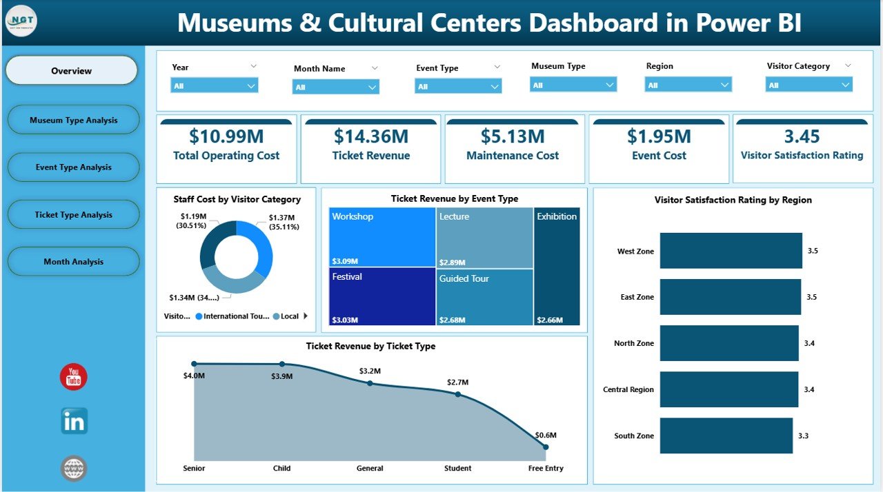
The Overview Page serves as the main landing page of the dashboard. From the moment users open the file, they gain a complete snapshot of museum performance.
Key Features of the Overview Page
-
Interactive slicers to filter data by relevant dimensions
-
Four KPI cards highlighting critical performance numbers
-
Four analytical charts offering immediate insights
Charts Included on the Overview Page
-
Staff Cost by Visitor Category
This chart shows how staffing expenses vary across different visitor segments. As a result, managers can optimize workforce allocation. -
Ticket Revenue by Event Type
This visualization highlights which event types generate the most revenue. Therefore, teams can prioritize high-performing events. -
Visitor Satisfaction Rating by Region
This chart reveals regional differences in visitor satisfaction. Consequently, institutions can focus improvement efforts where needed. -
Ticket Revenue by Ticket Type
This view compares revenue across ticket categories such as adult, child, group, or special passes.
Because everything appears on one page, leadership can assess performance within seconds.
Click to Purchases Museums & Cultural Centers Dashboard in Power BI
2. How Does Museum Type Analysis Improve Decision-Making?
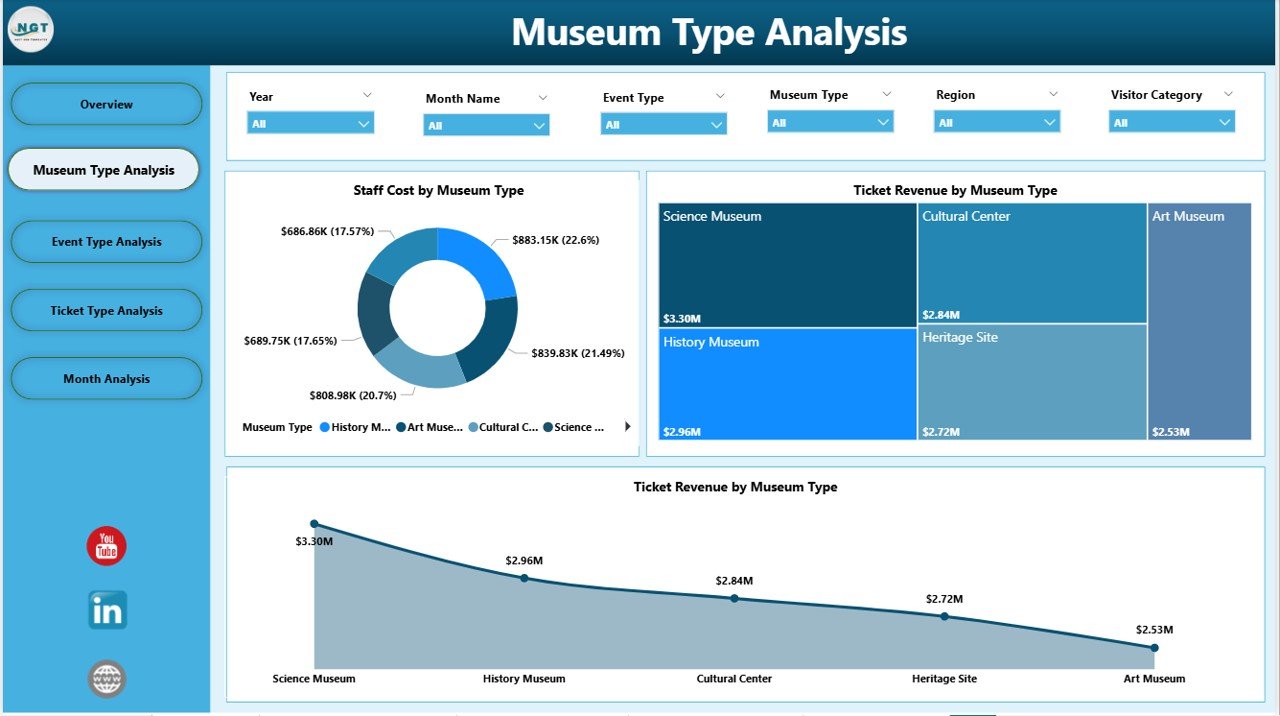
The Museum Type Analysis Page focuses on comparing performance across different museum categories, such as art museums, history museums, science centers, and cultural heritage sites.
Key Visuals on the Museum Type Analysis Page
-
Staff Cost by Museum Type
This chart helps identify staffing cost variations across museum types. As a result, managers can control labor expenses more effectively. -
Ticket Revenue by Museum Type
This visualization shows which museum categories attract higher-paying visitors or larger crowds. -
Total Operating Cost by Museum Type
This chart highlights operational efficiency by museum category.
Because this page compares similar entities side by side, it supports data-driven budgeting and strategic expansion decisions.
3. Why Is Event Type Analysis Critical for Museums?
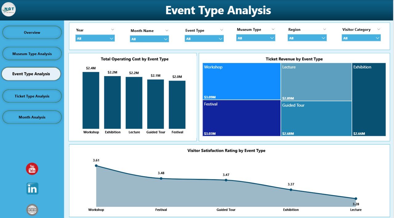
Events drive visitor engagement and revenue. However, not all events perform equally. That is why the Event Type Analysis Page plays a critical role.
Key Charts on the Event Type Analysis Page
-
Total Operating Cost by Event Type
This chart shows how much each event category costs to run. -
Ticket Revenue by Event Type
This visualization highlights revenue contribution from exhibitions, workshops, guided tours, and special events. -
Visitor Satisfaction by Event Type
This chart measures how visitors rate different event experiences.
Because this page combines cost, revenue, and satisfaction, teams can easily identify which events deliver the best overall value.
4. How Does Ticket Type Analysis Optimize Revenue Strategy?
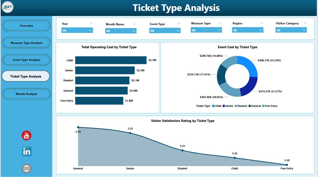
Ticket pricing strategy directly affects revenue and accessibility. Therefore, the Ticket Type Analysis Page focuses on understanding performance by ticket category.
Key Charts on the Ticket Type Analysis Page
-
Total Operating Cost by Ticket Type
This view shows how costs align with different ticket offerings. -
Event Cost by Ticket Type
This chart helps evaluate whether certain ticket categories drive higher event-related costs. -
Visitor Satisfaction by Ticket Type
This visualization reveals how different ticket holders perceive their experience.
Because of these insights, museums can refine pricing strategies without compromising visitor satisfaction.
5. Why Are Monthly Trends Essential for Cultural Centers?
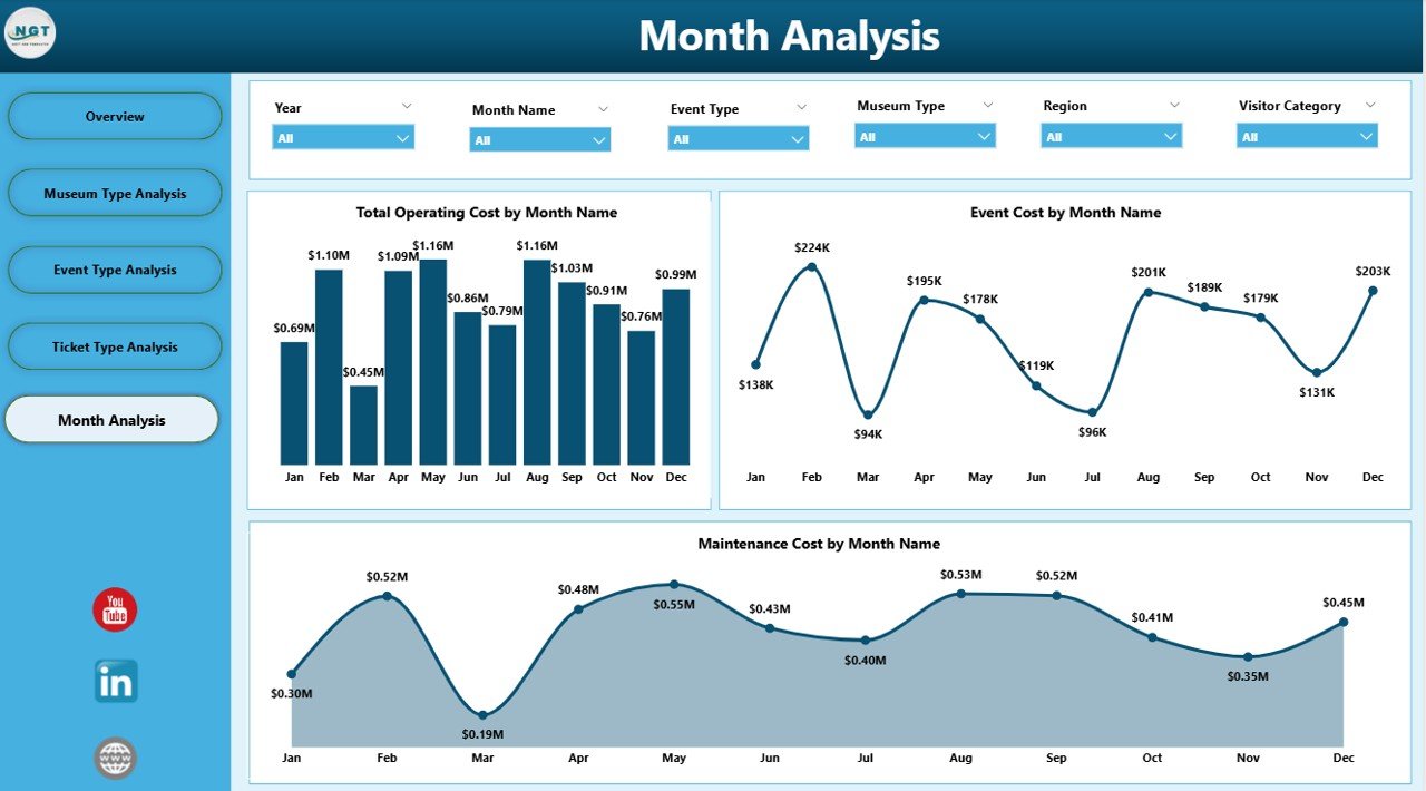
Trends reveal patterns that daily snapshots cannot show. Therefore, the Monthly Trends Page provides time-based insights.
Monthly Trend Charts Included
-
Total Operating Cost by Month
This chart tracks how operational expenses change throughout the year. -
Event Cost by Month
This visualization highlights seasonal event cost patterns. -
Maintenance Cost by Month
This chart shows when maintenance expenses peak.
Because leaders can see trends clearly, they can plan budgets, staffing, and maintenance schedules more effectively.
Advantages of Museums & Cultural Centers Dashboard in Power BI
Why Should Museums Use This Dashboard?
-
📊 Centralized Performance Visibility
All KPIs appear in one place, which eliminates fragmented reporting. -
⏱️ Faster Decision-Making
Interactive visuals reduce analysis time significantly. -
💰 Improved Cost Control
Clear cost breakdowns help manage staffing, events, and maintenance. -
🎟️ Optimized Revenue Strategy
Revenue analysis by event and ticket type supports smarter pricing. -
😊 Enhanced Visitor Experience
Satisfaction insights guide experience improvements. -
📈 Scalable and Flexible Design
The dashboard adapts easily as museums grow or add new events.
Best Practices for Using the Museums & Cultural Centers Dashboard in Power BI
How Can You Maximize Dashboard Value?
-
Maintain clean and structured data before uploading
-
Update data regularly to keep insights relevant
-
Use slicers consistently for accurate comparisons
-
Review trends monthly, not just snapshots
-
Share insights across departments to align strategy
-
Train staff on dashboard navigation to improve adoption
-
Combine dashboard insights with qualitative feedback for better decisions
When teams follow these best practices, the dashboard delivers maximum impact.
Click to Purchases Museums & Cultural Centers Dashboard in Power BI
Who Can Benefit from This Dashboard?
This dashboard supports a wide range of stakeholders:
-
Museum Directors and Trustees
-
Operations and Facility Managers
-
Finance and Budgeting Teams
-
Event and Exhibition Coordinators
-
Marketing and Visitor Engagement Teams
-
Government and Cultural Authorities
Because the dashboard adapts to different needs, it remains valuable across departments.
How Does This Dashboard Support Long-Term Strategic Planning?
Short-term decisions matter. However, long-term strategy defines success. Because this dashboard tracks trends, costs, and satisfaction over time, it supports evidence-based planning.
For example, leadership can:
-
Identify profitable event formats
-
Plan seasonal exhibitions effectively
-
Allocate budgets based on historical trends
-
Improve regional outreach strategies
As a result, museums move from reactive management to proactive leadership.
Conclusion: Why Is a Museums & Cultural Centers Dashboard in Power BI a Smart Investment?
A Museums & Cultural Centers Dashboard in Power BI transforms complex operational data into clear, actionable insights. Instead of managing museums through intuition alone, leaders gain a reliable decision-support system.
Because the dashboard combines cost control, revenue analysis, and visitor satisfaction in one platform, it improves efficiency, transparency, and impact. Therefore, museums and cultural centers that embrace this solution position themselves for sustainable growth and enhanced public value.
Frequently Asked Questions (FAQs)
1. What data sources can connect to a Museums & Cultural Centers Dashboard in Power BI?
Power BI connects easily with Excel files, databases, and cloud data sources. Most museums start with Excel-based data.
2. Do users need technical skills to use this dashboard?
No. The dashboard offers an intuitive interface with slicers and visuals, which makes it easy for non-technical users.
3. How often should museums update dashboard data?
Most institutions update data monthly. However, high-traffic museums may prefer weekly updates.
4. Can this dashboard support multiple museums or locations?
Yes. With proper data structure, the dashboard can analyze multiple museums, regions, or branches.
5. Does this dashboard help improve visitor satisfaction?
Yes. By tracking satisfaction by region, event type, and ticket type, teams can target improvements effectively.
6. Is Power BI suitable for small museums?
Absolutely. Power BI scales well and works effectively for both small cultural centers and large museum networks.
Visit our YouTube channel to learn step-by-step video tutorials