Modern nanotechnology organizations operate in a highly data-driven environment. Companies involved in nanomaterials research, manufacturing, and commercialization must continuously monitor performance indicators such as production efficiency, material quality, research output, operational targets, and innovation metrics. However, many organizations still depend on disconnected spreadsheets and manual reports. As a result, decision-makers struggle to evaluate performance quickly and accurately.
Therefore, businesses increasingly adopt intelligent dashboards that transform raw data into actionable insights. One powerful solution is the Nanomaterials KPI Dashboard in Power BI. This ready-to-use analytical dashboard helps organizations track KPIs efficiently while improving decision-making speed.
Click to Purchases Nanomaterials KPI Dashboard in Power BI
In this comprehensive article, you will learn everything about the Nanomaterials KPI Dashboard in Power BI, including its structure, features, benefits, implementation approach, best practices, and frequently asked questions. Moreover, you will understand how this dashboard enables organizations to achieve better operational control and strategic clarity.
What Is a Nanomaterials KPI Dashboard in Power BI?
A Nanomaterials KPI Dashboard in Power BI is an interactive business intelligence solution designed to monitor key performance indicators related to nanotechnology operations using dynamic visual reports.
Instead of reviewing multiple reports individually, managers can analyze all KPIs from a single centralized dashboard. Consequently, teams identify performance gaps faster and take corrective action without delay.
The dashboard captures data through an Excel data source and converts it into powerful visuals inside Power BI. Because of this integration, users maintain flexibility while enjoying advanced analytics capabilities.
Why Do Nanomaterials Organizations Need KPI Dashboards?
Nanomaterials industries involve complex processes such as research experimentation, material synthesis, testing, and commercialization. Therefore, performance tracking becomes essential.
Without a structured dashboard:
-
Teams waste time compiling reports.
-
Managers miss performance trends.
-
Decision-making slows down.
-
Targets become difficult to monitor.
However, when organizations implement a KPI dashboard, they gain real-time performance visibility. As a result, leaders improve operational efficiency and maintain strategic alignment.
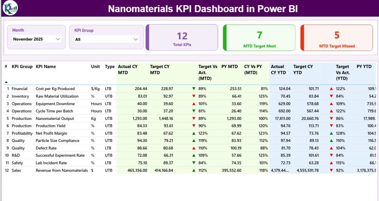
Key Features of the Nanomaterials KPI Dashboard in Power BI
The dashboard contains three powerful analytical pages, each designed to deliver specific insights.
1. Summary Page – Central Performance Overview
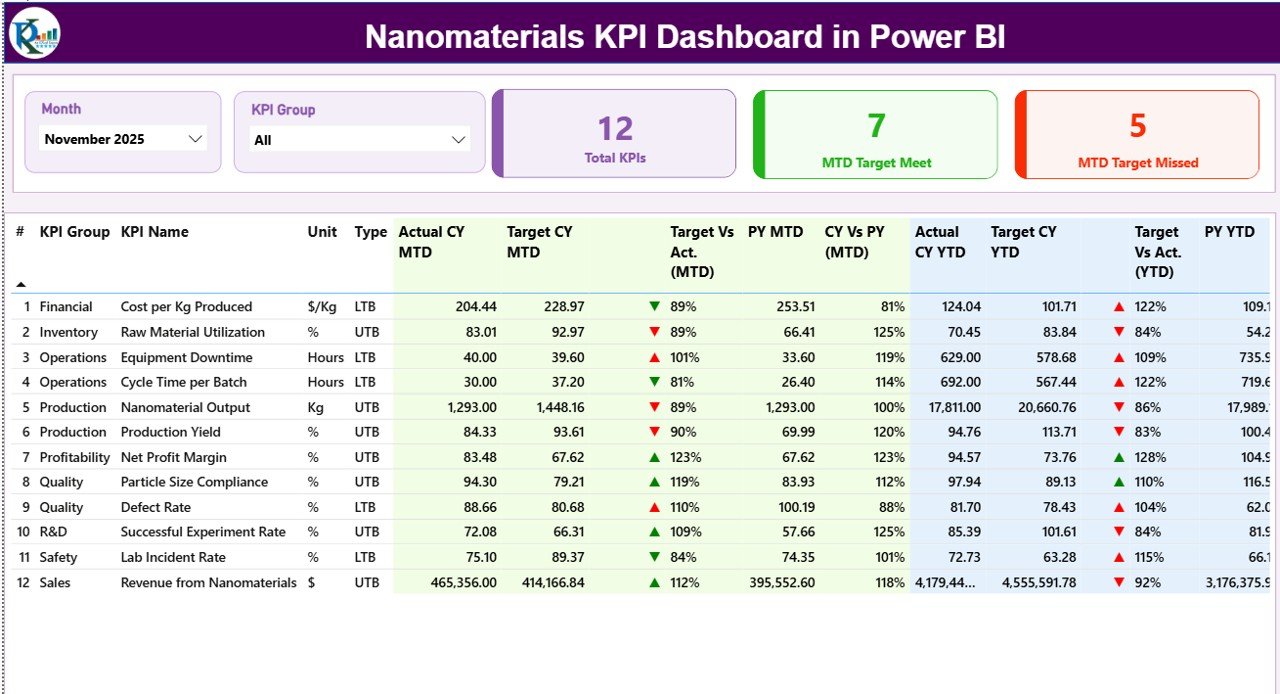
The Summary Page acts as the main control center of the dashboard. Here, users immediately understand overall KPI performance.
Top-Level Filters (Slicers)
At the top, the dashboard includes:
-
Month slicer – Allows users to analyze data month-wise.
-
KPI Group slicer – Filters KPIs by category or department.
Because of these filters, users quickly focus on specific performance areas.
KPI Performance Cards
The dashboard displays three important KPI cards:
-
Total KPIs Count
-
MTD Target Meet Count
-
MTD Target Missed Count
These cards instantly highlight organizational performance status.
Detailed KPI Table Explained
Below the cards, a detailed analytical table presents complete KPI information.
KPI Number
Shows the sequence number of each KPI for easy reference.
KPI Group
Represents the category or department associated with the KPI.
KPI Name
Displays the performance metric being monitored.
Unit
Defines the measurement unit such as percentage, quantity, or value.
Type (LTB or UTB)
-
LTB (Lower the Better) – Lower values indicate improvement.
-
UTB (Upper the Better) – Higher values indicate improvement.
This classification helps users interpret performance correctly.
Month-to-Date (MTD) Metrics
Click to Purchases Nanomaterials KPI Dashboard in Power BI
The dashboard evaluates short-term performance using MTD values.
-
Actual CY MTD – Current year actual performance.
-
Target CY MTD – Expected performance target.
-
MTD Icon – Green ▲ or Red ▼ indicates success or underperformance.
-
Target vs Actual (MTD) – Percentage comparison using:
Actual ÷ Target
-
PY MTD – Previous year performance for the same period.
-
CY vs PY (MTD) – Growth comparison between current and previous year.
Therefore, managers instantly see whether performance improves or declines.
Year-to-Date (YTD) Metrics
For long-term analysis, the dashboard includes YTD calculations.
-
Actual CY YTD
-
Target CY YTD
-
YTD Status Icons
-
Target vs Actual (YTD)
-
PY YTD
-
CY vs PY (YTD)
Because YTD metrics accumulate performance data, leadership gains a broader operational perspective.
2. KPI Trend Page – Performance Trend Analysis
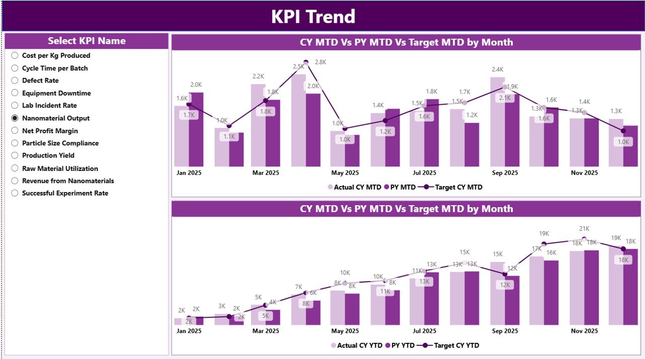
While the Summary page provides snapshots, the KPI Trend Page reveals performance trends over time.
Key Components
-
Two combo charts displaying:
-
Current Year Actual values
-
Previous Year Actual values
-
Target values
-
Charts appear for both:
-
MTD performance
-
YTD performance
KPI Selection Slicer
A slicer on the left allows users to select any KPI dynamically. As soon as users select a KPI, charts update automatically.
Consequently, analysts quickly identify patterns, seasonal changes, and performance variations.
3. KPI Definition Page – Drill-Through Insights
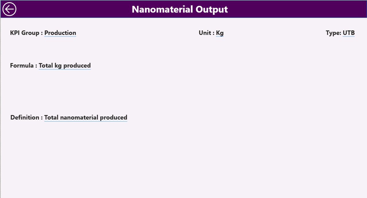
The KPI Definition Page serves as a hidden drill-through page.
Users can navigate from the Summary page to view detailed KPI information such as:
-
KPI Formula
-
KPI Definition
-
Measurement logic
-
KPI Type
A back button located at the top-left corner enables easy navigation.
This feature ensures transparency and clarity for all stakeholders.
How Does the Excel Data Source Work?
Click to Purchases Nanomaterials KPI Dashboard in Power BI
The dashboard uses an Excel file as its data foundation. This approach allows organizations to maintain familiar workflows while benefiting from Power BI analytics.
The Excel file contains three worksheets.
1. Input_Actual Sheet
Users enter actual performance values here.
Required fields include:
-
KPI Name
-
Month (first date of the month)
-
MTD numbers
-
YTD numbers
Once updated, Power BI refreshes visuals automatically.
2. Input_Target Sheet
This sheet stores target values.
Users fill:
-
KPI Name
-
Month
-
MTD target values
-
YTD target values
Because targets remain centralized, comparisons become accurate and consistent.
3. KPI Definition Sheet
This sheet defines KPI structure.
Columns include:
-
KPI Number
-
KPI Group
-
KPI Name
-
Unit
-
Formula
-
Definition
-
Type (LTB or UTB)
Therefore, organizations maintain standardized KPI governance.
How Does the Dashboard Improve Decision-Making?
The dashboard transforms raw numbers into meaningful insights.
For example:
-
Managers detect performance issues immediately.
-
Analysts compare current and historical trends.
-
Leadership evaluates strategic progress.
As a result, organizations shift from reactive management to proactive decision-making.
Advantages of Nanomaterials KPI Dashboard in Power BI
Implementing this dashboard offers multiple benefits.
✅ Centralized KPI Monitoring
All performance metrics appear in one location, reducing reporting complexity.
✅ Real-Time Performance Visibility
Users instantly see whether targets meet expectations.
✅ Improved Strategic Planning
Trend analysis supports data-driven planning.
✅ Easy Data Management
Excel integration keeps data entry simple.
✅ Visual Performance Indicators
Color-coded icons improve interpretation speed.
✅ Historical Comparison
Previous year analysis helps measure growth.
✅ User-Friendly Interface
Even non-technical users can operate the dashboard easily.
Who Can Use This Dashboard?
Click to Purchases Nanomaterials KPI Dashboard in Power BI
Several professionals benefit from this solution:
-
Nanotechnology manufacturers
-
Research laboratories
-
Quality assurance teams
-
Operations managers
-
Data analysts
-
Strategic planners
-
Innovation departments
Because the dashboard remains flexible, organizations can customize KPIs according to their needs.
Best Practices for the Nanomaterials KPI Dashboard in Power BI
To maximize dashboard effectiveness, follow these best practices.
1. Define Clear KPIs
Choose measurable and meaningful KPIs aligned with business goals.
2. Maintain Data Accuracy
Update Excel sheets regularly to ensure reliable analytics.
3. Standardize KPI Definitions
Use consistent formulas and units across departments.
4. Review Performance Monthly
Regular reviews help teams react faster.
5. Use Trend Analysis
Analyze patterns instead of focusing only on single values.
6. Train Users Properly
Provide training so teams interpret KPIs correctly.
7. Automate Data Refresh
Schedule refresh cycles for updated insights.
How to Implement the Nanomaterials KPI Dashboard?
Organizations can implement the dashboard using a structured approach.
Step 1: Define KPI Framework
Identify performance indicators relevant to nanomaterials operations.
Step 2: Prepare Excel Data
Fill actual and target worksheets carefully.
Step 3: Configure KPI Definitions
Add formulas and KPI classifications.
Step 4: Import Data into Power BI
Connect Excel file as the data source.
Step 5: Validate Calculations
Verify MTD and YTD comparisons.
Step 6: Share Dashboard
Publish reports for stakeholders.
Common Challenges and How to Overcome Them
Data Inconsistency
Solution: Use standardized data entry templates.
Incorrect KPI Interpretation
Solution: Add clear KPI definitions.
Delayed Updates
Solution: Assign data ownership responsibilities.
Too Many KPIs
Solution: Focus on critical performance indicators.
Why Power BI Is Ideal for KPI Dashboards?
Power BI provides powerful capabilities that enhance analytics.
-
Interactive visuals
-
Dynamic filtering
-
Automated calculations
-
Easy sharing
-
Cloud accessibility
-
Strong Excel integration
Therefore, organizations achieve enterprise-level analytics without complex systems.
Future Scope of KPI Dashboards in Nanotechnology
Click to Purchases Nanomaterials KPI Dashboard in Power BI
As nanotechnology evolves, analytics becomes even more important.
Future dashboards may include:
-
AI-driven predictions
-
Automated anomaly detection
-
Real-time IoT integration
-
Advanced sustainability metrics
Consequently, data intelligence will play a major role in innovation success.
Conclusion
The Nanomaterials KPI Dashboard in Power BI offers a structured and intelligent approach to performance monitoring. Instead of relying on manual reporting, organizations gain real-time insights through interactive visuals and automated calculations.
Because the dashboard combines Excel flexibility with Power BI analytics, teams achieve both simplicity and power. Moreover, detailed KPI tracking, trend analysis, and drill-through definitions create transparency across operations.
Ultimately, organizations that adopt KPI dashboards improve efficiency, strengthen decision-making, and drive continuous improvement in nanomaterials performance.
Frequently Asked Questions (FAQs)
1. What is the purpose of a Nanomaterials KPI Dashboard?
It helps organizations monitor performance indicators, compare targets with actual results, and analyze trends using interactive visuals.
2. Do users need advanced Power BI skills to use this dashboard?
No. The dashboard provides a user-friendly interface suitable for beginners and professionals.
3. Why does the dashboard use Excel as a data source?
Excel allows easy data entry while Power BI handles visualization and analytics.
4. What are MTD and YTD metrics?
-
MTD (Month-to-Date): Performance within the current month.
-
YTD (Year-to-Date): Cumulative performance from the start of the year.
5. What does LTB and UTB mean?
-
LTB: Lower values indicate better performance.
-
UTB: Higher values indicate better performance.
6. Can organizations customize KPIs?
Yes. Users can modify KPI definitions and targets according to business needs.
7. How often should data be updated?
Organizations should update data monthly or whenever new performance information becomes available.
8. Is the dashboard suitable for research labs?
Yes. Research organizations can track innovation metrics, experiments, and operational KPIs effectively.
Visit our YouTube channel to learn step-by-step video tutorials