In the fast-paced world of media, data drives every decision. Whether it’s tracking audience engagement, ad revenue, or content production, accurate performance insights are essential for newsroom success. The News and Journalism KPI Dashboard in Excel helps media professionals monitor critical metrics, identify trends, and make informed editorial and business decisions.
This ready-to-use Excel dashboard is designed to give journalists, editors, and media managers a 360° view of their key performance indicators (KPIs) — all in one place.
In this comprehensive article, we’ll explore what the dashboard includes, how it works, and how it can transform your media organization’s reporting process.
Click to Purchases News and Journalism KPI Dashboard in Excel
📘 What Is a News and Journalism KPI Dashboard in Excel?
A News and Journalism KPI Dashboard in Excel is a dynamic performance-tracking tool that consolidates essential newsroom and publication metrics into one interactive Excel workbook.
Instead of managing dozens of disconnected spreadsheets, this dashboard allows you to track audience engagement, digital reach, article performance, and advertising revenue in a structured, visual format.
With Excel’s powerful formulas, conditional formatting, and charts, this dashboard provides real-time insights that help media professionals make better editorial, operational, and financial decisions.
⚙️ Structure of the News and Journalism KPI Dashboard in Excel
The dashboard consists of seven worksheet tabs, each serving a specific purpose in the data-tracking and visualization process.
1️⃣ Home Sheet — The Interactive Index

The Home Sheet acts as the navigation hub of the dashboard.
It includes six clickable buttons that allow users to jump directly to different sections, such as Dashboard, KPI Trend, Input Sheets, and Definitions.
✨ Key Features:
-
Quick Access: Navigate instantly between analysis and data sheets.
-
User-Friendly Layout: Makes the workbook easy for beginners and non-technical users.
-
Professional Design: Adds polish and organization to the dashboard.
This index sheet ensures a smooth and intuitive user experience for analysts and editors alike.
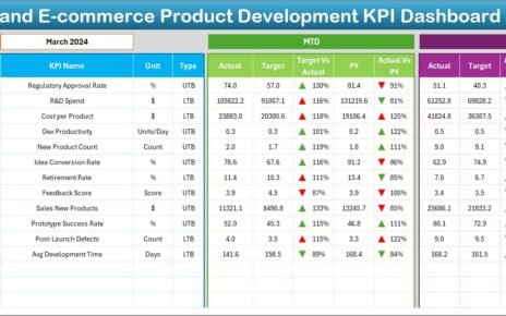
2️⃣ Dashboard Sheet — The Main Control Panel

The Dashboard Sheet is the centerpiece of the News and Journalism KPI Dashboard. It brings together all performance metrics into one unified view.
Click to Purchases News and Journalism KPI Dashboard in Excel
🔹 Key Highlights:
-
Dynamic Month Selector (Cell D3):
Choose the desired month from a dropdown menu, and the dashboard updates automatically. -
MTD (Month-to-Date) and YTD (Year-to-Date) Views:
Instantly switch between monthly and yearly performance data. -
Performance Comparisons:
Displays MTD and YTD Actuals, Targets, and Previous Year (PY) values. -
Conditional Formatting:
Uses up (▲) and down (▼) arrows with color coding to visualize performance — green for improvement, red for decline. -
Automatic Calculations:
-
Target vs Actual (%)
-
PY vs Actual (%)
-
This sheet provides a bird’s-eye view of how the media organization is performing across multiple KPIs such as readership, engagement, ad sales, and content output.
3️⃣ KPI Trend Sheet — Analyzing Performance Over Time

The KPI Trend Sheet allows for detailed analysis of how individual KPIs evolve over time.
🧭 Key Features:
-
KPI Selection Dropdown (Cell C3):
Pick any KPI to analyze its performance. -
Displayed Details:
-
KPI Group
-
Unit of Measurement
-
Type (LTB – Lower the Better / UTB – Upper the Better)
-
Formula
-
Definition
-
-
MTD and YTD Trend Charts:
Visualize performance for Actual, Target, and PY values through combo charts.
This helps editors and analysts identify trends such as audience growth, content engagement, or changes in ad performance over time.
4️⃣ Actual Numbers Input Sheet — Feeding the Dashboard with Real Data

The Actual Numbers Input Sheet is where users record monthly performance metrics for all KPIs.
📝 How It Works:
-
Input Structure:
Enter MTD and YTD actual values for each month. -
Month Control (Cell E1):
Enter the first month of the year to set the timeline automatically. -
Accuracy:
The dashboard calculations and visuals rely on the data entered here.
This sheet ensures that all performance numbers are centralized and updated consistently.
5️⃣ Target Sheet — Setting Performance Goals

The Target Sheet stores MTD and YTD target values for each KPI. These targets represent expected performance benchmarks for the newsroom or organization.
🧩 Use Case:
Managers and editors can define clear goals — such as page views, ad revenue, or publication frequency — and compare them against actual results for better accountability and focus.
6️⃣ Previous Year Numbers Sheet — Year-Over-Year Comparisons

This sheet keeps track of the previous year’s performance data, allowing for direct comparison with current-year results.
🎯 Why It’s Important:
Year-over-year comparison helps assess growth trends and seasonality — crucial for understanding reader behavior and advertising patterns in the media industry.
7️⃣ KPI Definition Sheet — Keeping KPIs Clear and Consistent

The KPI Definition Sheet serves as a reference library for all the KPIs included in the dashboard.
📋 Columns Include:
-
KPI Name
-
KPI Group
-
Unit
-
Formula
-
Definition
This ensures that everyone — from journalists to data analysts — interprets each KPI consistently.
🧩 Example KPIs for News and Journalism
A well-structured media performance dashboard typically includes a balanced mix of editorial, audience, and business KPIs.
📢 Editorial KPIs:
-
Articles Published per Month
-
Editorial Error Rate (%)
-
Average Article Length (Words)
-
Average Time to Publish (Hours)
👥 Audience KPIs:
-
Total Page Views
-
Unique Visitors
-
Average Session Duration (Minutes)
-
Bounce Rate (%)
-
Newsletter Subscribers
💰 Business KPIs:
-
Advertising Revenue (USD)
-
Cost per Article (USD)
-
Subscription Conversions (%)
-
CPM (Cost per Thousand Impressions)
📱 Engagement KPIs:
-
Social Shares per Article
-
Comments per Post
-
Engagement Rate (%)
-
Returning Visitor Ratio (%)
These KPIs give editors and media executives a holistic view of both editorial quality and audience response.
Click to Purchases News and Journalism KPI Dashboard in Excel
💡 Advantages of Using a News and Journalism KPI Dashboard in Excel
Implementing this dashboard offers several strategic advantages for newsrooms and media houses:
✅ 1. Unified Performance View
Bring editorial, audience, and business data together in one clear and interactive interface.
✅ 2. Real-Time Tracking
With automatic calculations and dropdown-based filters, monitor performance instantly without waiting for weekly reports.
✅ 3. Improved Decision-Making
Identify which stories, channels, or timeframes drive the most engagement or revenue.
✅ 4. Accountability Across Teams
Each department can track its specific KPIs and assess progress toward shared goals.
✅ 5. Historical Insights
Compare results across months and years to uncover trends and forecast future outcomes.
✅ 6. Cost-Effective and Customizable
Unlike expensive BI tools, Excel offers a simple, flexible, and budget-friendly way to manage performance tracking.
🔄 Opportunities for Improvement
Although Excel dashboards are powerful, you can elevate them even further:
-
Automate Data Collection:
Link Excel with web analytics or CMS data through Power Query. -
Add Power BI Integration:
Use Power BI to transform this Excel-based dashboard into a live, web-based analytics tool. -
Enhance Visuals:
Include dynamic charts and pivot slicers for deeper analysis. -
Collaborate in Real Time:
Store the dashboard on OneDrive or Google Drive for simultaneous access. -
Expand KPI Coverage:
Add video performance, podcast downloads, or social media metrics for multimedia organizations.
🧠 Best Practices for the News and Journalism KPI Dashboard in Excel
To ensure reliable data tracking and accurate performance insights, follow these best practices:
1️⃣ Define Clear Objectives
Before creating KPIs, define what success means for your newsroom — engagement, profitability, reach, or reputation.
2️⃣ Keep Data Updated
Enter Actual, Target, and PY numbers regularly to ensure real-time accuracy.
3️⃣ Use Conditional Formatting
Visual cues (arrows, colors) make KPI interpretation quick and intuitive.
4️⃣ Align KPIs Across Departments
Ensure editorial, business, and marketing teams all use the same KPI definitions.
5️⃣ Review Monthly and Quarterly
Regular performance reviews ensure your newsroom stays agile and data-driven.
6️⃣ Protect Data Integrity
Lock formula cells and use Excel’s protection features to prevent accidental edits.
7️⃣ Encourage Data Literacy
Train team members to understand how KPIs relate to strategy and storytelling.
Click to Purchases News and Journalism KPI Dashboard in Excel
📊 How to Use the News and Journalism KPI Dashboard Effectively
-
Open the Excel File.
Review all seven sheet tabs for structure. -
Enter KPI Definitions.
Fill in the KPI Definition Sheet with relevant media performance metrics. -
Input Actual, Target, and Previous Year Data.
Record these in their respective sheets monthly. -
Navigate to the Dashboard Sheet.
Select the desired month from the dropdown (D3) to view performance. -
Analyze MTD and YTD Data.
Compare Actual vs Target and PY vs Actual values. -
Review Trends.
Go to the KPI Trend Sheet to evaluate KPI performance patterns. -
Use Insights for Strategy.
Share results in editorial meetings or business planning sessions.
🧾 Who Can Benefit from This Dashboard?
The News and Journalism KPI Dashboard in Excel is ideal for:
-
Editors-in-Chief: To monitor publication quality and volume.
-
Audience Analysts: To track readership and engagement.
-
Business Managers: To assess ad revenue and ROI.
-
Marketing Teams: To analyze promotional success and social media traction.
-
Freelance Journalists: To evaluate their performance and output consistency.
🏆 Key Takeaways
-
The dashboard provides a complete view of editorial, audience, and revenue KPIs.
-
Excel integration ensures ease of use and customization.
-
Trend charts and conditional formatting offer clear visual insights.
-
Monthly and yearly comparisons help identify growth patterns and gaps.
With this tool, every newsroom can combine creativity with data-driven intelligence.
🏁 Conclusion
In today’s data-driven journalism landscape, success depends on understanding performance metrics as much as storytelling. The News and Journalism KPI Dashboard in Excel empowers media professionals to make informed, timely, and impactful decisions.
By consolidating editorial, engagement, and business KPIs, this dashboard helps you track progress, optimize resources, and elevate overall media performance. Whether you’re managing a digital publication, a print newsroom, or a multimedia agency, this Excel dashboard provides everything you need to stay ahead.
Click to Purchases News and Journalism KPI Dashboard in Excel
❓ Frequently Asked Questions (FAQs)
1️⃣ What is a News and Journalism KPI Dashboard in Excel?
It’s a structured Excel tool that tracks key performance indicators for newsrooms, such as readership, engagement, and ad revenue.
2️⃣ How is data updated in the dashboard?
You enter data manually in the Actual, Target, and Previous Year sheets each month and refresh the dashboard.
3️⃣ Can I customize the KPIs?
Yes. You can add, modify, or delete KPIs in the KPI Definition sheet based on your media organization’s needs.
4️⃣ Do I need advanced Excel knowledge to use it?
No. The dashboard uses dropdowns, formulas, and pre-built charts that anyone can use easily.
5️⃣ Is this dashboard suitable for small publications?
Absolutely. It works well for local newspapers, magazines, and digital startups.
6️⃣ Can this dashboard handle both digital and print metrics?
Yes. You can track digital (page views, ad impressions) and print (circulation, cost) data together.
7️⃣ How often should I update the dashboard?
Monthly updates are recommended to maintain accuracy and consistency.
Click to Purchases News and Journalism KPI Dashboard in Excel
Visit our YouTube channel to learn step-by-step video tutorials