Running a nonprofit organization demands vision, compassion, and measurable impact. However, managing multiple projects, tracking donors, and evaluating program effectiveness can quickly become overwhelming without a strong data-driven system. Nonprofits often struggle with fragmented data across spreadsheets, making it hard to assess how funds are used or how beneficiaries are impacted.
That’s where the Nonprofit Organizations Dashboard in Power BI makes a difference. This ready-to-use, interactive dashboard helps nonprofits consolidate data, track key performance indicators (KPIs), and visualize performance across regions, programs, and managers — all in one intuitive platform.
Built on Microsoft Power BI, the dashboard converts complex information into dynamic charts, KPI cards, and trend analyses. It empowers decision-makers to evaluate outcomes, measure fundraising effectiveness, and ensure transparency for donors and stakeholders.
Click to Purchases Nonprofit Organizations Dashboard in Power BI
What Is a Nonprofit Organizations Dashboard in Power BI?
A Nonprofit Organizations Dashboard in Power BI is an analytical tool that transforms raw data from Excel or other sources into meaningful, interactive insights. Instead of scrolling through endless tables, nonprofit leaders can instantly view program completion rates, funding utilization, beneficiary reach, and regional performance using simple visuals.
This Power BI dashboard integrates multiple perspectives — from donors and programs to managers and monthly trends — giving a 360° view of organizational impact. With real-time data updates, it becomes easy to identify what’s working and where improvement is needed.
Key Features of the Dashboard
The Nonprofit Organizations Dashboard in Power BI includes five powerful analytical pages, each designed to deliver clear and actionable insights:
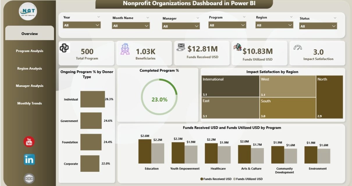
1️⃣ Overview Page
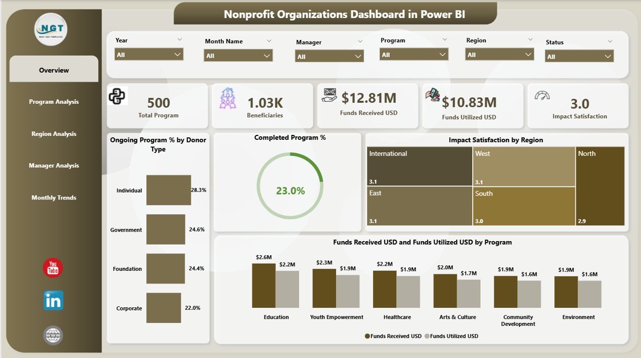
This is the main page of the dashboard and the perfect starting point for executives.
-
Interactive slicers allow you to filter data by month, donor type, or program.
-
KPI cards highlight core metrics: Total Programs, Funds Received (USD), Funds Utilized (USD), Ongoing Programs %, and Completed Programs %.
Key Charts:
- Ongoing Program % by Donor Type
- Completed Program %
- Impact Satisfaction by Region
- Funds Received (USD) vs Funds Utilized (USD) by Program
This page gives nonprofit leaders a quick, top-level snapshot of organizational performance, helping them make informed decisions at a glance.
2️⃣ Program Analysis Page
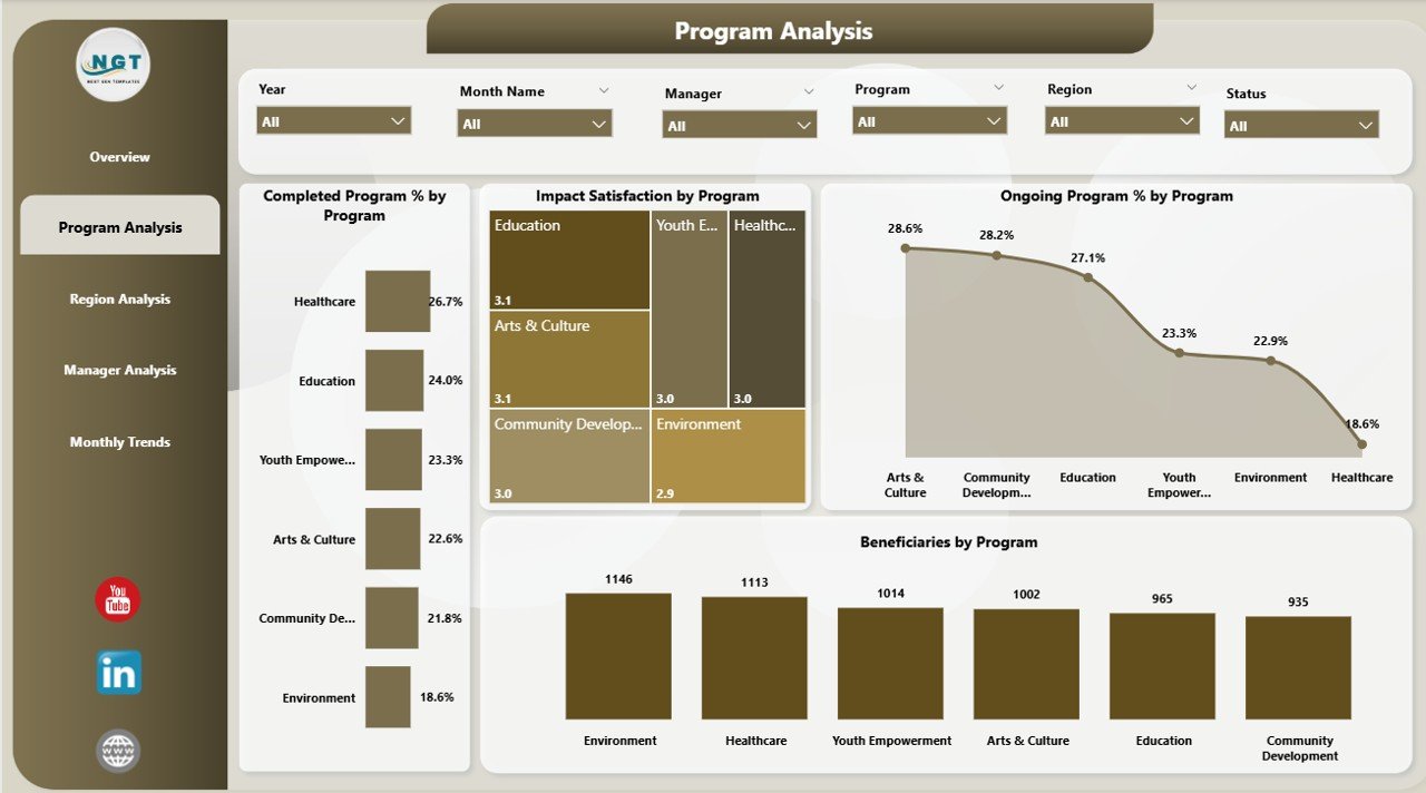
The Program Analysis page dives deep into individual project performance. Each chart here evaluates program effectiveness and impact.
Charts Included:
- Completed Program % by Program
- Impact Satisfaction by Program
- Ongoing Program % by Program
- Beneficiaries by Program
-
Click to Purchases Nonprofit Organizations Dashboard in Power BI
By analyzing these visuals, you can easily identify which initiatives are making the greatest difference and which may require additional support.
3️⃣ Region Analysis Page
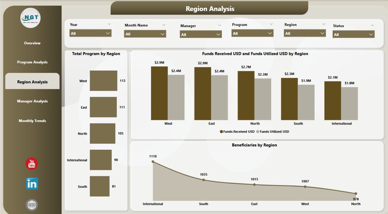
Nonprofits often operate in multiple regions — each with different challenges, funding sources, and impact levels. The Region Analysis page helps compare these areas side-by-side.
Charts Included:
- Total Programs by Region
- Funds Received (USD) and Funds Utilized (USD) by Region
- Beneficiaries by Region
This page highlights which regions are performing efficiently and where funds are under- or over-utilized.
4️⃣ Manager Analysis Page
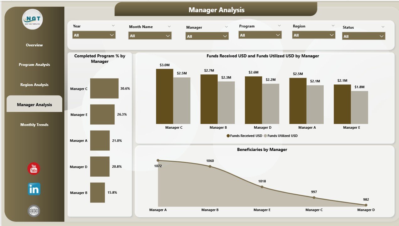
Every nonprofit program is guided by managers who play a key role in its success. The Manager Analysis page measures managerial effectiveness.
Charts Included:
- Completed Program % by Manager
- Funds Received (USD) vs Funds Utilized (USD) by Manager
- Beneficiaries by Manager
By comparing these metrics, leaders can reward high performers, balance workloads, and provide targeted support to improve results.
5️⃣ Monthly Trends Page
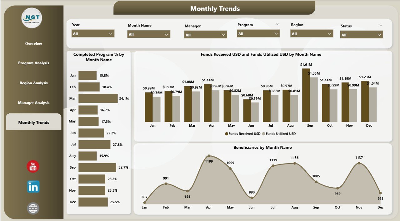
The Monthly Trends page is designed to show progress over time. It tracks both funding and impact month-by-month, enabling leaders to forecast performance and adjust strategies quickly.
Charts Included:
- Completed Program % by Month
- Funds Received (USD) vs Funds Utilized (USD) by Month
- Beneficiaries by Month
This page makes it easy to spot seasonal variations or funding cycles, ensuring that planning and resource allocation remain consistent.
Why Nonprofits Need a Power BI Dashboard
Without a centralized dashboard, data management in nonprofit organizations often becomes chaotic. Excel sheets multiply, reports get delayed, and decisions rely on incomplete information. Here’s why adopting Power BI Dashboards is a game-changer:
🧮 Data Consolidation: All funding, program, and impact data come together in one place.
🔄 Real-Time Insights: Instantly see updated numbers as data refreshes from Excel or databases.
📊 Visual Storytelling: Interactive charts make complex data easy to understand and present to boards or donors.
📈 KPI Monitoring: Track key metrics like funds utilization, beneficiary growth, and program completion rates in real time.
🔒 Transparency: Enhances trust by showing how resources are used and what impact they create.
Click to Purchases Nonprofit Organizations Dashboard in Power BI
How the Dashboard Supports Nonprofit Goals
A well-structured Power BI dashboard directly supports nonprofit objectives such as accountability, impact assessment, and donor engagement. It helps in:
-
Measuring Program Impact: Quantifies how many beneficiaries each initiative reaches.
-
Demonstrating Transparency: Donors can see how funds translate into real results.
-
Optimizing Resource Allocation: Identifies regions or programs that need more attention or support.
-
Enhancing Decision Making: Turns data into insights for strategic planning and growth.
-
Boosting Team Accountability: Provides clear performance metrics for managers and departments.
Advantages of Nonprofit Organizations Dashboard in Power BI
Using Power BI to manage nonprofit operations offers multiple advantages:
-
Comprehensive Visibility – Combines financial, operational, and program data into a single interface.
-
Time Savings – Automates data collection and report generation.
-
Accuracy and Consistency – Eliminates manual errors common in spreadsheet-based reporting.
-
Better Fund Utilization – Tracks how effectively funds are spent across programs and regions.
-
Enhanced Donor Communication – Provides transparent data visuals to strengthen donor trust.
-
Customizable Analytics – Tailor KPIs and visuals based on organizational priorities.
-
Easy Integration – Seamlessly connects with Excel, databases, or cloud platforms.
-
Interactive Filtering – Enables users to drill down into specific details with a few clicks.
-
Improved Forecasting – Identifies trends that guide future fundraising and program decisions.
-
User-Friendly Design – Requires minimal technical skills to navigate and interpret results.
How to Use the Nonprofit Dashboard Effectively
To make the most of your dashboard, follow these steps:
-
Import Data from Excel: Keep your source file updated with the latest funding and program data.
-
Refresh Power BI Data: Use the ‘Refresh’ option to load the newest information instantly.
-
Navigate Pages Efficiently: Use slicers and navigation buttons to move between Overview, Program, and Region pages.
-
Analyze KPIs: Compare Actual vs Target values to evaluate performance.
-
Share Reports: Publish your dashboard to Power BI Service for board members and donors.
Opportunities for Improvement
Even with its powerful features, there’s always room for enhancement. Consider the following:
-
Add Predictive Analytics: Use Power BI’s AI features to forecast donations or program success rates.
-
Integrate Real-Time Data Feeds: Connect live data from CRM systems or donor platforms.
-
Automate Email Updates: Schedule Power BI reports to be emailed to stakeholders monthly.
-
Expand KPI Coverage: Include metrics like average donor retention rate or cost per beneficiary.
-
Enable Mobile Accessibility: Publish a mobile-optimized version for field managers and volunteers.
Best Practices for Using a Nonprofit Power BI Dashboard
-
Define Clear Objectives: Start by identifying what questions your dashboard should answer.
-
Keep Data Clean and Consistent: Standardize naming conventions and units of measurement.
-
Use Meaningful KPIs: Select metrics that reflect impact, not just activity.
-
Leverage Visual Balance: Avoid overcrowding charts; use colors to emphasize key insights.
-
Regular Updates: Refresh data weekly or monthly to maintain accuracy.
-
Protect Sensitive Information: Implement role-based access for financial data.
-
Tell a Story: Structure your dashboard so each page leads to a clear narrative about impact and progress.
📘 Practical Use Cases
Here are a few real-world ways nonprofits can apply this dashboard:
-
Grant Management: Track grants received, funds spent, and impact achieved per grant.
-
Donor Reporting: Generate visual reports showing how donations translate into results.
-
Volunteer Management: Monitor volunteer hours and contribution across programs.
-
Impact Measurement: Visualize beneficiary growth and program reach over time.
-
Budget Planning: Compare funds received vs utilized to improve financial planning.
🎯 Why Power BI Is the Best Choice for Nonprofits
Many nonprofits rely on Excel, Google Sheets, or basic tools for reporting. Power BI goes beyond simple spreadsheets by offering:
-
Scalability: Can handle large datasets from multiple sources.
-
Interactivity: Allows dynamic filtering and real-time drill-downs.
-
Professional Presentation: Creates polished reports suitable for donor meetings and board reviews.
-
Automation: Eliminates manual data entry and report updates.
-
Integration: Connects to Excel, SharePoint, Dynamics 365, and more with ease.
For nonprofits focused on transparency and impact, Power BI provides a robust yet cost-effective solution to analyze data and communicate results clearly.
🏁 Conclusion
The Nonprofit Organizations Dashboard in Power BI is more than a reporting tool — it’s a strategic partner for data-driven impact. It simplifies complex datasets, strengthens accountability, and empowers leaders to make informed decisions with confidence.
By leveraging Power BI’s interactive visuals and automation capabilities, nonprofits can transform how they track funds, measure results, and communicate value to stakeholders.
In a sector where trust and transparency are paramount, this dashboard serves as a powerful bridge between data and impact.
❓ Frequently Asked Questions (FAQ)
1. What is the Nonprofit Organizations Dashboard in Power BI?
It is a ready-to-use Power BI report that visualizes key nonprofit metrics like funds received, program completion rates, and beneficiaries served, using data from Excel or other sources.
2. Who can use this dashboard?
Anyone in a nonprofit organization — from executive directors and program managers to analysts and donor relations teams — can use it to monitor and analyze performance.
3. Do I need technical skills to use Power BI?
No advanced technical skills are required. Power BI offers drag-and-drop features and intuitive interfaces that any user can learn quickly.
4. Can the dashboard connect to live data?
Yes. Power BI can connect to Excel, databases, and online systems to refresh data automatically.
5. How often should the data be updated?
Most organizations refresh their data weekly or monthly, but it depends on the frequency of program and funding activities.
6. Can I customize the dashboard?
Absolutely. You can add new charts, KPIs, or pages according to your organization’s needs.
7. How does this dashboard help with donor reporting?
It creates visually appealing and transparent reports that show donors exactly how their contributions are being used and what impact they create.
8. Is the dashboard available in Power BI Service for sharing?
Yes. You can publish the dashboard on Power BI Service and share it securely with stakeholders or team members.
Visit our YouTube channel to learn step-by-step video tutorials