Emergencies do not send invitations. They arrive without warning. Therefore, every organization must prepare in advance. However, many offices still track emergency drills, budgets, and risk levels in scattered Excel sheets. As a result, leaders struggle to monitor readiness levels, budget utilization, vendor performance, and departmental participation.So, how can you manage emergency preparedness in a structured, visual, and data-driven way.You need an Office Emergency Preparedness Dashboard in Power BI.This ready-to-use dashboard helps organizations track emergency drills, risk levels, attendance rates, vendor performance, and budget allocation in one centralized system. Moreover, it converts raw emergency data into powerful visual insights. Instead of manually reviewing reports, you can instantly filter data and analyze preparedness performance in real time.In this detailed guide, you will learn:What an Office Emergency Preparedness Dashboard in Power BI isWhy organizations need itA complete explanation of all 5 dashboard pages .Key KPIs you should monitor
- Advantages of Office Emergency Preparedness Dashboard in Power BI
- Best Practices for the Office Emergency Preparedness Dashboard
- Frequently Asked Questions with Answers
Click to buy Office Emergency Preparedness Dashboard in Power BI
What Is an Office Emergency Preparedness Dashboard in Power BI?
An Office Emergency Preparedness Dashboard in Power BI is a structured analytics solution designed to monitor emergency planning, response drills, safety budgets, and risk assessments across departments and locations.
Instead of using multiple files and manual calculations, this dashboard centralizes:
- Emergency type data
- Department participation
- Vendor involvement
- Budget allocation and spending
- Damage costs by risk level
- Monthly preparedness trends
Because Power BI allows interactive filtering, users can select specific months, departments, emergency types, responder levels, or vendors. As a result, decision-makers gain instant visibility into preparedness performance.
Why Do Organizations Need an Office Emergency Preparedness Dashboard?
Every office faces risks such as fire, medical emergencies, natural disasters, or security threats. However, without proper monitoring, organizations cannot measure readiness.
Here is why companies need this dashboard:
- First, it improves emergency planning transparency.
- Second, it tracks budget utilization accurately.
- Third, it identifies weak departments with low attendance.
- Moreover, it monitors vendor effectiveness.
- In addition, it tracks damage cost trends by risk level.
- Finally, it supports compliance and audit reporting.
When leadership sees real-time emergency KPIs, they make faster and smarter safety decisions.
Complete Explanation of All 5 Dashboard Pages
The Office Emergency Preparedness Dashboard in Power BI includes 5 interactive pages. Each page focuses on a different dimension of preparedness management.
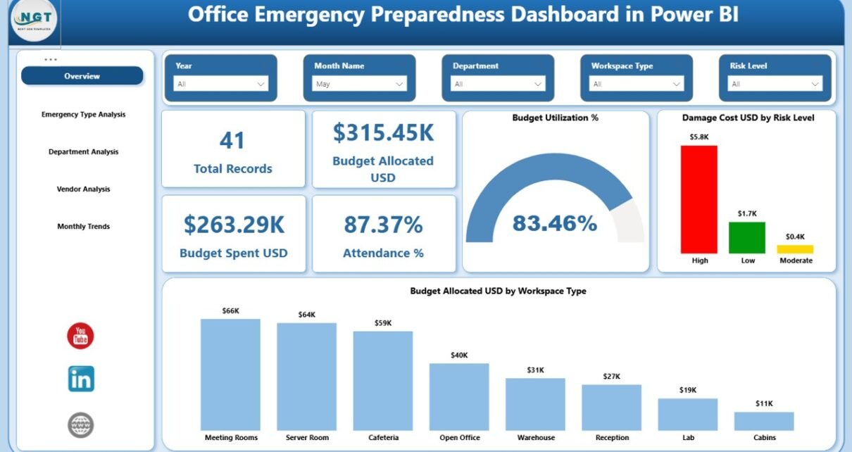
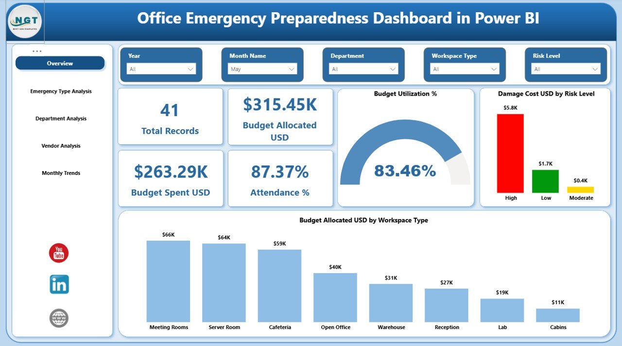
Overview Page – What Does It Show?
The Overview page acts as the main control center of the dashboard.
Key Features of the Overview Page:
- Interactive slicers for filtering data
- 5 KPI cards for quick insights
- Budget and damage visualizations
KPI Cards Included:
- Total Records
- Budget Allocated (USD)
- Total Spend (USD)
- Attendance %
- Budget Utilization %
Because these KPIs appear at the top, management can quickly evaluate performance.
Charts on Overview Page:
- Damage Cost (USD) by Risk Level
- Budget Allocated (USD) by Workspace Type
For example, if High-Risk events show high damage costs, leaders can increase preventive measures. Similarly, if certain workspace types consume more budget, finance teams can reallocate funds strategically.
Click to buy Office Emergency Preparedness Dashboard in Power BI
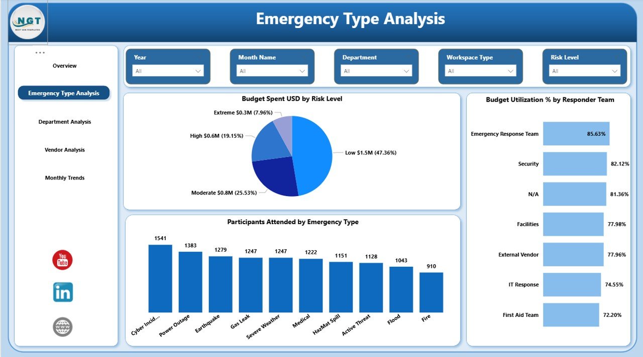
Emergency Type Analysis – How Do Different Emergencies Perform?
This page focuses on analyzing different emergency categories such as:
- Fire Drill
- Earthquake Drill
- Medical Emergency
- Security Threat
- Evacuation Drill
Key Charts:
- Budget Spend (USD) by Risk Level
- Budget Utilization % by Responder Level
- Participants Attendance by Emergency Type
Because every emergency type requires different resources, this page helps compare spending and participation patterns.
For instance, if Fire Drills show high attendance but low budget utilization, management can optimize cost allocation. On the other hand, if Medical Emergencies show high risk but low participation, HR can strengthen training initiatives.
Click to buy Office Emergency Preparedness Dashboard in Power BI
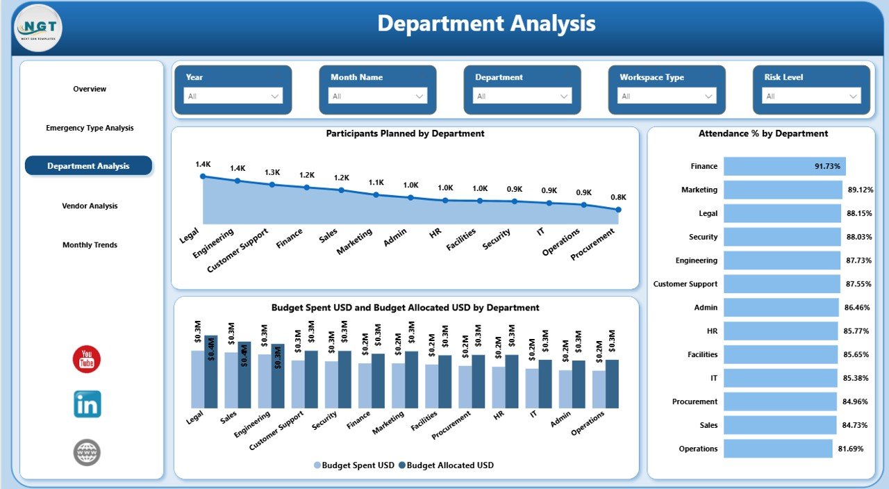
Department Analysis – Which Departments Show Strong Readiness?
Emergency preparedness requires cross-department coordination. Therefore, this page evaluates departmental involvement.
Charts Included:
- Participants Planned by Department
- Attendance % by Department
- Budget Spent (USD) vs Budget Allocated (USD) by Department
This page helps answer important questions:
- Which department shows the highest attendance rate?
- Which department underutilizes budget?
- Which department requires additional training?
Because attendance directly reflects preparedness, leadership can take corrective actions quickly.
Click to buy Office Emergency Preparedness Dashboard in Power BI
Vendor Analysis – How Effective Are Emergency Service Providers?
Many organizations rely on external vendors for:
- Safety training
- Equipment supply
- Emergency response services
- Risk assessment audits
Therefore, vendor performance plays a critical role.
Charts on Vendor Analysis Page:
- Participants Attended by Vendor
- Participants Planned by Vendor
- Average Risk Score by Vendor
If a vendor shows high risk scores and low participation impact, management can reconsider vendor contracts. Additionally, comparing vendors helps negotiate better service agreements.
Click to buy Office Emergency Preparedness Dashboard in Power BI
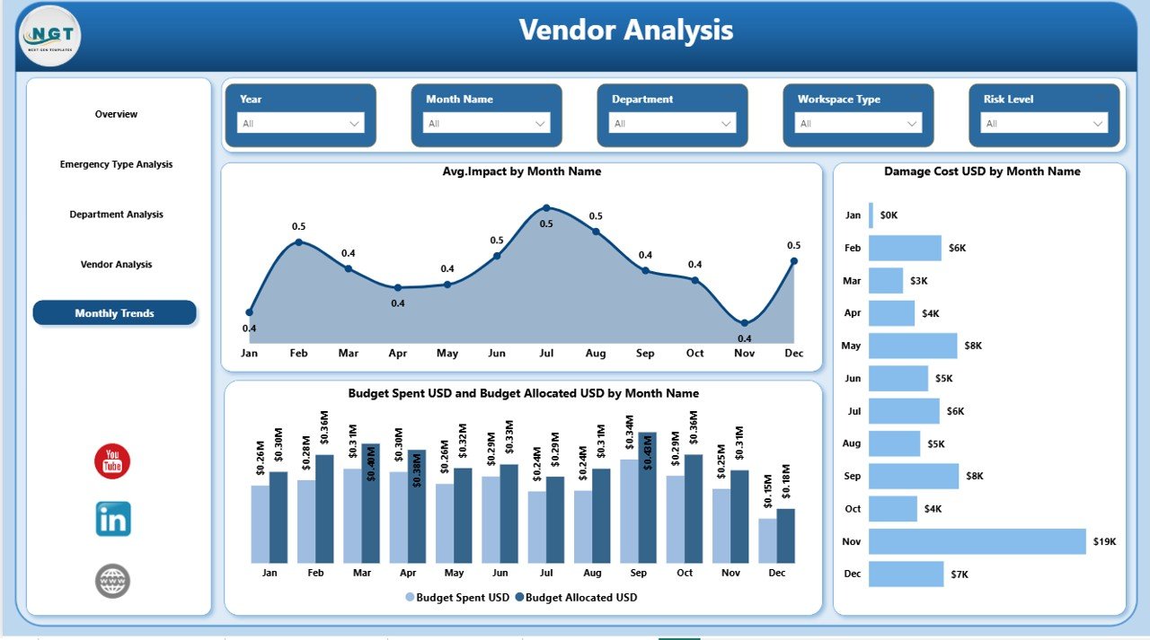
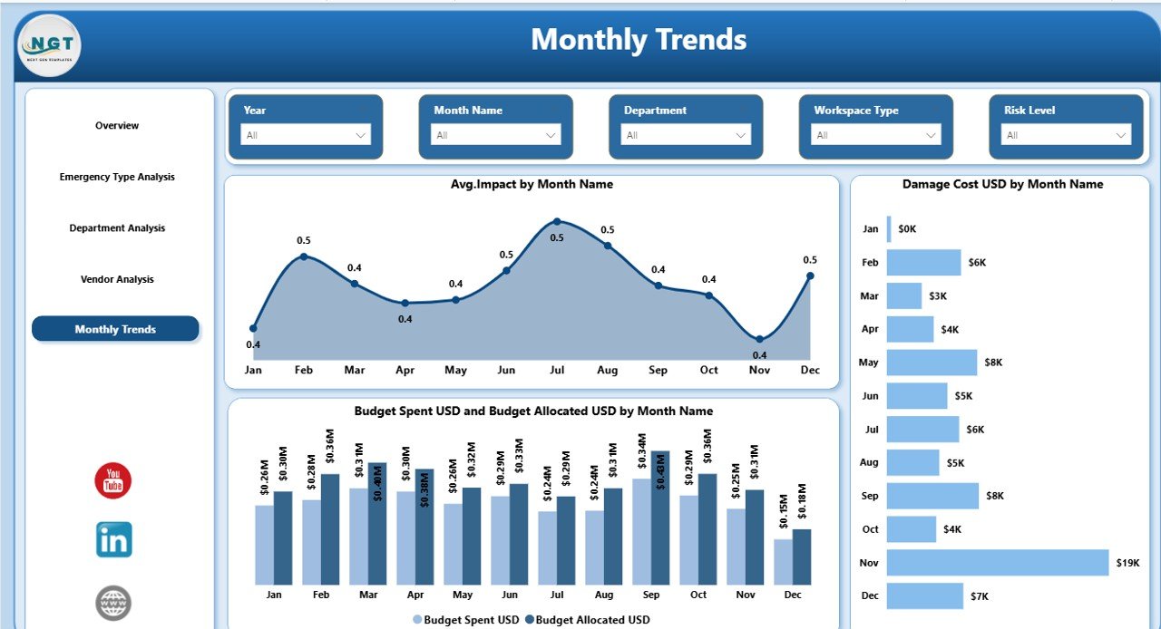
Monthly Trends – Are We Improving Over Time?
Preparedness improves with consistency. Therefore, trend tracking becomes essential.
Charts Included:
- Average Impact by Month Name
- Damage Cost (USD) by Month Name
- Budget Spent (USD) vs Budget Allocated (USD) by Month Name
Because this page shows monthly progression, leadership can:
- Identify seasonal risk patterns
- Track cost spikes
- Analyze budget planning accuracy
- Improve future emergency strategies
For example, if damage costs increase during specific months, companies can introduce preventive measures during those periods.
Click to buy Office Emergency Preparedness Dashboard in Power BI
Key KPIs to Track in Office Emergency Preparedness
Monitoring the right KPIs ensures accurate evaluation.
Here are essential KPIs:
- Attendance %
- Budget Utilization %
- Total Damage Cost (USD)
- Risk Level Distribution
- Vendor Risk Score
- Planned vs Actual Participants
- Budget Variance (Allocated vs Spent)
- Average Emergency Impact Score
Because these KPIs provide both financial and operational insights, leadership gains a balanced perspective.
Advantages of Office Emergency Preparedness Dashboard in Power BI
Using this dashboard provides several strategic benefits.
Improves Emergency Readiness
Because teams monitor attendance and training performance, preparedness improves continuously.
Enhances Budget Control
Real-time budget tracking prevents overspending and ensures optimal resource allocation.
Strengthens Compliance Reporting
Organizations can generate audit-ready reports instantly.
Identifies High-Risk Areas
Risk-level visualization highlights vulnerable departments or workspace types.
Improves Vendor Accountability
Vendor comparison ensures better service quality and contract management.
Supports Data-Driven Decisions
Leadership makes informed decisions using real-time insights instead of assumptions.
Best Practices for the Office Emergency Preparedness Dashboard
To maximize dashboard effectiveness, follow these best practices:
Maintain Accurate Data Entry
Ensure teams update emergency records consistently.
Review KPIs Monthly
Schedule monthly review meetings to analyze preparedness performance.
Set Clear Attendance Targets
Define minimum participation benchmarks for all departments.
Monitor Budget Variance Regularly
Compare allocated and spent budgets to avoid financial surprises.
Evaluate Vendors Quarterly
Review vendor risk scores and participation impact.
Use Trend Insights for Planning
Analyze monthly patterns before finalizing next-year budgets.
When organizations follow these practices, they transform the dashboard into a powerful safety management tool.
How Does This Dashboard Improve Workplace Safety Culture?
A strong safety culture begins with visibility. When employees see that management tracks emergency preparedness seriously, they participate actively.
Moreover:
- Employees feel safer.
- Leaders respond faster to risks.
- Departments collaborate better.
- Vendors improve service quality.
As a result, the organization builds resilience against unexpected events.
Who Can Use the Office Emergency Preparedness Dashboard?
This dashboard benefits:
- Corporate offices
- IT companies
- Manufacturing firms
- Co-working spaces
- Educational institutions
- Healthcare offices
- Government agencies
Any organization that conducts emergency drills and allocates safety budgets can use this solution.
How Does Power BI Enhance Emergency Preparedness Reporting?
Power BI adds significant value because it offers:
- Interactive slicers
- Real-time filtering
- Drill-down capabilities
- Dynamic comparisons
- Visual storytelling
Unlike static reports, Power BI dashboards allow instant data exploration. Therefore, leadership can move from summary view to detailed analysis within seconds.
Conclusion
Emergency preparedness protects lives, assets, and reputation. However, organizations cannot manage what they cannot measure. Therefore, they need a structured and visual system.
The Office Emergency Preparedness Dashboard in Power BI provides exactly that.
It centralizes emergency data.
It tracks budgets and participation.
It monitors vendors and risk levels.
It reveals monthly trends.
Most importantly, it transforms safety planning into a data-driven strategy.
If your organization wants stronger readiness, better compliance, and smarter budget control, this dashboard becomes an essential tool.
Frequently Asked Questions with Answers
What is an Office Emergency Preparedness Dashboard in Power BI?
It is an interactive Power BI dashboard that tracks emergency drills, budgets, attendance, risk levels, vendor performance, and monthly trends.
Who should use this dashboard?
Safety managers, HR teams, operations leaders, facility managers, and compliance officers should use it.
Can this dashboard track multiple emergency types?
Yes. It analyzes different emergency categories such as fire drills, medical emergencies, and security threats.
Does the dashboard track budget utilization?
Yes. It compares budget allocated versus budget spent and calculates utilization percentages.
Can I monitor departmental attendance?
Yes. The Department Analysis page shows planned participants and attendance percentage by department.
How does Vendor Analysis help?
Vendor Analysis evaluates participation levels and average risk scores, which helps improve vendor accountability.
Why is Monthly Trend analysis important?
Monthly analysis helps identify risk patterns, cost spikes, and preparedness improvements over time.
Is this dashboard suitable for compliance reporting?
Yes. It generates structured and audit-ready emergency preparedness reports.
Does Power BI allow filtering by month and department?
Yes. Interactive slicers allow dynamic filtering across all pages.
How does this dashboard improve workplace safety?
It improves visibility, accountability, and strategic planning. As a result, organizations strengthen their emergency readiness.
Watch the step-by-step video tutorial:
Visit our YouTube channel to learn step-by-step video tutorials
Click to buy Office Emergency Preparedness Dashboard in Power BI