Managing office utility costs has become more important than ever. Energy prices continue to rise. Water tariffs keep changing. Demand charges increase without warning. As a result, businesses struggle to track expenses accurately.
However, companies that monitor their utility costs in real time reduce waste faster. They identify unusual spikes earlier. They improve budget planning. Most importantly, they protect profit margins.That is exactly why you need an Office Utility Cost Dashboard in Power BI.In this detailed guide, you will learn:
- What an Office Utility Cost Dashboard in Power BI is
- Why organizations need it
- A complete explanation of all 5 dashboard pages
- Key utility KPIs to track
- Advantages of Office Utility Cost Dashboard in Power BI
- Best Practices for the Office Utility Cost Dashboard
- Frequently Asked Questions with Answers
Click to buy Office Utility Cost Dashboard in Power BI
What Is an Office Utility Cost Dashboard in Power BI?
An Office Utility Cost Dashboard in Power BI is a ready-to-use analytics solution that helps organizations monitor and control utility expenses across departments, buildings, and utility types.
Instead of using scattered Excel sheets, this dashboard centralizes:
- Electricity bills
- Water invoices
- Gas consumption
- Demand charges
- Late fees
- Taxes
- Discounts
Moreover, it converts raw invoice data into meaningful visual insights. Therefore, decision-makers quickly understand:
- How much they spend
- Where they overspend
- Which departments exceed budgets
- When consumption spikes occur
Because Power BI offers interactive filters and drill-down features, users can slice data by month, department, building, and utility type within seconds.
Why Do Organizations Need an Office Utility Cost Dashboard?
Many offices track utility expenses manually. However, manual tracking creates delays. It also increases errors. Furthermore, managers often miss hidden cost patterns.
Here is why organizations urgently need a utility dashboard:
Rising Utility Costs
Energy prices fluctuate frequently. Therefore, businesses must monitor cost changes regularly.
Budget Control
Without comparison between budget and actual amounts, overspending becomes common.
Department Accountability
When you allocate utility costs department-wise, managers take responsibility.
Early Detection of Anomalies
If consumption suddenly increases by 20% in one month, the dashboard highlights it instantly.
Strategic Planning
When leadership understands historical trends, they plan future budgets more accurately.
As a result, companies reduce waste and improve financial stability.
Detailed Explanation of All 5 Dashboard Pages
The Office Utility Cost Dashboard in Power BI includes 5 interactive pages. Each page focuses on a specific area of analysis.
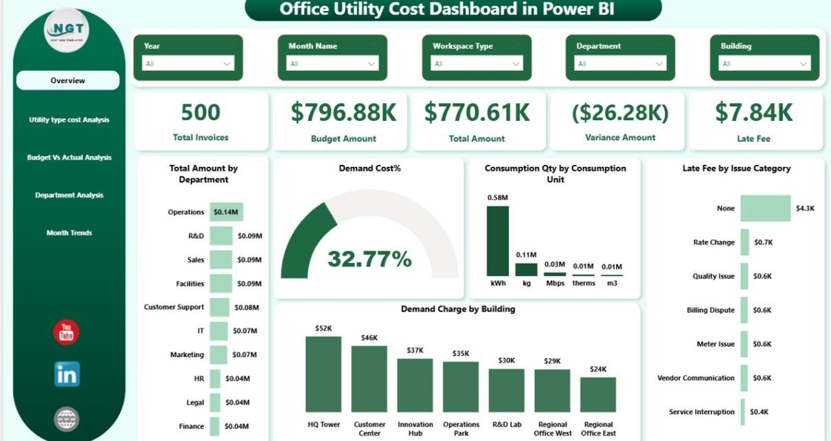
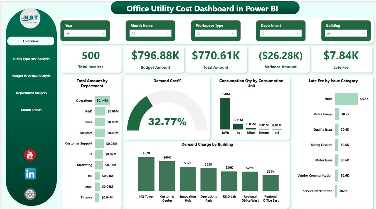
Overview Page – What Does It Show?
The Overview Page acts as the control center. It provides a high-level summary of utility performance.
KPI Cards on the Overview Page
You will find 5 powerful KPI cards:
- Total Invoices
- Budget Amount
- Total Amount
- Variance Amount
- Late Fee
These cards instantly show whether you overspent or stayed within limits.
Key Visualizations on Overview Page
- Total Amount by Department
- Demand Cost %
- Consumption Quantity by Consumption Unit
- Late Fee by Issue Category
- Demand Charge by Building
Because this page includes slicers, users can filter data by:
- Month
- Department
- Building
- Utility Type
Therefore, managers quickly get a complete snapshot of office utility health.
Click to buy Office Utility Cost Dashboard in Power BI
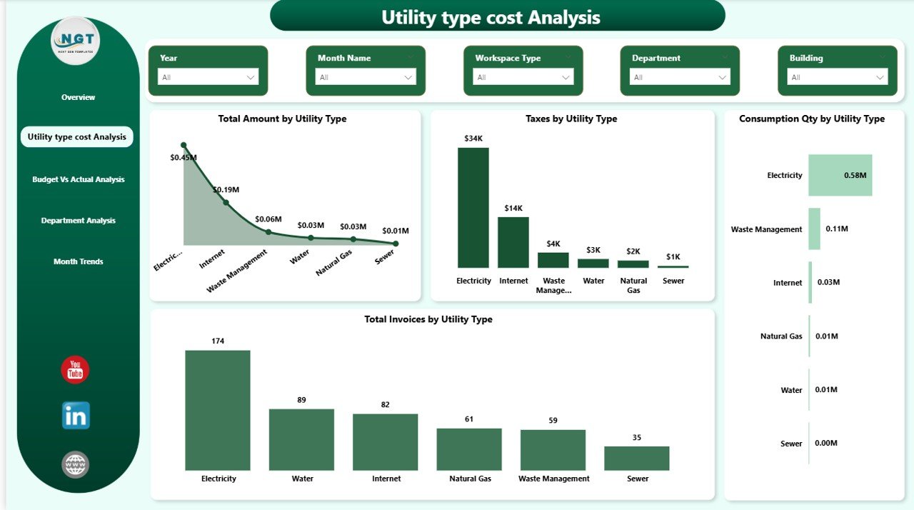
Utility Type Cost Analysis – Where Does the Money Go?
This page focuses on utility categories.
Visuals Included:
- Total Amount by Utility Type
- Taxes by Utility Type
- Consumption Quantity by Utility Type
- Total Invoices by Utility Type
For example, electricity may represent 65% of total utility cost. Meanwhile, water may represent only 15%.
Because the dashboard breaks costs by type, you can:
- Identify the most expensive utility
- Analyze tax impact
- Monitor consumption volume
- Control invoice frequency
As a result, organizations prioritize cost-saving efforts effectively.
Click to buy Office Utility Cost Dashboard in Power BI
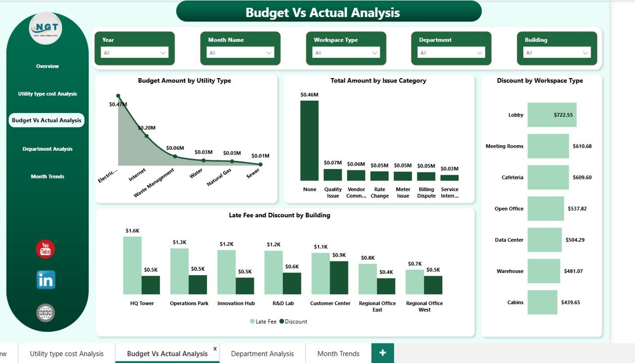
Budget vs Actual Analysis – Are You Overspending?
Budget control remains one of the most important financial activities. Therefore, this page compares planned amounts with actual spending.
Charts Included:
- Budget Amount by Utility Type
- Total Amount by Issue Category
- Discount by Workspace Type
- Late Fee and Discount by Building
When actual spending exceeds budget, variance appears clearly. Consequently, finance teams take immediate corrective action.
Moreover, this page helps you:
- Reduce unnecessary discounts
- Identify high late-fee buildings
- Improve financial discipline
Because you see variance visually, decision-making becomes faster.
Click to buy Office Utility Cost Dashboard in Power BI
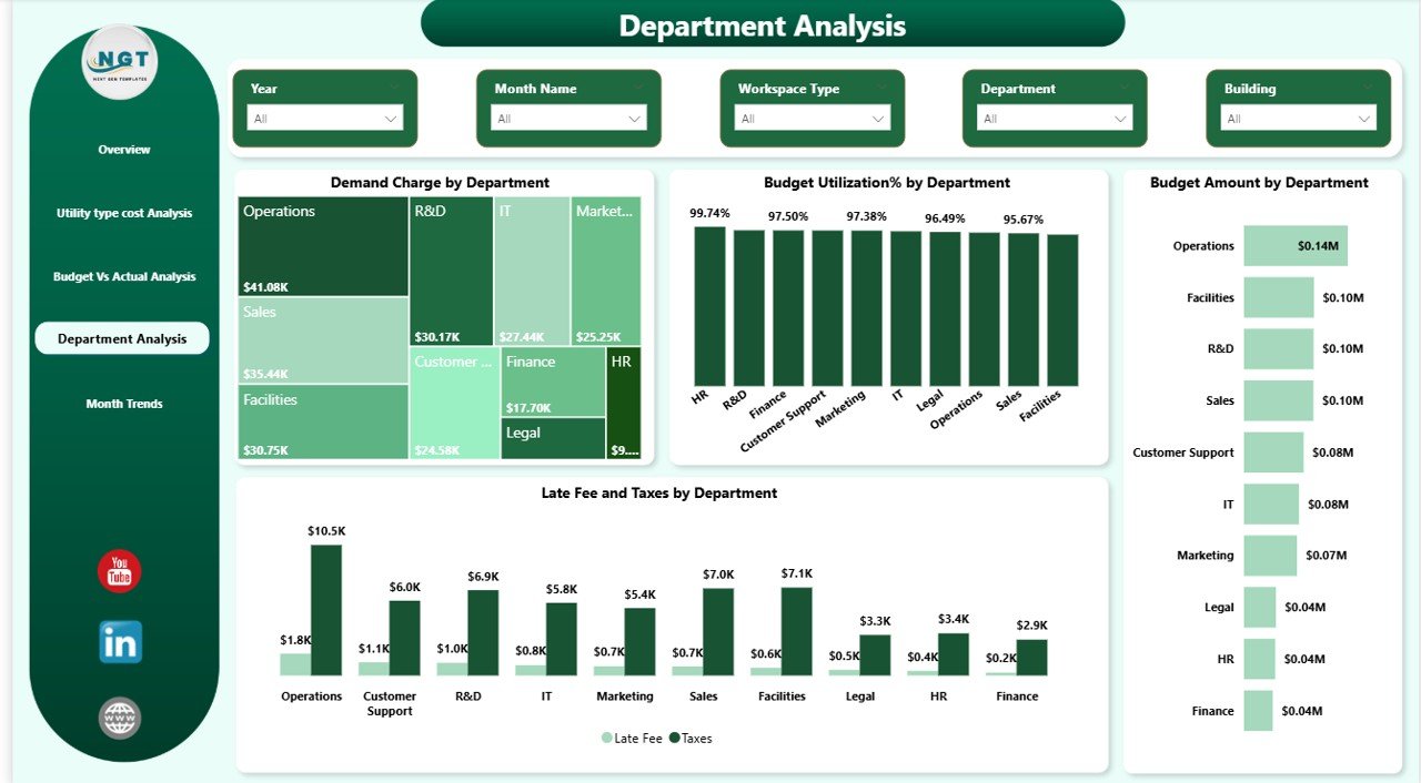
Department Analysis – Which Department Uses More Utilities?
Utility cost accountability improves when departments track their usage.
Key Charts:
- Demand Charge by Department
- Budget Utilization % by Department
- Budget Amount by Department
- Late Fee and Taxes Amount by Department
Click to buy Office Utility Cost Dashboard in Power BI
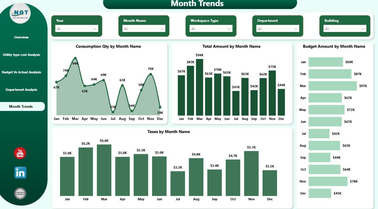
Monthly Trends – How Do Costs Change Over Time?
Trend analysis reveals long-term patterns.
Monthly Charts:
- Consumption Quantity by Month
- Total Amount by Month
- Budget Amount by Month
- Taxes Amount by Month
If costs spike during summer months, you can attribute the increase to air conditioning demand.
Similarly, if late fees increase in a specific quarter, finance teams can review payment cycles.
Therefore, trend monitoring helps improve forecasting accuracy.
Key Utility KPIs You Should Track
An effective Office Utility Cost Dashboard includes measurable KPIs.
Here are important KPIs:
- Total Utility Cost
- Budget Variance
- Demand Charge %
- Consumption Quantity
- Late Fee Amount
- Tax Percentage
- Budget Utilization %
- Cost per Department
- Invoice Count
When you track these KPIs regularly, you reduce financial surprises.
Click to buy Office Utility Cost Dashboard in Power BI
Advantages of Office Utility Cost Dashboard in Power BI
Implementing this dashboard provides multiple benefits.
- Real-Time Monitoring
You view live data instantly. Therefore, you act quickly.
- Better Budget Control
You compare budget vs actual in seconds.
- Improved Cost Transparency
Departments clearly see their utility expenses.
- Faster Decision-Making
Interactive visuals speed up analysis.
- Reduced Late Fees
You identify buildings with frequent delays.
- Energy Efficiency Improvement
You monitor consumption patterns and reduce waste.
- Centralized Data Management
You store all utility data in one place.
Because of these advantages, organizations gain strong financial control.
Best Practices for the Office Utility Cost Dashboard
To maximize dashboard effectiveness, follow these best practices:
- Update Data Regularly
Import invoice data monthly without delay.
- Validate Budget Inputs
Ensure accurate budget allocation before analysis.
- Use Department Filters Smartly
Encourage department heads to monitor their own data.
- Monitor Variance Weekly
Do not wait until year-end to check variance.
- Automate Data Integration
Connect billing systems directly to Power BI.
- Track Seasonal Trends
Prepare for high-demand months in advance.
- Train Team Members
Ensure managers understand KPI meanings.
When you follow these practices, you increase dashboard impact significantly.
How Does Power BI Enhance Utility Cost Management?
Power BI offers features that make this dashboard powerful:
- Interactive slicers
- Drill-through capabilities
- Dynamic filtering
- Real-time data refresh
- Cross-filtering between charts
Because Power BI supports advanced analytics, you gain deeper insights without complexity.
Who Can Benefit from This Dashboard?
This solution benefits:
- Finance Teams
- Facility Managers
- Operations Managers
- Energy Management Teams
- Corporate Leadership
- Real Estate Managers
If your organization manages multiple buildings, this dashboard becomes even more valuable.
How Can This Dashboard Help Reduce Utility Expenses?
You reduce expenses when you:
- Identify high-demand buildings
- Detect overconsumption
- Eliminate late fees
- Control taxes and discounts
- Align actual spending with budget
Conclusion
Utility costs directly impact profitability. Therefore, organizations must track them carefully.
An Office Utility Cost Dashboard in Power BI transforms scattered invoice data into powerful insights. It improves visibility. It enhances accountability. It strengthens budget control.
Moreover, it helps managers identify overspending early. As a result, companies reduce waste and improve operational efficiency.
If you want smarter financial control and stronger energy management, this dashboard provides the perfect solution.
Frequently Asked Questions (FAQs)
- What data do I need for this dashboard?
You need invoice data including utility type, consumption quantity, budget amount, department, building, taxes, late fees, and demand charges.
- Can I customize the dashboard?
Yes. You can modify filters, KPIs, and visuals based on business needs.
- How often should I update the data?
You should update data monthly. However, weekly updates improve monitoring accuracy.
- Can this dashboard handle multiple buildings?
Yes. You can analyze costs building-wise and department-wise easily.
- Does this dashboard help reduce late fees?
Yes. It highlights buildings and departments with high late fees. Therefore, you can improve payment management.
- Is Power BI required to use this dashboard?
Yes. You need Power BI Desktop or Power BI Service to operate and refresh the dashboard.
Watch the step-by-step video tutorial:
Click to buy Office Utility Cost Dashboard in Power BI
Visit our YouTube channel to learn step-by-step video tutorials