In today’s fast-paced work environment, ensuring smooth operations and minimizing workflow bottlenecks is vital for business success. One of the most effective ways to manage this is through a Power BI-based Office Workflow Efficiency Dashboard. This powerful tool helps organizations visualize tasks, track delays, monitor departmental efficiency, and improve decision-making through data-driven insights.
In this article, we’ll explore everything you need to know about the Office Workflow Efficiency Dashboard in Power BI, its structure, key features, advantages, best practices, and answers to frequently asked questions.
Click to Purchases Office Workflow Efficiency Dashboard in Power BI
What Is an Office Workflow Efficiency Dashboard in Power BI?
An Office Workflow Efficiency Dashboard is a visual reporting solution created using Power BI, designed to monitor, analyze, and optimize tasks and performance across departments. It uses real-time data—captured typically from Excel or databases—to show how efficiently tasks move from start to completion.
This dashboard not only highlights current workloads but also pinpoints bottlenecks, delays, task priorities, and departmental performance. With the help of interactive charts and filters, users can drill down to gain insights at different organizational levels.
Dashboard Structure: The 5 Powerful Pages
The Power BI file for this dashboard includes five interactive pages, each designed with slicers (filters), charts, and KPIs. Let’s break down each page:
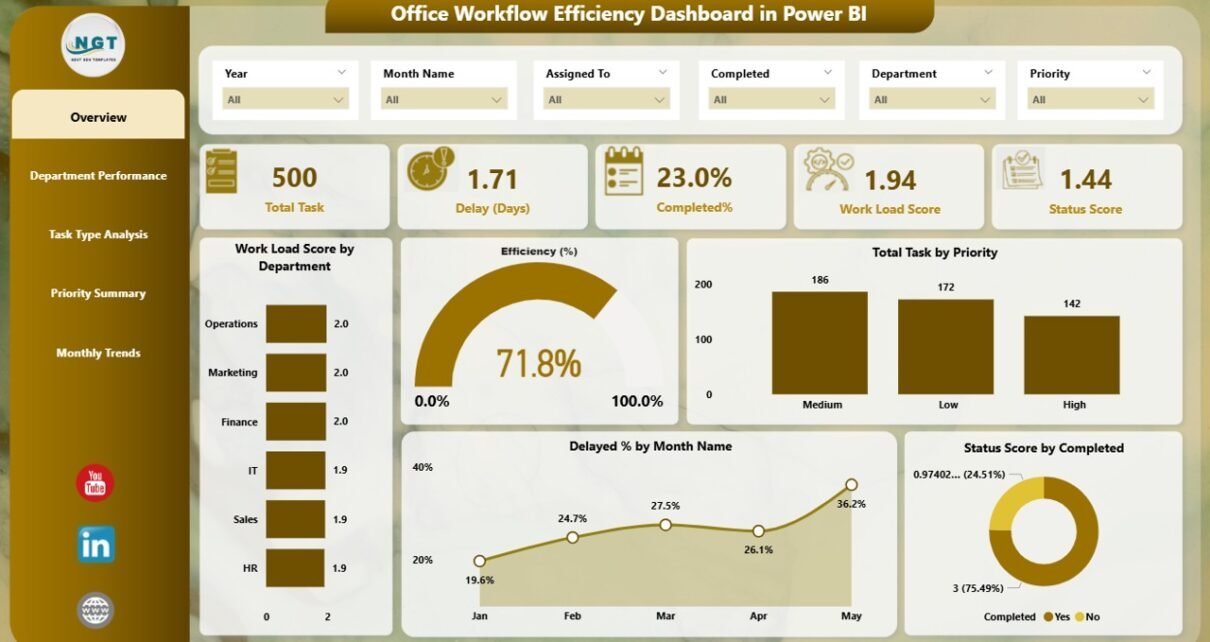
Overview Page
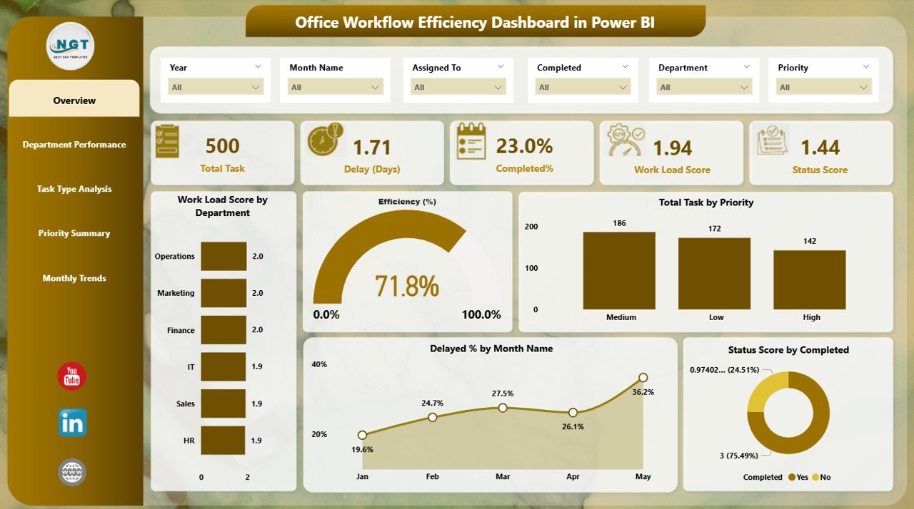
This is the main landing page of the dashboard. It gives a quick snapshot of overall workflow performance across the office.
Components on this page include:
-
6 Slicers to filter data by Department, Task Type, Priority, Status, Month, and Year
5 KPI Cards showing key figures such as:
- Total Tasks
- Completed Tasks
- Delayed Tasks
- Efficiency %
- Status Score
5 Key Charts:
- 📌 Workload Score by Department
- 📌 Efficiency (%)
- 📌 Total Task by Priority
- 📌 Delayed % by Month Name
- 📌 Status Score by Completed
These visuals allow managers to instantly assess which departments are overloaded or underperforming.
Department Performance Page
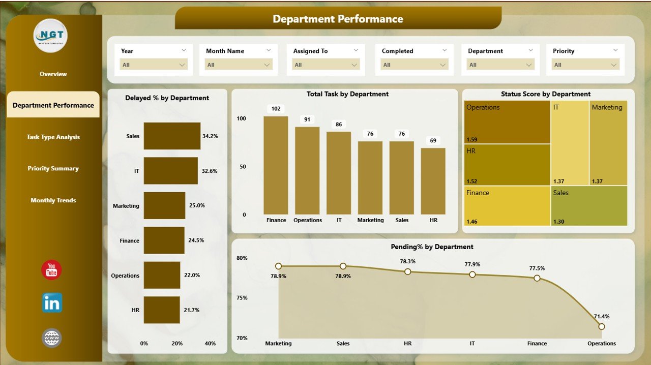
This page focuses on analyzing workflow efficiency by department.
What you’ll find here:
-
6 Slicers for better data filtering.
4 Visuals to understand team-level performance:
- 🏢 Delayed % by Department
- 🏢 Total Task by Department
- 🏢 Status Score by Department
- 🏢 Pending % by Department
This helps you compare how each department is handling tasks and whether they are facing recurring delays.
Click to Purchases Office Workflow Efficiency Dashboard in Power BI
Task Type Analysis Page
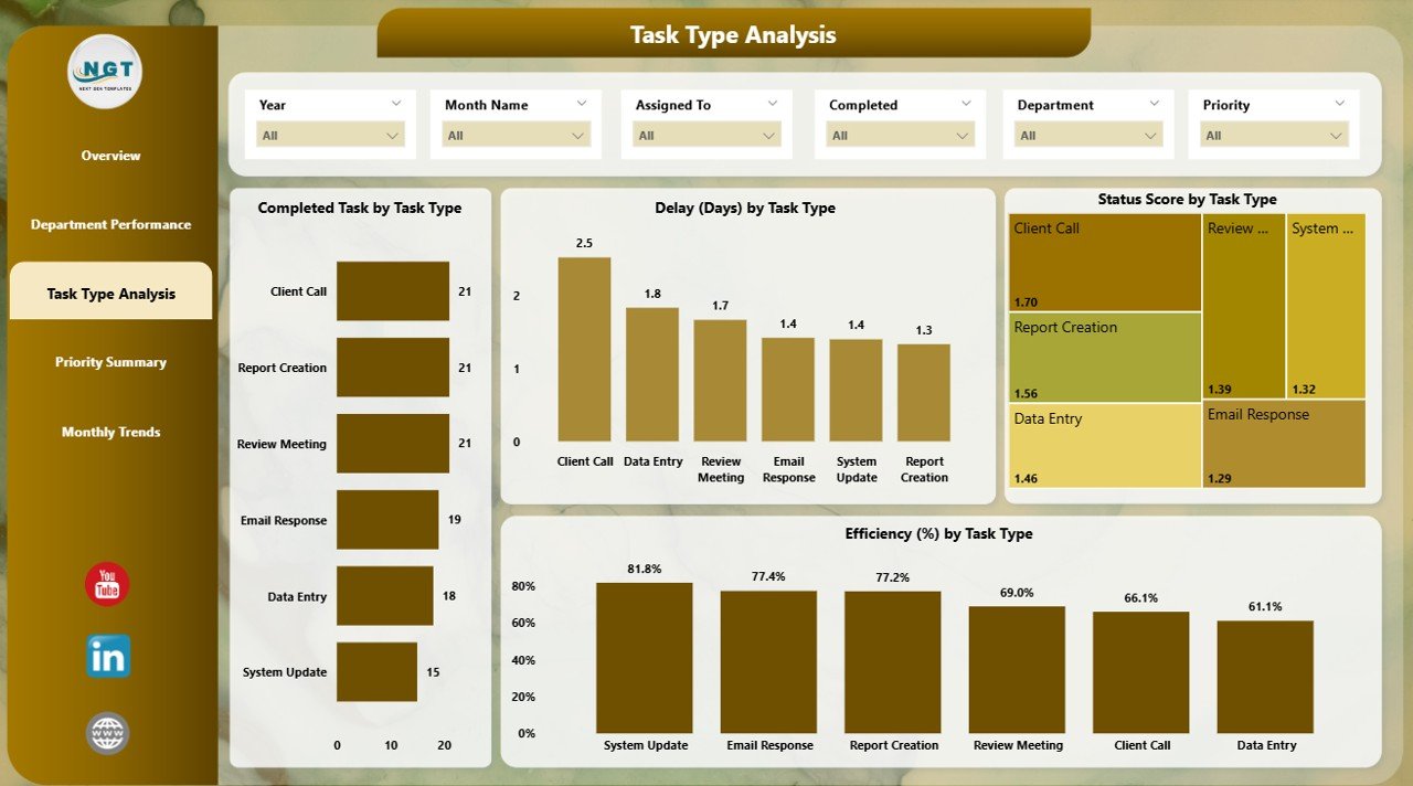
Every office handles a mix of different task types. This page digs deeper into performance based on task types (e.g., Reports, Meetings, Documentation, etc.).
Included Components:
-
6 Slicers
4 Focused Charts:
- ✅ Completed Task by Task Type
- ✅ Delay (Days) by Task Type
- ✅ Status Score by Task Type
- ✅ Efficiency % by Task Type
This is especially useful for identifying which types of tasks commonly lead to delays or require improvements.
Priority Summary Page
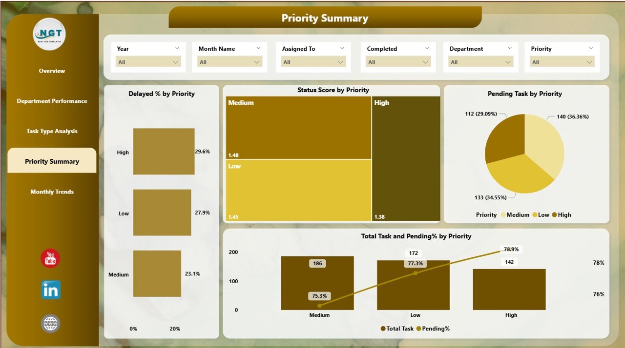
Prioritization plays a key role in office efficiency. This page displays metrics categorized by task priority (High, Medium, Low, etc.).
Key Visuals:
-
6 Slicers
4 Insightful Charts:
- 🚦 Delayed % by Priority
- 🚦 Status Score by Priority
- 🚦 Pending Task by Priority
- 🚦 Total Task and Pending % by Priority
This allows better allocation of resources to high-priority tasks and reduces the chances of missing critical deadlines.
Time Trend Analysis Page
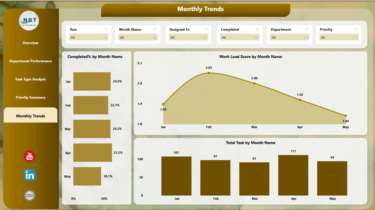
This final page gives a time-series view of workflow efficiency. It’s helpful in identifying monthly performance trends and planning for upcoming workloads.
Elements on this page:
-
7 Slicers
3 Dynamic Charts:
- 📈 Completed % by Month Name
- 📈 Workload Score by Month Name
- 📈 Total Task by Month Name
Use this page to observe seasonal patterns or fluctuations in team performance.
Advantages of Office Workflow Efficiency Dashboard in Power BI
A well-designed Power BI dashboard transforms raw data into actionable insights. Here’s what makes this tool a must-have:
✅ Real-Time Insights
You get up-to-date visibility on task performance, delays, and workload distribution across departments.
✅ Improved Decision-Making
Managers can make informed decisions faster by analyzing trends and workload metrics.
✅ Identifies Bottlenecks
Spot delayed tasks, overburdened departments, or inefficient processes instantly.
✅ Enhances Accountability
Department-wise breakdown ensures every team understands its role and performance.
✅ Promotes Transparency
With a shared dashboard, everyone from executives to staff can see and track workflow progress.
📌 Best Practices for Using the Office Workflow Efficiency Dashboard
To fully unlock the power of this dashboard, follow these best practices:
1. 💡 Keep Your Data Updated
Ensure your Excel or source data is regularly updated so the dashboard reflects real-time metrics.
2. 🔍 Use Filters Strategically
Take advantage of the slicers provided to view performance from different angles: department, task type, or time period.
3. 📊 Track KPIs Monthly
Use the Time Trend Analysis page to monitor monthly improvement or identify recurring slowdowns.
4. 📁 Standardize Task Categories
Keep task types, statuses, and priorities consistent in your data source for clean visual outputs.
5. 🗂 Train Your Team
Educate your managers and team leads on how to use Power BI visuals effectively.
6. ⚙️ Customize for Your Workflow
Modify the visuals, metrics, or filters to better suit your organization’s structure.
How to Use the Office Workflow Efficiency Dashboard
Here’s a simple guide to navigating and using the dashboard effectively:
Step 1: Load Your Data
Connect the Power BI file to your updated Excel dataset with columns like Task ID, Assigned To, Department, Task Type, Priority, Start Date, End Date, Status, and Delay Days.
Step 2: Navigate Between Pages
Use the navigation buttons or tabs at the bottom to switch between the 5 dashboard pages.
Step 3: Apply Slicers
Use slicers at the top of each page to filter results. You can filter by department, task type, month, or priority.
Step 4: Analyze KPIs and Charts
Focus on key performance metrics. Look for red flags like high delay %, low efficiency scores, or task overload.
Step 5: Take Action
Use the insights to reassign tasks, train low-performing teams, or streamline high-delay task types.
Real-World Use Cases
🏢 For Office Managers:
Track workload distribution and remove bottlenecks from recurring workflows.
📈 For Operations Teams:
Measure delays and improve task allocation efficiency across high-priority work.
👥 For HR and Admin:
Monitor compliance-related task completions or pending documentation processes.
🧑💼 For Executives:
Get a helicopter view of how the overall office workflow is progressing month by month.
Common Metrics You Can Track
-
✅ Efficiency %
-
✅ Workload Score
-
✅ Delayed %
-
✅ Status Score
-
✅ Pending %
-
✅ Total Tasks by Priority
-
✅ Completed % by Department/Month
These KPIs give you a well-rounded view of operational health.
Why Power BI for Workflow Efficiency?
Power BI stands out for its:
-
Interactive visuals with drill-down capabilities
-
Real-time data refresh from Excel or databases
-
Ease of use for non-technical users
-
Customization for company-specific KPIs and structures
-
Cloud sharing via Power BI service
It becomes a powerful, collaborative tool when multiple teams want to stay aligned and work smart.
Conclusion
The Office Workflow Efficiency Dashboard in Power BI is a powerful asset for any organization aiming to improve internal processes, reduce task delays, and drive accountability. With its five-tab structure and interactive visuals, the dashboard provides a complete picture of your office’s performance—from department-level breakdowns to task-type trends and monthly performance.
Whether you manage a small team or oversee operations across departments, this dashboard helps you take control, make better decisions, and optimize your workflow like never before.
Frequently Asked Questions (FAQs)
1. What is an Office Workflow Efficiency Dashboard?
An Office Workflow Efficiency Dashboard tracks task performance, delays, and departmental workload using interactive visuals in Power BI.
2. Can I connect this dashboard to my existing Excel files?
Yes! The dashboard is built to work with Excel data. Just ensure your column names match the expected structure.
3. Which KPIs does this dashboard track?
The dashboard tracks metrics like Efficiency %, Workload Score, Delayed %, Completed %, Pending Tasks, and Status Score.
4. Is this dashboard customizable?
Absolutely. You can add or remove visuals, adjust slicers, or modify KPI definitions to fit your workflow needs.
5. Do I need Power BI Pro to use this dashboard?
You can use the dashboard with the free Power BI Desktop. However, sharing it over the cloud via Power BI Service may require Power BI Pro.
6. Who can benefit from this dashboard?
Office managers, operations teams, HR, administrative staff, and executives will find this dashboard extremely helpful for improving efficiency.
7. What’s the difference between Workload Score and Efficiency %?
Workload Score indicates the volume of work handled, while Efficiency % measures how effectively the tasks are completed without delay.
Visit our YouTube channel to learn step-by-step video tutorials