Managing online subscriptions without structured reporting creates confusion and revenue leakage. Many businesses still depend on scattered spreadsheets to track subscriptions, revenue, discounts, and customer activity. As a result, decision-makers struggle to monitor performance, identify churn risks, and improve profitability.
However, you can solve this problem with a smart and interactive solution. The Online Subscription Platforms Dashboard in Excel provides a ready-to-use system that converts raw subscription data into clear insights. Moreover, it allows managers to track performance across platforms, regions, devices, and months in one place.
In this detailed guide, you will learn:
-
What an Online Subscription Platforms Dashboard in Excel is
-
Why subscription-based businesses need it
-
Detailed explanation of all 5 dashboard pages
-
Advantages of this dashboard
-
Best practices for implementation
-
Frequently asked questions with answers
Let’s explore everything step by step.
What Is an Online Subscription Platforms Dashboard in Excel?
An Online Subscription Platforms Dashboard in Excel is an interactive reporting tool built inside Microsoft Excel. It helps businesses monitor subscription performance, revenue growth, device usage, regional performance, and customer engagement.
Instead of checking multiple sheets manually, you can:
-
Track total subscriptions
-
Monitor active subscriptions
-
Analyze total revenue
-
Compare monthly fees
-
Evaluate discounts and support tickets
Because it uses Excel features like Pivot Tables, slicers, and dynamic charts, the dashboard updates automatically when you refresh the data. Therefore, managers always see the latest performance numbers.
Why Do Online Subscription Businesses Need This Dashboard?
Subscription businesses grow quickly. However, they also face challenges such as churn, discount control, regional performance gaps, and device usage trends.
Without a structured dashboard:
-
Revenue tracking becomes inconsistent
-
Subscription growth becomes unclear
-
Regional performance remains hidden
-
Device trends go unnoticed
-
Decision-making slows down
On the other hand, when you use this dashboard, you gain full visibility. As a result, you can increase retention, improve pricing strategies, and boost profitability.
Key Features of Online Subscription Platforms Dashboard in Excel
Before we explore each page, let’s understand the core structure.
1️⃣ Page Navigator
Located on the left side, the Page Navigator allows smooth movement between different analytical pages. Therefore, users can switch between Overview, Platform Analysis, Device Analysis, Region Analysis, and Month Analysis instantly.
2️⃣ Right-Side Slicers
Each page contains slicers on the right side. These slicers help filter data by:
-
Platform Name
-
Region
-
Device Type
-
Subscription Type
-
Month
Because of this filtering system, users can perform detailed analysis within seconds.
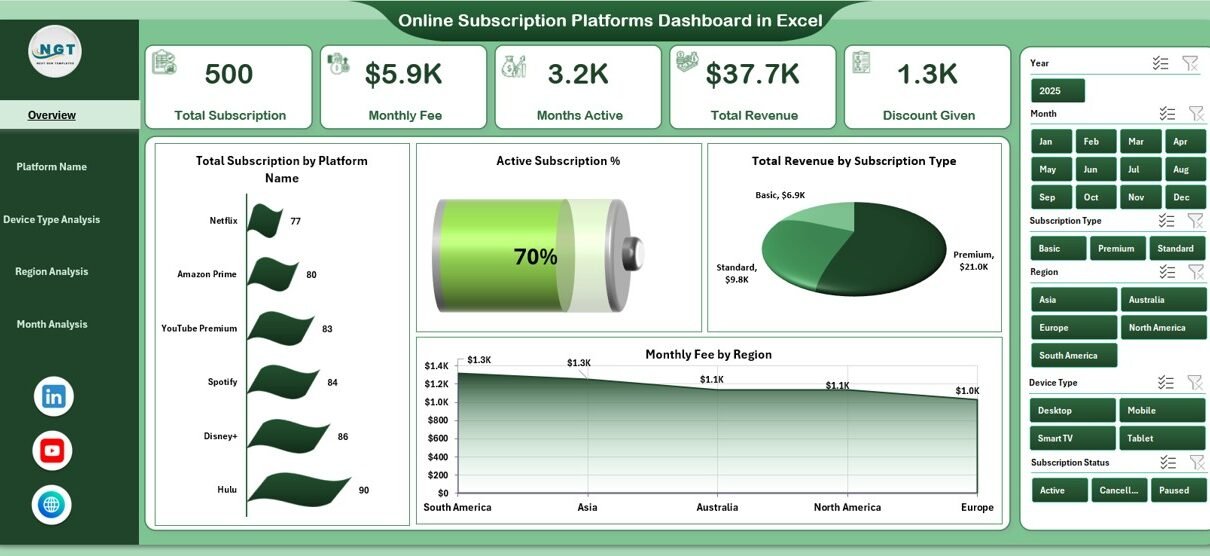
What Does the Overview Page Show?
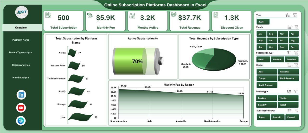
The Overview Page works as the main summary page. It provides high-level KPIs and overall performance insights.
KPI Cards on Overview Page
-
Total Subscriptions
-
Active Subscriptions
-
Total Revenue
-
Monthly Fee
These cards give instant clarity. Therefore, managers can quickly understand business performance.
Charts on Overview Page
-
Total Subscription by Platform Name
-
Active Subscription
-
Total Revenue by Subscription Type
-
Monthly Fee by Region
Because this page combines revenue, subscriptions, and region performance, decision-makers can identify trends immediately.
For example:
-
If one platform shows higher subscriptions but lower revenue, pricing might need adjustment.
-
If one region generates higher monthly fees, marketing can focus more on that region.
How Does the Platform Name Analysis Help?
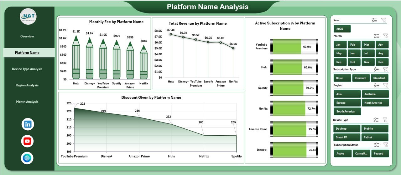
The Platform Name Analysis Page provides deep insights into individual platforms such as streaming services, software tools, or digital memberships.
Charts on Platform Name Analysis
-
Total Monthly Fee by Platform Name
-
Total Revenue by Platform Name
-
Active Subscription by Platform Name
-
Discount Given by Platform Name
With this analysis, businesses can:
-
Identify the highest-earning platform
-
Monitor which platform provides excessive discounts
-
Compare subscription growth across platforms
As a result, management can optimize pricing strategies and marketing budgets.
Why Is Device Type Analysis Important?
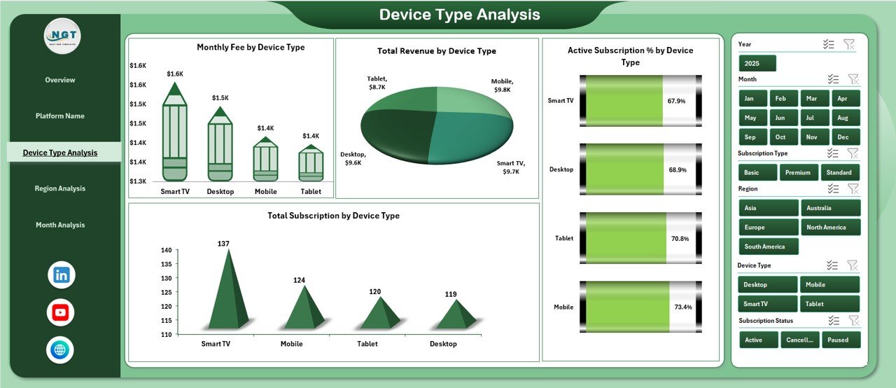
Today, customers use multiple devices such as mobile phones, tablets, desktops, and smart TVs. Therefore, businesses must understand device-based behavior.
Charts on Device Type Analysis
-
Monthly Fee by Device Type
-
Total Revenue by Device Type
-
Active Subscription by Device Type
-
Total Subscription by Device Type
This analysis helps answer questions like:
-
Which device generates maximum revenue?
-
Do mobile users subscribe more than desktop users?
-
Should you improve app performance for specific devices?
Consequently, product teams can improve user experience where it matters most.
What Insights Does the Region Analysis Provide?
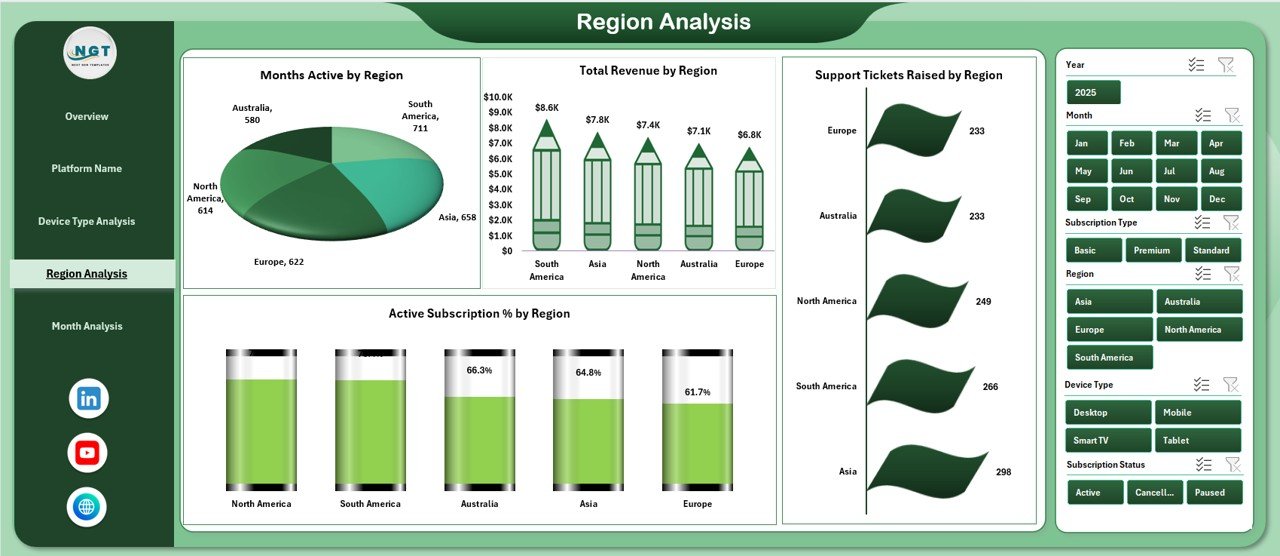
Regional performance plays a huge role in subscription growth. Some regions may show strong revenue, while others may require attention.
Charts on Region Analysis
-
Monthly Fee by Region
-
Total Revenue by Region
-
Active Subscription by Region
-
Support Tickets Raised by Region
This page allows businesses to:
-
Compare regional revenue
-
Track subscription growth by region
-
Monitor support issues by geography
For instance, if one region shows high support tickets, the company can improve service quality there. Therefore, customer satisfaction improves.
How Does the Month Analysis Improve Trend Tracking?
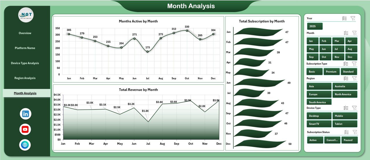
The Month Analysis Page focuses on time-based trends.
Charts on Month Analysis
-
Monthly Fee by Month
-
Total Revenue by Month
-
Total Subscription by Month
This page helps managers:
-
Track revenue growth
-
Identify seasonal patterns
-
Monitor subscription increases or decreases
Because subscription businesses rely on recurring revenue, monthly tracking becomes critical. Consequently, management can forecast future performance accurately.
What Is the Role of the Support Sheet?
The Support Sheet stores raw data and backend calculations. It contains structured tables that feed Pivot Tables and charts.
Typically, it includes:
-
Subscription ID
-
Platform Name
-
Subscription Type
-
Device Type
-
Region
-
Monthly Fee
-
Revenue
-
Discount
-
Active Status
-
Support Tickets
-
Month and Year
Because the support sheet organizes data in a structured format, the dashboard works smoothly.
Advantages of Online Subscription Platforms Dashboard in Excel
Now let’s discuss the key advantages.
✅ Centralized Reporting
You can view all performance metrics in one file. Therefore, you eliminate scattered reports.
✅ Faster Decision-Making
Managers can analyze data instantly. As a result, they take action quickly.
✅ Improved Revenue Monitoring
You can track total revenue, subscription types, and monthly fees clearly.
✅ Device and Region Insights
You can optimize marketing and product strategy based on device and region data.
✅ Discount Control
You can monitor discount trends and prevent revenue leakage.
✅ Easy Customization
Because the dashboard runs in Excel, you can customize KPIs easily.
Best Practices for the Online Subscription Platforms Dashboard in Excel
To get maximum value, follow these best practices:
🔹 Keep Data Clean
Ensure consistent naming for platform, region, and device type.
🔹 Update Data Regularly
Refresh monthly data to maintain accuracy.
🔹 Use Structured Tables
Convert raw data into Excel Tables for dynamic updates.
🔹 Monitor Key KPIs Frequently
Review revenue, active subscriptions, and churn indicators weekly.
🔹 Avoid Manual Edits in Pivot Areas
Make changes only in the data sheet to prevent errors.
🔹 Analyze Trends, Not Just Numbers
Always compare month-over-month growth.
How Can Businesses Use This Dashboard Strategically?
Businesses can use this dashboard to:
-
Plan marketing campaigns
-
Improve subscription retention
-
Adjust pricing models
-
Identify high-performing platforms
-
Reduce support issues
-
Forecast revenue
Therefore, the dashboard becomes a strategic decision-making tool rather than just a reporting file.
Who Can Benefit from This Dashboard?
This dashboard benefits:
-
SaaS Companies
-
Streaming Platforms
-
E-Learning Platforms
-
Membership-Based Websites
-
Subscription Box Businesses
-
Digital Service Providers
Because subscription models dominate today’s digital economy, almost every online business can use this dashboard.
How Does This Dashboard Improve Profitability?
First, it highlights high-revenue platforms.
Second, it shows discount impact.
Third, it tracks device and region performance.
Finally, it identifies support problem areas.
When you combine all these insights, you can increase revenue and reduce costs simultaneously.
Conclusion
Subscription-based businesses require structured, real-time performance tracking. Without clear insights, companies struggle to manage revenue, subscriptions, and customer engagement.
The Online Subscription Platforms Dashboard in Excel solves these challenges. It provides five powerful analytical pages, dynamic slicers, and clear KPI cards. Moreover, it helps businesses analyze platform performance, device trends, regional revenue, and monthly growth.
Therefore, if you want better visibility, smarter decisions, and stronger revenue control, this dashboard offers a complete solution.
Frequently Asked Questions (FAQs)
1. What is an Online Subscription Platforms Dashboard in Excel?
It is an interactive Excel reporting tool that tracks subscriptions, revenue, devices, regions, and monthly trends.
2. Can I customize the dashboard?
Yes. You can modify KPIs, charts, and slicers based on your business needs.
3. Do I need advanced Excel skills?
No. Basic knowledge of Excel and Pivot Tables is enough to use it.
4. Can I track multiple subscription types?
Yes. You can track different plans such as monthly, quarterly, and yearly subscriptions.
5. How often should I update the dashboard?
You should update it monthly or weekly, depending on your reporting cycle.
6. Is this dashboard suitable for SaaS businesses?
Yes. SaaS companies can use it to track revenue, active users, and device trends.
Visit our YouTube channel to learn step-by-step video tutorials