Ophthalmology is one of the fastest-growing specialties in healthcare. As patient demand rises and diagnostic technologies evolve, eye-care providers need accurate, real-time insights to track performance, improve services, and maintain high-quality clinical operations. Because of this, the Ophthalmology Services KPI Dashboard in Excel has become an essential tool for hospitals, clinics, and eye-care centers.
This dashboard helps you analyze clinical KPIs, measure progress, and monitor both MTD (Month-To-Date) and YTD (Year-To-Date) performance in one place. It provides complete visibility into patient flow, treatment outcomes, surgery numbers, revenue performance, diagnostic efficiency, and more. Additionally, it is designed with easy navigation, dynamic charts, and simple data entry sheets, making it ideal for both clinical and administrative teams.
In this detailed article, you will explore every component of the dashboard, learn how it works, and understand how it helps ophthalmology teams improve decision-making and patient outcomes.
Click to Purchases Ophthalmology Services KPI Dashboard in Excel
What Is an Ophthalmology Services KPI Dashboard in Excel?
An Ophthalmology Services KPI Dashboard in Excel is a structured reporting tool that tracks all key performance indicators related to eye-care services. It monitors clinical efficiency, patient volume, diagnostic capacity, treatment outcomes, financial performance, and workflow timelines.
Because this dashboard is built in Excel, it is:
-
Easy to update
-
Fully customizable
-
Simple to maintain
-
Accessible to all healthcare staff
The dashboard uses dynamic formulas, lookups, charts, and conditional formatting to provide quick insights. You can filter the data by month, view historical comparisons, and identify growth trends.
This makes it a practical daily tool for:
-
Ophthalmologists
-
Administrators
-
Clinic managers
-
Technicians
-
Optometrists
-
Hospital front-office teams
Why Ophthalmology Departments Need KPI Tracking
Eye-care services include multiple processes such as OPD visits, diagnostics, surgeries, follow-ups, optical sales, and emergency care. Because of this, tracking performance manually becomes difficult.
A KPI dashboard helps you:
-
Avoid service delays
-
Improve patient experience
-
Maintain quality standards
-
Reduce errors in reporting
-
Compare clinical performance across months
-
Improve staff productivity
-
Understand financial health
Since all KPIs appear in one place, teams stay aligned and informed.
Click to Purchases Ophthalmology Services KPI Dashboard in Excel
Key Features of the Ophthalmology Services KPI Dashboard in Excel
This dashboard includes seven worksheets, each serving a specific purpose. Together, they create a complete clinical performance monitoring system.
1. Home Sheet – The Navigation Center
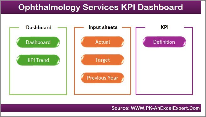
The Home sheet acts as the index page of the dashboard. It includes six navigation buttons that help users jump directly to important worksheets.
These quick-access buttons improve usability and make the entire file easy for clinicians, managers, and administrative staff.
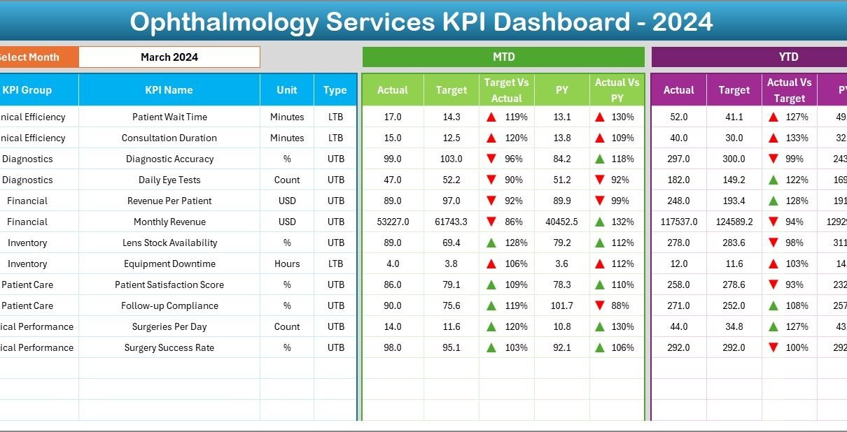
2. Dashboard Sheet – The Main Performance View
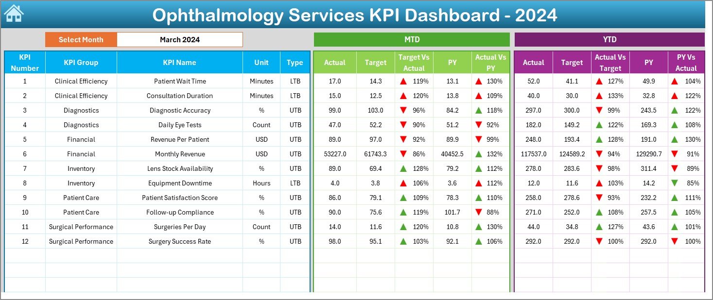
This is the core of the dashboard and displays all ophthalmology KPIs in a clean, structured format.
✔ Month Selection
At cell D3, you can choose any month from a drop-down menu.
The entire dashboard updates instantly to reflect:
-
MTD Actual
-
MTD Target
-
MTD PY (Previous Year)
-
Target vs Actual %
-
PY vs Actual %
It also displays the same details for YTD values, including conditional formatting with:
-
Green ▲ for improvement
-
Red ▼ for decline
Because of these indicators, users can quickly interpret KPI performance.
What This Sheet Shows
The Dashboard sheet provides:
-
Current performance
-
Comparison against targets
-
Comparison with last year
-
Variance indicators
-
Clinical progress trends
This layout helps department heads identify issues early and take corrective action.
Click to Purchases Ophthalmology Services KPI Dashboard in Excel
3. KPI Trend Sheet – Detailed Trend Analysis
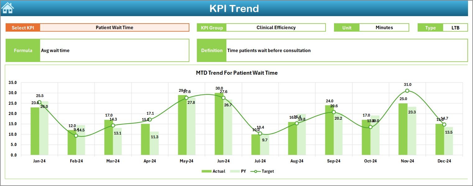
The KPI Trend sheet allows you to analyze any specific KPI in detail.
✔ KPI Selection
You can select any KPI name from the drop-down available in cell C3.
Once selected, the sheet displays:
-
KPI Group
-
KPI Unit
-
KPI Type (LTB or UTB)
-
KPI Formula
-
KPI Definition
These details give users complete clarity about what each KPI measures.
✔ MTD & YTD Trend Charts
The sheet shows two charts:
-
MTD Trend Chart – Actual vs Target vs Previous Year
-
YTD Trend Chart – Actual vs Target vs Previous Year
These charts help track performance across months, understand patterns, and evaluate long-term progress.
Because trends are visual, decision-makers can easily identify:
-
Seasonal variations
-
Months with high patient volume
-
Treatment gaps
-
Revenue fluctuation
-
Improvement areas
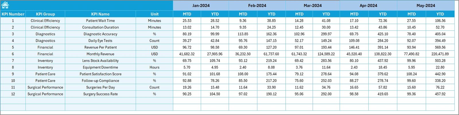
4. Actual Numbers Input Sheet
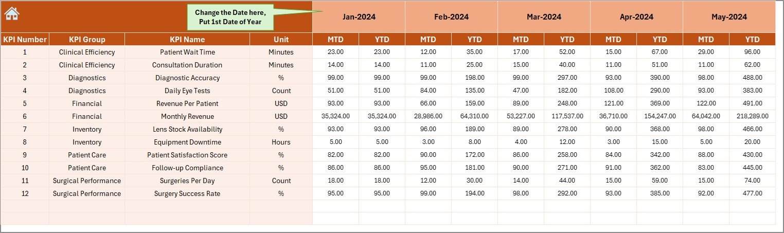
This sheet is designed for data entry. You can enter:
-
MTD Actual values
-
YTD Actual values
-
Month (first day of month in cell E1)
The sheet updates the dashboard automatically after data entry.
Click to Purchases Ophthalmology Services KPI Dashboard in Excel
5. Target Sheet Tab
Here, you enter:
-
MTD Target values
-
YTD Target values
-
KPI Name
-
Monthly target expectations
Because targets are set in advance, this helps create realistic planning and accurate performance evaluation.
6. Previous Year Numbers Sheet
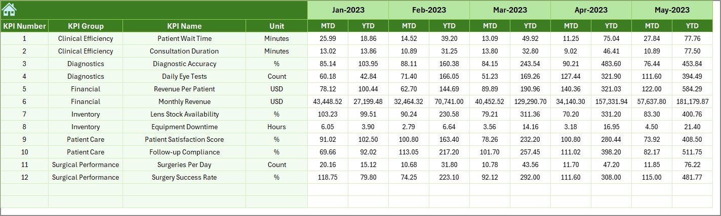
This sheet allows you to enter:
-
Previous Year MTD values
-
Previous Year YTD values
This makes year-over-year comparison possible, giving better visibility into clinical performance improvements.
Click to Purchases Ophthalmology Services KPI Dashboard in Excel
7. KPI Definition Sheet
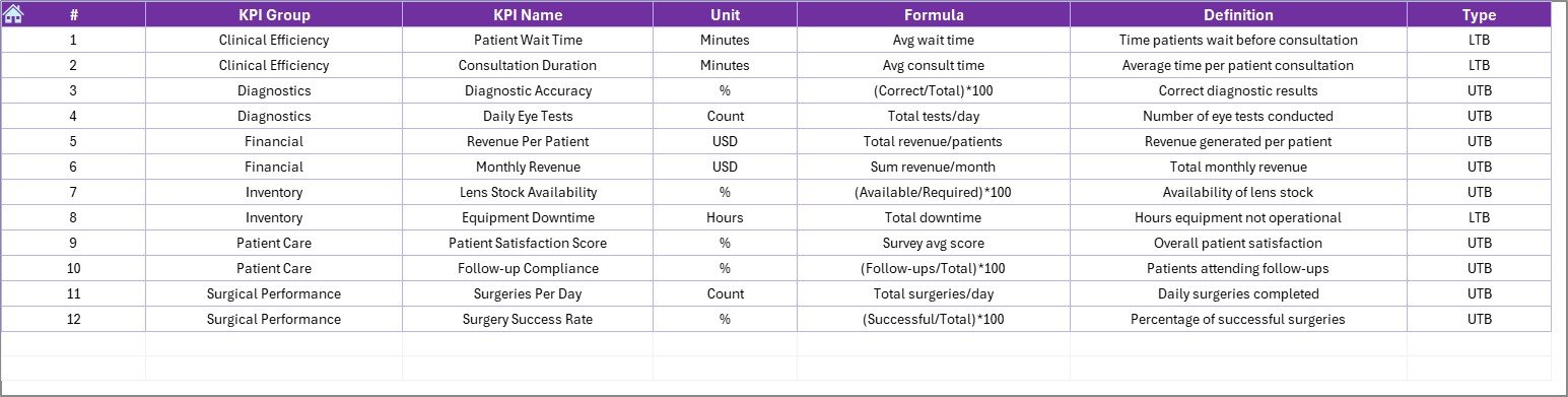
This sheet stores essential information about every KPI, including:
-
KPI Name
-
KPI Group
-
Unit of measurement
-
Formula
-
KPI Definition
-
Type (Lower the Better / Upper the Better)
It works as your KPI knowledge base and ensures consistency across the organization.
Types of KPIs You Can Track in Ophthalmology Services
Ophthalmology requires unique clinical and operational KPIs. Here are some common metrics this dashboard helps you measure:
Clinical KPIs
-
Patient OPD Volume
-
Diagnostic Tests Completed
-
Cataract Surgeries Performed
-
Retina Treatments Completed
-
Post-Surgery Success Rate
-
Surgery Cancellation Rate
Operational KPIs
-
Average Waiting Time
-
Consultation Time
-
Diagnostic Turnaround Time
-
Patient Throughput
-
Equipment Utilization Rate
Financial KPIs
-
Revenue from OPD
-
Revenue from Diagnostics
-
Surgery Revenue
-
Revenue from Optical Shop
-
YTD vs Target Revenue
Quality KPIs
-
Patient Satisfaction Scores
-
Revisit Rate
-
Errors in Documentation
-
Compliance Rate
Growth KPIs
-
New Patient Registrations
-
Patient Retention Rate
-
Monthly Appointment Growth
Because these KPIs reflect real clinical performance, the dashboard helps you maintain quality and improve patient experience.
Click to Purchases Ophthalmology Services KPI Dashboard in Excel
How the Ophthalmology Dashboard Supports Decision-Making
The dashboard transforms raw data into actionable insights. Here is how it benefits your team:
✔ Enhances Clinical Efficiency
You can track the number of tests, consultations, and surgeries, helping reduce bottlenecks.
✔ Improves Patient Experience
KPIs like waiting time and revisit rate help identify service gaps.
✔ Supports Financial Planning
Revenue KPIs help monitor business growth and profitability.
✔ Strengthens Team Accountability
Every KPI has clear definitions, making expectations transparent.
✔ Enables Better Forecasting
YTD comparisons help predict upcoming patient loads and revenue cycles.
Advantages of the Ophthalmology Services KPI Dashboard in Excel
1. Easy Navigation
The Home sheet allows users to jump directly to any section.
2. Real-Time Insights
Month selection dynamically updates the dashboard.
3. Clear KPI Comparison
You can compare Actual vs Target vs Previous Year for both MTD and YTD.
4. Visual Trend Analysis
MTD and YTD charts make trends easy to understand.
5. Standardized KPI Definitions
Helps reduce confusion among staff and new team members.
6. Zero Technical Skills Required
Anyone familiar with Excel can use the dashboard.
7. Fully Customizable
You can add more KPIs, rename sheets, or expand formulas based on your hospital’s needs.
Click to Purchases Ophthalmology Services KPI Dashboard in Excel
Best Practices for Using the Ophthalmology KPI Dashboard
1. Update Data on the Same Day Every Month
Consistency ensures accuracy in trend analysis.
2. Maintain Clean Data
Avoid typos, empty cells, or mixed units.
3. Keep KPI Names Uniform
Using a standard naming convention helps prevent errors.
4. Review Monthly Targets Regularly
Targets should reflect realistic workloads.
5. Use Trend Charts for Planning
These charts help predict busy periods and staffing needs.
6. Train Staff to Use KPI Definitions
This ensures all departments interpret KPIs the same way.
7. Review Year-Over-Year Performance
This helps highlight long-term improvements or declines.
Real-World Examples of How Clinics Use This Dashboard
✔ Example 1: Managing High OPD Load
When patient volume increases suddenly, managers use trend charts to adjust staffing.
✔ Example 2: Monitoring Surgery Numbers
Clinics track cataract or retina surgeries to maintain productivity.
✔ Example 3: Improving Diagnostic Turnaround Time
The dashboard reveals test delays, helping improve workflows.
✔ Example 4: Enhancing Revenue Management
Finance teams monitor month-wise YTD performance to adjust strategies.
Conclusion
The Ophthalmology Services KPI Dashboard in Excel offers a powerful way to track clinical, operational, and financial performance. Because the dashboard is simple to use, visually clear, and fully customizable, it supports better decisions and more productive workflows. With seven well-structured sheets, trend charts, definition tables, and dynamic month selection, it becomes a complete performance monitoring system for any eye-care facility.
Whether you manage a large eye hospital or a small clinic, this dashboard helps you deliver better patient outcomes and stronger operational control.
Click to Purchases Ophthalmology Services KPI Dashboard in Excel
Frequently Asked Questions (FAQs)
1. What does this Ophthalmology KPI Dashboard track?
It tracks OPD load, diagnostic tests, surgeries, financial KPIs, patient experience metrics, and operational performance.
2. Do I need advanced Excel skills to use it?
No. Anyone with basic Excel knowledge can use, update, and maintain the dashboard.
3. Can I add more KPIs to the dashboard?
Yes, the structure supports full customization.
4. How often should I update data?
Monthly updates are recommended for accurate insights.
5. Can the dashboard compare performance with previous years?
Yes, you can track PY values for both MTD and YTD.
6. Can this dashboard be used in multi-branch hospitals?
Yes, you can add branch-wise KPIs or create separate sheets for each branch.
7. Is this dashboard suitable for small clinics?
Absolutely. It works for clinics, diagnostic centers, and large eye-care hospitals.
8. Can I use this dashboard for audits?
Yes, the structured format helps during internal and external audits.
Click to Purchases Ophthalmology Services KPI Dashboard in Excel
Visit our YouTube channel to learn step-by-step video tutorials