The optical retail industry grows rapidly as customers demand high-quality eyewear, advanced lenses, competitive pricing, and excellent service. Because of this, retailers must track many KPIs—sales, cost, profit, customer satisfaction, product categories, store performance, and brand trends. However, manual reporting creates delays, confusion, and errors. OpOptical Retail Dashboard in Power BItical Retail Dashboard in Power BI Managers struggle to understand what works and what needs improvement.
A Power BI Optical Retail Dashboard solves this problem. It gives a complete, real-time view of performance across all stores, brands, and product lines. With interactive visuals, a user-friendly layout, and slicers on every page, managers understand trends instantly and take action quickly.
Optical Retail Dashboard in Power BI In this article, you will learn how this dashboard works, what insights each page offers, why it helps decision-making, and how retailers can get the most value from it. You will also explore the key advantages, best practices, and FAQs.
Let’s begin.
Click to Purchases Optical Retail Dashboard in Power BI
What Is an Optical Retail Dashboard in Power BI?
An Optical Retail Dashboard in Power BI is a ready-to-use analytics solution that tracks retail performance across:
-
Store locations
-
Lens types
-
Brand names
-
Product categories
-
Sales zones
-
Monthly trends
It displays KPIs such as net sales, gross amount, total cost, profit, and customer satisfaction. Because it uses Power BI, managers interact with filters and charts easily. They also view trends instantly without manual calculations.
This dashboard contains five powerful analytical pages:
-
Overview Page
-
Store Name Analysis
-
Product Category Analysis
-
Brand Name Analysis
-
Monthly Trends
These pages create a complete performance intelligence system for optical retail.
1. Overview Page: What Insights Does It Provide?
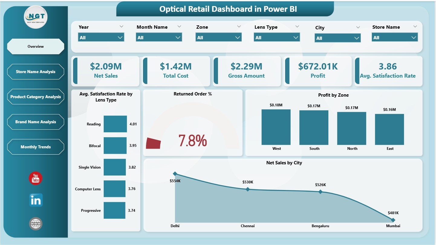
The Overview Page works as the main performance screen. It summarizes the most important KPIs and trends. Users also get slicers on the right side to filter data by store, brand, region, or product category.
✔ KPI Cards on the Overview Page
This page displays five essential KPI cards:
-
Net Sales
-
Total Cost
-
Gross Amount
-
Profit
-
Average Satisfaction Rate
These KPIs show a quick snapshot of retail performance. Retail managers use these numbers to understand the health of the business.
✔ Charts on the Overview Page
The page includes four insights-rich charts:
1️⃣ Average Satisfaction Rate by Lens Type
Helps understand which lenses give the best customer experience.
2️⃣ Returned Order %
Shows the percentage of orders customers return, which helps identify product or service issues.
3️⃣ Profit by Zone
Displays which geographical zones deliver the highest profitability.
4️⃣ Net Sales by City
Shows sales performance across different cities, helping retailers improve regional planning.
These visuals make it easy to compare stores, cities, and product segments.
Click to Purchases Optical Retail Dashboard in Power BI
2. Store Name Analysis: Why Is This Page Important?
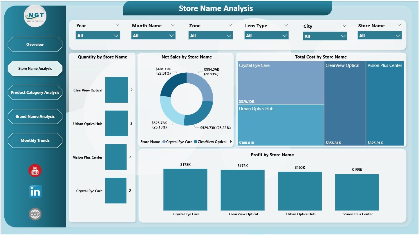
This page focuses on performance at the store level. Every optical store has different customer preferences, sales trends, and operating costs. Because of this, store-level analysis becomes essential.
With a slicer on the right side, users filter data instantly.
✔ Charts on the Store Name Analysis Page
-
Quantity by Store Name – Shows how many items each store sells
-
Net Sales by Store Name – Reveals sales performance across stores
-
Total Cost by Store Name – Highlights cost differences
-
Profit by Store Name – Helps identify high- and low-performing stores
This page helps retail leaders understand store productivity and profitability. It also helps identify stores that require training, support, or promotions.
3. Product Category Analysis: How Does It Help?
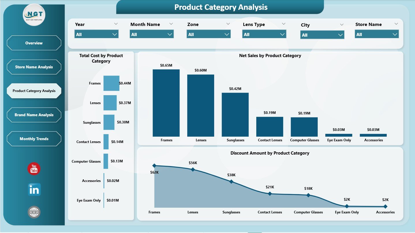
Every optical retailer sells multiple product categories:
-
Lenses
-
Frames
-
Sunglasses
-
Contact lenses
-
Accessories
Each category performs differently. Therefore, category-level analysis helps managers optimize inventory, pricing, and marketing.
With slicers on the right, users filter data for better insights.
✔ Charts on the Product Category Analysis Page
-
Total Cost by Product Category
-
Net Sales by Product Category
-
Discount Amount by Product Category
These visuals help answer important questions:
-
Which categories drive the highest net sales?
-
Do discounts reduce profit in certain categories?
-
Which categories have rising costs?
Because the dashboard shows these patterns clearly, managers make better stocking and pricing decisions.
Click to Purchases Optical Retail Dashboard in Power BI
4. Brand Name Analysis: What Does It Show?
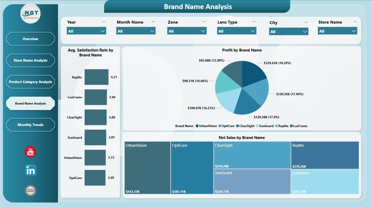
Brand performance varies significantly in optical retail. Customers may prefer certain brands for style, comfort, pricing, or durability. This page focuses on complete brand-level analytics.
The page includes three powerful charts:
1️⃣ Average Satisfaction Rate by Brand Name
Shows how different brands perform in customer satisfaction.
2️⃣ Profit by Brand Name
Reveals which brands contribute most to business profitability.
3️⃣ Net Sales by Brand Name
Shows which brands sell the most across stores.
With brand analytics, retailers plan discounts, display arrangements, and inventory more effectively.
5. Monthly Trends Page: Why Is It Useful?
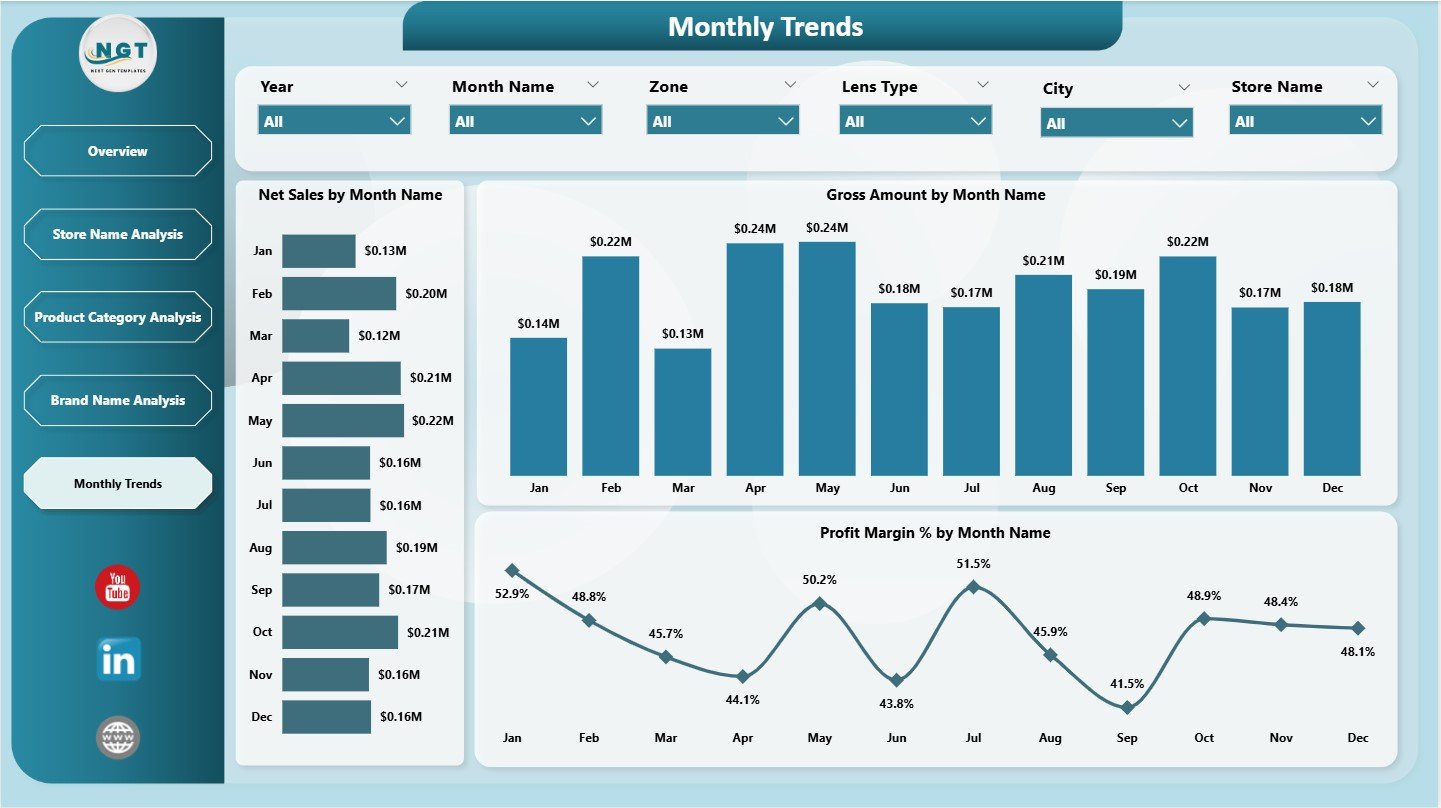
Monthly trends reveal performance patterns over time. They help retailers detect seasonality, growth opportunities, and sales dips.
The page includes three important charts:
-
Net Sales by Month Name
-
Gross Amount by Month
-
Profit Margin % by Month Name
These visuals help teams understand:
-
Which months bring higher sales
-
Gross revenue patterns
-
Profit cycles
-
Seasonal buying behavior
Retailers use this information for marketing planning, staffing decisions, and inventory preparation.
Click to Purchases Optical Retail Dashboard in Power BI
Advantages of an Optical Retail Dashboard in Power BI
This dashboard brings several powerful benefits to optical retailers. Here are the most important ones:
⭐ 1. Complete Visibility of Sales and Profit
Managers see how each store, brand, and product category performs.
⭐ 2. Better Decision-Making
Real-time insights support faster, data-driven decisions.
⭐ 3. Deep Product and Brand Insights
Brand-level and category-level charts reveal customer preferences clearly.
⭐ 4. Strong Operational Control
Managers track returned orders, costs, and satisfaction levels effectively.
⭐ 5. Better Regional Planning
Charts like profit by zone and net sales by city help optimize store placement.
⭐ 6. Improved Customer Experience
Satisfaction metrics show areas for service improvement.
⭐ 7. Trend Tracking Made Easy
Monthly trends show sales movement and seasonal behavior.
⭐ 8. Simple and Interactive
Power BI slices and filters make the dashboard easy to use for everyone.
How Does This Dashboard Improve Retail Growth?
This dashboard improves growth in several ways:
-
Shows best-selling categories
-
Highlights low-performing stores
-
Improves promotional planning
-
Supports regional decision-making
-
Reduces product returns
-
Helps optimize product mix
-
Guides pricing and discount strategies
-
Enhances customer satisfaction
When retailers understand their performance clearly, they take faster actions that improve revenue and customer loyalty.
Click to Purchases Optical Retail Dashboard in Power BI
Best Practices for Using an Optical Retail Dashboard
Follow these practices to get maximum value:
✔ 1. Refresh Data Regularly
Daily or weekly updates keep insights accurate.
✔ 2. Monitor Return % Closely
High return rates signal product quality or service issues.
✔ 3. Check Store Performance Often
Identify stores that need support or training.
✔ 4. Use Brand Analysis to Plan Inventory
Stock more of the brands that perform well.
✔ 5. Compare Trends Month by Month
Look for seasonal opportunities or weak periods.
✔ 6. Track Customer Satisfaction Monthly
This helps improve service quality quickly.
✔ 7. Align Promotions with Category Insights
Use category-level data before launching campaigns.
✔ 8. Train Teams on Power BI Filters
Better use of slicers leads to deeper insights.
Conclusion
An Optical Retail Dashboard in Power BI makes it easy for retail managers to monitor performance across stores, brands, categories, and regions. It displays KPIs such as net sales, cost, profit, satisfaction rate, and return percentage. With five analytical pages—Overview, Store Analysis, Category Analysis, Brand Analysis, and Monthly Trends—teams gain complete visibility of optical retail operations.
Because the dashboard uses Power BI, it provides dynamic visuals, interactive filters, and fast insights. Retail leaders use this dashboard to make smarter decisions, improve customer satisfaction, and increase profitability.
This dashboard becomes a powerful tool for any optical retailer that wants to track performance accurately and grow with confidence.
Click to Purchases Optical Retail Dashboard in Power BI
Frequently Asked Questions (FAQs)
1. Who should use this dashboard?
Store managers, retail directors, data analysts, brand managers, and finance teams.
2. Does the dashboard show brand-wise performance?
Yes. It displays satisfaction rate, net sales, and profit for every brand.
3. Can I analyze store performance?
Yes. You can track quantity sold, net sales, cost, and profit by store name.
4. Does it include trend analysis?
Yes. The Monthly Trends page shows net sales, gross amount, and profit margin.
5. Do I need Power BI expertise to use this dashboard?
No. Basic BI knowledge is enough because the dashboard is user-friendly.
6. Can I customize the visuals?
Yes. You can change colors, filters, KPIs, and add new charts.
7. Does this dashboard support decision-making?
Yes. It provides deep insights that help retailers improve performance.
Click to Purchases Optical Retail Dashboard in Power BI
Visit our YouTube channel to learn step-by-step video tutorials