Running outlet stores successfully requires much more than selling products at discounted prices. You must constantly monitor sales performance, inventory movement, customer behavior, margins, and operational efficiency. However, when data stays scattered across multiple Excel files, decision-making becomes slow and unclear. That is exactly why an Outlet Stores KPI Dashboard in Excel plays a critical role in modern retail management.
In this in-depth article, you will learn what an Outlet Stores KPI Dashboard in Excel is, why it matters, how it works, and how each worksheet supports better reporting and analysis. Moreover, you will discover its advantages, best practices, opportunities for improvement, and frequently asked questions. By the end of this guide, you will clearly understand how to use this dashboard as a powerful decision-support tool for outlet store operations.
What Is an Outlet Stores KPI Dashboard in Excel?
An Outlet Stores KPI Dashboard in Excel is a structured and interactive performance management tool designed to track, analyze, and visualize key performance indicators (KPIs) for outlet retail stores. Instead of reviewing raw data tables, this dashboard converts numbers into clear insights using KPIs, trends, comparisons, and visual indicators.
Moreover, this dashboard allows outlet managers, regional heads, and business owners to evaluate both monthly (MTD) and year-to-date (YTD) performance against targets and previous-year results. As a result, it helps retail teams act quickly and confidently.
Why Do Outlet Stores Need a KPI Dashboard?
Outlet stores operate in a highly competitive environment where margins stay thin and volumes remain high. Therefore, managers must monitor performance continuously rather than periodically.
An Outlet Stores KPI Dashboard in Excel helps because:
- It centralizes all KPIs in one place
- It highlights performance gaps instantly
- It improves accountability across teams
- It supports data-driven decisions
- It saves time spent on manual reporting
Furthermore, since Excel remains widely used, this dashboard does not require expensive BI tools or advanced technical skills.
How Does an Outlet Stores KPI Dashboard in Excel Work?
The dashboard works by separating data entry, KPI definitions, and visual reporting into well-structured worksheets. This approach ensures flexibility, accuracy, and scalability.
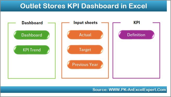
In this template, the dashboard includes 7 carefully designed worksheets, each serving a clear purpose. Let us explore them one by one.
What Are the Key Worksheets in the Outlet Stores KPI Dashboard?
Summary Page – How Does Navigation Become Effortless?
The Summary Page acts as an index sheet for the entire dashboard. Instead of scrolling through tabs, users can jump directly to any worksheet.
Key highlights of the Summary Page:
- Clean index layout
- 6 navigation buttons
- One-click access to key sheets
- User-friendly design for non-technical users
As a result, navigation becomes fast, intuitive, and error-free.
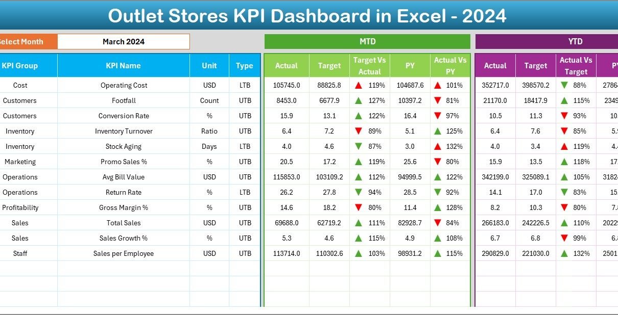
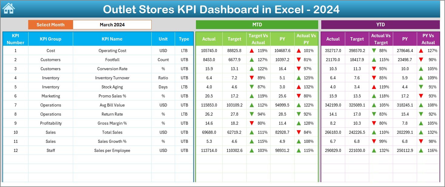
Dashboard Sheet – How Do You Track Overall Performance?
The Dashboard sheet serves as the heart of the entire KPI system. It displays a consolidated view of all KPIs with dynamic filtering.
Key features of the Dashboard sheet include:
- Month selection drop-down at cell D3
- Automatic refresh of all KPI values based on the selected month
- MTD and YTD performance views
- Actual, Target, and Previous Year comparisons
- Conditional formatting with up/down arrows
KPIs Displayed on the Dashboard
For each KPI, the dashboard shows:
- MTD Actual
- MTD Target
- MTD Previous Year
- Target vs Actual %
- Previous Year vs Actual %
- YTD Actual
- YTD Target
- YTD Previous Year
Because of conditional arrows, users instantly identify whether performance improves or declines. Consequently, managers can take corrective action without delay.
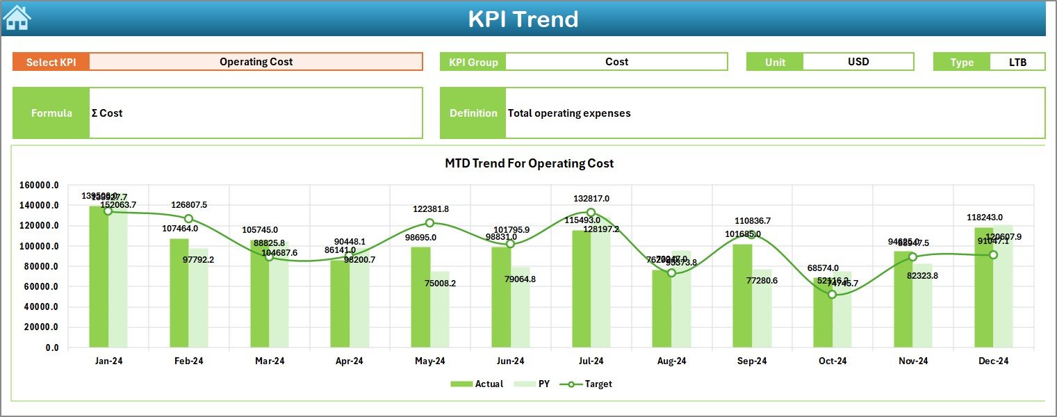
Trend Sheet – How Can You Analyze KPI Trends Over Time?
The Trend sheet focuses on deep KPI-level analysis. Instead of viewing all KPIs together, users can analyze one KPI at a time.
How the Trend Sheet Works:
- Select KPI Name from the drop-down in cell C3
- Automatically display:
KPI Group
KPI Unit
KPI Type (Upper the Better / Lower the Better)
KPI Formula
KPI Definition
Visual Trend Analysis
Additionally, the Trend sheet displays:
- MTD trend chart for Actual, Target, and Previous Year
- YTD trend chart for Actual, Target, and Previous Year
Therefore, users can easily understand performance direction and consistency over time.
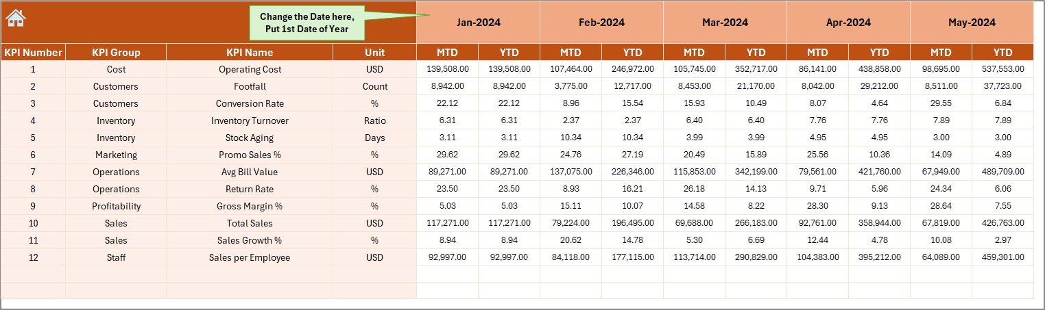
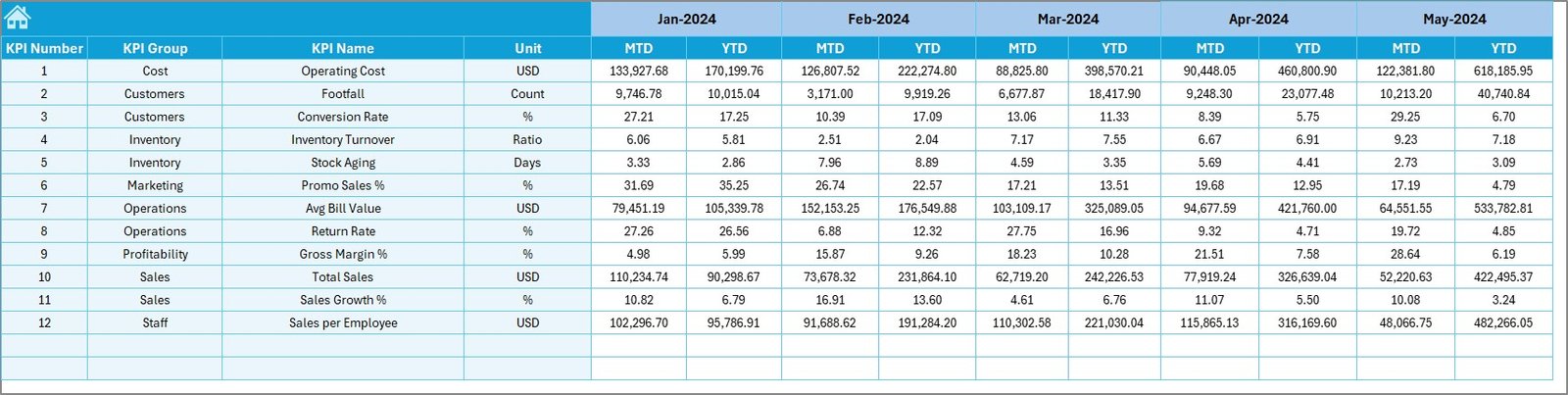
Actual Numbers Input Sheet – Where Do You Enter Real Performance Data?
The Actual Numbers Input sheet allows users to enter actual outlet store performance data.
Key design elements:
- Month selector in cell E1
- Ability to define the first month of the financial year
- Separate input fields for MTD and YTD values
- Structured layout to avoid data entry errors
Since this sheet remains isolated from visual reports, data integrity stays intact.
Target Sheet – How Do You Set Performance Benchmarks?
The Target Sheet stores target values for each KPI.
What you enter here:
- Monthly MTD targets
- Monthly YTD targets
- KPI-wise performance benchmarks
Because targets remain separate, users can revise goals without affecting actual data.
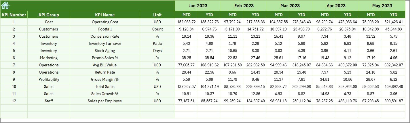
Previous Year Number Sheet – Why Is Year-on-Year Comparison Important?
The Previous Year Number sheet captures last year’s performance data.
Benefits of this sheet include:
- Accurate year-on-year comparisons
- Better seasonality analysis
- Improved forecasting accuracy
By comparing current results with historical data, managers gain deeper performance insights.
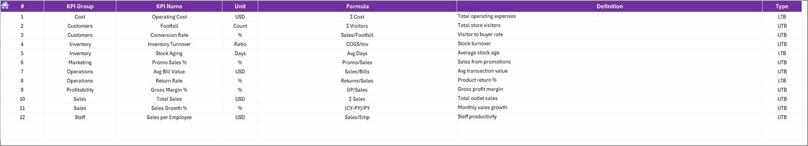
KPI Definition Sheet – How Do You Maintain KPI Consistency?
The KPI Definition sheet ensures standardization across the organization.
Information stored in this sheet:
- KPI Name
- KPI Group
- KPI Unit
- KPI Formula
- KPI Definition
Because every KPI remains clearly defined, interpretation stays consistent across teams and locations.
What Types of KPIs Can You Track in an Outlet Stores Dashboard?
An Outlet Stores KPI Dashboard in Excel can track a wide range of retail KPIs, such as:
- Total Sales Revenue
- Sales Growth %
- Average Transaction Value
- Conversion Rate
- Inventory Turnover
- Stock Aging
- Gross Margin %
- Discount Impact
- Footfall Conversion
- Shrinkage %
Moreover, you can customize KPIs based on your business model.
Advantages of Outlet Stores KPI Dashboard in Excel
Using an Outlet Stores KPI Dashboard in Excel offers several practical benefits.
- Centralized Performance Monitoring
Instead of reviewing multiple reports, you see all KPIs in one dashboard. As a result, decision-making becomes faster.
- Improved Data Accuracy
Since data entry, targets, and definitions remain separate, errors reduce significantly.
- Better Visibility into Trends
MTD and YTD trend charts clearly show whether performance improves or declines over time.
- Faster Decision-Making
Conditional formatting highlights performance gaps instantly. Therefore, managers act quickly.
- Cost-Effective Solution
Excel dashboards eliminate the need for expensive BI tools while delivering strong analytical value.
Opportunities for Improvement in Outlet Stores KPI Dashboards
Although the dashboard delivers strong insights, you can further enhance it.
- Add store-wise or region-wise slicers
- Introduce category-level KPI analysis
- Include automated data import features
- Add alert-based performance indicators
- Integrate budget vs actual analysis
These enhancements further strengthen analytical depth.
Best Practices for the Outlet Stores KPI Dashboard in Excel
To get maximum value from your dashboard, follow these best practices.
- Define KPIs Clearly
Always maintain clear KPI definitions to avoid confusion across teams.
- Update Data Regularly
Enter actual, target, and previous-year data on time to ensure accurate reporting.
- Limit KPI Count
Focus only on KPIs that directly impact business outcomes.
- Use Consistent Time Periods
Always align MTD and YTD calculations with the same financial calendar.
- Review Trends, Not Just Numbers
Trend analysis often reveals deeper insights than static values.
How Does This Dashboard Support Decision-Making?
An Outlet Stores KPI Dashboard in Excel supports decisions by:
- Highlighting underperforming KPIs
- Identifying seasonal sales patterns
- Comparing current and historical performance
- Tracking progress against targets
- Improving accountability
As a result, leadership teams gain clarity and confidence.
Who Can Benefit from an Outlet Stores KPI Dashboard?
This dashboard benefits multiple stakeholders, including:
- Outlet Store Managers
- Regional Retail Heads
- Sales and Operations Teams
- Finance and Planning Teams
- Business Owners
Because of its simplicity, even non-technical users can operate it easily.
Conclusion: Why Should You Use an Outlet Stores KPI Dashboard in Excel?
An Outlet Stores KPI Dashboard in Excel transforms raw retail data into actionable insights. By combining structured worksheets, dynamic filters, KPI comparisons, and trend analysis, it enables smarter and faster decisions.
Moreover, since Excel remains widely accessible, this dashboard delivers enterprise-level reporting without high costs. When used correctly, it becomes a powerful performance management system for outlet retail operations.
Frequently Asked Questions (FAQs)
What is an Outlet Stores KPI Dashboard in Excel?
An Outlet Stores KPI Dashboard in Excel is a performance tracking tool that visualizes key retail KPIs using MTD, YTD, target, and previous-year comparisons.
Can I customize KPIs in the dashboard?
Yes, you can easily customize KPIs by updating the KPI Definition sheet and related data input sheets.
Do I need advanced Excel skills to use this dashboard?
No, basic Excel knowledge is sufficient. The dashboard uses simple formulas, drop-downs, and charts.
How often should I update the dashboard?
You should update actual and target data monthly or weekly, depending on reporting needs.
Can this dashboard support multiple outlet stores?
Yes, with minor enhancements such as store-level filters, the dashboard can support multiple outlets.
Visit our YouTube channel to learn step-by-step video tutorials
Watch the step-by-step video tutorial: