The packaging industry plays a crucial role in manufacturing, retail, logistics, and supply chain operations. Every product needs the right packaging, and every packaging line needs accurate monitoring. Because production speed, quality, wastage, downtime, and delivery performance shift every day, managers must track these changing numbers in a simple, fast, and reliable way.
A Packaging Industry Dashboard in Excel solves this challenge. It brings all key metrics into one easy-to-understand visual report that helps production teams, supervisors, and plant managers take immediate action. This article explains everything about the dashboard—its features, its pages, its benefits, and how you can use it to improve performance. You will also learn the best practices and get answers to the most common questions.
Click to Purchases Packaging Industry Dashboard in Excel
What Is a Packaging Industry Dashboard in Excel?
A Packaging Industry Dashboard in Excel is a ready-to-use reporting tool created to track all important KPIs related to packaging production, material usage, quality performance, downtime, and delivery results. It allows teams to monitor daily, weekly, monthly, and yearly numbers without switching between different files or systems.
Because the dashboard works completely in Excel, anyone can update data easily. Supervisors enter production data, downtime details, and quality numbers in simple tables. The dashboard then updates automatically through formulas, charts, and slicers.
This dashboard supports packaging industries such as:
-
Plastic packaging
-
Paper packaging
-
Box manufacturing
-
Flexible packaging
-
Corrugated packaging
-
Carton production
-
Industrial packaging
-
Food and beverage packaging
Whether you work in a small unit or a large factory, this dashboard gives a clear picture of your production performance.
How Does the Packaging Industry Dashboard in Excel Work?
The dashboard operates through a structured workflow:
-
Data Entry Sheet – Teams enter daily production, delivery, downtime, and energy usage data.
-
Support Sheets – These sheets store lookup values, product categories, package types, shift details, and supervisor information.
-
Dashboard Pages – Excel formulas, pivot tables, and slicers convert raw data into useful visuals.
-
Page Navigator – A simple navigation panel helps users move between pages quickly.
As soon as new data is entered, every chart and KPI refreshes automatically.
Key Features of the Packaging Industry Dashboard in Excel
This dashboard includes a range of high-value features that make day-to-day analysis smooth and effortless.
✔ Page Navigator
Located on the left side, the page navigator allows quick and simple movement between:
-
Overview
-
Product Category Analysis
-
Package Analysis
-
Material Analysis
-
Month Analysis
Users do not need to scroll or search for sheets.
Pages Included in the Dashboard
The dashboard contains five powerful analytical pages, each designed for a different angle of analysis.
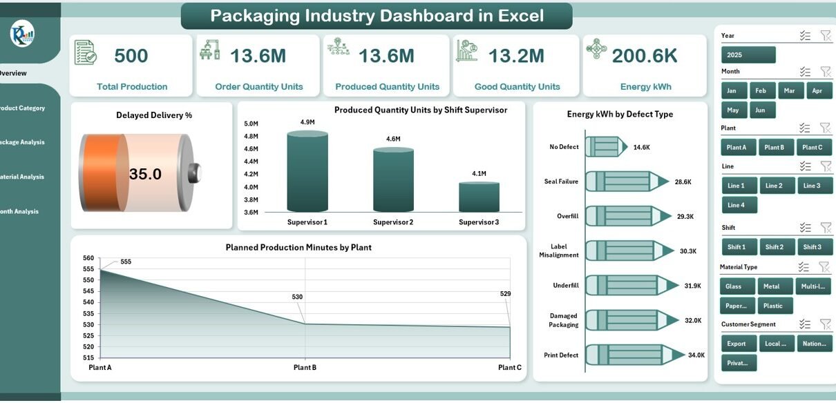
1. Overview Page
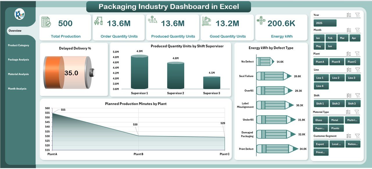
The Overview Page acts as the home screen of the dashboard. When you open the dashboard, this page gives a complete view of the packaging operations.
Elements on the Overview Page
-
Right-side slicers for filtering by:
-
Month
-
Plant
-
Material
-
Supervisor
-
Product category
-
-
Five performance cards showing:
-
Total production
-
Good quantity
-
Delayed deliveries
-
Energy consumption
-
Downtime overview
-
Charts on the Overview Page
-
Delayed Delivery %
-
Produced Quantity Units by Shift Supervisor
-
Energy kWh by Defect Type
-
Planned Production Minutes by Plant
This page shows the most important story of the day, week, or month at a glance.
2. Product Category Analysis Page
This page focuses on how different product categories contribute to production, quality, and delivery performance.
Slicers
Located on the right side for quick drill-down.
Charts on This Page
-
Planned Production Minutes by Product Category
-
On Time Delivery % by Product Category
-
Produced Quantity Units by Product Category
-
Energy kWh by Product Category
This section helps identify which product categories perform well and which need improvement.
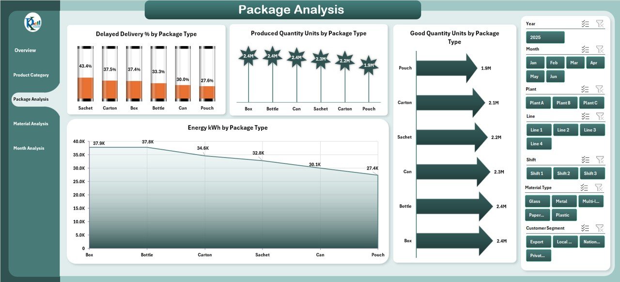
3. Package Analysis Page
Every packaging factory handles different package types such as bottles, pouches, jars, boxes, or cartons. This page compares the performance of each type.
Charts on This Page
-
Delayed Delivery % by Package Type
-
Produced Quantity Units by Package Type
-
Good Quantity Units by Package Type
-
Energy kWh by Package Type
You can quickly see which package type gives the highest production and which type struggles with delays or quality issues.
Click to Purchases Packaging Industry Dashboard in Excel
4. Material Analysis Page
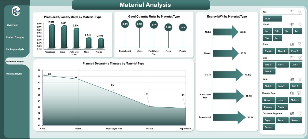
Material plays a major role in production cost, quality, wastage, and energy consumption. This page helps track performance by raw material type.
Charts on This Page
-
Produced Quantity Units by Material Type
-
Good Quantity Units by Material Type
-
Energy kWh by Material Type
-
Planned Downtime Minutes by Material Type
This analysis helps identify which materials cause more downtime or require more energy.
5. Month Analysis Page
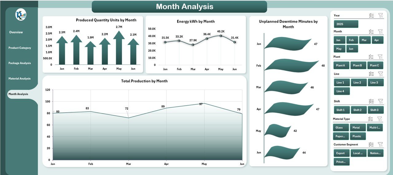
This page helps teams understand long-term performance trends across the year.
Charts on This Page
-
Produced Quantity Units by Month
-
Energy kWh by Month
-
Unplanned Downtime Minutes by Month
-
Total Production by Month
The monthly view allows managers to compare seasonal demand, resource needs, and production patterns.
Support Sheets in the Dashboard
The dashboard includes support sheets to ensure accurate calculations and fast analysis.
Support Sheet
Stores:
-
Product categories
-
Package types
-
Material types
-
Plant codes
-
Shift details
-
Supervisor names
Data Sheet
Teams enter:
-
Produced quantity
-
Good quantity
-
Defect quantity
-
Material used
-
Energy consumption
-
Planned and unplanned downtime
-
Delivery status
-
Shift and supervisor details
Once data is entered, Excel updates all pages instantly.
Why Do Packaging Industries Need This Dashboard?
The packaging industry deals with:
-
Tight delivery deadlines
-
High machine dependency
-
Large material usage
-
Continuous production cycles
-
High energy needs
-
Frequent quality checks
Manual reporting takes time and often leads to errors. A dashboard helps teams make decisions faster and avoid production loss.
Advantages of Packaging Industry Dashboard in Excel
Using this dashboard provides many benefits for manufacturing and packaging teams.
1. Real-Time Decision Making
Data updates instantly, which helps supervisors take action quickly.
2. Reduce Delayed Deliveries
The dashboard highlights delivery problems so teams can improve planning.
3. Improve Production Efficiency
Managers see which shifts or categories produce more output.
4. Better Quality Control
Charts show defect trends and good quantity performance.
5. Track Energy Consumption
Teams identify high-energy areas and take steps to save cost.
6. Manage Downtime
The dashboard separates planned and unplanned downtime, making it easier to fix issues.
7. Improve Material Planning
Material analysis helps in cutting wastage and choosing better suppliers.
8. Easy to Use
Since it runs in Excel, anyone can use it without technical training.
9. Supports Continuous Improvement
Teams can monitor trends and compare performance every month.
Best Practices for Using a Packaging Industry Dashboard in Excel
To get the best results, use the following best practices:
✔ Keep Your Data Clean
Always enter data correctly to avoid calculation errors.
✔ Update the Data Sheet Daily
Daily updates create accurate monthly and yearly trends.
✔ Use Slicers for Deep Analysis
Slicers help filter performance by:
-
Material
-
Product category
-
Month
-
Supervisor
-
Shift
✔ Train Your Team
Make sure supervisors understand how to read the dashboard.
✔ Review Monthly Trends
Monthly reviews help identify long-term issues.
✔ Track KPIs Consistently
Focus on:
-
Production
-
Downtime
-
Quality
-
Delivery
-
Energy
✔ Compare Plant Performance
If your company has more than one plant, the dashboard helps identify the best performing location.
How This Dashboard Helps Improve Packaging Operations
Click to Purchases Packaging Industry Dashboard in Excel
This dashboard acts as a complete performance control center. Because all KPIs sit in one place, managers can track:
-
Output per shift
-
Quality changes
-
Material issues
-
Defect patterns
-
Supervisor performance
-
Monthly trends
The dashboard also supports review meetings, audits, ISO reporting, and planning sessions.
Who Should Use the Packaging Industry Dashboard in Excel?
This dashboard is useful for:
-
Plant managers
-
Production supervisors
-
Quality managers
-
Operations managers
-
Maintenance teams
-
Industrial engineers
-
Supply chain managers
-
Packaging line operators
-
Manufacturing directors
Any team that needs fast and clear production insights can use this tool.
Common KPIs Tracked in Packaging Industry Dashboard
Some common KPIs include:
-
Produced Quantity
-
Good Quantity
-
Defect Quantity
-
On Time Delivery %
-
Delayed Delivery %
-
Energy kWh
-
Planned Production Minutes
-
Downtime Minutes
-
Shift Output
-
Material Usage Efficiency
-
Supervisor Performance
-
Monthly Production Trend
These KPIs help maintain consistent quality and productivity.
What Makes This Dashboard Different from Others?
✔ Fully automated Excel file
No coding or macros needed.
✔ Clean and simple design
Easy to understand visuals.
✔ Multiple analysis pages
Covers all major areas of packaging operations.
✔ All data in one place
No need to manage separate files.
✔ Instant updates
Charts refresh automatically.
Conclusion
A Packaging Industry Dashboard in Excel gives packaging teams a powerful and practical way to track their production, quality, downtime, and delivery performance. Since it works entirely in Excel, users can update data without technical skills. The dashboard helps teams reduce delays, improve output, manage materials better, and monitor monthly trends. When companies use this tool regularly, they make faster decisions and improve overall performance.
Frequently Asked Questions (FAQs)
1. What data do I need to use this dashboard?
You need production quantity, material type, downtime minutes, delivery status, and energy usage data.
2. Can beginners use this dashboard easily?
Yes. The dashboard uses simple slicers, charts, and tables that anyone can understand.
3. How often should I update the data?
Daily updates give the best accuracy, but weekly updates also work.
4. Does this dashboard support multiple plants?
Yes. You can filter by plant and compare performance easily.
5. Can we add more KPIs?
Yes. You can expand the data sheet and add new formulas and charts.
6. Does the dashboard track monthly trends?
Yes. The Month Analysis page shows monthly production, downtime, and energy usage.
7. Can this dashboard reduce material wastage?
Yes. The Material Analysis page helps identify high-wastage or low-performance materials.
8. Is Excel fast enough for large production data?
Yes. With proper data structure and pivot tables, Excel handles large volumes smoothly.
Visit our YouTube channel to learn step-by-step video tutorials
Click to Purchases Packaging Industry Dashboard in Excel