The paper and pulp industry operates at the intersection of production precision, sustainability, and quality control. Every stage — from raw material procurement to finished product delivery — generates critical performance data. Managing and analyzing this data manually can be complex and time-consuming.
To simplify this process, we’ve designed the Paper and Pulp KPI Dashboard in Excel — a ready-to-use, dynamic tool that transforms raw data into actionable insights. It enables decision-makers to monitor performance, identify bottlenecks, and optimize production efficiency — all within Microsoft Excel.
Click to Purchases Paper and Pulp KPI Dashboard in Excel
🧠 What Is a Paper and Pulp KPI Dashboard in Excel?
A Paper and Pulp KPI Dashboard in Excel is a data analysis and performance management tool specifically designed for paper mills, pulp factories, and packaging manufacturers. It consolidates all your key performance indicators (KPIs) in one place, allowing you to track production output, energy usage, cost, waste, and quality performance in real time.
With built-in automation, slicers, and visual elements, this dashboard helps management teams compare actual vs target values, monitor monthly and yearly trends, and evaluate whether operations meet the company’s goals.
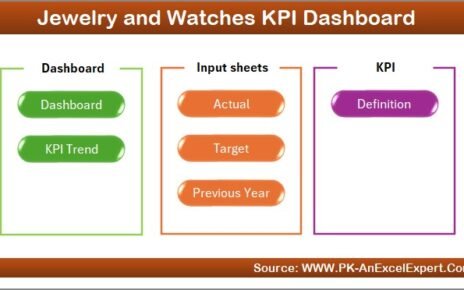
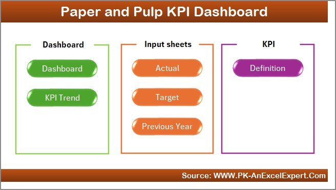
⚙️ Structure of the Paper and Pulp KPI Dashboard
This Excel file includes seven powerful worksheet tabs, each performing a unique role in performance tracking.
1️⃣ Home Sheet – The Central Navigation Hub
The Home Sheet acts as an index or command center for your dashboard.
Features:
-
🧭 Navigation Buttons: Quickly jump to any of the six main sheets — Dashboard, KPI Trend, Actual Input, Target, Previous Year Data, or KPI Definition.
-
📋 User-Friendly Layout: Simplifies movement between tabs without scrolling or searching manually.
-
⚡ One-Click Access: Saves time, enhances user experience, and ensures a seamless workflow.
This sheet is perfect for professionals who manage multiple departments or processes simultaneously.
Click to Purchases Paper and Pulp KPI Dashboard in Excel
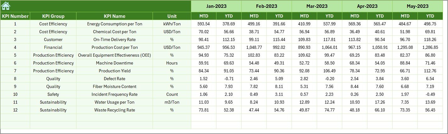
2️⃣ Dashboard Sheet Tab – Your Performance Command Center
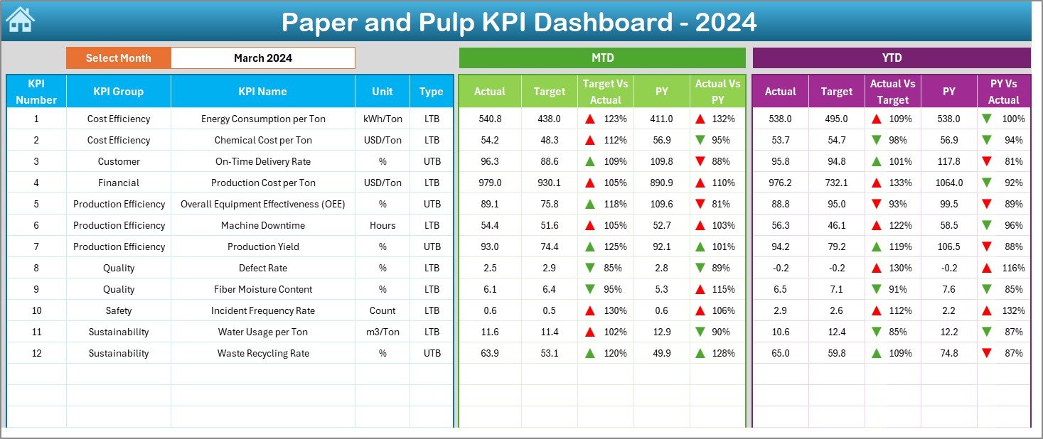
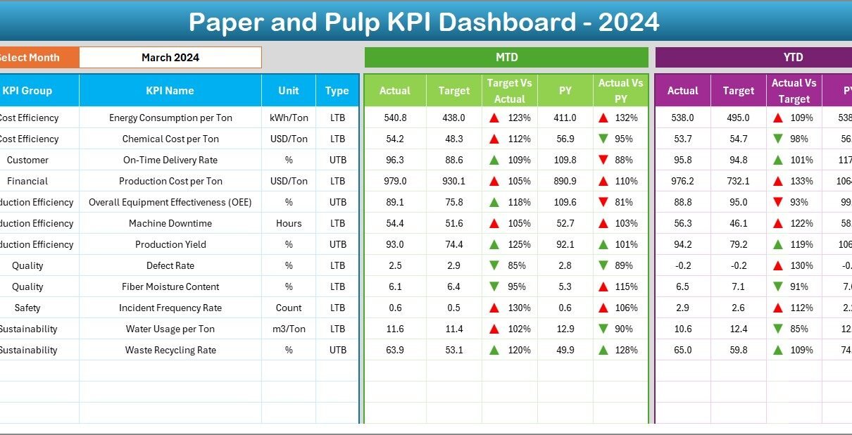
The Dashboard Sheet is the main analytical page that displays all KPIs for any selected month.
Key Highlights:
-
📅 Month Selector (Cell D3): Choose a specific month to update all performance visuals instantly.
-
📊 MTD and YTD Comparisons:
-
MTD (Month-to-Date) shows current monthly performance.
-
YTD (Year-to-Date) aggregates performance since the start of the year.
-
-
🔺 Actual vs Target vs Previous Year:
Compare real-time values using dynamic visuals with conditional arrows:-
Green ▲ = Above Target
-
Red ▼ = Below Target
-
-
⚙️ Automatic Calculations:
Calculates Target vs Actual % and Previous Year vs Actual % automatically.
This sheet helps decision-makers identify underperforming KPIs instantly and take corrective actions on time.
3️⃣ KPI Trend Sheet Tab – Visualize Performance Over Time
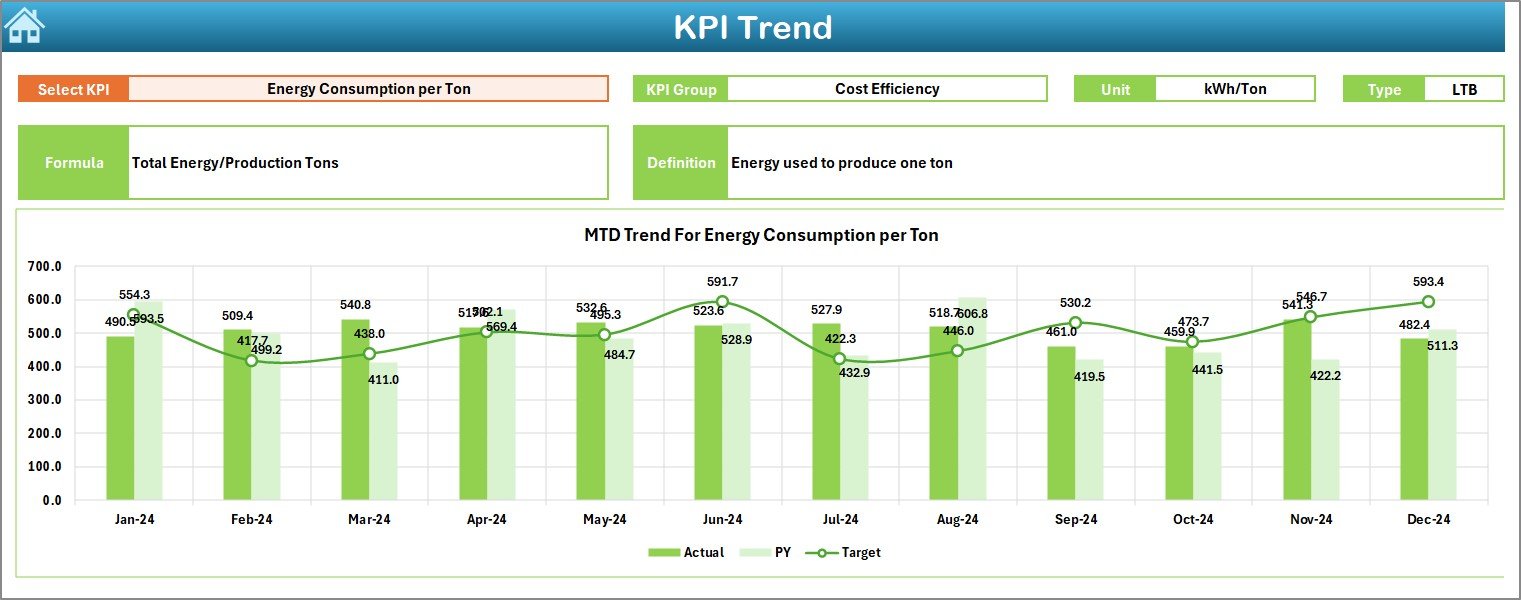
Understanding long-term performance patterns is crucial for continuous improvement. The KPI Trend Sheet enables trend analysis across months and years.
Features:
-
📍 Dynamic KPI Selector (Cell C3): Choose any KPI to view its group, formula, and definition.
-
📘 Displayed Information:
-
KPI Group
-
Unit of Measurement
-
KPI Type (LTB or UTB)
-
Formula
-
Definition
-
-
📈 Trend Charts:
Dual charts display MTD and YTD trends for Actual, Target, and Previous Year (PY) values.
For example, if “Energy Consumption per Ton” increases month over month, managers can immediately investigate efficiency issues or raw material changes.
Click to Purchases Paper and Pulp KPI Dashboard in Excel
4️⃣ Actual Numbers Input Sheet – Record Real Performance Data
The Actual Numbers Input Sheet is the foundation of the dashboard.
You’ll Enter:
-
KPI Name
-
MTD Actual Values
-
YTD Actual Values
-
Month (starting with the first day of the month, e.g., 01-Jan-2024)
Top Features:
-
🕒 Dynamic Month Setting (Cell E1): Define your first reporting month once, and the sheet adjusts automatically.
-
✍️ Simple Data Entry: Paste or import data directly from ERP systems or manual logs.
-
⚡ Automatic Refresh: As soon as data is entered, the dashboard updates instantly.
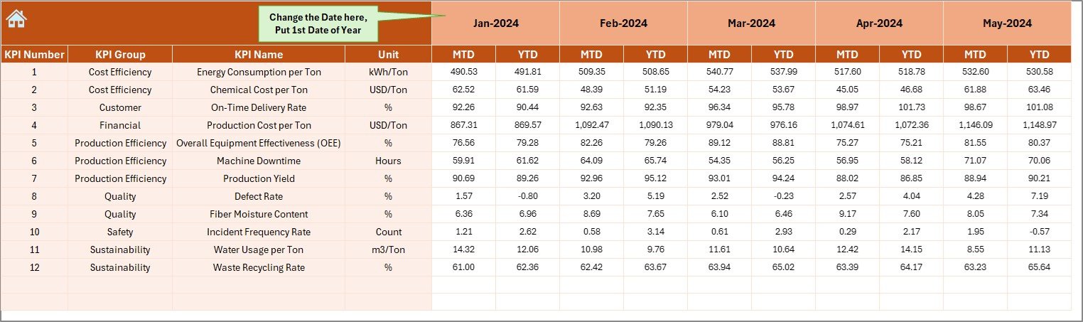
5️⃣ Target Sheet Tab – Define Performance Benchmarks
The Target Sheet sets the benchmark for your KPIs.
Contents:
-
KPI Name
-
Monthly Targets (MTD and YTD)
-
Monthly Breakdown for the full year
Purpose:
By comparing actual results with targets, you can measure efficiency, detect gaps, and drive improvement across all operations — from production yield to waste reduction.
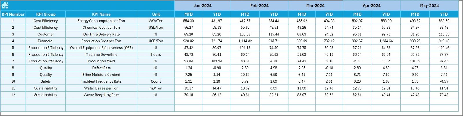
6️⃣ Previous Year Numbers Sheet Tab – Enable Historical Comparison
This sheet contains all previous year’s data for each KPI.
Benefits:
-
Allows year-over-year performance comparison.
-
Helps identify improvement patterns.
-
Provides context to understand whether deviations are seasonal or operational.
It’s a vital reference for companies following continuous improvement models such as Lean Manufacturing or Six Sigma.
7️⃣ KPI Definition Sheet – The Blueprint of Measurement
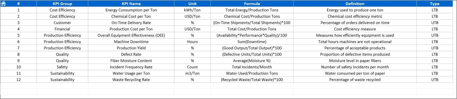
The KPI Definition Sheet explains every KPI included in the dashboard.
It Includes Columns For:
-
KPI Name
-
KPI Group (Production, Quality, Cost, Safety, etc.)
-
Unit
-
Formula
-
Definition
-
Type (UTB or LTB)
By maintaining clear KPI definitions, you ensure everyone — from operators to executives — interprets data the same way.
📈 Common KPIs in the Paper and Pulp Industry
Below are the essential KPIs typically included in this dashboard:
🏭 Production KPIs
-
Production Volume (Tons)
-
Machine Downtime (Hours)
-
Production Yield (%)
-
Overall Equipment Effectiveness (OEE %)
🧪 Quality KPIs
-
Defect Rate (%)
-
Rework Ratio (%)
-
Product Moisture Content (%)
-
Customer Complaints Count
💰 Cost KPIs
-
Cost per Ton (USD)
-
Maintenance Cost (% of Production)
-
Energy Cost per Ton (USD)
-
Material Waste (%)
🌱 Sustainability KPIs
-
Water Consumption per Ton (m³)
-
Energy Usage (kWh per Ton)
-
Carbon Emissions (kg CO₂/Ton)
-
Recycling Rate (%)
👷 Safety & Workforce KPIs
-
Lost Time Injury Frequency Rate (LTIFR)
-
Employee Attendance (%)
-
Training Hours per Employee
-
Safety Audit Score (%)
Each KPI is categorized as UTB (Upper the Better) or LTB (Lower the Better) depending on its ideal performance direction.
Click to Purchases Paper and Pulp KPI Dashboard in Excel
🌟 Advantages of Using the Paper and Pulp KPI Dashboard in Excel
✅ 1. Centralized Performance Monitoring
Track all KPIs — from production to safety — in one file, ensuring total visibility across departments.
✅ 2. Real-Time Insights
Instantly view actual vs target results with visual indicators that eliminate guesswork.
✅ 3. Easy to Customize
Add or remove KPIs, modify formulas, and expand chart ranges without advanced Excel skills.
✅ 4. Data-Driven Decision Making
MTD/YTD comparisons empower managers to identify trends and act before problems escalate.
✅ 5. Cost-Effective Solution
Unlike ERP or BI software, this Excel dashboard is affordable, lightweight, and easy to deploy.
✅ 6. Improves Accountability
Each KPI is assigned to a responsible department, fostering ownership and transparency.
✅ 7. Simplifies Reporting
Present monthly or annual performance reports using automated visuals — no need for PowerPoint slides.
💡 How to Use the Dashboard Effectively
Follow these simple steps to get started:
-
Input Data: Fill the Actual, Target, and Previous Year sheets with your values.
-
Select Month: Go to the Dashboard tab and choose the month from cell D3.
-
Review KPI Cards and Charts: Observe instant changes across MTD and YTD performance.
-
Analyze Trends: Visit the KPI Trend Sheet to spot month-over-month improvements.
-
Make Data-Driven Decisions: Use conditional indicators to identify problem areas quickly.
🧭 Best Practices for Maintaining the KPI Dashboard
📘 1. Define Clear KPIs
Ensure every KPI aligns with company objectives and follows consistent definitions.
📅 2. Update Data Monthly
Enter actual, target, and previous year numbers regularly for accurate reporting.
🧩 3. Keep Formatting Consistent
Maintain uniform date and number formats to avoid calculation errors.
💾 4. Use Data Validation
Add drop-down lists or restrictions to prevent incorrect data entry.
🔍 5. Review Performance Trends
Focus on long-term trends, not just monthly spikes, for meaningful insights.
🤝 6. Share Results Regularly
Distribute performance dashboards during management reviews for collaborative improvement.
🧠 7. Backup Data
Always save backups before making structural changes to protect historical records.
🔍 Customization Ideas for Advanced Users
You can further enhance the Paper and Pulp Dashboard by:
-
Adding slicers for Region, Plant, or Product Type.
-
Creating pivot-based visuals for Energy Efficiency Trends.
-
Integrating macros for one-click refresh or PDF export.
-
Adding variance analysis columns to show absolute differences.
-
Linking multiple factory files into one consolidated corporate dashboard.
👷 Who Can Benefit from This Dashboard?
The Paper and Pulp KPI Dashboard in Excel is designed for:
-
Plant Managers – to monitor efficiency and output
-
Production Supervisors – to track downtime and yield
-
Quality Engineers – to evaluate product defect trends
-
Financial Controllers – to analyze cost per ton and margin
-
Sustainability Officers – to monitor energy and water usage
-
Executives – to get a 360° overview of plant performance
Whether you operate a paper mill, pulp factory, or packaging plant, this tool enhances transparency and decision-making.
🏁 Conclusion
The Paper and Pulp KPI Dashboard in Excel provides a complete, data-driven performance monitoring system for the manufacturing industry.
With automated charts, conditional formatting, and structured data entry, it simplifies reporting and drives operational excellence.
You can now replace manual spreadsheets with an intelligent, interactive dashboard — gaining better insights, faster decisions, and measurable improvements across production, quality, and sustainability.
Click to Purchases Paper and Pulp KPI Dashboard in Excel
❓ Frequently Asked Questions (FAQs)
1. What is the main purpose of this KPI Dashboard?
It helps track production, cost, quality, and sustainability KPIs in a single Excel-based performance management tool.
2. Can I modify or add new KPIs?
Yes. You can easily edit KPI names, formulas, and definitions in the KPI Definition Sheet.
3. Does it require any advanced Excel knowledge?
No. The dashboard is beginner-friendly with automated formulas and dropdowns.
4. How often should I update the data?
Ideally, every month — or weekly if you need frequent performance reviews.
5. Can this dashboard handle multiple factories?
Yes. You can merge multiple input files or add “Plant” as a slicer for consolidated analysis.
6. How are trends shown?
The KPI Trend Sheet displays monthly and yearly visuals for Actual, Target, and Previous Year values.
7. What is the difference between UTB and LTB?
UTB means Upper the Better (e.g., production yield), while LTB means Lower the Better (e.g., defect rate).
Click to Purchases Paper and Pulp KPI Dashboard in Excel
Visit our YouTube channel to learn step-by-step video tutorials