Managing a pathology laboratory today requires much more than processing samples and delivering reports. Labs must control turnaround time, reduce delays, manage costs, monitor revenue, and ensure service quality across cities, labs, and test categories. However, many pathology labs still depend on manual Excel reports, scattered systems, and delayed reviews. Because of this, decision-makers often fail to spot performance issues on time.
That is exactly why a Pathology Labs Dashboard in Power BI becomes a powerful and practical analytics solution.
This detailed guide explains what a Pathology Labs Dashboard in Power BI is, why pathology labs need it, how it works, page-wise dashboard structure, key advantages, best practices, and frequently asked questions. Moreover, the article uses clear language, smooth transitions, and real-world explanations to ensure easy understanding and strong SEO performance.
Click to Purchases Pathology Labs Dashboard in Power BI
What Is a Pathology Labs Dashboard in Power BI?
A Pathology Labs Dashboard in Power BI is an interactive reporting and analytics solution that helps pathology labs track operational, clinical, and financial performance using visual KPIs.
Instead of relying on multiple disconnected spreadsheets, this dashboard consolidates lab data into a single Power BI file. As a result, lab managers, operations teams, finance teams, and leadership gain instant visibility into turnaround times, pending tests, revenue trends, and cost performance.
Because the dashboard uses Power BI, it allows users to:
-
Filter data dynamically
-
Drill down into lab, city, and test category performance
-
Track monthly trends easily
-
Identify delays and inefficiencies quickly
Consequently, pathology labs move from reactive decision-making to proactive performance management.
Why Do Pathology Labs Need a Power BI Dashboard?
Pathology labs operate in a high-volume, time-sensitive, and accuracy-driven environment. Therefore, even small delays or inefficiencies can impact patient satisfaction and profitability.
Without a centralized dashboard, pathology labs often face several challenges.
Common Challenges Faced by Pathology Labs
-
Delayed test reports and increasing turnaround time
-
Lack of visibility into lab-wise and city-wise performance
-
Difficulty tracking pending and delayed tests
-
Manual and time-consuming monthly reporting
-
Poor cost control across test categories
-
Limited insights into revenue drivers
However, when labs implement a Pathology Labs Dashboard in Power BI, they gain clarity, control, and confidence in decision-making.
How Does a Pathology Labs Dashboard in Power BI Work?
A Pathology Labs Dashboard in Power BI works by connecting structured lab data—usually stored in Excel or databases—to Power BI visuals.
Data Flow Explained Simply
-
Data Source
Lab data such as test details, turnaround time, cost, revenue, city, and lab name is maintained in an Excel or database file. -
Power BI Data Model
Power BI imports and models this data using relationships, measures, and calculated fields. -
Interactive Visuals
Charts, cards, and slicers transform raw data into meaningful insights. -
User Interaction
Users select filters such as city, lab name, test category, or month to analyze performance instantly.
As a result, pathology labs gain real-time insights without manual effort.
What Are the Key Pages in the Pathology Labs Dashboard in Power BI?
This dashboard contains five well-structured pages, each designed to answer specific operational and business questions.
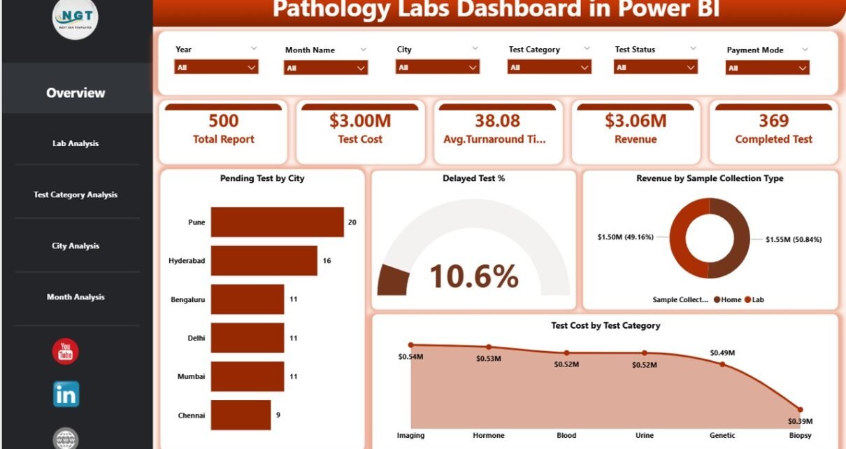
1. Overview Page: How Can Labs Get a Quick Performance Snapshot?
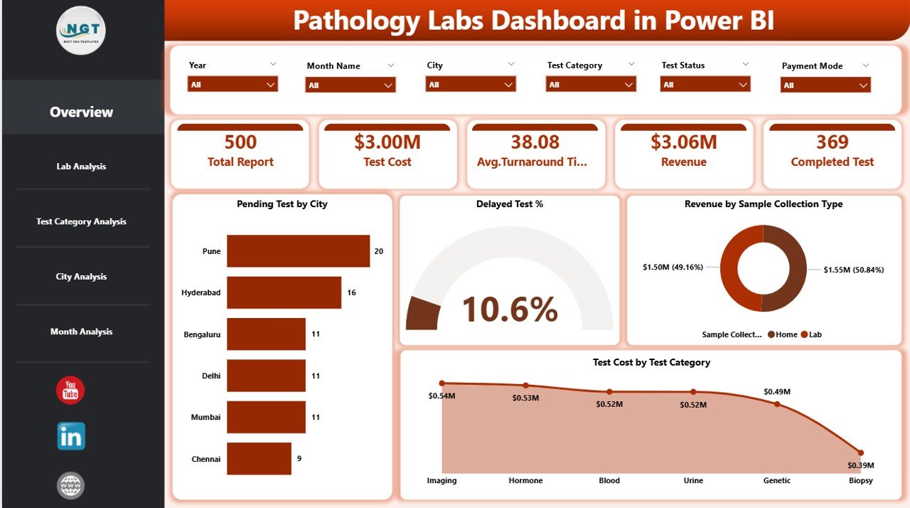
The Overview Page serves as the executive summary of the dashboard. It provides a high-level view of overall lab performance.
Key Features of the Overview Page
-
Dynamic Slicers
Users can filter data by time period, city, lab, or test category. -
KPI Cards
-
Total Pending Tests
-
Delayed Test Percentage
-
Total Revenue
-
Total Test Cost
-
-
Charts Included
-
Pending Tests by City
-
Delayed Test %
-
Revenue by Sample Collection Type
-
Test Cost by Test Category
-
Why the Overview Page Matters
Click to Purchases Pathology Labs Dashboard in Power BI
Because this page highlights critical KPIs instantly, decision-makers can identify problem areas without scrolling through detailed reports. Moreover, it helps leadership focus on what matters most.
2. Lab Analysis Page: How Is Each Lab Performing?
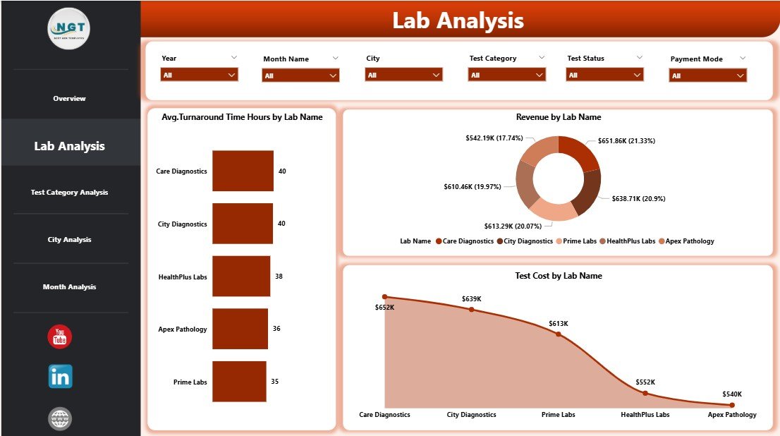
The Lab Analysis Page focuses on lab-wise operational and financial performance.
Key Charts in the Lab Analysis Page
-
Average Turnaround Time (Hours) by Lab Name
-
Revenue by Lab Name
-
Test Cost by Lab Name
Insights You Can Gain
-
Identify labs with high turnaround time
-
Compare revenue contribution across labs
-
Detect cost inefficiencies at the lab level
Consequently, management can take targeted actions to improve underperforming labs.
3. Test Category Analysis Page: Which Tests Drive Revenue and Delays?
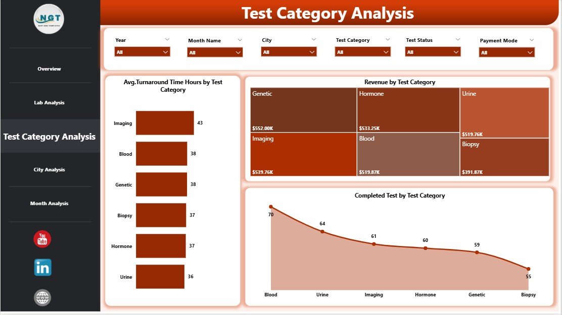
The Test Category Analysis Page provides insights into performance by test category.
Key Charts in the Test Category Analysis Page
-
Average Turnaround Time (Hours) by Test Category
-
Revenue by Test Category
-
Test Cost by Test Category
Why This Page Is Important
Some test categories generate high revenue but also cause delays or high costs. Therefore, this page helps labs balance profitability and operational efficiency.
4. City Analysis Page: How Do Cities Compare in Performance?
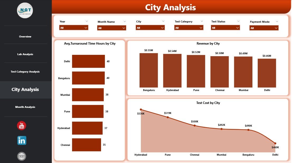
The City Analysis Page focuses on geographic performance.
Key Charts in the City Analysis Page
-
Average Turnaround Time (Hours) by City
-
Revenue by City
-
Test Cost by City
Business Value of City-Level Analysis
-
Identify cities with frequent delays
-
Compare revenue across regions
-
Optimize logistics and sample collection strategies
As a result, labs can improve service quality across locations.
Click to Purchases Pathology Labs Dashboard in Power BI
5. Monthly Trends Page: Are Performance Metrics Improving Over Time?
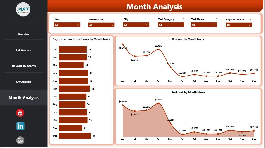
The Monthly Trends Page shows how key metrics change over time.
Key Charts in the Monthly Trends Page
-
Average Turnaround Time (Hours) by Month
-
Revenue by Month
-
Test Cost by Month
Why Trend Analysis Matters
Trend analysis helps labs:
-
Track improvement initiatives
-
Forecast revenue and costs
-
Identify seasonal demand patterns
Therefore, labs can plan resources more effectively.
What KPIs Are Commonly Tracked in a Pathology Labs Dashboard?
A Pathology Labs Dashboard in Power BI typically tracks the following KPIs:
-
Average Turnaround Time (Hours)
-
Pending Tests Count
-
Delayed Test Percentage
-
Revenue by Lab, City, and Test Category
-
Test Cost by Lab, City, and Test Category
-
Monthly Revenue and Cost Trends
Because these KPIs update dynamically, labs always work with the latest insights.
Advantages of Pathology Labs Dashboard in Power BI
Implementing a Pathology Labs Dashboard in Power BI offers several strategic and operational benefits.
✅ Centralized Performance Monitoring
-
View all lab KPIs in one place
-
Eliminate data silos and confusion
✅ Faster Decision-Making
-
Identify delays and cost overruns instantly
-
Take corrective action without waiting for reports
✅ Improved Turnaround Time Control
-
Monitor average turnaround time across labs and cities
-
Reduce delayed tests proactively
✅ Better Cost Management
-
Track test costs by category and location
-
Identify high-cost processes easily
✅ Revenue Optimization
-
Analyze revenue drivers clearly
-
Focus on high-performing labs and test categories
✅ Interactive and User-Friendly
-
Use slicers and filters without technical skills
-
Drill down into details effortlessly
Best Practices for the Pathology Labs Dashboard in Power BI
To get maximum value from your dashboard, follow these best practices.
🔹 Maintain Clean and Structured Data
-
Use consistent naming for labs, cities, and test categories
-
Validate turnaround time and cost data regularly
🔹 Update Data Frequently
-
Refresh data daily or weekly
-
Ensure timely performance tracking
🔹 Focus on Actionable KPIs
-
Track metrics that drive decisions
-
Avoid unnecessary visuals
🔹 Use Standard Time Definitions
-
Define turnaround time clearly
-
Use consistent calculation logic
🔹 Train Users Properly
-
Educate staff on using slicers and filters
-
Encourage data-driven discussions
🔹 Review Trends Monthly
-
Monitor performance improvement over time
-
Adjust strategies based on trends
Who Can Use a Pathology Labs Dashboard in Power BI?
This dashboard benefits multiple stakeholders.
-
Pathology Lab Owners
-
Operations Managers
-
Quality Control Teams
-
Finance and Revenue Teams
-
Regional Managers
-
Senior Leadership
Because the dashboard remains intuitive, even non-technical users can leverage it effectively.
How Does Power BI Help Pathology Labs Compared to Traditional Reports?
Traditional Excel reports require manual updates and lack interactivity. In contrast, Power BI dashboards provide:
-
Real-time insights
-
Interactive filtering
-
Visual clarity
-
Scalable reporting
As a result, pathology labs improve transparency and efficiency.
Conclusion: Why Should Pathology Labs Use Power BI Dashboards?
A Pathology Labs Dashboard in Power BI transforms how labs monitor performance, manage costs, and improve service quality. Instead of reacting to problems after they occur, labs gain the ability to detect issues early and act decisively.
Because the dashboard combines operational and financial insights in one place, it empowers labs to deliver faster results, control costs, and grow revenue sustainably. Therefore, investing in a Power BI dashboard becomes a strategic step toward operational excellence.
Frequently Asked Questions (FAQs)
❓ What is a Pathology Labs Dashboard in Power BI used for?
A Pathology Labs Dashboard in Power BI tracks turnaround time, pending tests, revenue, and costs using interactive visuals.
❓ Can small pathology labs use Power BI dashboards?
Yes, Power BI dashboards scale easily and work well for both small and large labs.
❓ Do users need technical skills to use the dashboard?
No, users can analyze data using slicers and visuals without technical expertise.
❓ Can the dashboard connect to Excel data?
Yes, most pathology lab dashboards use Excel as the primary data source.
❓ How often should data be refreshed?
Labs should refresh data daily or weekly for accurate insights.
❓ Does the dashboard support city-wise and lab-wise analysis?
Yes, the dashboard includes dedicated pages for lab and city analysis.
Visit our YouTube channel to learn step-by-step video tutorials