Pathology laboratories play a critical role in modern healthcare. Every diagnosis, treatment decision, and patient outcome strongly depends on accurate and timely lab results. However, managing pathology lab performance without clear visibility often leads to delays, inefficiencies, and missed targets. That is exactly why a Pathology Labs KPI Dashboard in Power BI becomes a powerful and practical solution.
In this detailed blog post, you will learn what a Pathology Labs KPI Dashboard in Power BI is, how it works, why pathology labs need it, and how it helps improve operational and clinical performance. In addition, the article explains dashboard pages, KPI logic, Excel data structure, advantages, best practices, and frequently asked questions—all in simple and easy-to-understand language.
Click to Purchases Pathology Labs KPI Dashboard in Power BI
What Is a Pathology Labs KPI Dashboard in Power BI?
A Pathology Labs KPI Dashboard in Power BI is a ready-to-use performance monitoring tool that tracks laboratory KPIs through interactive visuals, tables, and trends. Instead of working with multiple Excel sheets and static reports, pathology labs can use one centralized dashboard to monitor targets, actuals, and comparisons.
Moreover, this dashboard uses Excel as the data source and Power BI Desktop for visualization, which keeps data entry simple while delivering powerful analytics. Because pathology labs manage volumes, turnaround time, quality indicators, and operational efficiency, this dashboard makes performance tracking structured and reliable.
Why Do Pathology Labs Need a KPI Dashboard?
Pathology labs handle large volumes of diagnostic tests daily. Therefore, managers and lab heads must ensure accuracy, speed, and quality at all times. However, many labs still face common challenges, such as:
-
Manual KPI tracking
-
Delayed performance reporting
-
Difficulty comparing targets vs actuals
-
Limited visibility into trends
-
Inconsistent KPI definitions
As a result, performance gaps remain unnoticed until problems escalate. A Pathology Labs KPI Dashboard in Power BI solves these issues by providing real-time insights, standard KPIs, and clear comparisons.
Click to Purchases Pathology Labs KPI Dashboard in Power BI
How Does the Pathology Labs KPI Dashboard in Power BI Work?
The dashboard follows a simple three-step workflow that ensures ease of use and accuracy.
Step 1: Data Entry in Excel
Users enter actual values, target values, and KPI definitions in structured Excel worksheets.
Step 2: Power BI Data Modeling
Power BI connects to the Excel file and calculates MTD, YTD, comparisons, and icons automatically.
Step 3: Interactive Dashboard Analysis
Users analyze KPIs using slicers, drill-through pages, tables, and trend charts.
Because data entry and reporting remain separate, teams reduce errors and improve confidence in insights.
What Are the Key Features of the Pathology Labs KPI Dashboard in Power BI?
This dashboard includes several powerful features designed specifically for pathology and diagnostic environments.
How Does the Summary Page Support Lab Performance Review?
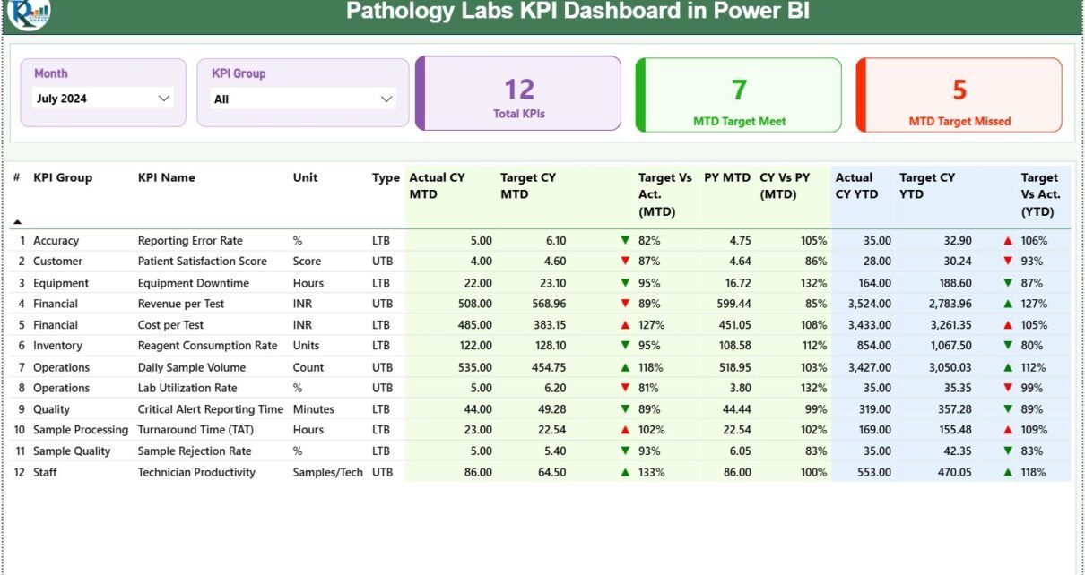
The Summary Page is the main page of the dashboard. It gives a high-level overview of pathology lab performance in just one screen.
Summary Page Slicers
At the top of the dashboard, users see:
-
Month Slicer – Analyze data month by month
-
KPI Group Slicer – Filter KPIs by category
Because of these slicers, lab managers can focus on specific periods or KPI groups instantly.
Why Are KPI Cards Important on the Summary Page?
The dashboard displays three KPI cards that highlight overall performance trends.
-
Total KPIs Count – Total number of KPIs tracked
-
MTD Target Met Count – KPIs that achieved targets in the current month
-
MTD Target Missed Count – KPIs that failed to meet targets
These cards help decision-makers quickly assess whether the lab is on track.
How Does the Detailed KPI Table Add Deeper Insights?
Below the KPI cards, the summary page shows a detailed KPI table that captures complete performance information.
Key Fields in the Detailed KPI Table
-
KPI Number – Unique sequence number
-
KPI Group – Category of the KPI (Quality, Productivity, TAT, etc.)
-
KPI Name – Name of the indicator
-
Unit – Measurement unit such as %, count, or hours
-
Type –
-
LTB (Lower the Better)
-
UTB (Upper the Better)
-
This structure ensures clarity and consistency for all stakeholders.
Click to Purchases Pathology Labs KPI Dashboard in Power BI
How Are MTD KPIs Tracked in the Dashboard?
Month-to-Date KPIs help labs identify issues early and take corrective action.
MTD Metrics Included
-
Actual CY MTD – Current year actual MTD value
-
Target CY MTD – Current year target MTD value
-
MTD Icon –
-
▲ Green arrow for target met
-
▼ Red arrow for target missed
-
-
Target vs Actual (MTD) –
Calculated as:
Actual MTD / Target MTD -
PY MTD – Previous year MTD value
-
CY vs PY (MTD) –
Current Year MTD / Previous Year MTD
Because these figures appear together, users can easily judge current performance and improvement trends.
How Does the Dashboard Track YTD Performance?
Year-to-Date KPIs help pathology labs review cumulative performance across the year.
YTD Metrics Included
-
Actual CY YTD – Current year YTD actual value
-
Target CY YTD – Current year YTD target
-
YTD Icon – Visual indicator of target achievement
-
Target vs Actual (YTD) –
Actual YTD / Target YTD -
PY YTD – Previous year YTD value
-
CY vs PY (YTD) –
Current Year YTD / Previous Year YTD
As a result, lab leadership can track progress without waiting for end-of-year reports.
Click to Purchases Pathology Labs KPI Dashboard in Power BI
What Does the KPI Trend Page Show?
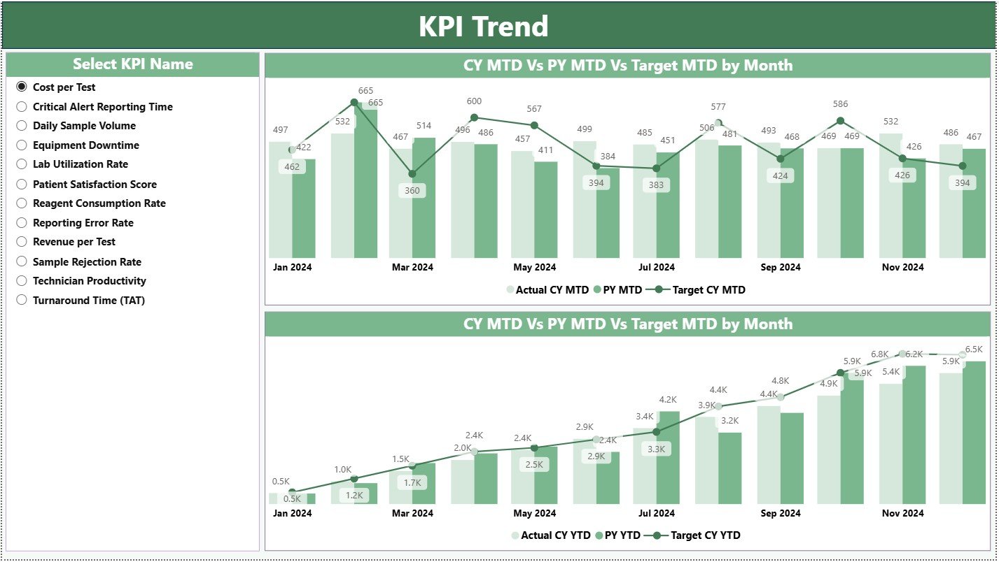
The KPI Trend Page focuses on performance trends rather than static numbers.
Key Elements of the KPI Trend Page
-
Two combo charts
-
Visual comparison of:
-
Current year actuals
-
Previous year actuals
-
Target values
-
-
Separate analysis for:
-
MTD trends
-
YTD trends
-
On the left side, a KPI Name slicer allows users to select a specific KPI and analyze its movement over time.
Why Is Trend Analysis Critical for Pathology Labs?
Trend analysis helps pathology labs:
-
Detect recurring delays
-
Measure process improvements
-
Compare seasonal patterns
-
Review long-term performance
Without trend visibility, labs operate reactively. However, with trend analysis, labs act proactively.
Click to Purchases Pathology Labs KPI Dashboard in Power BI
What Is the KPI Definition Page and Why Is It Hidden?
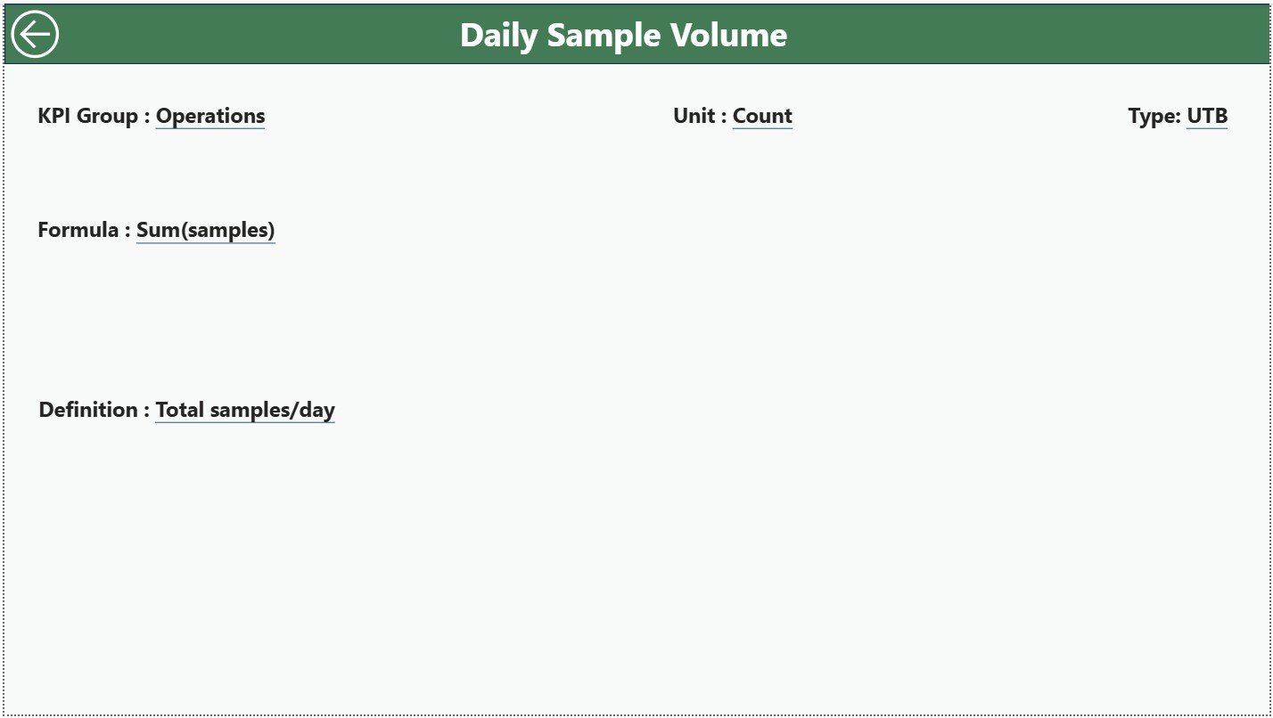
The KPI Definition Page is a drill-through page designed to explain KPIs clearly.
Information Available on the KPI Definition Page
-
KPI Formula
-
KPI Definition
-
Measurement Unit
-
KPI Type (LTB or UTB)
This page remains hidden to keep the dashboard clean. However, users can drill through from the Summary Page whenever they need detailed explanations. A Back button on the top-left corner guides users back easily.
How Is Excel Used as the Data Source?
The dashboard connects to an Excel file that contains three structured worksheets.
What Goes Into the Input_Actual Sheet?
This sheet stores actual performance data.
Users fill:
-
KPI Name
-
Month (first date of the month)
-
MTD actual value
-
YTD actual value
This sheet captures real performance results.
What Goes Into the Input_Target Sheet?
This sheet stores planned targets.
Users fill:
-
KPI Name
-
Month
-
MTD target value
-
YTD target value
Because targets remain separate, performance comparisons stay accurate.
What Goes Into the KPI Definition Sheet?
This sheet defines KPI logic and meaning.
Users fill:
-
KPI Number
-
KPI Group
-
KPI Name
-
Unit
-
Formula
-
Definition
-
Type (LTB or UTB)
As a result, KPI interpretation remains consistent across the organization.
Advantages of Pathology Labs KPI Dashboard in Power BI
A Pathology Labs KPI Dashboard in Power BI delivers several key benefits.
✅ Centralized KPI monitoring
✅ Improved turnaround time tracking
✅ Clear MTD and YTD performance visibility
✅ Target vs actual comparisons
✅ Visual indicators for quick action
✅ Strong trend analysis
✅ Standard KPI definitions
✅ Reduced manual reporting effort
✅ Data-driven decision-making
Because of these advantages, pathology labs can focus more on quality and efficiency.
How Does This Dashboard Improve Laboratory Decision-Making?
This dashboard supports better decisions by:
-
Highlighting underperforming KPIs instantly
-
Showing gaps between targets and actuals
-
Tracking improvements over time
-
Ensuring one version of the truth
As a result, lab managers make faster and more confident decisions.
Click to Purchases Pathology Labs KPI Dashboard in Power BI
Best Practices for the Pathology Labs KPI Dashboard in Power BI
To get the best results, labs should follow these best practices.
Maintain Accurate Excel Data
Ensure consistent KPI names, dates, and units.
Update Data Regularly
Update MTD and YTD values every month.
Standardize KPI Definitions
Keep KPI logic clear and agreed upon.
Avoid Tracking Too Many KPIs
Focus only on KPIs that matter most.
Review Trends Periodically
Analyze KPI trends, not just monthly numbers.
Train Users
Ensure users understand slicers, drill-through, and icons.
Who Can Use the Pathology Labs KPI Dashboard?
This dashboard works well for:
-
Diagnostic lab managers
-
Pathology department heads
-
Hospital administrators
-
Quality and compliance teams
-
Healthcare executives
Because the structure remains flexible, labs can adapt it to different diagnostic units.
Conclusion
A Pathology Labs KPI Dashboard in Power BI transforms raw laboratory data into actionable insights. Instead of fragmented reports, labs gain clarity, accuracy, and speed. Moreover, Excel-based inputs keep implementation simple, while Power BI delivers advanced analytics.
When pathology labs rely on data-driven insights, quality improves, delays reduce, and targets become achievable. Therefore, this dashboard stands as a must-have tool for modern diagnostic operations.
Frequently Asked Questions (FAQs)
What is a Pathology Labs KPI Dashboard in Power BI?
It is a Power BI dashboard that tracks pathology lab KPIs using Excel data, MTD and YTD analysis, icons, and trends.
Do I need Power BI Service to use this dashboard?
No. The dashboard works in Power BI Desktop.
Can I customize KPIs in this dashboard?
Yes. You can add or modify KPIs through the Excel data sheets.
What does LTB and UTB mean?
LTB stands for Lower the Better. UTB stands for Upper the Better.
How often should data be updated?
Monthly updates ensure accurate MTD and YTD tracking.
Is this dashboard suitable for non-technical users?
Yes. Data entry happens in Excel, and the Power BI visuals remain intuitive.
Click to Purchases Pathology Labs KPI Dashboard in Power BI
Visit our YouTube channel to learn step-by-step video tutorials