Managing performance without clear data always leads to confusion, delays, and missed targets. However, when businesses track the right KPIs in a structured way, decision-making becomes faster, smarter, and more reliable. That is exactly where a Performance Management KPI Dashboard in Excel plays a vital role.
In this detailed and practical guide, you will learn what a Performance Management KPI Dashboard in Excel is, why it matters, how it works, its worksheet-wise structure, key features, advantages, best practices, and frequently asked questions. By the end of this article, you will clearly understand how this ready-to-use Excel dashboard helps organizations monitor performance and achieve goals with confidence.
Click to buy Performance Management KPI Dashboard in Excel
What Is a Performance Management KPI Dashboard in Excel?
A Performance Management KPI Dashboard in Excel is a structured and visual reporting tool that tracks key performance indicators (KPIs) related to business goals, operations, productivity, and outcomes.
Instead of reviewing multiple Excel sheets or long MIS reports, this dashboard displays all KPIs in one place. It uses Excel features such as drop-down lists, conditional formatting, formulas, and charts to show performance clearly.
Moreover, because the dashboard works inside Excel, teams can easily update data without advanced technical skills. As a result, managers gain instant visibility into MTD (Month-to-Date), YTD (Year-to-Date), Target vs Actual, and Previous Year comparisons.
Why Do Businesses Need a Performance Management KPI Dashboard in Excel?
Many organizations still track performance manually. However, manual tracking often leads to errors, delays, and inconsistent reporting. On the other hand, a structured KPI dashboard eliminates these problems.
Here is why businesses rely on a Performance Management KPI Dashboard in Excel:
- It centralizes all KPIs in one place
- It improves visibility across departments
- It reduces manual reporting efforts
- It supports faster and data-driven decisions
- It ensures accountability at every level
Because Excel remains widely used, this dashboard fits seamlessly into existing workflows.
How Does a Performance Management KPI Dashboard in Excel Work?
A Performance Management KPI Dashboard in Excel works by linking input sheets to calculation logic and visual outputs.
First, users enter data such as Actuals, Targets, and Previous Year values. Next, Excel formulas calculate MTD, YTD, variances, and trends. Finally, the dashboard visually presents this information using cards, tables, arrows, and charts.
As a result, users can instantly understand whether KPIs are on track, improving, or declining.
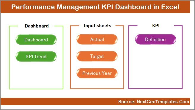
What Is the Worksheet-Wise Structure of the Performance Management KPI Dashboard in Excel?
This dashboard follows a well-structured worksheet design. Each sheet serves a clear purpose, which makes the dashboard easy to use and maintain.
Summary Page – How Does the Summary Page Help?
The Summary Page acts as the index or navigation hub of the dashboard.
Key Features of the Summary Page
- Provides 6 navigation buttons
- Allows quick movement between dashboard sheets
- Improves user experience and usability
- Saves time by eliminating manual scrolling
Because of this design, even first-time users can navigate the dashboard confidently.
Click to buy Performance Management KPI Dashboard in Excel
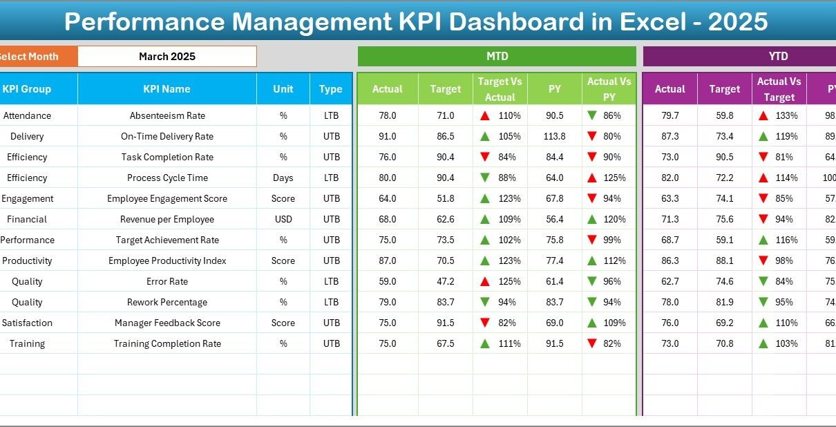
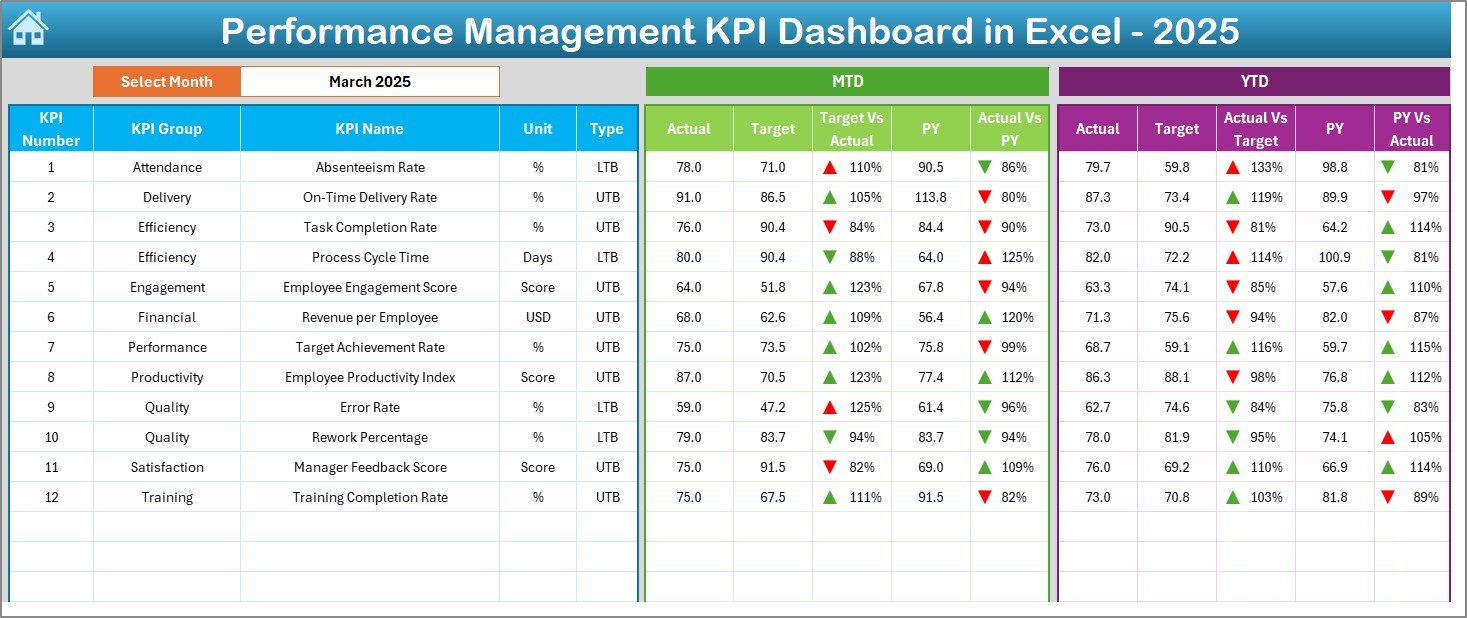
Dashboard Sheet – How Do You Track Overall KPI Performance?
The Dashboard Sheet serves as the main performance view.
Key Features of the Dashboard Sheet
- Month selection using a drop-down at cell D3
- Dynamic updates based on selected month
- Displays MTD Actual, Target, and Previous Year
- Displays YTD Actual, Target, and Previous Year
- Shows Target vs Actual and PY vs Actual
- Uses up/down arrows and color indicators
Because of conditional formatting, users can quickly identify:
- KPIs performing well
- KPIs needing attention
- KPIs declining over time
Click to buy Performance Management KPI Dashboard in Excel
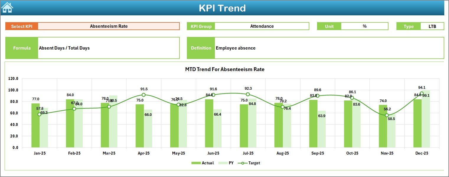
KPI Trend Sheet – How Can You Analyze KPI Trends?
The KPI Trend Sheet focuses on individual KPI analysis.
Key Features of the KPI Trend Sheet
- KPI selection using a drop-down at cell C3
- Displays KPI Group, Unit, and Type (LTB or UTB)
- Shows KPI Formula and Definition
- Provides MTD and YTD trend charts
- Compares Actual, Target, and Previous Year values
As a result, users can easily identify patterns, seasonality, and performance gaps.
Click to buy Performance Management KPI Dashboard in Excel
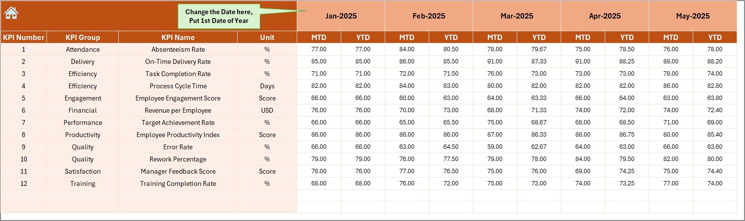
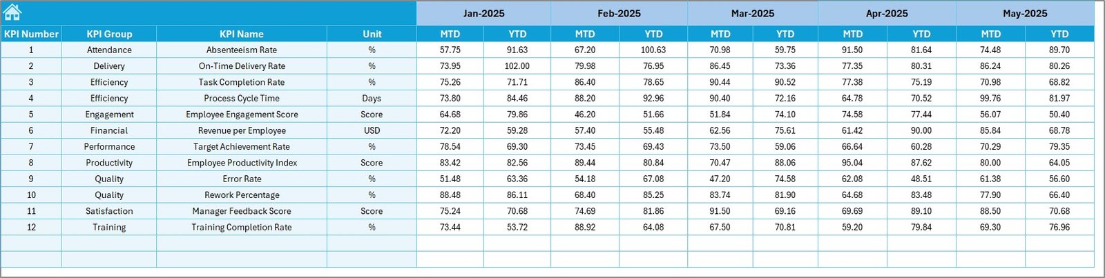
Actual Numbers Input Sheet – How Do You Enter Actual Data?
The Actual Numbers Input Sheet captures current year actual values.
Key Features of the Actual Numbers Input Sheet
- Month selection using cell E1
- Enter only the first month of the year
- Input MTD and YTD actual values
- Automatically feeds calculations to the dashboard
Because of this setup, users avoid repeated manual changes every month.
Click to buy Performance Management KPI Dashboard in Excel
Target Sheet – How Do You Set KPI Targets?
The Target Sheet stores planned performance targets.
Key Features of the Target Sheet
- Enter MTD and YTD target values
- Define realistic and measurable targets
- Align targets with business goals
- Supports variance analysis
As targets remain centralized, performance comparisons stay consistent.
Click to buy Performance Management KPI Dashboard in Excel
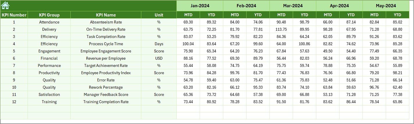
Previous Year Number Sheet – Why Is Historical Data Important?
The Previous Year Number Sheet allows year-over-year analysis.
Key Features of the Previous Year Sheet
- Enter last year’s data in the same format
- Enables PY vs Actual comparison
- Highlights growth or decline trends
- Supports long-term planning
Because of historical comparisons, leadership teams gain better strategic insights.
Click to buy Performance Management KPI Dashboard in Excel
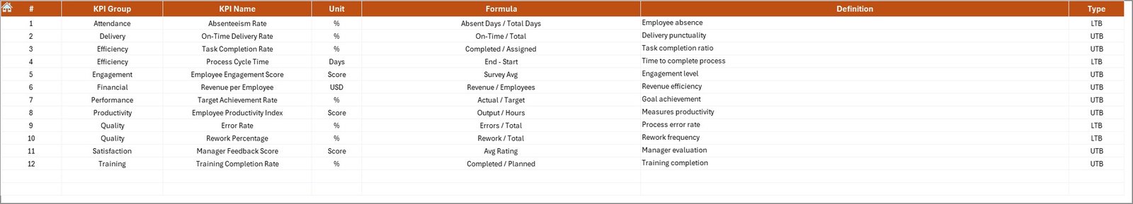
KPI Definition Sheet – How Do You Maintain KPI Consistency?
The KPI Definition Sheet acts as the foundation of the dashboard.
Key Features of the KPI Definition Sheet
- Stores KPI Name and KPI Group
- Defines KPI Unit of measurement
- Specifies KPI Formula
- Explains KPI Definition
- Identifies KPI Type (LTB or UTB)
Because all KPIs remain clearly defined, teams avoid confusion and misinterpretation.
Click to buy Performance Management KPI Dashboard in Excel
What Are the Key Benefits of Using a Performance Management KPI Dashboard in Excel?
A Performance Management KPI Dashboard in Excel delivers measurable value across the organization.
Advantages of Performance Management KPI Dashboard in Excel
- Centralized Performance Tracking
All KPIs remain available in one structured dashboard, which improves clarity.
- Faster Decision-Making
Because data updates instantly, managers act quickly.
- Improved Accountability
Each KPI clearly shows ownership and results.
- Reduced Manual Effort
Automated calculations replace repetitive reporting tasks.
- Better Goal Alignment
Targets stay aligned with business objectives.
- Cost-Effective Solution
Excel eliminates the need for expensive BI tools.
Who Should Use a Performance Management KPI Dashboard in Excel?
This dashboard suits a wide range of users:
- Business owners
- Department heads
- Operations managers
- HR and finance teams
- Strategy and planning teams
Because of its flexibility, teams across industries can customize it easily.
Best Practices for the Performance Management KPI Dashboard in Excel
Following best practices ensures long-term success and accuracy.
- Select Meaningful KPIs
Always choose KPIs that directly impact goals.
- Keep KPI Definitions Clear
Short and simple definitions avoid confusion.
- Update Data Regularly
Consistent updates maintain dashboard accuracy.
- Avoid Overloading KPIs
Focus on critical KPIs instead of tracking everything.
- Review Trends Monthly
Trend analysis reveals early warning signs.
- Use Consistent Units
Uniform units improve comparability.
- Validate Data Before Entry
Accurate inputs lead to reliable insights.
How Does This Dashboard Improve Performance Reviews?
During performance reviews, this dashboard provides:
- Objective performance evidence
- Clear comparisons against targets
- Historical trend visibility
- Transparent discussions
As a result, reviews become data-driven instead of opinion-based.
Can You Customize a Performance Management KPI Dashboard in Excel?
Yes, absolutely.
You can customize:
- KPI lists
- KPI groups
- Targets and thresholds
- Color rules
- Charts and layouts
Because Excel remains flexible, customization remains simple.
Conclusion: Why Should You Use a Performance Management KPI Dashboard in Excel?
A Performance Management KPI Dashboard in Excel transforms raw data into meaningful insights. It improves visibility, strengthens accountability, and supports better decisions.
Moreover, because the dashboard uses Excel, it stays accessible, affordable, and easy to maintain. When organizations track the right KPIs with clarity and discipline, performance improvement becomes measurable and sustainable.
Frequently Asked Questions About Performance Management KPI Dashboard in Excel
- What is the main purpose of a Performance Management KPI Dashboard in Excel?
The main purpose is to track KPIs, compare performance against targets, and support data-driven decisions.
- Can beginners use this dashboard easily?
Yes, the dashboard uses simple Excel features, which makes it beginner-friendly.
- How often should KPI data be updated?
You should update KPI data monthly for accurate tracking.
- What is the difference between MTD and YTD?
MTD shows current month performance, while YTD shows performance from the start of the year.
- Can I add more KPIs later?
Yes, you can easily add or remove KPIs using the KPI Definition Sheet.
- Does this dashboard support multiple departments?
Yes, KPI Groups allow department-wise performance tracking.
- Is Excel better than BI tools for KPI tracking?
Excel works best for small to medium teams due to flexibility and cost savings.
Visit our YouTube channel to learn step-by-step video tutorials
Watch the step-by-step video tutorial:
Click to buy Performance Management KPI Dashboard in Excel