Managing a primary school becomes easier when teachers, administrators, and education leaders view all important information in one place. A Primary Schools Dashboard in Power BI solves this need with clear visuals, simple navigation, and powerful insights. As school operations grow complex, decision-makers need a tool that displays student engagement, teacher performance, fee collection, exam results, parent satisfaction, and other critical indicators in real time.
This detailed guide explains everything about the Primary Schools Dashboard in Power BI. You will learn how it works, why schools use it, and how each page supports smooth academic and administrative performance. You will also discover the key advantages, best practices, and answers to common questions.
Click to Purchases Primary Schools Dashboard in Power BI
What Is a Primary Schools Dashboard in Power BI?
A Primary Schools Dashboard in Power BI is a ready-made reporting system that displays the most important school metrics in a clean and interactive way. Schools use this dashboard to track:
-
Student engagement
-
Teacher rating
-
Scholarship percentage
-
Fee due and fee paid
-
Exam performance
-
Parent satisfaction
-
Subject-wise insights
-
Monthly trends
Because Power BI handles large amounts of data smoothly, schools can review performance with just a few clicks. It helps improve academic quality, strengthen communication, and align school departments toward better results.
Why Do Primary Schools Need a Dashboard?
Primary schools manage many responsibilities. They handle student learning, teacher development, fee collection, classroom activities, exam schedules, and parent feedback. When teams check data in different files, confusion grows. However, a dashboard removes the struggle.
A dashboard:
-
Brings every insight into one place
-
Saves time
-
Reduces human error
-
Supports better planning
-
Helps teachers and leaders understand what needs improvement
Because of this, every modern school benefits from a Power BI dashboard.
Key Features of the Primary Schools Dashboard in Power BI
The dashboard includes five powerful pages, each designed for easy decision-making. Below is a detailed explanation of every page.
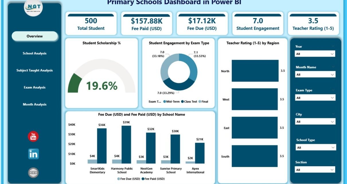
1. Overview Page – What Does It Show?
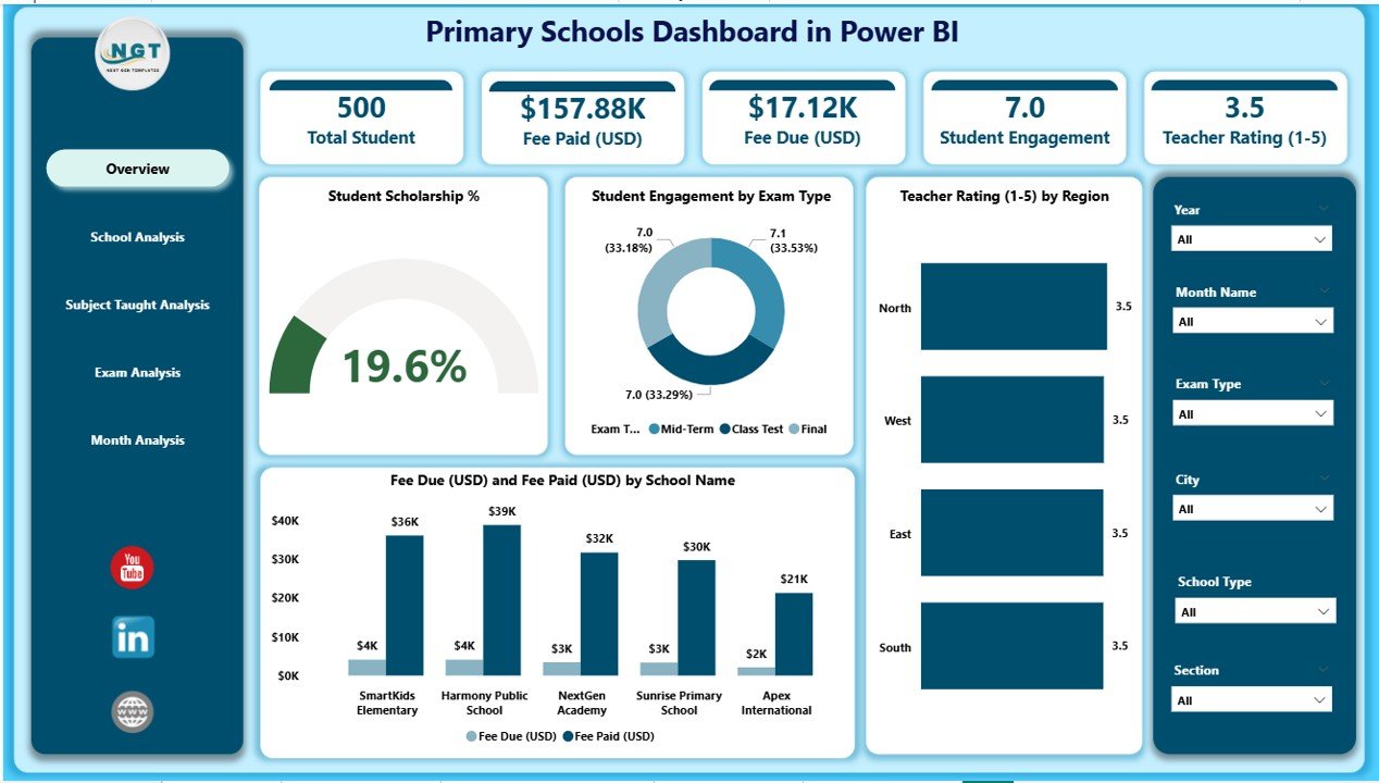
The Overview Page works as the main dashboard page. School leaders open this page first because it gives a quick summary of performance. The page includes slicers that allow users to filter the results based on month, year, exam type, or school type.
This page includes four important KPI cards:
-
Student Scholarship %
-
Student Engagement %
-
Teacher Rating
-
Fee Summary (Due and Paid)
It also includes four charts:
-
Student Scholarship %
-
Student Engagement by Exam Type
-
Teacher Rating by Region
-
Fee Due (USD) and Fee Paid (USD) by School Type
Together, these visuals help users understand how the school performs in academics, fees, and teacher quality. This page supports quick reviews during meetings, presentations, and weekly updates.
2. School Analysis Page – How Does It Help?
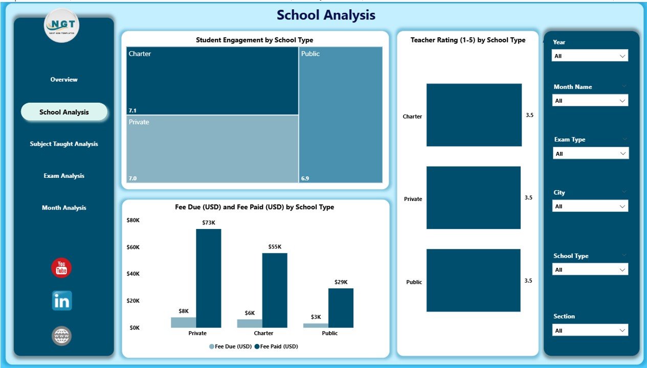
The School Analysis Page focuses on performance comparisons between different schools. This page includes slicers to narrow down data by region, month, or exam type.
It includes three main charts:
-
Student Engagement by School Name
-
Teacher Rating by School Name
-
Fee Due (USD) and Fee Paid (USD) by School Name
This page helps principals and administrators compare:
-
Which school has the highest engagement
-
Which school needs more teacher training
-
Where fee collection improves
-
Where fee due increases
Schools use this page to identify weak areas and create focused improvement plans.
Click to Purchases Primary Schools Dashboard in Power BI
3. Subject Taught Analysis – What Insights Does It Provide?
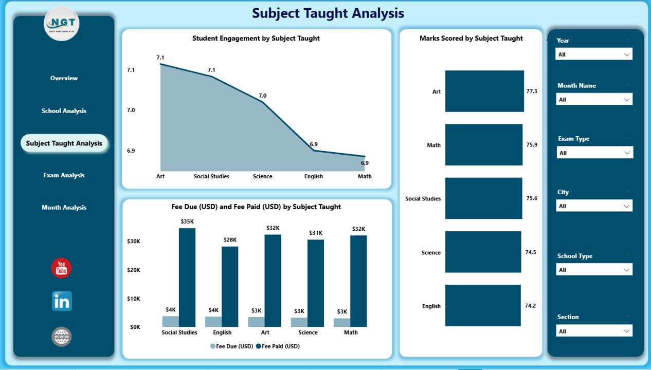
The Subject Taught Analysis Page helps academic coordinators understand performance across different subjects. This page includes slicers so users filter the subjects that matter the most.
This page includes three key charts:
-
Student Engagement by Subject Taught
-
Marks Scored by Subject Taught
-
Fee Due (USD) and Fee Paid (USD) by Subject Taught
These insights help schools:
-
Track subject popularity
-
Identify subjects with lower student interest
-
Review academic performance
-
Monitor fee behavior based on subject type
Academic leaders use this page to improve teaching methods and support subjects that show low performance.
4. Exam Analysis Page – Why Is It Important?
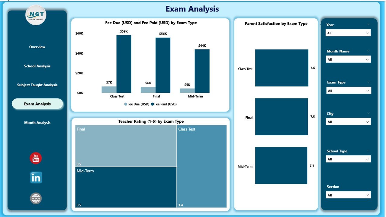
The Exam Analysis Page helps teachers and school leaders understand exam-based performance and satisfaction trends.
This page includes three important charts:
-
Fee Due (USD) and Paid (USD) by Exam Type
-
Parent Satisfaction by Exam Type
-
Teacher Rating by Exam Type
Schools use these insights to understand:
-
How students perform in different types of exams
-
How parents feel about exam quality
-
Whether teacher support increases exam success
This page helps schools improve exam structures and support parents and students better.
5. Monthly Trends Page – What Patterns Does It Show?
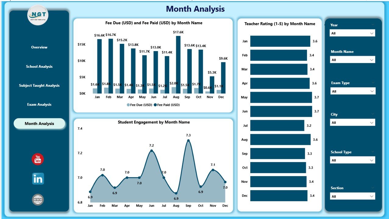
The Monthly Trends Page shows how performance changes month by month. This page becomes helpful for long-term planning.
It includes three important charts:
-
Fee Due (USD) and Fee Paid (USD) by Month
-
Teacher Rating by Month
-
Student Engagement by Month
Schools use this page to understand:
-
Which months show higher engagement
-
When fee payments drop
-
How teacher ratings change over time
These trends help schools prepare better strategies for academic calendars, fee reminders, events, and exam schedules.
Advantages of Using the Primary Schools Dashboard in Power BI
Click to Purchases Primary Schools Dashboard in Power BI
Schools gain many benefits when they use this dashboard. Below are the most important advantages.
1. Better Decision-Making
The dashboard gives complete clarity. School leaders see every important metric instantly. They use these insights to make fast and correct decisions.
2. Improved Student Engagement
The visuals help teams identify low-engagement areas. Teachers create better teaching methods when they understand how students respond.
3. Stronger Teacher Development
Teacher ratings help schools plan training programs. Schools support teachers who need guidance and appreciate teachers who perform well.
4. Transparent Fee Management
The dashboard shows fee due and fee paid clearly. Accounts teams track payments faster and reduce errors.
5. Higher Parent Satisfaction
The dashboard shows how parents feel about exams and learning. Schools improve communication and deliver better experiences.
6. Easy Comparison Between Schools
Multi-school operations become easier. Leaders compare engagement, fees, and ratings across all schools in a single view.
7. Real-Time Insights
Power BI updates the dashboard automatically. Schools track performance daily without manual work.
Best Practices for the Primary Schools Dashboard in Power BI
To get the best results, schools must follow certain best practices.
1. Update Data Regularly
Schools should refresh data daily or weekly. Updated data provides the most accurate insights for planning.
2. Use Clear Naming Conventions
Schools must name fields, subjects, and exam types clearly so users understand the dashboard easily.
3. Train Teachers and Admin Staff
Teams should learn how to use slicers, charts, and filters. When users understand the dashboard well, they take better decisions.
4. Review Monthly Trends
Schools must check monthly trends to understand seasonal performance changes. These insights help with future planning.
5. Involve Parents
Schools can share selected dashboard insights during parent meetings. This builds trust and transparency.
6. Monitor Fee Collection Every Week
A weekly review helps schools manage fee reminders and reduce due amounts.
7. Evaluate Teacher Performance Periodically
Teachers should receive regular feedback based on dashboard insights.
How Does This Dashboard Improve Learning?
The dashboard supports learning in many ways. Teachers understand which subjects need attention. Administrators track student engagement. Parents receive insights that build trust. Because the dashboard displays everything in one place, learning becomes smoother and more organized.
Who Should Use This Dashboard?
The Primary Schools Dashboard supports many stakeholders:
-
School Principals
-
Teachers
-
Academic Coordinators
-
Fee Management Teams
-
Parent Relations Executives
-
Education Consultants
-
Multi-School Management Groups
Every group uses the insights for better planning and daily management.
Conclusion
A Primary Schools Dashboard in Power BI transforms the way schools monitor and improve performance. It brings clarity to student learning, teacher performance, fee management, subject analysis, exam results, and monthly trends. When schools use this dashboard, they gain complete control over academic and administrative activities.
The dashboard supports better decision-making, stronger engagement, improved financial tracking, and overall growth. As educational needs continue to evolve, every modern school should adopt tools like this for smarter and faster insights.
Frequently Asked Questions (FAQs)
1. What is a Primary Schools Dashboard in Power BI?
It is a ready-to-use reporting tool that displays student engagement, teacher ratings, fee details, exam results, and monthly trends in a simple and interactive format.
2. Who can use this dashboard?
Principals, teachers, academic heads, fee teams, and parent coordinators use this dashboard for better planning.
3. Does the dashboard help improve teaching?
Yes. Teachers understand subject-wise performance and engagement trends. They adjust teaching methods based on the insights.
4. Can schools compare multiple branches?
Yes. Schools compare different branches easily using the School Analysis Page.
5. Does the dashboard support financial tracking?
Yes. The dashboard tracks fee due and fee paid by month, school type, and subject taught.
6. Why should schools use Power BI for reporting?
Power BI provides fast, accurate, and interactive visuals. It also saves time and reduces manual reporting.
7. Can schools customize the dashboard?
Yes. Schools can add new KPIs, visuals, subjects, and columns based on their needs.
Visit our YouTube channel to learn step-by-step video tutorials