Managing public health programs without accurate performance tracking often leads to delayed interventions, inefficient resource allocation, and poor outcomes. Therefore, public health organizations increasingly rely on dashboards that convert complex data into clear and meaningful insights. That is exactly where a Public Health Programs KPI Dashboard in Power BI becomes essential.
In this detailed guide, you will learn what a Public Health Programs KPI Dashboard in Power BI is, how it works, why it matters, and how every dashboard page supports better public health decisions. Moreover, you will also understand the Excel data structure, advantages, best practices, and frequently asked questions related to this dashboard.
Click to Purchases Public Health Programs KPI Dashboard in Power BI
What Is a Public Health Programs KPI Dashboard in Power BI?
A Public Health Programs KPI Dashboard in Power BI is an interactive analytics solution designed to monitor, evaluate, and improve the performance of public health initiatives.
Instead of relying on static Excel reports or manual tracking, this dashboard visually presents key performance indicators (KPIs) such as program coverage, service delivery outcomes, target achievement, and year-over-year comparisons.
Because Power BI offers dynamic filters, drill-through capabilities, and automated calculations, public health officials can identify gaps quickly, review trends easily, and act proactively.
Why Do Public Health Programs Need KPI Dashboards?
Public health programs operate under constant pressure to achieve targets, optimize funding, and demonstrate impact. However, without structured performance tracking, decisions often depend on assumptions rather than facts.
A Public Health Programs KPI Dashboard in Power BI helps organizations:
-
Track performance against monthly and yearly targets
-
Identify underperforming KPIs instantly
-
Compare current performance with previous years
-
Improve accountability and transparency
-
Support evidence-based policy decisions
As a result, leadership teams gain clarity, confidence, and control over complex program data.
How Does the Public Health Programs KPI Dashboard Work?
This ready-to-use dashboard uses Excel as a data source and Power BI Desktop for visualization. Because Excel remains familiar and flexible, data entry becomes simple. Meanwhile, Power BI handles calculations, visuals, and interactivity.
You only need to update the Excel file regularly. After refreshing the Power BI file, all KPIs, charts, and indicators update automatically.
Click to Purchases Public Health Programs KPI Dashboard in Power BI
What Are the Key Pages in the Public Health Programs KPI Dashboard in Power BI?
This dashboard contains three focused and purpose-driven pages, each designed to support a specific level of analysis.
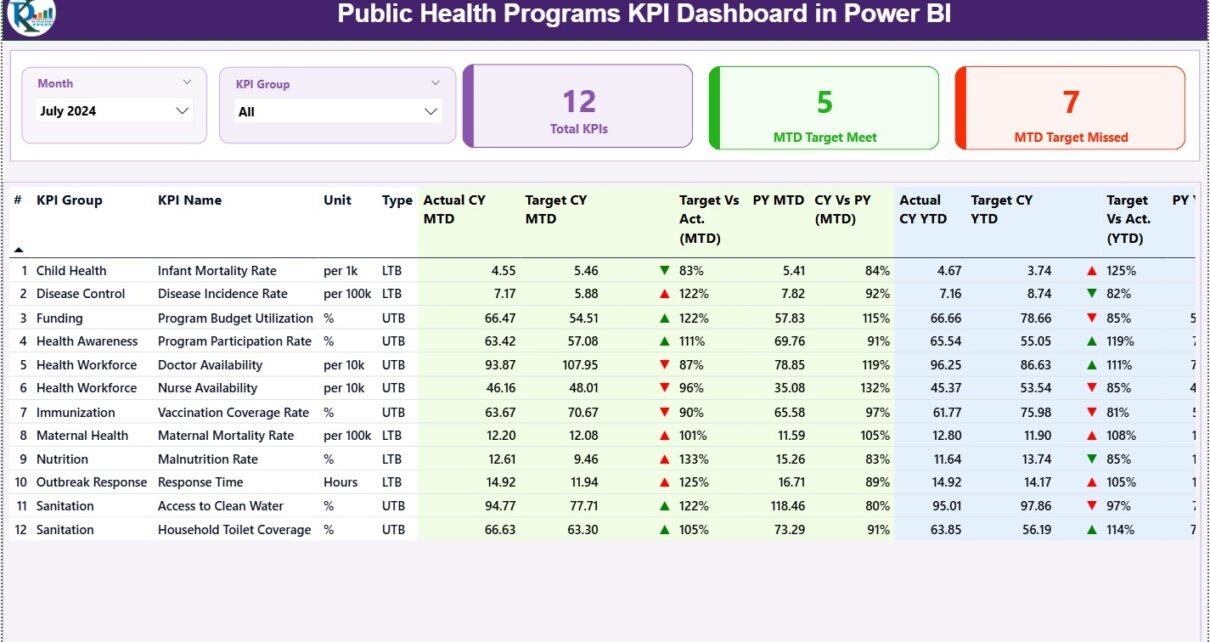
1. How Does the Summary Page Help Monitor KPI Performance?
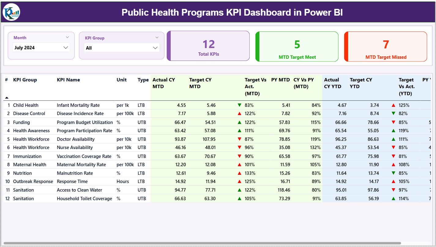
The Summary Page acts as the control center of the entire dashboard. From here, you can view overall performance and dive deeper when needed.
Top-Level Filters (Slicers)
At the top of the page, you will find:
-
Month slicer
-
KPI Group slicer
Because of these slicers, users can analyze performance by time period and KPI category in seconds.
KPI Summary Cards
Just below the slicers, three KPI cards deliver instant insights:
-
Total KPIs Count
-
MTD Target Met Count
-
MTD Target Missed Count
These cards immediately show how many KPIs perform well and how many need attention.
Detailed KPI Performance Table
The Summary Page also includes a detailed performance table with the following fields:
KPI Identification Fields
-
KPI Number – Sequence number of the KPI
-
KPI Group – Category or program area
-
KPI Name – Name of the performance metric
-
Unit – Measurement unit
KPI Type Indicator
-
Type –
-
UTB (Upper the Better)
-
LTB (Lower the Better)
-
This classification helps users interpret performance correctly.
MTD (Month-to-Date) Performance Metrics
-
Actual CY MTD – Current year actual MTD value
-
Target CY MTD – Target value for current month
-
MTD Icon –
-
▲ Green: Target met
-
▼ Red: Target missed
-
-
Target vs Actual (MTD)
Formula: -
PY MTD – Previous year MTD value
-
CY vs PY (MTD)
Formula:
As a result, you can instantly evaluate both target performance and year-over-year progress.
YTD (Year-to-Date) Performance Metrics
-
Actual CY YTD – Current year actual YTD
-
Target CY YTD – Current year YTD target
-
YTD Icon – Status indicator for YTD
-
Target vs Actual (YTD)
Formula: -
PY YTD – Previous year YTD
-
CY vs PY (YTD)
Formula:
Because of this structure, users can track short-term execution and long-term performance in one place.
Click to Purchases Public Health Programs KPI Dashboard in Power BI
2. How Does the KPI Trend Page Support Time-Based Analysis?
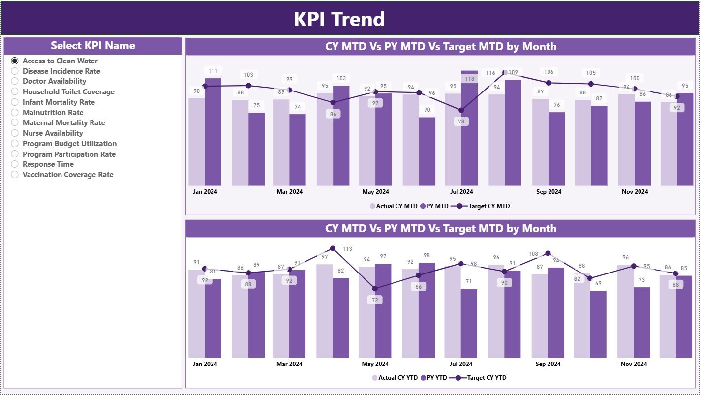
The KPI Trend Page focuses on tracking performance trends over time.
KPI Selection Slicer
On the left side, a slicer allows users to choose a specific KPI name.
Once selected, all visuals update automatically.
Trend Combo Charts
This page contains two combo charts:
MTD Trend Chart
Shows:
-
Current Year Actual
-
Previous Year Actual
-
Target Values
YTD Trend Chart
Shows:
-
Current Year YTD
-
Previous Year YTD
-
Target Values
Because combo charts show both bars and lines, trend interpretation becomes easy and intuitive.
Click to Purchases Public Health Programs KPI Dashboard in Power BI
3. What Is the Purpose of the KPI Definition Page?
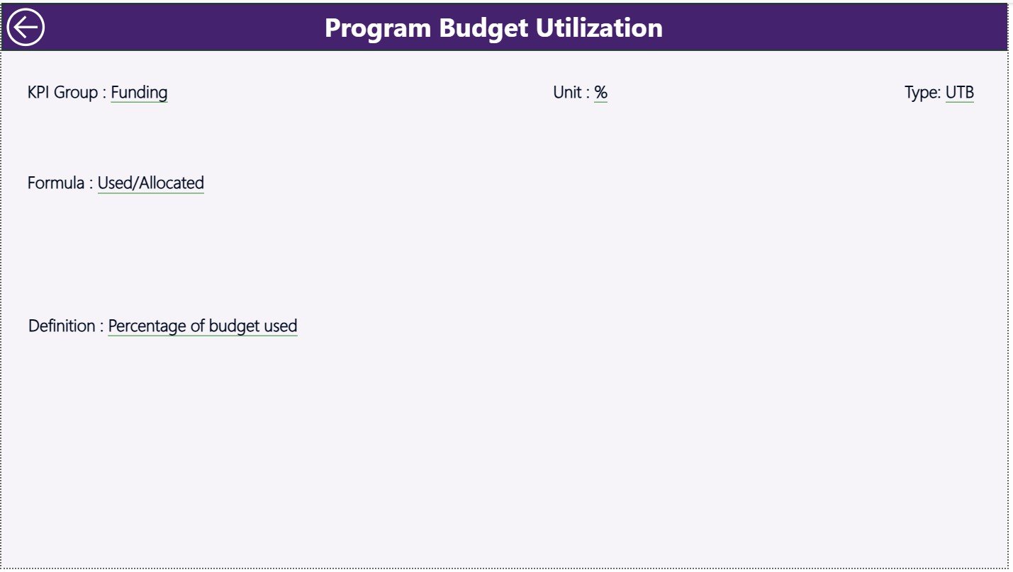
The KPI Definition Page acts as a reference and validation tool.
Drill-Through Functionality
-
This page remains hidden by default
-
Users can drill through from the Summary Page
-
Clicking a KPI opens detailed information
KPI Details Available
-
KPI Formula
-
KPI Definition
-
Measurement logic
-
KPI Type (UTB / LTB)
After reviewing the details, users can return to the Summary Page by clicking the Back button on the top left.
This setup ensures clarity, consistency, and transparency across the organization.
How Is Excel Used as the Data Source for This Dashboard?
Excel serves as the data backbone of this Power BI dashboard. The file contains three structured worksheets.
1. Input_Actual Sheet: How to Maintain Actual Data?
In this sheet, users enter:
-
KPI Name
-
Month (First date of the month)
-
MTD Actual Value
-
YTD Actual Value
Because the structure remains simple, data entry becomes fast and error-free.
Click to Purchases Public Health Programs KPI Dashboard in Power BI
2. Input_Target Sheet: How to Manage Target Values?
This sheet captures:
-
KPI Name
-
Month
-
MTD Target Value
-
YTD Target Value
As a result, the dashboard calculates performance variance automatically.
3. KPI Definition Sheet: Why Is It Important?
This sheet stores master KPI data:
-
KPI Number
-
KPI Group
-
KPI Name
-
Unit
-
Formula
-
Definition
-
Type (LTB or UTB)
Because of this sheet, KPI logic remains standardized across reports.
Advantages of Public Health Programs KPI Dashboard in Power BI
A Public Health Programs KPI Dashboard in Power BI offers multiple operational and strategic benefits.
✅ Improved Visibility
Leaders see all KPIs on one screen instead of multiple reports.
✅ Faster Decision-Making
Visual alerts highlight issues instantly.
✅ Consistent KPI Tracking
Standard definitions eliminate confusion.
✅ Stronger Accountability
Teams track performance transparently.
✅ Cost-Effective Solution
Excel + Power BI reduces dependency on expensive systems.
How Does This Dashboard Support Public Health Decision-Making?
This dashboard supports decision-making by:
-
Identifying underperforming programs early
-
Monitoring progress against health targets
-
Comparing current performance with historical trends
-
Supporting funding allocation decisions
-
Improving reporting to stakeholders
As a result, organizations move from reactive reporting to proactive management.
Click to Purchases Public Health Programs KPI Dashboard in Power BI
Best Practices for the Public Health Programs KPI Dashboard in Power BI
To maximize the dashboard’s value, public health teams should follow these best practices.
✅ Standardize KPI Definitions
Always maintain a single source of truth for KPIs.
✅ Update Data Regularly
Refresh Excel data monthly for accurate reporting.
✅ Train Key Users
Ensure teams understand KPI logic and interpretation.
✅ Use Slicers Wisely
Avoid clutter by limiting filter options.
✅ Monitor Both MTD and YTD
Balance short-term performance with long-term outcomes.
Who Can Use a Public Health Programs KPI Dashboard?
This dashboard benefits a wide range of users, including:
-
Public health program managers
-
Government health departments
-
NGOs and international health agencies
-
Monitoring and evaluation teams
-
Policy analysts and leadership teams
Conclusion: Why Should You Use a Public Health Programs KPI Dashboard in Power BI?
A Public Health Programs KPI Dashboard in Power BI transforms complex operational data into actionable insights. It improves visibility, strengthens accountability, and supports better health outcomes.
Because this dashboard combines Excel’s flexibility with Power BI’s analytical power, it delivers a practical, scalable, and cost-effective solution for public health performance management.
If your organization aims to improve monitoring, reporting, and strategic decision-making, then this dashboard becomes an essential analytical tool.
Frequently Asked Questions (FAQs)
What is a KPI in public health programs?
A KPI measures the performance, efficiency, or outcome of a public health initiative against defined targets.
Why use Power BI for public health dashboards?
Power BI provides dynamic visuals, filters, and automated comparisons that improve analysis and reporting.
Can I customize the KPIs in this dashboard?
Yes. You can add, remove, or modify KPIs using the Excel data source.
How often should the data be updated?
You should update data monthly for accurate MTD and YTD reporting.
Does this dashboard require advanced Power BI skills?
No. Basic Power BI knowledge and Excel skills are sufficient.
Can this dashboard support multiple health programs?
Yes. The KPI Group field allows analysis across multiple programs.
Is Excel mandatory as a data source?
For this version, yes. However, you can connect other data sources if needed.
Click to Purchases Public Health Programs KPI Dashboard in Power BI
Visit our YouTube channel to learn step-by-step video tutorials