Ensuring public safety is one of the most critical responsibilities of any government or municipal authority. With the rise in urban populations and increasing complexity of incidents, decision-makers need accurate, real-time data to respond effectively. That’s where a Public Safety Dashboard in Power BI makes a transformative difference.
This interactive, visually rich dashboard allows administrators, police departments, fire services, and emergency teams to analyze incident trends, monitor performance metrics, and allocate resources efficiently — all from one unified platform.
In this article, we’ll explore what a Public Safety Dashboard is, its structure, features, advantages, best practices, and how it can help drive proactive public safety strategies.
Click to Purchases Public Safety Dashboard in Power BI
What Is a Public Safety Dashboard in Power BI?
A Public Safety Dashboard in Power BI is an interactive reporting tool designed to visualize and analyze data related to public safety operations. It combines data from multiple sources — such as incident logs, service response reports, and regional statistics — and presents them in easy-to-understand charts, KPIs, and visuals.
The goal is simple: to help agencies monitor safety performance, detect problem areas, and make data-backed decisions faster.
Built entirely in Microsoft Power BI, this dashboard captures data from Excel or cloud-based databases, automates analysis, and enables users to filter insights by region, department, or time period.
With just a few clicks, users can view incident resolution rates, satisfaction scores, response costs, and monthly performance trends — all in one interactive space.
Key Features of the Public Safety Dashboard in Power BI
The Public Safety Dashboard consists of five powerful pages, each dedicated to a specific aspect of analysis.
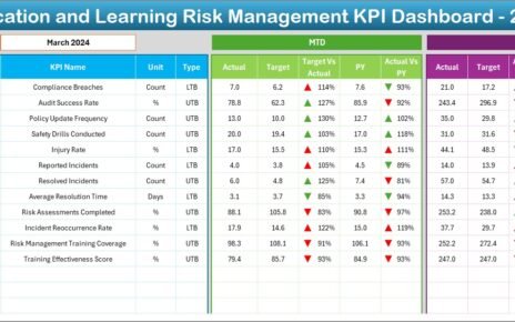
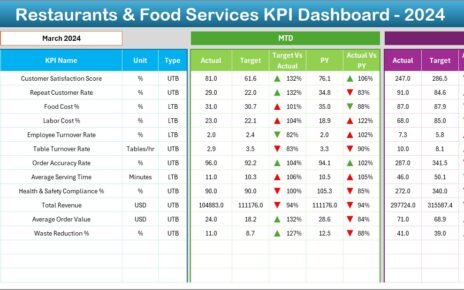
1️⃣ Overview Page
The Overview Page provides a quick summary of all public safety KPIs.
Here you can:
-
Use slicers to filter by region, department, or time frame.
-
View five KPI cards showing overall performance metrics.
Analyze four major charts:
🧍♂️ Public Satisfaction by Department
✅ Resolved Incident Percentage
⚠️ In-Progress Incident % by Region
💰 Total Cost (USD) by Incident Type
This page serves as a command center, giving leaders an at-a-glance understanding of overall operational performance.
2️⃣ Department Analysis Page
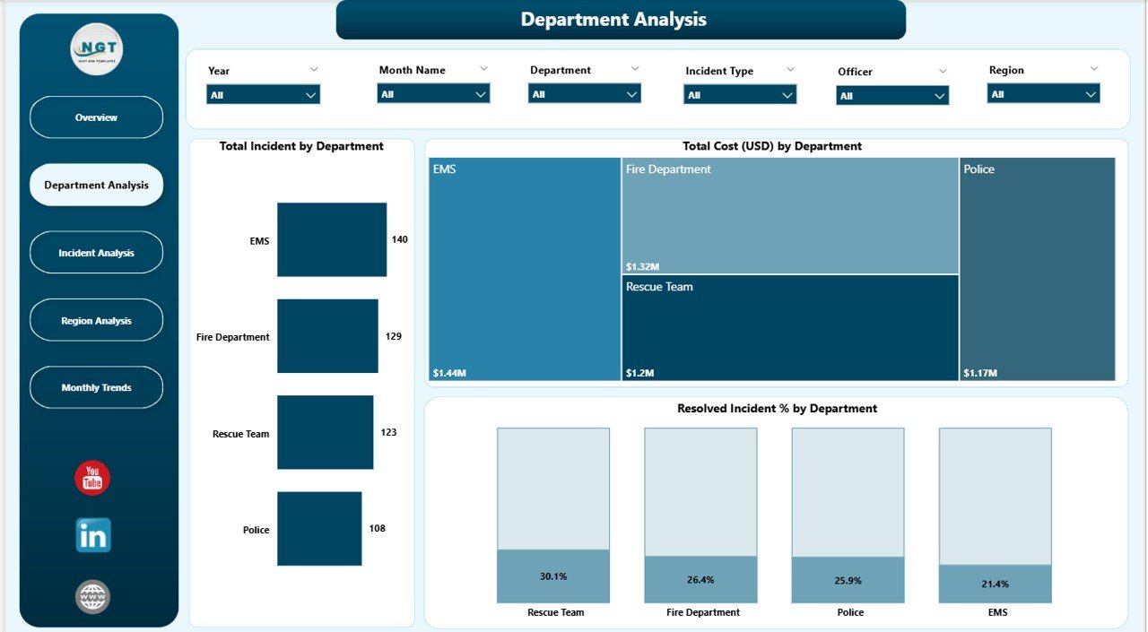
This page dives deeper into performance by department. It helps evaluate how each department contributes to overall safety goals.
Key visualizations include:
-
🏢 Total Incidents by Department – Understand workload distribution.
-
💸 Total Cost (USD) by Department – Identify high-cost units.
-
✅ Resolved Incident % by Department – Measure efficiency and effectiveness.
With these visuals, managers can detect departments that need additional support or training.
Click to Purchases Public Safety Dashboard in Power BI
3️⃣ Incident Analysis Page
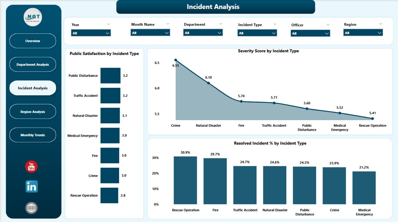
The Incident Analysis Page focuses on incident-level performance and severity.
It displays:
🧾 Public Satisfaction by Incident Type – Measure how the public perceives incident handling.
🔥 Severity Score by Incident Type – Identify which incident types require urgent attention.
⚡ Resolved Incident % by Incident Type – Track how efficiently each type of case gets resolved.
This section enables proactive planning and helps teams set smarter response priorities.
4️⃣ Region Analysis Page
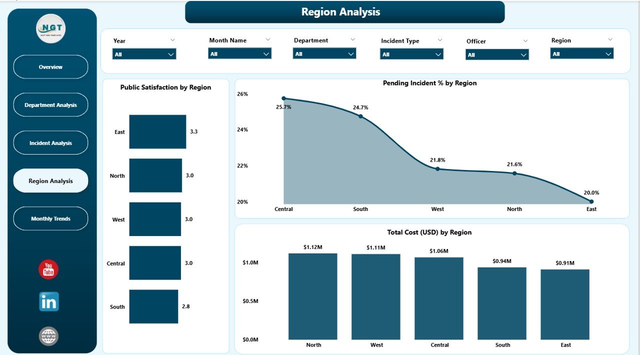
The Region Analysis Page helps compare performance across different areas.
It includes three insightful charts:
-
🗺️ Public Satisfaction by Region
-
🚨 Pending Incident % by Region
-
💵 Total Cost (USD) by Region
By analyzing these metrics, decision-makers can pinpoint underperforming regions and redistribute resources strategically.
5️⃣ Monthly Trends Page
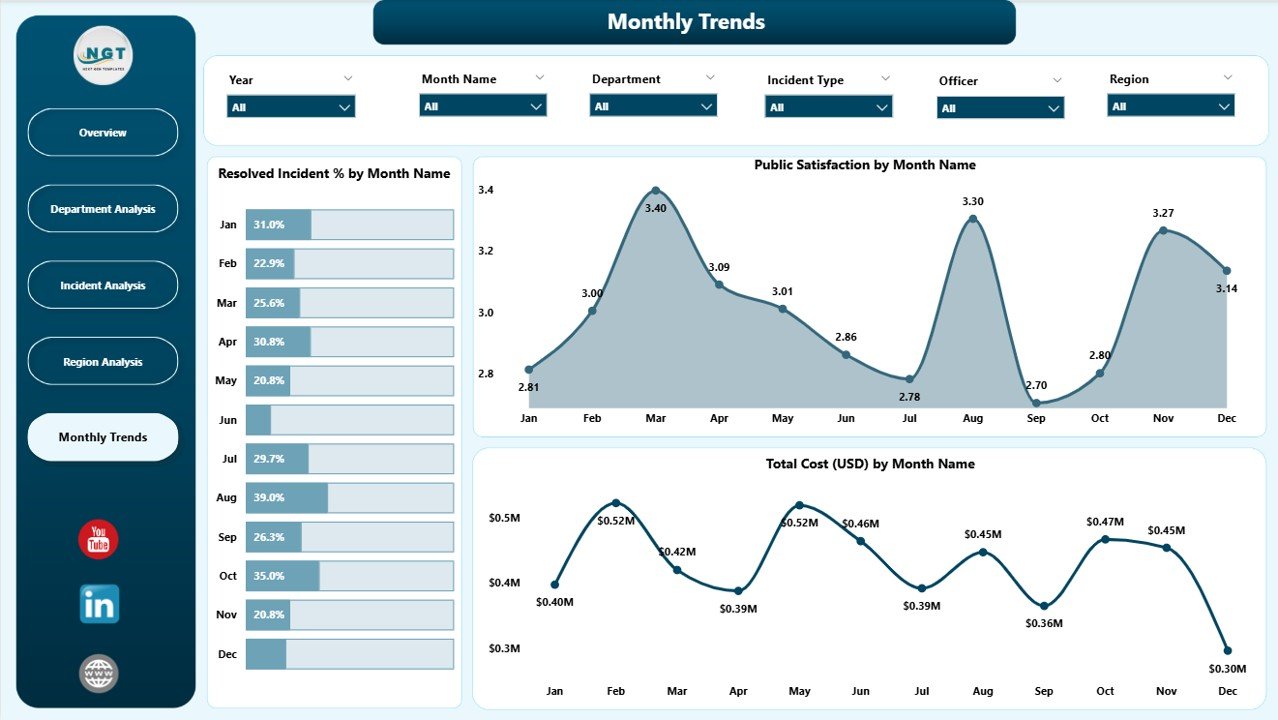
The Monthly Trends Page visualizes performance evolution over time.
It includes:
-
📈 Resolved Incident % by Month Name
-
📊 Public Satisfaction by Month Name
-
💰 Total Cost (USD) by Month Name
This helps users understand seasonal trends, recurring challenges, and overall improvement in public safety outcomes.
Click to Purchases Public Safety Dashboard in Power BI
💡 Why Use Power BI for Public Safety Analytics?
Microsoft Power BI is one of the best tools for public sector analytics because it offers:
-
Real-time interactive dashboards
-
Data integration from multiple systems
-
Easy drag-and-drop visual creation
-
Cloud sharing and collaboration
-
Strong security controls
By using Power BI, public safety agencies can move from reactive decision-making to predictive and proactive strategies.
🧩 How the Public Safety Dashboard Works
The dashboard pulls data from Excel or databases, processes it through Power BI’s modeling engine, and presents it in a visual format.
-
Data Input: Incident data, satisfaction surveys, department costs
-
Processing: Power Query cleans and merges data sources
-
Visualization: Dynamic charts and KPI cards display insights
-
Interaction: Filters, slicers, and drill-throughs allow detailed exploration
Users can easily switch between views, compare KPIs, and export insights for presentations or reports.
🌍 Applications of the Public Safety Dashboard
The Public Safety Dashboard in Power BI can be used by:
-
Municipal governments
-
Police and fire departments
-
Emergency response teams
-
Healthcare agencies
-
Disaster management authorities
It helps these organizations monitor incidents, evaluate performance, and plan resources more effectively.
✅ Advantages of the Public Safety Dashboard in Power BI
1. Centralized Visibility
All data related to incidents, satisfaction, and costs stay in one platform, reducing data silos.
2. Real-Time Monitoring
Live dashboards update automatically, giving leaders immediate access to critical data.
3. Improved Decision-Making
With clear visuals and trend analysis, managers can make smarter, faster decisions.
4. Cost Optimization
Identifying high-cost departments or regions helps reduce unnecessary expenses.
5. Enhanced Accountability
KPIs such as Resolved Incident % and Public Satisfaction help track departmental performance transparently.
6. Citizen Confidence
Improved response times and efficiency directly boost public trust and satisfaction.
⚙️ Opportunities for Improvement
While Power BI provides a powerful platform, agencies can improve their dashboards by:
-
Adding AI-driven predictive analytics for forecasting incident trends.
-
Integrating real-time feeds from IoT sensors or emergency response systems.
-
Enhancing mobile access for on-field officers.
-
Automating incident report uploads from public portals.
-
Creating cross-departmental KPIs for holistic collaboration.
These upgrades can make the Public Safety Dashboard even more actionable and future-ready.
🧠 Best Practices for Building a Public Safety Dashboard in Power BI
Building a successful public safety dashboard requires careful design and planning. Here are some best practices:
1. Define Clear KPIs
Start by identifying measurable indicators like incident resolution rate, satisfaction score, and cost per case.
2. Keep the Design Simple
Avoid cluttered visuals. Use clear charts and concise labels to make insights easy to read.
3. Use Consistent Color Coding
Assign consistent colors for severity levels or regions to improve visual clarity.
4. Implement Data Validation
Ensure that input data is accurate, complete, and timely to maintain report reliability.
5. Automate Refresh Schedules
Enable Power BI’s auto-refresh feature for up-to-date performance monitoring.
6. Encourage User Interaction
Add slicers, filters, and buttons to let users explore data dynamically.
7. Ensure Data Security
Use Power BI’s row-level security and access controls to protect sensitive data.
Use Cases of the Dashboard
1. Police Department
Analyze crime incidents, response time, and community feedback.
2. Fire Department
Track fire response efficiency, property damage cost, and regional risk patterns.
3. Emergency Medical Services
Monitor ambulance response time, patient satisfaction, and cost per dispatch.
4. City Administration
View a complete snapshot of all public safety KPIs to allocate budgets more efficiently.
🔄 Integration Possibilities
The Public Safety Dashboard in Power BI can easily integrate with:
-
Microsoft Excel
-
SQL Server
-
Azure Data Lake
-
Google Sheets
-
APIs from emergency reporting systems
This ensures seamless data flow and continuous improvement in analysis accuracy.
💬 How to Use the Dashboard Effectively
-
Collect accurate incident and department data monthly.
-
Import the data into Excel or Power BI.
-
Refresh the dashboard and filter using slicers (month, department, region).
-
Review MTD and YTD performance trends.
-
Identify weak areas using visual alerts.
-
Export charts or insights for monthly review meetings.
This workflow helps public safety leaders stay informed and make better strategic choices.
Why Every City Should Use a Public Safety Dashboard
Modern cities face increasing safety challenges — from road accidents and fires to community disputes and natural disasters. A data-driven dashboard provides visibility, accountability, and performance management like never before.
It allows local authorities to move beyond intuition-based management and use measurable data to improve citizen safety and trust.
🧩 Real Impact of Public Safety Dashboards
Cities that have adopted data visualization systems report:
-
Up to 30% improvement in response time
-
Higher citizen satisfaction scores
-
Reduced operational costs through resource optimization
-
Better interdepartmental coordination
By turning raw data into actionable insights, Power BI dashboards directly contribute to safer, smarter communities.
🧭 Conclusion
The Public Safety Dashboard in Power BI is more than a reporting tool — it’s a strategic system for improving efficiency, transparency, and trust.
By visualizing incidents, costs, and satisfaction data in one interactive platform, public safety agencies can proactively respond to risks, allocate resources better, and enhance community wellbeing.
When implemented effectively, it transforms raw data into meaningful action — and ultimately, into safer lives.
❓ Frequently Asked Questions (FAQ)
1. What is the main purpose of a Public Safety Dashboard?
The main purpose is to visualize and track safety-related KPIs like incident resolution rate, satisfaction levels, and cost trends — all in one dashboard.
2. Who can use the Public Safety Dashboard in Power BI?
It can be used by municipal governments, police, fire departments, emergency services, and public administrators.
3. Can the dashboard be customized?
Yes. You can customize KPIs, visuals, and filters to match the specific needs of your department or region.
4. What kind of data sources can be connected?
Power BI supports Excel files, SQL databases, web APIs, and cloud-based systems for seamless data integration.
5. How often should the dashboard be updated?
Ideally, it should refresh automatically on a daily or weekly basis to maintain real-time accuracy.
6. What are the benefits of using Power BI for public safety?
It enhances data transparency, enables faster decision-making, reduces response time, and improves citizen satisfaction.
7. Is the dashboard suitable for small municipalities?
Absolutely. Power BI’s scalability makes it perfect for both small towns and large metropolitan cities.
8. Can it support mobile access?
Yes. Power BI dashboards can be viewed and interacted with through mobile devices using the Power BI app.
Visit our YouTube channel to learn step-by-step video tutorials