Public transit systems run thousands of operations every single day. Buses move across long routes, trains run on tight schedules, and passengers depend on reliable service. Because of this huge responsibility, transit authorities need clear insights into their performance. A small delay, a long queue, or a missed trip can affect thousands of people. Therefore, transit agencies need strong data monitoring through a smart dashboard.
A Public Transit KPI Dashboard in Power BI solves this challenge. It brings all important performance metrics into one place. Moreover, it helps management monitor routes, measure service reliability, compare trends, and take quick decisions. This article explains everything about this dashboard in simple words so that anyone can understand and use it.
In this guide, you will learn:
-
What a Public Transit KPI Dashboard in Power BI is
-
Why every transit agency needs it
-
Key features of the dashboard
-
How each page works
-
How the Excel data structure supports reporting
-
Advantages of using this dashboard
-
Best practices to follow
-
Frequently asked questions
Let’s explore the details step by step.
Click to Purchases Public Transit KPI Dashboard in Power BI
What Is a Public Transit KPI Dashboard in Power BI?
A Public Transit KPI Dashboard in Power BI is an analytical reporting tool designed for transport departments, municipal transit authorities, metro corporations, and bus operations teams. It tracks all important KPIs such as ridership, trip completion, service reliability, on-time performance, route efficiency, and monthly trends.
The dashboard connects to an Excel data source and converts raw numbers into meaningful insights. As a result, decision-makers understand their performance quickly. The design is simple, interactive, and suitable even for non-technical users.
Moreover, the dashboard includes slicers, cards, icon indicators, tables, and charts for fast analysis. Teams no longer depend on manual spreadsheets or slow reports. They get real-time clarity with just one click.
Why Do Transit Agencies Need a Public Transit KPI Dashboard?
Public transit systems face daily challenges. Delays, missed targets, low ridership, and vehicle breakdowns affect service quality. Without proper monitoring, these issues stay hidden. Therefore, agencies need a dashboard that shows every detail in a clean and structured format.
Here are some common problems transit teams face:
-
Data stored in multiple spreadsheets
-
Slow reporting and delayed insights
-
No clear comparison between month-to-date (MTD) and year-to-date (YTD) performance
-
Difficulty tracking KPIs across multiple routes or categories
-
No visual indicators for target achievement
-
No easy drill-through options for definitions and formulas
A Public Transit KPI Dashboard in Power BI removes all these issues. It brings clarity, speed, and accuracy to daily transit operations.
Click to Purchases Public Transit KPI Dashboard in Power BI
Key Features of the Public Transit KPI Dashboard in Power BI
This dashboard includes three powerful pages, each designed for a specific purpose. All data comes from an Excel file that contains Actual values, Target values, and KPI Definitions.
Below is a detailed explanation of each page.
1. Summary Page
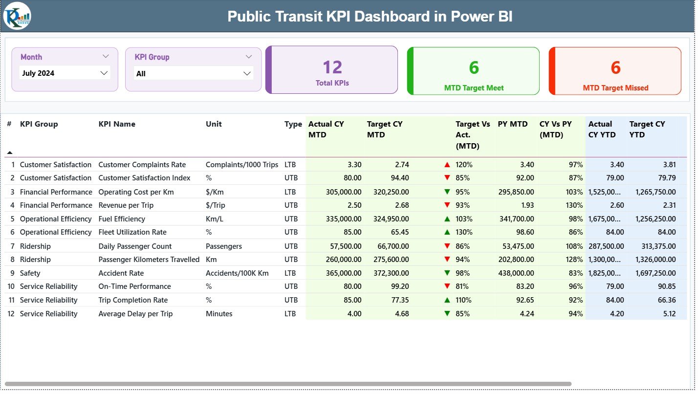
The Summary Page acts as the main control center. Every important KPI appears here along with MTD and YTD insights. Because the page is interactive, users switch between months and KPI groups easily.
Key Elements of the Summary Page
✔ Month Slicer
Users choose the reporting month from this slicer. As soon as a month changes, all visuals update instantly.
✔ KPI Group Slicer
This slicer helps filter KPIs based on categories like:
-
Ridership
-
On-time performance
-
Vehicle reliability
-
Service coverage
-
Customer satisfaction
It saves time and keeps analysis simple.
✔ KPI Cards
The dashboard shows three important cards at the top:
-
Total KPIs Count
-
MTD Target Met Count
-
MTD Target Missed Count
These cards help management understand performance at a glance.
Detailed KPI Table
Below the cards, you see a complete KPI grid. This table shows all key metrics required for performance measurement. Each row includes:
-
KPI Number – Sequence number of the KPI
-
KPI Group – Category or group of the KPI
-
KPI Name – Title of the KPI
-
Unit – Measurement unit like %, minutes, or numbers
-
Type – LTB (Lower the Better) or UTB (Upper the Better)
-
Actual CY MTD – Current year MTD actual number
-
Target CY MTD – Current year MTD target number
-
MTD Icon – Up/Down arrow showing KPI status (▲ for green, ▼ for red)
-
Target vs Actual (MTD) – Actual ÷ Target (%)
-
PY MTD – Previous year’s MTD number
-
CY vs PY (MTD) – Current MTD ÷ Previous MTD (%)
-
Actual CY YTD – Current year YTD actual
-
Target CY YTD – Current year YTD target
-
YTD Icon – Up/Down arrows for YTD status
-
Target vs Actual (YTD) – Actual ÷ Target (%)
-
PY YTD – Previous year’s YTD actual
-
CY vs PY (YTD) – Current YTD ÷ Previous YTD (%)
Because of this structured table, leaders can track performance across multiple aspects without confusion.
Click to Purchases Public Transit KPI Dashboard in Power BI
2. KPI Trend Page
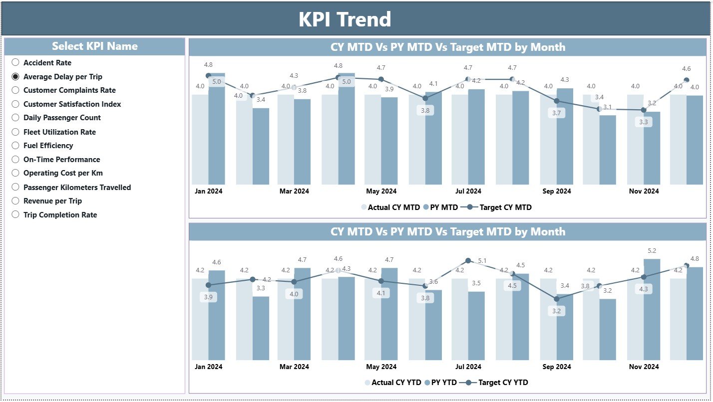
The KPI Trend Page shows the movement of KPIs over time. It includes two combo charts:
✔ MTD Trend Chart
This chart displays:
-
Actual Current Year
-
Previous Year
-
Target values
Because the chart compares three metrics together, users quickly identify improvement or decline.
✔ YTD Trend Chart
This chart shows:
-
Actual Current Year YTD
-
Previous Year YTD
-
Target YTD
This helps users review long-term performance over the entire year.
KPI Slicer
A slicer on the left allows users to choose which KPI they want to analyze. Once selected, both charts update automatically.
Click to Purchases Public Transit KPI Dashboard in Power BI
3. KPI Definition Page
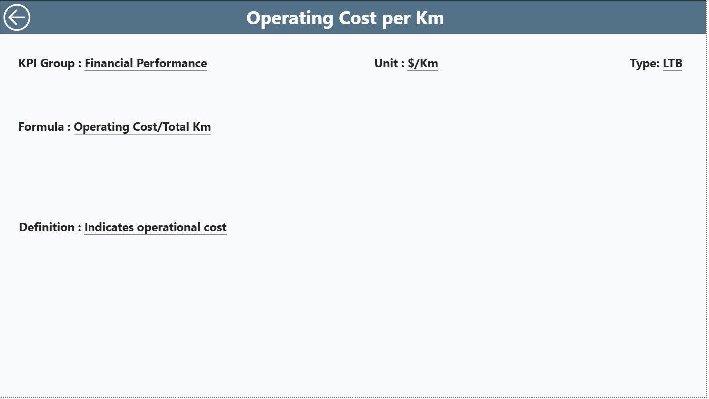
This hidden page stores all details related to KPI definitions. Users reach this page from the Summary Page by drilling through a KPI row.
This page includes:
-
KPI Number
-
KPI Group
-
KPI Name
-
Unit of Measurement
-
Formula
-
Definition
-
KPI Type (LTB/UTB)
There is also a Back Button in the top-left corner to return to the Summary Page.
This page ensures full transparency because every team member understands how each KPI works.
Excel Data Source Structure
The dashboard uses a simple and clean Excel file with three sheets.
1. Input_Actual Sheet
This sheet includes:
-
KPI Name
-
Month (select the first date of the month)
-
Actual MTD
-
Actual YTD
Users only need to enter monthly numbers.
2. Input_Target Sheet
This sheet includes:
-
KPI Name
-
Month
-
Target MTD
-
Target YTD
Targets help compare goals with performance.
3. KPI Definition Sheet
This sheet includes:
-
KPI Number
-
KPI Group
-
KPI Name
-
Unit
-
Formula
-
Definition
-
Type (UTB or LTB)
Because of this structure, the dashboard remains organized, accurate, and easy to update.
Click to Purchases Public Transit KPI Dashboard in Power BI
Advantages of Using a Public Transit KPI Dashboard in Power BI
1. Faster Decision-Making
The dashboard shows insights instantly. Managers do not waste time checking multiple spreadsheets.
2. Improved Service Reliability
By tracking KPIs like on-time performance, trip completion, and delays, agencies improve service quality.
3. Better Passenger Experience
Transit teams understand issues early and fix them quickly, which improves commuter satisfaction.
4. Real-Time Target Monitoring
MTD and YTD icons give immediate feedback about target achievement.
5. Clear Trend Visibility
Trend charts show progress across months and years.
6. Smooth Data Entry
Excel-based data entry keeps the process simple for all teams.
7. Strong Accountability
KPI definitions make sure everyone understands performance measurement rules.
Click to Purchases Public Transit KPI Dashboard in Power BI
Best Practices for Using the Public Transit KPI Dashboard
1. Update Data Every Month
Always fill the Actual and Target sheets on time so the dashboard stays accurate.
2. Use Standard Naming
Maintain consistent KPI names in all sheets to avoid mismatches.
3. Track Both MTD and YTD
Monthly and yearly numbers give balanced insights.
4. Review Trend Charts Regularly
KPI trends show hidden performance gaps early.
5. Train All Users
Teach teams how to use slicers, filters, and drill-through pages.
6. Validate Data Before Uploading
Clean data ensures the dashboard stays error-free.
7. Use KPI Definitions Consistently
Every person must follow the same KPI rules and formulas.
Conclusion
A Public Transit KPI Dashboard in Power BI is a powerful solution for transit agencies that want to improve service quality, increase passenger satisfaction, and track performance accurately. It simplifies complex data, shows instant insights, and supports quick decision-making. With its Summary Page, Trend Page, and Definition Page, the dashboard creates a complete performance monitoring system.
Transit teams no longer depend on scattered spreadsheets or slow reports. Instead, they get an all-in-one view of their operational performance and targets. When used with best practices, this dashboard becomes an essential tool for every transit authority.
Click to Purchases Public Transit KPI Dashboard in Power BI
Frequently Asked Questions (FAQs)
1. What is a Public Transit KPI Dashboard in Power BI?
It is a reporting dashboard that tracks transit performance metrics such as ridership, on-time performance, delays, and monthly trends.
2. Who can use this dashboard?
Transit authorities, bus operators, metro corporations, municipal transport teams, and planning departments use this dashboard.
3. What data does the dashboard require?
It requires monthly Actual and Target numbers along with KPI definitions stored in an Excel file.
4. Can beginners use this dashboard?
Yes. The layout is simple, and anyone can use it without technical knowledge.
5. What are the main pages of the dashboard?
Three pages:
-
Summary Page
-
KPI Trend Page
-
KPI Definition Page
6. Can I customize the KPIs?
Yes. Just update the KPI Definition sheet and adjust your data.
7. What does LTB and UTB mean?
-
LTB = Lower The Better
-
UTB = Upper The Better
8. How often should I update the Excel data?
Update it monthly for the best accuracy.
9. Does the dashboard support drill-through?
Yes. The KPI Definition page opens through drill-through from the Summary Page.
10. Can I add more KPIs later?
Yes. You can add unlimited KPIs as long as the data structure remains consistent.
Click to Purchases Public Transit KPI Dashboard in Power BI
Visit our YouTube channel to learn step-by-step video tutorials