In today’s competitive business environment, quality assurance (QA) plays a vital role in ensuring that products meet the highest standards before reaching the customer. With the rapid advancements in data analysis and reporting tools, Power BI has become a go-to platform for businesses looking to streamline their quality assurance processes and gain insights into performance metrics.
In this article, we will explore the Quality Assurance Dashboard in Power BI, an incredibly useful tool designed to track, manage, and report on the quality of products and services. The dashboard’s key features, advantages, best practices, and frequently asked questions will all be covered, providing you with a complete understanding of how it works and how to use it effectively.
What is a Quality Assurance Dashboard in Power BI?
A Quality Assurance Dashboard in Power BI is a powerful tool that captures and displays key quality metrics in a visually intuitive and interactive way. Designed to help businesses analyze their quality data, the dashboard uses Power BI’s visualization capabilities to track performance and identify areas for improvement.
This ready-to-use dashboard can be linked to an Excel file where the quality data is recorded. The data is then processed and visualized within Power BI, allowing users to monitor key performance indicators (KPIs) related to defects, inspections, rework time, and product quality.
Click to Purchases Quality Assurance Dashboard in Power BI
Key Features of the Quality Assurance Dashboard in Power BI
The Quality Assurance Dashboard in Power BI comes with several essential features that make it a valuable tool for quality management. Below are the five primary pages of the dashboard:
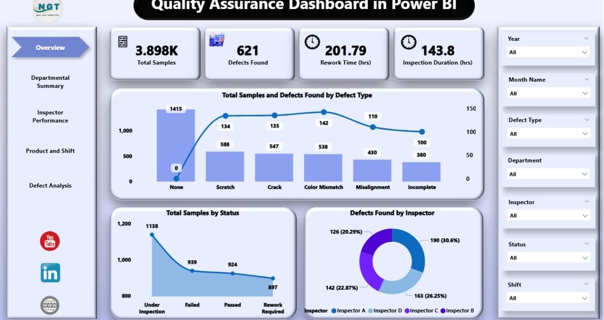
Overview Page

This page serves as the main summary of the quality assurance data. It includes:
-
7 slicers that allow you to filter the data based on different categories.
-
5 cards displaying high-level insights into the QA process.
Key metrics such as:
- Total Samples and Defects Found by Defect Type
- Total Samples by Status
- Defects Found by Inspector
These features give a snapshot of overall performance, enabling decision-makers to see at a glance how well the company is performing in terms of quality.
Departmental Summary

The Departmental Summary page provides insights into how each department is performing. It features:
-
7 slicers for filtering by various attributes.
3 charts:
- Rework Time (hrs) by Department
- Inspection Duration (hrs) by Department
- Defects Found by Department
This page helps pinpoint which departments are performing well and which may need additional support or improvement.
Inspector Performance

The Inspector Performance page is designed to track how individual inspectors are performing in terms of inspections and defect detection. It contains:
-
7 slicers for filtering by inspector or other parameters.
3 charts:
- Total Samples and Defects Found by Inspector
- Avg. Rework Time (hrs) by Inspector
- Inspection Duration (hrs) by Inspector
Click to Purchases Quality Assurance Dashboard in Power BI
This page provides valuable insights into the performance of the QA inspectors and helps identify areas where additional training or resources may be needed.
Product and Shift

This page focuses on product lines and shifts, allowing businesses to assess how quality varies across different products and work shifts. It includes:
-
7 slicers for filtering by various product or shift data.
4 charts:
- Inspection Duration (hrs) by Product Line
- Total Samples by Product Line
- Defects Found by Product Line
- Rework Time (hrs) by Shift
This page helps to track the performance of product lines and shifts, helping managers make data-driven decisions regarding scheduling, resources, and product focus.
Defect Analysis

The final page is dedicated to defect analysis. This is where businesses can track defects over time and spot trends or recurring issues. The page includes:
-
7 slicers for filtering by defect-related data.
2 charts:
- Total Samples and Defects Found by Month Name
- Inspection Duration (hrs) by Month Name
This page is crucial for identifying patterns in defects and understanding how they evolve over time, enabling businesses to address recurring quality issues.
Advantages of Using a Quality Assurance Dashboard in Power BI
Using a Quality Assurance Dashboard in Power BI provides businesses with several advantages that can significantly improve their quality control processes. Some of the key benefits include:
-
Improved Decision-Making: With clear, real-time insights, decision-makers can quickly assess the performance of quality assurance processes and make informed decisions.
-
Increased Efficiency: The dashboard reduces manual reporting and data compilation efforts, freeing up resources and saving time.
-
Better Accountability: With performance metrics available at both the departmental and individual levels, accountability is improved, and issues are identified quickly.
-
Cost Savings: By identifying defects early and understanding trends, businesses can reduce rework costs and improve overall product quality.
-
Data-Driven Insights: With powerful data visualizations, businesses can uncover insights that would be difficult to spot in raw data alone.
-
Customizable Reports: Power BI allows users to easily customize the dashboard to fit the specific needs of their organization or industry.
Best Practices for the Quality Assurance Dashboard in Power BI
To make the most out of the Quality Assurance Dashboard in Power BI, it’s essential to follow best practices that ensure effective use of the tool and accurate data analysis. Below are some key best practices to consider:
1. Ensure Accurate Data Input
Before you can rely on the insights provided by Power BI, make sure that the data being captured is accurate and up-to-date. Consistently monitor the input data to ensure its reliability.
2. Customize Slicers for Better Filtering
The 7 slicers present in each page of the dashboard offer an excellent way to filter and drill down into specific data points. Ensure that these slicers are customized to capture the most relevant data for your needs.
3. Regularly Update the Dashboard
Regularly updating the dashboard ensures that the data is current and provides real-time insights. It is also essential to refresh the dashboard periodically to incorporate new data.
4. Use the Dashboard to Spot Trends
Use the defect and inspection data to identify trends over time. This can help you predict potential issues and make proactive changes to improve product quality.
5. Train Employees on Dashboard Use
Ensure that team members and decision-makers are properly trained on how to interpret the dashboard data. This will empower them to make informed decisions based on the insights provided.
6. Integrate with Other Data Sources
Power BI allows you to connect multiple data sources. Consider integrating data from different systems, such as ERP or CRM, to get a more comprehensive view of your operations.
Conclusion
The Quality Assurance Dashboard in Power BI is a powerful tool for businesses looking to enhance their quality management processes. By offering real-time insights into key quality metrics, the dashboard helps businesses identify inefficiencies, track performance, and make data-driven decisions. With its customizable reports and interactive charts, this tool can revolutionize how businesses manage their quality assurance activities and improve product standards.
Frequently Asked Questions (FAQs)
What is the purpose of a Quality Assurance Dashboard in Power BI?
The purpose of a Quality Assurance Dashboard in Power BI is to visualize and track key quality metrics such as defects, inspection duration, rework time, and product performance. This helps businesses analyze data, spot trends, and make informed decisions to improve product quality and efficiency.
How can the dashboard help improve defect detection?
The dashboard provides a comprehensive overview of defects, including which products or departments are producing the most defects. By tracking these metrics, businesses can identify patterns, address root causes, and make improvements to reduce defect rates.
Is the Quality Assurance Dashboard customizable?
Yes, the Quality Assurance Dashboard in Power BI is highly customizable. Businesses can add or remove charts, slicers, and KPIs to meet their specific needs, and integrate data from other sources to get a complete picture of quality performance.
How does the Quality Assurance Dashboard improve decision-making?
With its real-time data and interactive visualizations, the dashboard makes it easy for decision-makers to assess quality performance and take action quickly. The insights provided help businesses optimize their quality control processes and make data-driven decisions.
Can the dashboard be used for tracking inspector performance?
Yes, the dashboard includes an Inspector Performance page, which tracks individual inspector metrics such as defect detection, rework time, and inspection duration. This helps businesses assess inspector performance and provide targeted training or resources where needed.
Visit our YouTube channel to learn step-by-step video tutorials