Radio and podcast platforms grow every day, and media companies now depend on fast insights to plan content, understand audience behavior, manage costs, and track revenue. Because the media industry moves quickly, a traditional spreadsheet or manual reporting method cannot support decision-making. Teams need a smart, interactive, and visually rich reporting system.
A Radio & Podcasts Dashboard in Power BI solves this problem. It pulls together data from multiple sources and presents everything in clean visuals, quick metrics, and real-time insights. When you use Power BI, you see what works, what needs improvement, and how your content performs across countries, devices, platforms, and genres.
In this detailed article, you will learn everything about the Radio & Podcasts Dashboard in Power BI. You will explore its structure, page-wise breakdown, benefits, real-use cases, best practices, and answers to the most common questions.
Let’s walk through the complete guide.
Click to Purchases Radio & Podcasts Dashboard in Power BI
What Is a Radio & Podcasts Dashboard in Power BI?
A Radio & Podcasts Dashboard in Power BI is a ready-to-use analytical tool that tracks all major performance indicators for radio channels, podcast shows, digital listening apps, and audience engagement platforms. It brings your revenue, cost, satisfaction rating, platform performance, genre analysis, and monthly trends into one interactive dashboard.
Since Power BI offers dynamic visuals, slicers, and drill-down options, your team can view insights quickly without wasting time in manual calculations. You select the platform, month, device type, or country, and the numbers update instantly. This helps content managers, marketing teams, finance teams, and leadership make better choices.
Why Do Radio and Podcast Teams Need a Power BI Dashboard?
Radio and podcast businesses rely on accurate and fast data. You track so many things—content type, show performance, user location, advertising revenue, production costs, marketing spend, and listener satisfaction.
However, without a dashboard:
-
Reports take time
-
Data stays scattered
-
Decisions slow down
-
Team alignment becomes difficult
-
Growth opportunities get ignored
A Power BI dashboard brings everything together. It supports better planning, helps identify your profitable content, and highlights areas where cost increases or satisfaction decreases.
Key Features of the Radio & Podcasts Dashboard in Power BI
This dashboard includes five powerful and well-structured pages. Each page focuses on a specific type of analysis. Below is the complete explanation of every page built inside the Power BI file.
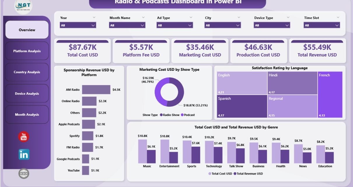
1. Overview Page — The Main Control Center
The Overview Page acts as the central hub of the dashboard. You see a complete picture of your performance in one place. The layout includes slicers, cards, and visual charts that simplify the analysis.
What You See on the Overview Page
-
Slicers to filter the data quickly
-
4 KPI Cards
-
Total Sponsorship Revenue (USD)
-
Total Marketing Cost (USD)
-
Total Satisfaction Rating
-
Total Cost and Total Revenue
-
-
4 Charts that show:
-
Sponsorship Revenue by Platform
-
Marketing Cost by Show Type
-
Satisfaction Rating by Language
-
Total Cost and Total Revenue by Genre
-
Because everything updates instantly when you choose a platform, language, or show type, you understand your audience and financial performance in seconds.
2. Platform Analysis Page — Compare All Platforms Easily
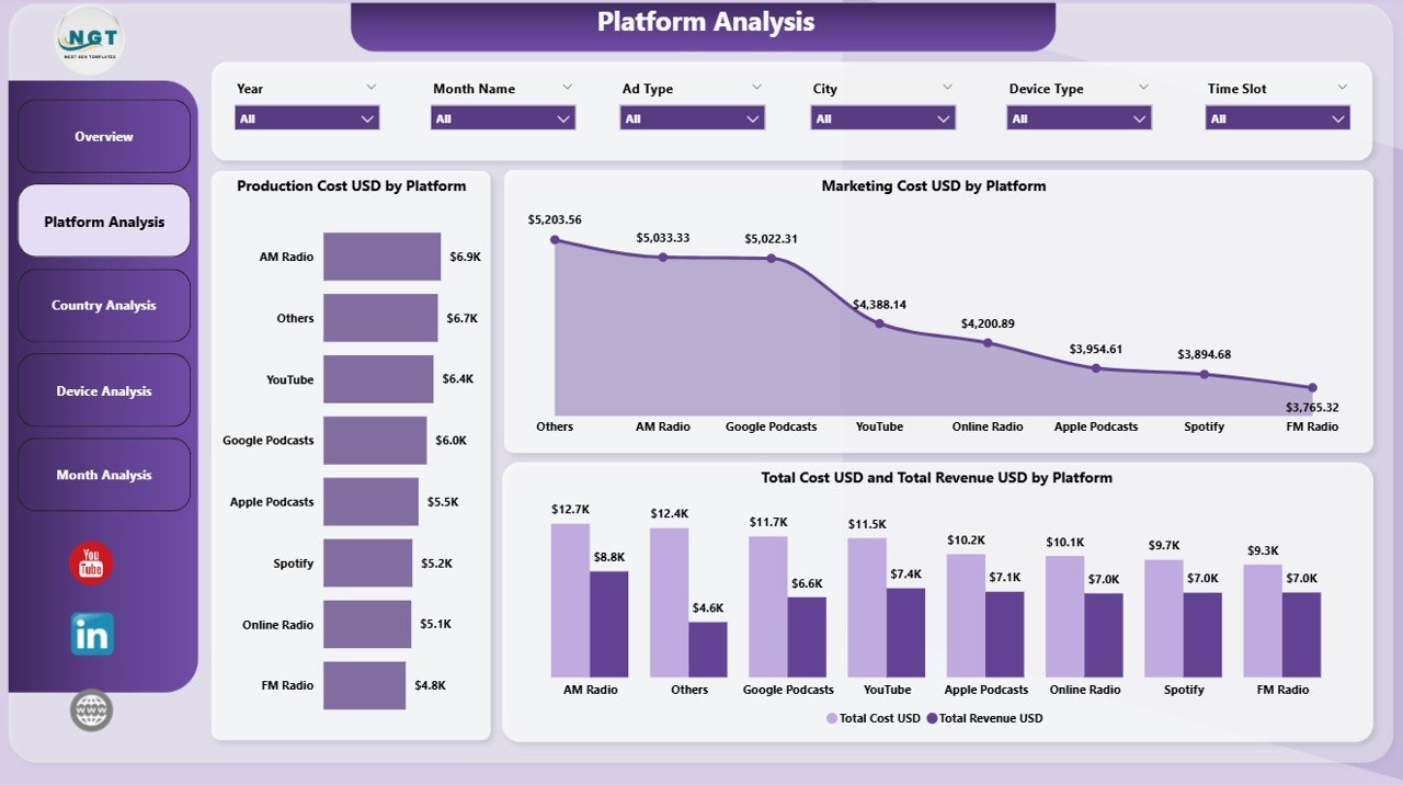
The Platform Analysis Page helps you compare performance across different streaming platforms such as Apple Podcasts, Spotify, FM Radio, YouTube, Amazon Music, and others.
The Platform Analysis Page Includes:
-
3 Insightful Charts
-
Production Cost (USD) by Platform
-
Marketing Cost (USD) by Platform
-
Total Cost and Total Revenue (USD) by Platform
-
This page helps managers identify which platform delivers the best listener base, best revenue, and lowest cost. It also brings transparency to your promotions and distribution budget.
Click to Purchases Radio & Podcasts Dashboard in Power BI
3. Country Analysis Page — Track Audience Behavior Across Regions
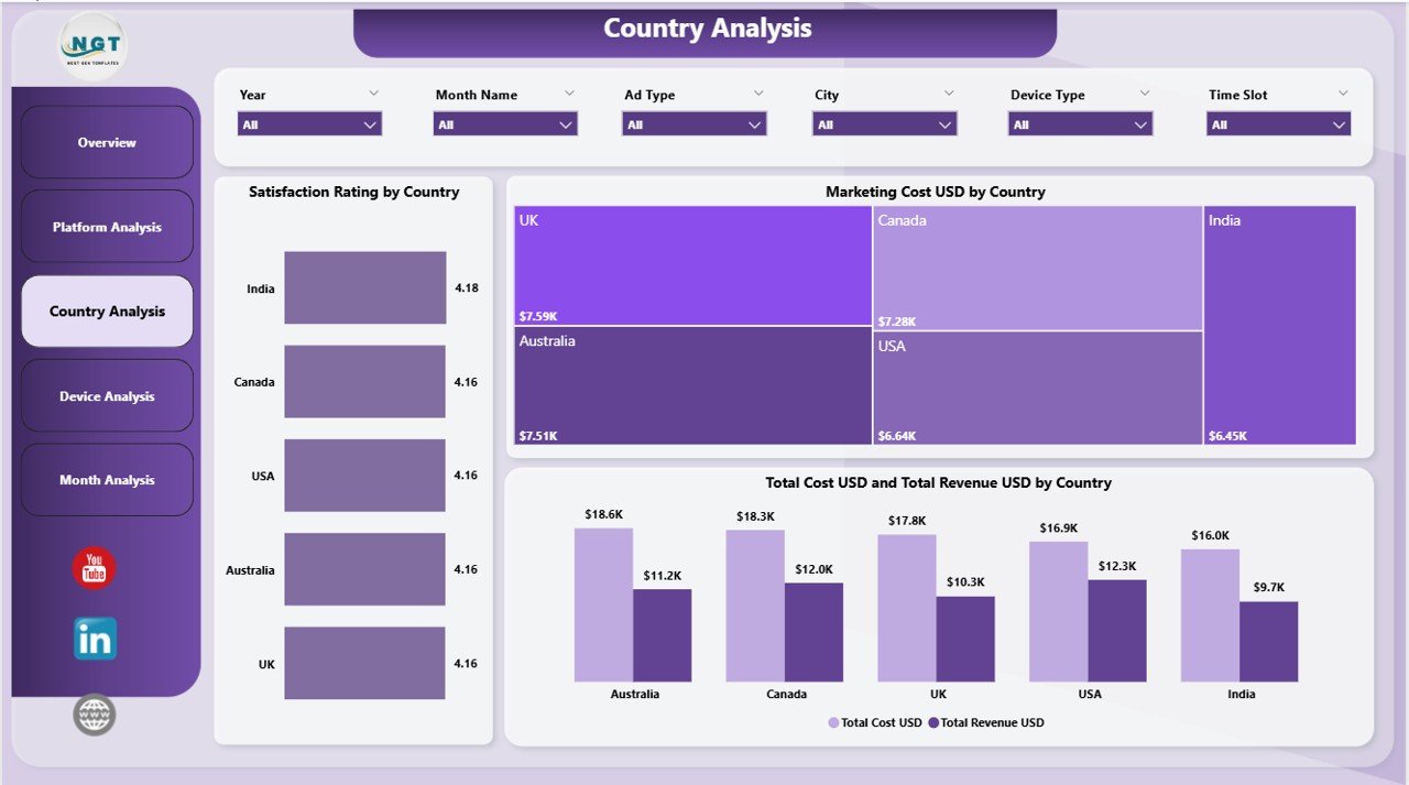
Radio and podcast audiences vary by geography. A show that performs well in one country may not do well in another. The Country Analysis Page helps you understand these differences.
Charts on This Page:
-
Satisfaction Rating by Country
-
Marketing Cost (USD) by Country
-
Total Cost and Total Revenue (USD) by Country
With this information, you plan region-wise content, target the right listeners, and manage your marketing spend efficiently.
4. Device Analysis Page — Understand Where Users Listen
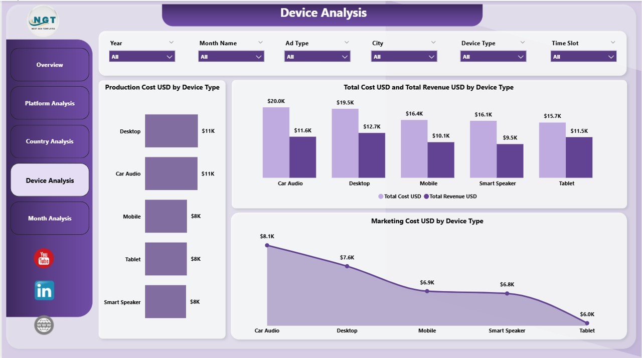
Listeners use various devices: mobile phones, laptops, smart speakers, car audio systems, tablets, and home radio stations. The Device Analysis Page shows performance by device type so you can optimize your content for the right device category.
Key Charts Displayed:
-
Production Cost (USD) by Device Type
-
Marketing Cost (USD) by Device Type
-
Total Cost and Total Revenue (USD) by Device Type
These insights help your technical team, marketing team, and content creators focus on the best-performing devices.
5. Monthly Trends Page — Spot Patterns and Seasonal Behavior
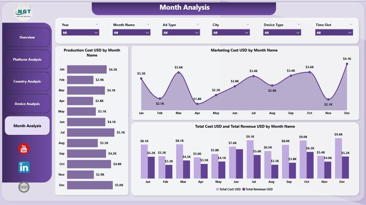
The dashboard ends with a strong analytical page known as Monthly Trends. It helps you see performance growth and decline month-by-month.
This Page Includes:
-
Production Cost (USD) by Month
-
Marketing Cost (USD) by Month
-
Total Cost and Total Revenue (USD) by Month
Since trend analysis plays a major role in media planning, this page helps you track audience behavior through festivals, holidays, or major events.
What Makes This Dashboard Powerful?
You get full visibility into:
-
Revenue patterns
-
Platform popularity
-
Country-wise trends
-
Device performance
-
Cost structure
-
Satisfaction ratings
-
Monthly behavior
When all of these insights sit inside a single dashboard, your team takes faster and smarter decisions.
Advantages of Radio & Podcasts Dashboard in Power BI
⭐ 1. You Make Faster Decisions
The dashboard updates instantly when you change a filter. You view real-time results without waiting.
⭐ 2. You Track Revenue Growth Easily
The charts show clear trends, so you understand which platform or genre brings the most money.
⭐ 3. You Manage Marketing Costs Better
You compare cost across platforms, countries, months, and devices. This helps you cut waste.
⭐ 4. You Improve Content Strategy
You track what listeners like through satisfaction ratings, genres, languages, and show types.
⭐ 5. You Get a Single Source of Truth
Instead of scattered files, your entire team uses one dashboard. This creates accuracy and improves coordination.
⭐ 6. You Identify High-Performing Regions
Country-wise charts help you plan campaigns, advertisements, and content based on audience behavior.
⭐ 7. You Measure Device Preferences
Device analysis helps you optimize your audio quality and distribution strategy.
⭐ 8. You Gain Better Visibility into Monthly Trends
Monthly charts help you track improvements, declines, and seasonal performance.
Who Should Use the Radio & Podcasts Dashboard in Power BI?
Click to Purchases Radio & Podcasts Dashboard in Power BI
This dashboard is useful for:
-
Radio stations
-
Podcast producers
-
Digital audio platforms
-
Media managers
-
Advertising agencies
-
Content creators
-
Streaming service providers
-
Marketing teams
-
Finance departments
Anyone who manages audio content, listener engagement, or advertising revenue will benefit from this dashboard.
Best Practices for Using the Radio & Podcasts Dashboard in Power BI
✔ 1. Update Your Master Dataset Regularly
Fresh data keeps your insights accurate and reliable.
✔ 2. Use Filters for Deep Analysis
Explore performance by platform, country, device type, language, or month.
✔ 3. Compare Revenue and Cost Together
Always check cost vs. revenue to find your profitable areas.
✔ 4. Track Satisfaction Ratings Every Month
Ratings reveal listener expectations and help you improve content.
✔ 5. Analyze Platforms Separately
Different platforms behave differently. View their unique performance patterns.
✔ 6. Review Monthly Trends Before Planning
Monthly charts help you plan future promotions and releases.
✔ 7. Use Device Insights to Improve Distribution
When you know the most used devices, you optimize audio quality accordingly.
✔ 8. Build Predictive Insights Later
You can expand this dashboard with forecasting models inside Power BI.
Conclusion
Radio and podcast businesses need fast insights to stay competitive. A Radio & Podcasts Dashboard in Power BI brings together your revenue, cost, satisfaction ratings, device usage, monthly behavior, and platform performance into one place. It helps you plan your content, optimize your marketing spend, understand your audience, and track performance effectively.
When you follow the best practices, you get a powerful decision-making tool that supports your growth and improves your listener experience.
Frequently Asked Questions (FAQs)
1. What does this Radio & Podcasts Dashboard track?
It tracks production cost, marketing cost, revenue, satisfaction ratings, platform performance, country analysis, device usage, and monthly trends.
2. Can beginners use this dashboard easily?
Yes. The layout stays simple, clean, and supported by slicers, so anyone can understand it quickly.
3. Does the dashboard work with Excel data?
Yes. You can connect data from Excel, CSV, SQL Server, Google Sheets, and other sources.
4. Can I customize the KPIs?
Yes. You can add, remove, or modify KPIs based on your business needs.
5. Which teams benefit the most from this dashboard?
Marketing teams, content teams, finance teams, leadership, radio channels, podcast creators, and media agencies.
6. Can this dashboard track multiple countries?
Yes. The Country Analysis page helps you compare audience behavior across different locations.
7. Does it support real-time updates?
Yes, when you connect your data source to a live database or automated file.
8. Can I export insights to PDF or Excel?
Power BI allows exporting visuals, insights, and tables easily.
9. Is this dashboard suitable for small media companies?
Yes. Small and large companies both benefit from this dashboard.
10. Can I add forecasting or AI insights?
Yes. Power BI supports predictive analytics, AI visuals, and advanced forecasting models.
Visit our YouTube channel to learn step-by-step video tutorials
Click to Purchases Radio & Podcasts Dashboard in Power BI