Radio and podcast platforms continue to grow rapidly as content consumption shifts to audio-first experiences. Listeners now prefer on-the-go content, and broadcasters need fast insights to track performance. However, traditional reporting methods slow teams and hide important patterns. Manual Excel sheets, scattered files, and delayed updates block quick decision-making.
A Radio & Podcasts KPI Dashboard in Power BI solves these problems with real-time visibility, interactive charts, and structured reporting. It brings together production, audience insights, advertising metrics, operational KPIs, and performance trends—allowing media teams to work smarter and deliver better content.
If you want a ready-to-use template, you can explore the Radio & Podcasts KPI Dashboard in Power BI here:In this detailed article, you will learn what this dashboard is, how it works, its advantages, the structure of each page, best practices, and answers to common questions. You will also understand how to use the underlying Excel file and how each component supports better decision-making.
Click to buy Radio & Podcasts KPI Dashboard in Power BI
What Is a Radio & Podcasts KPI Dashboard in Power BI?
A Radio & Podcasts KPI Dashboard in Power BI is a structured reporting tool that tracks critical metrics related to radio shows, podcast episodes, listener trends, advertising performance, operational efficiency, and content engagement. It helps media teams monitor Month-to-Date (MTD) and Year-to-Date (YTD) performance with complete clarity.
Because Power BI connects directly with Excel files or any data source, the dashboard updates instantly after each data refresh. This makes the reporting cycle smooth and error-free.
Teams use this dashboard to:
- Monitor audience growth
- Track episode performance
- Analyze listener engagement
- Compare actual KPIs with targets
- Measure YOY (Year-over-Year) trends
- Improve advertising revenue
- Understand production efficiency
Since radio and podcast businesses depend on timely decisions, structured analytics become essential. This dashboard converts raw data into useful visuals, strong insights, and clear performance indicators.
Why Do Radio and Podcast Teams Need a KPI Dashboard?
Today’s audio platforms work with multiple content categories, audience groups, and advertising flows. The industry grows fast, and decision-makers need accurate numbers every day. A Power BI dashboard supports this need because it:
- Brings all KPIs into one place
- Updates numbers instantly
- Reduces manual reporting effort
- Helps identify problems early
- Supports content planning and scheduling
- Improves audience understanding
Without a dashboard, teams rely on manual sheets that take time and cause errors. With Power BI, managers track everything with just a few clicks.
How Does the Radio & Podcasts KPI Dashboard Work?
The dashboard uses a simple Excel data source that includes three sheets:
- Input_Actual – stores actual MTD and YTD numbers
- Input_Target – stores target MTD and YTD numbers
- KPI Definition – stores KPI metadata like KPI Name, Unit, Group, and Formula
Power BI imports this data and applies calculations and visuals to create interactive pages.
The dashboard includes the following major pages:
- Summary Page
- KPI Trend Page
- KPI Definition Page (Drill Through)
Each page provides a different layer of insights to help media teams understand performance from every angle.
Dashboard Structure: Pages, Insights, and Features
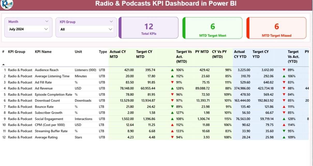
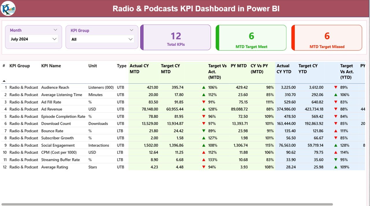
Summary Page – The Complete KPI Snapshot
The Summary Page is the central hub of the dashboard. It allows users to monitor MTD and YTD performance at a glance. It also shows KPI groups, status icons, and comparison analysis.
Key Features of the Summary Page
- Month slicer to select the reporting period
- KPI Group slicer to filter KPIs based on category
- Three KPI cards on top:
- Total KPIs Count
- MTD Target Met Count
- MTD Target Missed Count
Below these cards, the dashboard displays a detailed table with rich insights.
Details Included in the KPI Summary Table
- KPI Number – unique sequence for each KPI
- KPI Group – category to which the KPI belongs
- KPI Name – name of the performance metric
- Unit – measurement unit
- Type – LTB (Lower the Better) or UTB (Upper the Better)
- Actual CY MTD – actual value for current month
- Target CY MTD – target value for current month
- MTD Icon (▲ ▼) – shows KPI performance status
- Target vs Actual (MTD) – actual ÷ target in %
- Previous Year MTD – last year’s number for the same period
- CY vs PY (MTD) – YOY % comparison
- Actual CY YTD – total actuals for the year till date
- Target CY YTD – total target for the year till date
- YTD Icon (▲ ▼) – shows KPI performance status
- Target vs Actual (YTD) – actual ÷ target in %
- Previous Year YTD – previous year’s cumulative value
- CY vs PY (YTD) – YOY % comparison
This page gives a complete overview of all KPIs in a simple and easy-to-digest format.
Click to buy Radio & Podcasts KPI Dashboard in Power BI
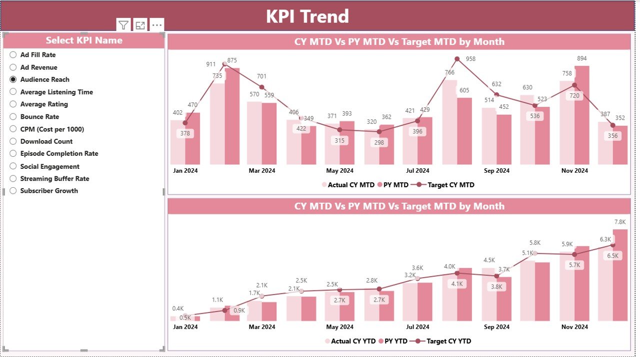
KPI Trend Page – Understanding Performance Over Time
The KPI Trend Page helps users track performance for each KPI across different periods. It includes two combo charts:
- MTD Trend Chart – shows monthly Actual, Target, and Previous Year values
- YTD Trend Chart – shows cumulative performance vs targets and last year
A slicer on the left allows users to choose any KPI. Once selected, both charts update instantly.
This feature helps media teams:
- Identify performance patterns
- Compare growth across months
- Understand target gaps
- Align content strategies
- Measure year-over-year progress
For radio and podcast platforms, trend analysis is critical because listener habits change over time.
Click to buy Radio & Podcasts KPI Dashboard in Power BI
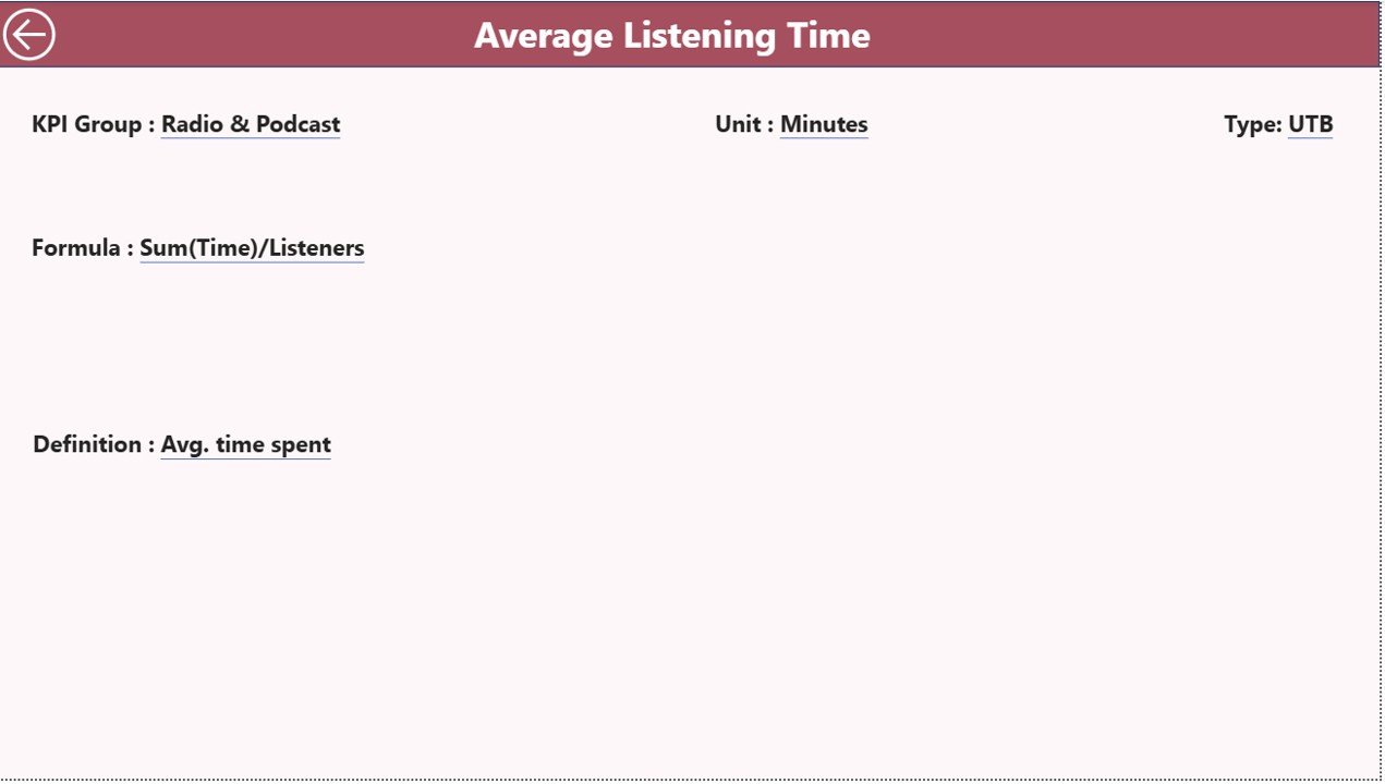
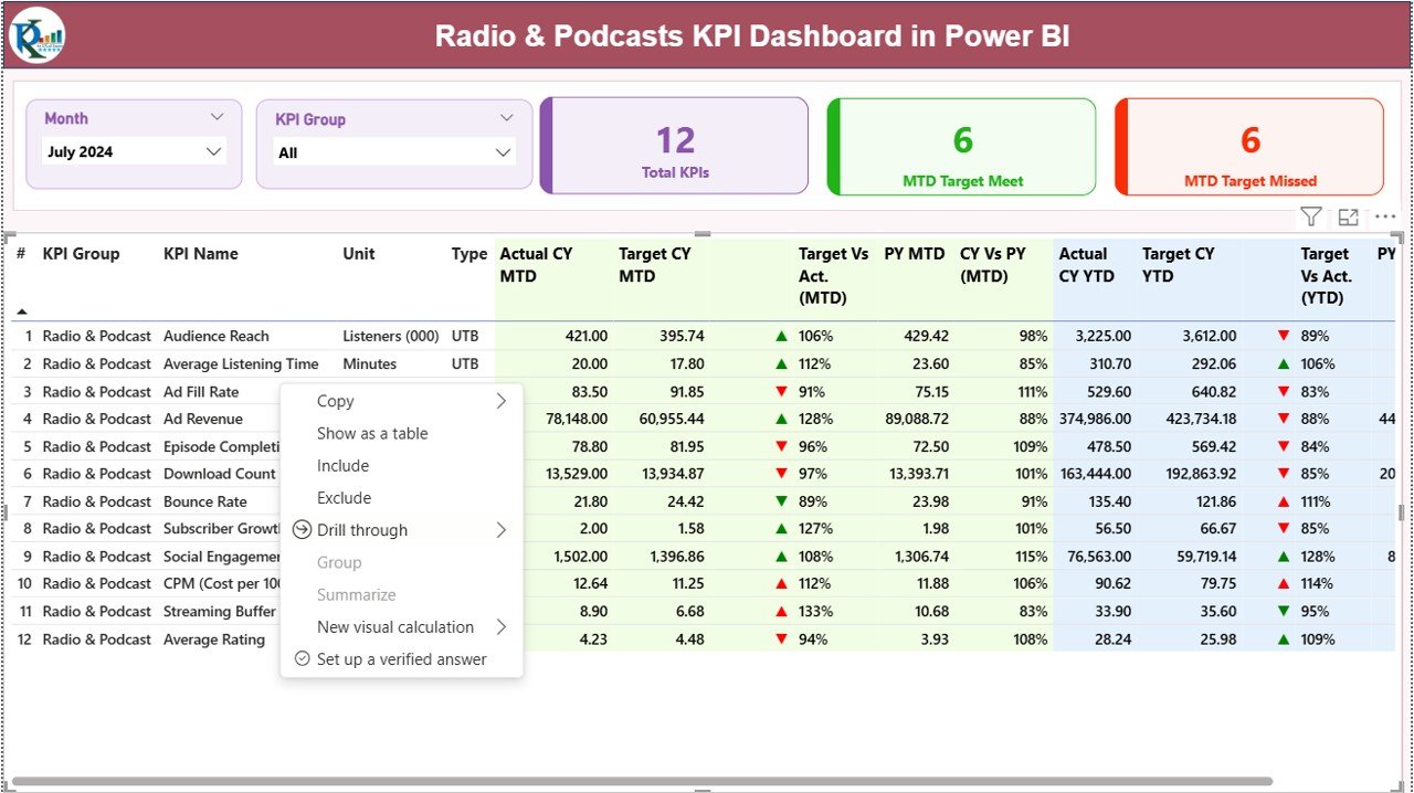
KPI Definition Page – Drill Through for Deeper Knowledge
The KPI Definition Page is a hidden page designed for drill-through analysis. From the Summary Page, users can right-click a KPI and navigate to this page.
This page shows:
- Formula
- KPI definition
- KPI group
- Unit
- Type
- Calculation logic
This helps teams understand how the KPI works and why the values appear the way they do.
It also builds clarity among new team members and makes onboarding easy.
Click to buy Radio & Podcasts KPI Dashboard in Power BI
Excel Data Structure for the Dashboard
The dashboard reads data from three Excel sheets:
- Input_Actual Sheet
You enter:
- KPI Name
- Month (first date of the month)
- MTD actual value
- YTD actual value
Since audio platforms use monthly reporting cycles, this structure keeps data clean.
- Input_Target Sheet
You enter:
- KPI Name
- Month
- MTD target
- YTD target
Targets help media teams compare performance and set benchmarks.
Click to buy Radio & Podcasts KPI Dashboard in Power BI
- KPI Definition Sheet
This sheet defines the basic structure of each KPI. It includes:
- KPI Number
- KPI Group
- KPI Name
- Unit
- Formula
- Definition
- Type (LTB or UTB)
This design keeps the dashboard flexible and easy to maintain.
What KPIs Can You Track with This Dashboard?
Although KPIs vary across radio and podcast platforms, common groups include:
Audience & Engagement KPIs
- Listener Growth
- Average Listening Duration
- Episode Completion Rate
- Listener Retention
- New Subscribers vs Lost Subscribers
Content Performance KPIs
- Episode Downloads
- Live Show Ratings
- Weekly Show Reach
- Episode Click-through Rate
- Content Engagement Score
Revenue KPIs
- Advertising Revenue
- Sponsorship ROI
- Cost per Listener
- Revenue per Episode
- Monthly Monetization Score
Operational KPIs
- Production Cycle Time
- Episode Publishing Speed
- Content Quality Score
- Script Review Turnaround Time
The dashboard supports all KPIs, and you can add new KPIs at any time through the Excel file.
Advantages of the Radio & Podcasts KPI Dashboard in Power BI
- Real-Time Reporting
The dashboard updates instantly when you refresh Power BI. Teams get fresh numbers without waiting for manual reports.
- Better Content Decisions
Since you see how each episode performs, you can adjust the content strategy, improve topics, and strengthen audience engagement.
- Clear KPIs for Every Team
Different departments like content, production, marketing, finance, and operations get relevant insights in one place.
- Strong Audience Understanding
The dashboard highlights listener behavior, content trends, and engagement patterns.
- Error-Free Reporting
Since formulas are built into Power BI, the risk of manual mistakes becomes zero.
- Faster Monthly Reviews
MTD and YTD comparisons help teams understand performance quickly during review meetings.
- Ready-to-Use Template
If you use the ready-made dashboard template, you can start reporting within minutes:
Best Practices for Using the Radio & Podcasts KPI Dashboard
- Keep KPI Names Clear
Use simple KPI names so all teams understand what each number means.
- Update Actuals Every Month
Make sure the Input_Actual sheet stays updated to get accurate insights.
- Set Realistic Targets
Strong targets lead to meaningful comparisons and better performance tracking.
- Use Drill-Through Wisely
Review formulas and definitions often to ensure complete clarity.
- Analyze Trends Before Making Decisions
Trends show the real picture and help you plan future content strategies.
- Keep KPI Groups Organized
Audience, content, operations, and revenue groups must stay clean for easy filtering.
- Refresh the Dashboard Regularly
Refresh ensures Power BI reads the latest Excel data.
- Review YTD and MTD Together
This helps teams understand short-term and long-term success.
Conclusion
The Radio & Podcasts KPI Dashboard in Power BI transforms complex data into simple, powerful insights. It helps radio broadcasters, podcast creators, media managers, and content teams understand performance clearly. Instead of spending time on manual reporting, teams focus on improving content, growing audiences, and increasing revenue.
Because the dashboard uses a clean Excel source and three structured pages, anyone can use it without technical effort. With interactive visuals, drill-through pages, and trend analysis, radio and podcast teams make faster, smarter, and more confident decisions.
You can explore the ready-made template here:
Frequently Asked Questions (FAQs)
- What is a Radio & Podcasts KPI Dashboard in Power BI?
It is a reporting tool that tracks all important KPIs related to content performance, audience insights, revenue, and operations in radio and podcast platforms.
- Who can use this dashboard?
Radio stations, podcast creators, audio streaming companies, media agencies, and content teams use this dashboard for performance tracking.
- Does the dashboard update automatically?
Yes. Power BI updates the visuals as soon as you refresh the data connected to the Excel file.
- Can I add more KPIs?
Yes. You can add new KPIs easily by updating the KPI Definition, Input_Actual, and Input_Target sheets.
- Which metrics are most important for podcast analytics?
Episode downloads, listener duration, audience retention, subscriber growth, and advertising revenue are the most common KPIs.
- Do I need advanced Power BI knowledge to use this template?
No. The template is designed for beginners. You only need to fill the Excel file.
- Can I customize charts and colors?
Yes. Power BI allows complete customization based on your needs.
- How does the drill-through page help?
The KPI Definition page helps users see formulas and definitions so they understand how each KPI works.
- Is this dashboard suitable for monthly reviews?
Yes. The design focuses on MTD and YTD values, making it ideal for monthly reporting.
- Where can I get the ready-made dashboard?
Visit our YouTube channel to learn step-by-step video tutorials
Watch the step-by-step video tutorial:
Click to buy Radio & Podcasts KPI Dashboard in Power BI