The rail transport industry handles thousands of passengers every day. Trains run across multiple routes, ticket types vary, delays occur, and passenger demand changes during different periods. Because of this dynamic environment, rail operators need a powerful reporting system to track revenue, trip count, passenger activity, class-wise distribution, line performance, and ticket behaviour. A Rail Passenger Transport Dashboard in Excel becomes the perfect solution, as it provides clear insights without requiring any advanced software.
This article explains everything about the Rail Passenger Transport Dashboard in Excel. You will learn the structure, page-by-page analysis, navigation flow, charts, KPIs, advantages, best practices, and frequently asked questions. The language remains simple, the transitions stay smooth, and the content ensures full clarity for readers at all levels.
Let’s explore the dashboard in detail.
Click to Purchases Rail Passenger Transport Dashboard in Excel
What Is a Rail Passenger Transport Dashboard in Excel?
A Rail Passenger Transport Dashboard in Excel is a ready-to-use reporting template that tracks key KPIs related to passenger movement, revenue, trip performance, station activity, ticket behaviour, and class distribution. Since it runs completely inside Excel, users can update the dashboard easily by modifying the data sheet.
This dashboard becomes useful for:
-
Train operators
-
Transport planners
-
Revenue managers
-
Station managers
-
Passenger service leaders
-
Rail analytics teams
Because Excel offers powerful formulas, charts, slicers, and conditional formatting, the dashboard helps rail organizations turn raw data into meaningful insights instantly.
Why Do Rail Operators Need a Passenger Transport Dashboard?
Rail operators must track multiple aspects of daily operations. They need to know:
-
How much revenue trains generate
-
How many passengers travel each day
-
Which stations are more active
-
Which routes attract more demand
-
How different ticket types perform
-
How travel class distribution changes
-
How delays impact performance
-
How line types contribute to the business
A KPI dashboard simplifies all of this by collecting metrics in one place. Therefore, rail organizations make faster, more accurate, and more confident decisions.
Click to Purchases Rail Passenger Transport Dashboard in Excel
Key Features of the Rail Passenger Transport Dashboard in Excel
This dashboard includes a Page Navigator, which is placed on the left side. It allows quick movement between different analytical pages. Navigation becomes smooth, and the entire dashboard feels professional and easy to use.
The dashboard contains five main pages, supported by a data sheet and support sheet.
The main pages are:
-
Overview Page
-
Destination Station Analysis
-
Ticket Type Analysis
-
Line Analysis
-
Monthly Trends
Below is a detailed explanation of each page.
1. Overview Page – Summary of Rail Performance
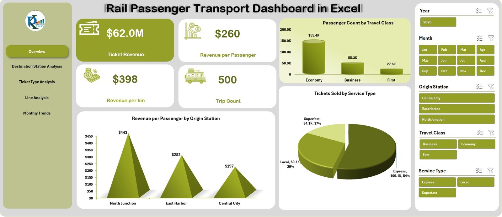
The Overview Page gives a complete summary of rail transport metrics. It contains a slicer on the right side, allowing users to change views based on required filters.
The page includes five card KPIs:
• Ticket Revenue
Shows total earnings from passenger travel.
• Revenue per Passenger
Indicates how much revenue each passenger generates.
• Revenue per Km
Measures revenue efficiency per kilometer.
• Trip Count
Shows how many train trips occurred.
These cards help rail teams assess performance instantly.
Click to Purchases Rail Passenger Transport Dashboard in Excel
Charts on the Overview Page
The page contains three important charts:
1. Revenue per Passenger by Origin Station
Shows which origin stations generate the highest revenue per passenger.
2. Passenger Count by Travel Class
Reveals the popularity of classes like Economy, Standard, AC Chair Car, Sleeper, Business, or First Class.
3. Tickets Sold by Service Type
Shows performance across service types such as Express, Local, Intercity, Overnight, AC Express, or Rapid Service.
These charts highlight passenger trends and revenue behaviour with clear visuals.
2. Destination Station Analysis – Station Performance Insights
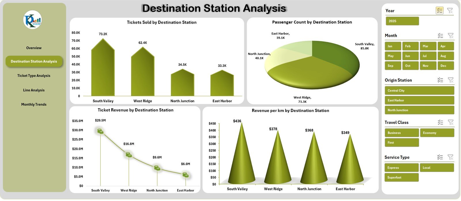
The Destination Station Analysis page helps teams understand how different destination stations perform. It includes a slicer on the right side for easy filtering.
Charts on the Destination Station Page
1. Tickets Sold by Destination Station
Shows which destinations receive the highest number of passengers.
2. Passenger Count by Destination Station
Confirms demand patterns and station popularity.
3. Ticket Revenue by Destination Station
Shows high-earning routes.
4. Revenue per Km by Destination Station
Helps identify profitable destinations based on distance.
This page is extremely useful for route planning, pricing analysis, and station-wise forecasting.
Click to Purchases Rail Passenger Transport Dashboard in Excel
3. Ticket Type Analysis – Behaviour Based on Ticket Category
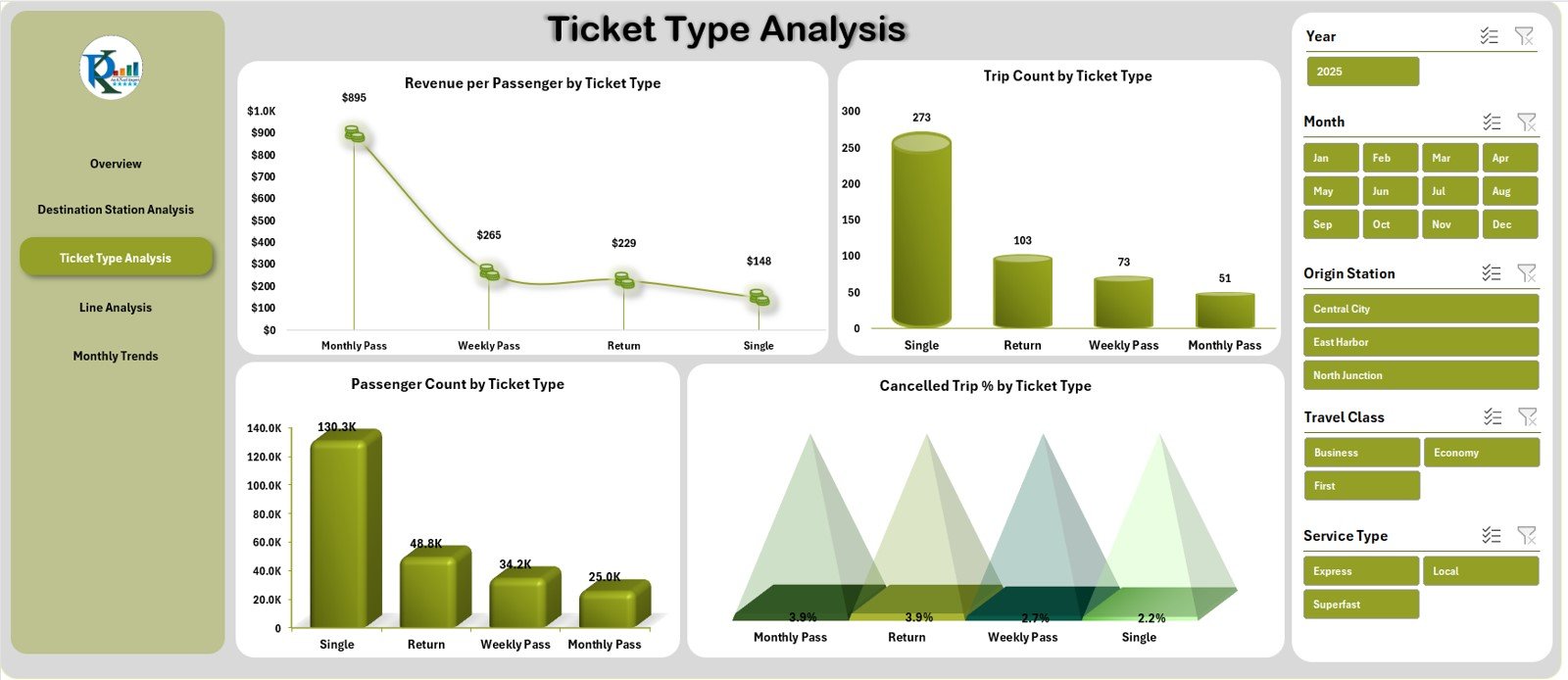
Ticket types influence how passengers travel and how trains earn revenue. The Ticket Type Analysis page provides deeper insights.
A slicer is available on the right side for easy filtering.
Charts on the Ticket Type Page
1. Revenue per Passenger by Ticket Type
Shows high-earning categories like Business Class, First Class, or Premium Express.
2. Trip Count by Ticket Type
Indicates how frequently each ticket type is used.
3. Passenger Count by Ticket Type
Helps understand passenger preferences.
4. Cancelled Trip % by Ticket Type
Displays cancellation behaviour, often influenced by travel class, route popularity, or price.
This page becomes valuable for marketing teams, ticketing departments, and passenger service planners.
Click to Purchases Rail Passenger Transport Dashboard in Excel
4. Line Analysis – Performance by Line Type
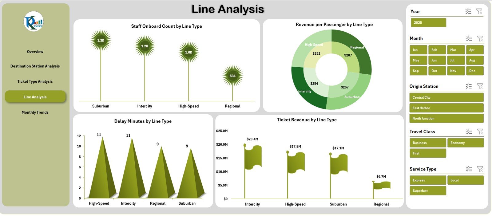
Rail lines differ by type—Local, Express, Metro, Intercity, Freight-accompanied passenger routes, and more. The Line Analysis page helps teams evaluate how different line types perform.
A right-side slicer is included for filtering.
Charts on the Line Analysis Page
1. Staff Onboard Count by Line Type
Shows staffing requirements or distribution.
2. Revenue per Passenger by Line Type
Helps identify high-revenue lines.
3. Delay Minutes by Line Type
Highlights punctuality performance and identifies lines that need improvement.
4. Ticket Revenue by Line Type
Shows earnings from each type of rail line.
This page supports operational decision-making and workforce planning.
Click to Purchases Rail Passenger Transport Dashboard in Excel
5. Monthly Trends – Performance Over Time
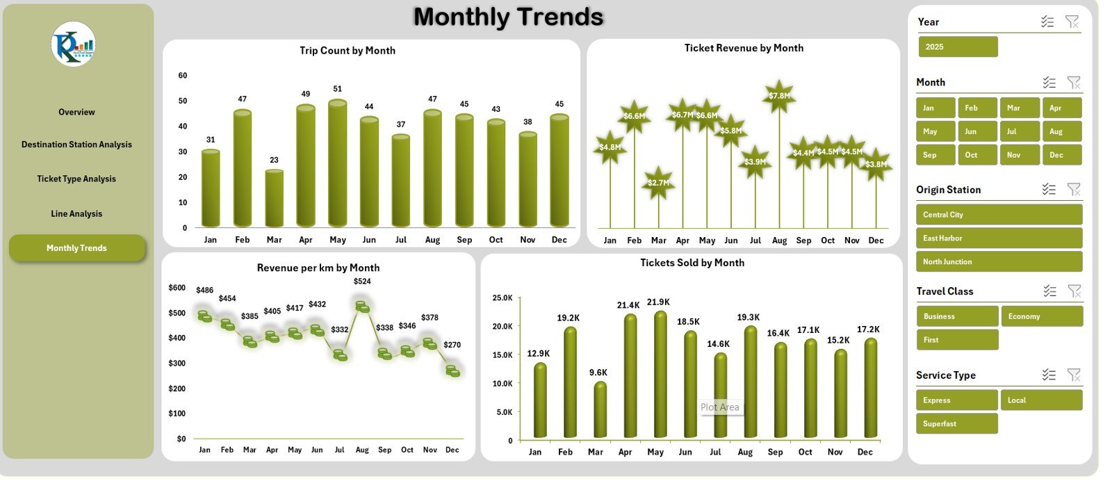
The Monthly Trends Page gives a clear month-by-month view of key rail transport metrics. A slicer on the right helps you switch easily between views.
Charts on the Monthly Trends Page
1. Trip Count by Month
Shows seasonal travel patterns.
2. Ticket Revenue by Month
Helps identify revenue fluctuations.
3. Revenue per Km by Month
Reveals efficiency changes over time.
4. Tickets Sold by Month
Displays monthly passenger activity.
This page is essential for forecasting, budgeting, and identifying seasonal strengths.
Support Sheet & Data Sheet
Although not part of the main dashboard, these sheets play important roles:
Support Sheet
Contains helper tables, lists, and formulas used throughout the dashboard.
Data Sheet
Stores all raw data, including:
-
Passenger count
-
Ticket sales
-
Revenue
-
Trip details
-
Station names
-
Line types
-
Travel classes
-
Ticket categories
-
Distances
-
Monthly values
Users update this sheet to refresh the dashboard automatically.
Click to Purchases Rail Passenger Transport Dashboard in Excel
Advantages of the Rail Passenger Transport Dashboard in Excel
This dashboard offers strong benefits for rail organizations:
1. Easy Navigation
The Page Navigator makes switching between pages simple and fast.
2. Complete Visibility in One File
All KPIs—revenue, trips, passenger count, class distribution, delay minutes—stay visible in one dashboard.
3. Helps Rail Operators Improve Planning
Charts reveal patterns that support decisions like:
-
Increasing trips during busy months
-
Adjusting ticket pricing
-
Deploying more staff on specific line types
-
Improving scheduling and efficiency
4. Supports Revenue Growth
Metrics like Revenue per Passenger and Revenue per Km help identify profitable routes and service types.
5. Improves Customer Understanding
Class-wise and ticket-type analysis shows passenger preferences clearly.
6. Identifies Problem Areas Quickly
Delay Minutes, Cancelled Trip %, and low-revenue destinations become easy to spot.
7. No Coding or Special Tools Required
The entire dashboard works inside Excel, making it easy for non-technical users.
Click to Purchases Rail Passenger Transport Dashboard in Excel
Best Practices for Using the Rail Passenger Transport Dashboard
To ensure accurate and reliable reporting, use these best practices:
1. Update the Data Sheet Regularly
Always enter clean and correct values.
2. Use Consistent Station Names
Spelling variations create errors in charts.
3. Maintain Correct Ticket Type Categories
Grouping should remain standardized across all sheets.
4. Review Monthly Performance Patterns
Monthly Trends help forecast future demand.
5. Track Delay Minutes Carefully
It helps improve punctuality and customer satisfaction.
6. Compare Revenue per Km Across Lines
This helps identify underperforming routes.
7. Protect Support Sheet Formulas
Incorrect modifications can break dashboard visuals.
Conclusion
The Rail Passenger Transport Dashboard in Excel is a powerful analytical tool designed for rail organizations that want actionable insights. With five professionally built pages, interactive slicers, KPI cards, and targeted charts, this dashboard covers everything—from revenue and trip count to ticket behaviour and line delays.
Because the dashboard runs completely in Excel, anyone can update it without technical knowledge. It supports stronger decision-making, improves planning, enhances efficiency, and helps rail operators understand passenger behaviour with full clarity.
Whether you’re analyzing destination-wise demand, ticket patterns, or month-wise performance, this dashboard delivers reliable insights for every rail passenger transport team.
Click to Purchases Rail Passenger Transport Dashboard in Excel
Frequently Asked Questions (FAQs)
1. What is a Rail Passenger Transport Dashboard in Excel?
It is a ready-to-use Excel dashboard that tracks rail performance through KPIs, charts, and navigable pages.
2. Who uses this dashboard?
Rail operators, transport planners, revenue teams, and station managers.
3. Does it require technical knowledge?
No. Users only need basic Excel skills to update the data sheet.
4. Can I add more KPIs?
Yes. You can expand the data sheet and update the charts accordingly.
5. Does it show monthly trends?
Yes. The Monthly Trends page displays revenue, trips, tickets sold, and more.
6. Can I customize line types or ticket categories?
Yes. You can update categories in the support sheet or data sheet.
7. Is this dashboard useful for budgeting?
Absolutely. Revenue and trip trends help rail organizations plan budgets and forecast demand.
Click to Purchases Rail Passenger Transport Dashboard in Excel
Visit our YouTube channel to learn step-by-step video tutorials