Managing railway cargo operations requires accuracy, speed, and clarity. However, many railway operators, logistics managers, and freight planners still rely on scattered spreadsheets, manual registers, and delayed reports. As a result, they struggle to track cargo performance, control operating costs, and improve profitability.
That is exactly why a Railway Cargo Dashboard in Excel becomes a powerful and practical solution.
This article explains what a Railway Cargo Dashboard in Excel is, how it works, why it is important, and how each dashboard page helps decision-makers gain complete visibility into railway freight operations. Additionally, you will learn the advantages, best practices, and frequently asked questions related to this dashboard.
Click to Purchases Railway Cargo Dashboard in Excel
What Is a Railway Cargo Dashboard in Excel?
A Railway Cargo Dashboard in Excel is a ready-to-use analytical and reporting tool designed to monitor, analyze, and visualize railway freight data in one centralized place. Instead of reviewing multiple spreadsheets, users can track key performance indicators (KPIs), costs, revenues, profit margins, and invoice status through interactive charts and summary cards.
Moreover, this dashboard transforms raw cargo data into meaningful insights. It allows railway authorities, logistics teams, and freight operators to understand operational efficiency, revenue trends, and cost drivers clearly.
Because the dashboard is built in Excel, it remains accessible, flexible, and easy to customize without requiring advanced BI tools.
Why Do Railway Cargo Operations Need a Dashboard?
Railway cargo operations involve multiple variables such as origin zones, destination zones, wagon types, commodity groups, operating costs, freight revenue, and invoice payments. When teams track these metrics manually, errors increase and decision-making slows down.
A Railway Cargo Dashboard in Excel solves these challenges by offering:
-
Centralized freight performance tracking
-
Clear cost and revenue visibility
-
Faster operational and financial decisions
-
Improved profitability monitoring
-
Better planning across zones and wagon types
As a result, organizations gain control, transparency, and confidence in their cargo operations.
How Does a Railway Cargo Dashboard in Excel Work?
The dashboard pulls data from structured Excel tables that contain cargo movement, cost, revenue, invoice, and operational details. Once the data updates, all charts, KPI cards, and analysis pages refresh automatically.
Additionally, slicers (filters) allow users to analyze data by:
-
Month
-
Zone
-
Commodity Group
-
Wagon Type
-
Customer
Because of this interactive structure, users can drill down into details without changing formulas or rebuilding reports.
What Are the Key Features of the Railway Cargo Dashboard in Excel?
The Railway Cargo Dashboard in Excel comes with a structured layout and multiple analytical pages. Each page focuses on a specific aspect of railway freight performance.
Page Navigator for Easy Navigation
A Page Navigator sits on the left side of the dashboard. This feature allows users to move quickly between different analysis pages without scrolling or searching.
As a result, navigation becomes intuitive, fast, and user-friendly.
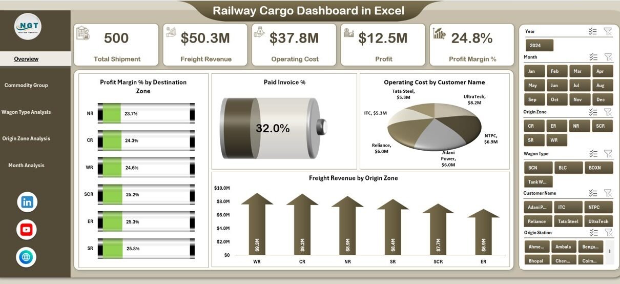
What Does the Overview Page Show?
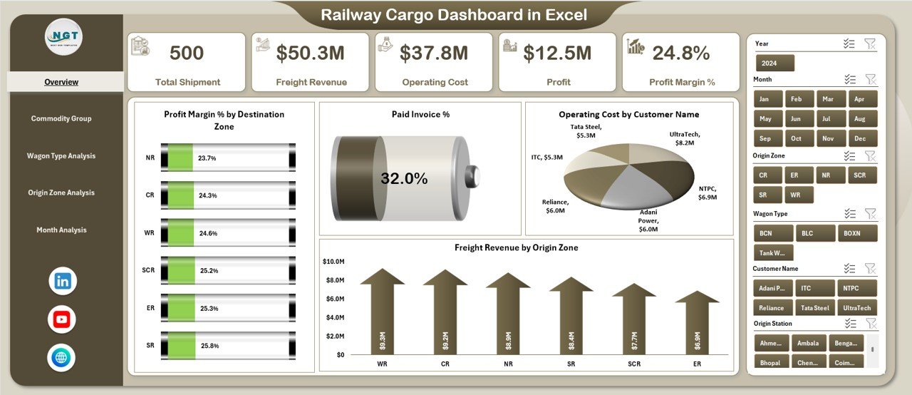
The Overview Page acts as the command center of the Railway Cargo Dashboard in Excel.
Overview Page Highlights
On this page, users see:
-
A right-side slicer for quick filtering
-
Four KPI cards for high-level performance
-
Four key analytical charts
KPI Cards on the Overview Page
The four cards provide instant visibility into critical metrics such as:
-
Profit Margin %
-
Paid Invoice %
-
Operating Cost
-
Freight Revenue
Because these cards update dynamically, decision-makers can assess performance at a glance.
Charts on the Overview Page
The Overview Page includes the following charts:
-
Profit Margin % by Destination Zone
This chart highlights which destination zones generate higher or lower margins. -
Paid Invoice %
This chart helps track payment efficiency and outstanding receivables. -
Operating Cost by Customer Name
This chart identifies cost-heavy customers and potential optimization areas. -
Freight Revenue by Origin Zone
This chart shows which origin zones contribute most to revenue.
Together, these visuals create a strong foundation for strategic decisions.
Click to Purchases Railway Cargo Dashboard in Excel
What Is Commodity Group Analysis in the Railway Cargo Dashboard?
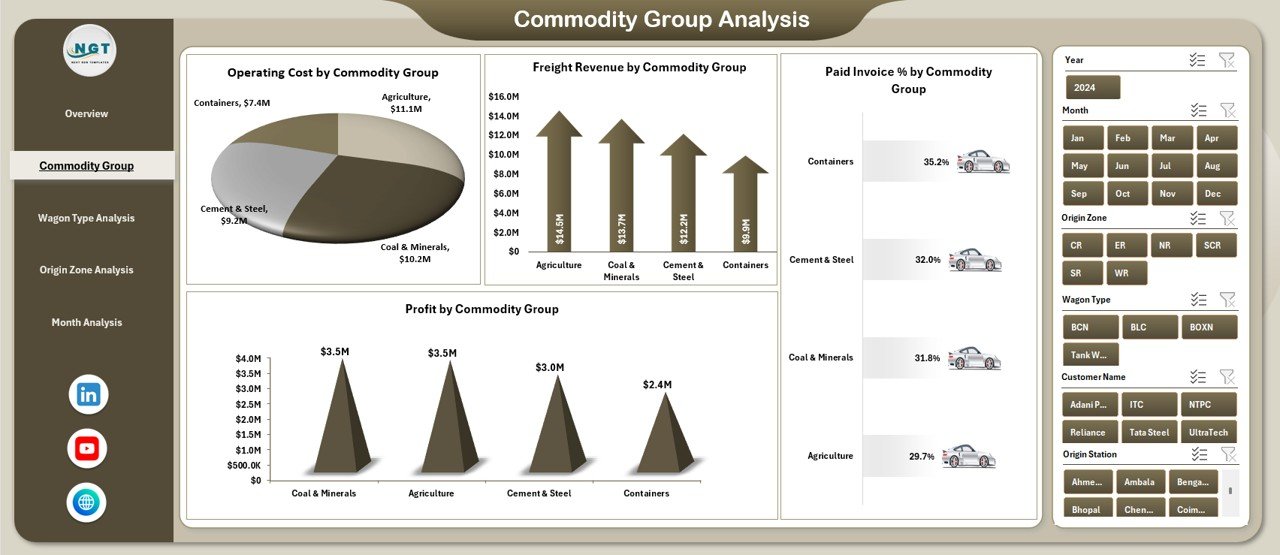
The Commodity Group Analysis Page focuses on cargo performance across different commodity categories.
Why Commodity Group Analysis Matters
Different commodities involve varying handling requirements, wagon types, costs, and margins. Therefore, analyzing data by commodity group helps identify profitable and high-cost cargo segments.
Charts in Commodity Group Analysis
This page includes four detailed charts:
-
Operating Cost by Commodity Group
Helps identify which commodities drive higher expenses. -
Freight Revenue by Commodity Group
Shows revenue contribution from each commodity type. -
Paid Invoice % by Commodity Group
Tracks payment performance across commodities. -
Profit by Commodity Group
Highlights high-profit and low-profit cargo categories.
Because of this breakdown, managers can adjust pricing, routing, and operational strategies.
How Does Wagon Type Analysis Improve Cargo Decisions?
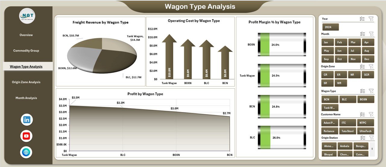
The Wagon Type Analysis Page analyzes performance based on different wagon types used in railway cargo operations.
Importance of Wagon Type Analysis
Each wagon type has unique capacity, cost structure, and usage pattern. Therefore, understanding wagon-wise performance becomes essential for operational efficiency.
Charts in Wagon Type Analysis
This page contains the following charts:
-
Freight Revenue by Wagon Type
Identifies revenue contribution from each wagon category. -
Operating Cost by Wagon Type
Highlights cost-intensive wagon types. -
Profit Margin % by Wagon Type
Shows margin efficiency across wagon types. -
Profit by Wagon Type
Displays absolute profit generated by each wagon type.
As a result, planners can optimize wagon allocation and reduce unnecessary costs.
Why Is Origin Zone Analysis Important?
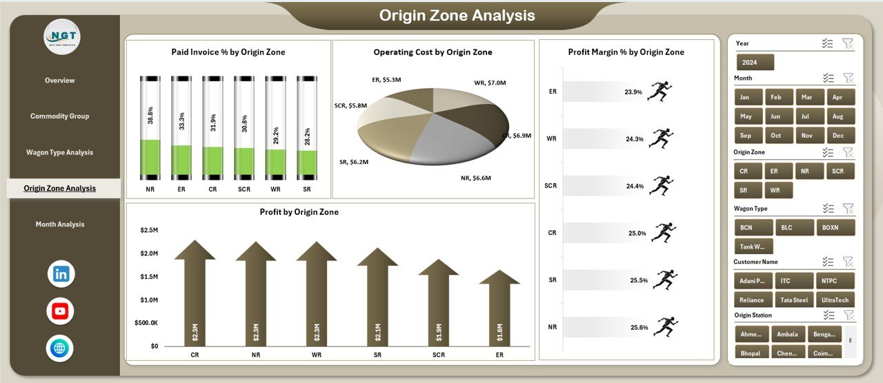
The Origin Zone Analysis Page focuses on freight performance based on cargo origin zones.
Benefits of Origin Zone Analysis
Railway networks cover multiple zones, each with different demand patterns, costs, and infrastructure constraints. By analyzing data at the origin level, teams can identify strong and weak zones.
Charts in Origin Zone Analysis
This page includes four charts:
-
Paid Invoice % by Origin Zone
Tracks payment reliability across zones. -
Operating Cost by Origin Zone
Shows zones with higher operational expenses. -
Profit Margin % by Origin Zone
Highlights margin differences across zones. -
Profit by Origin Zone
Identifies zones that generate maximum profit.
Because of this clarity, management can focus improvement efforts on underperforming zones.
What Does the Month Analysis Page Show?
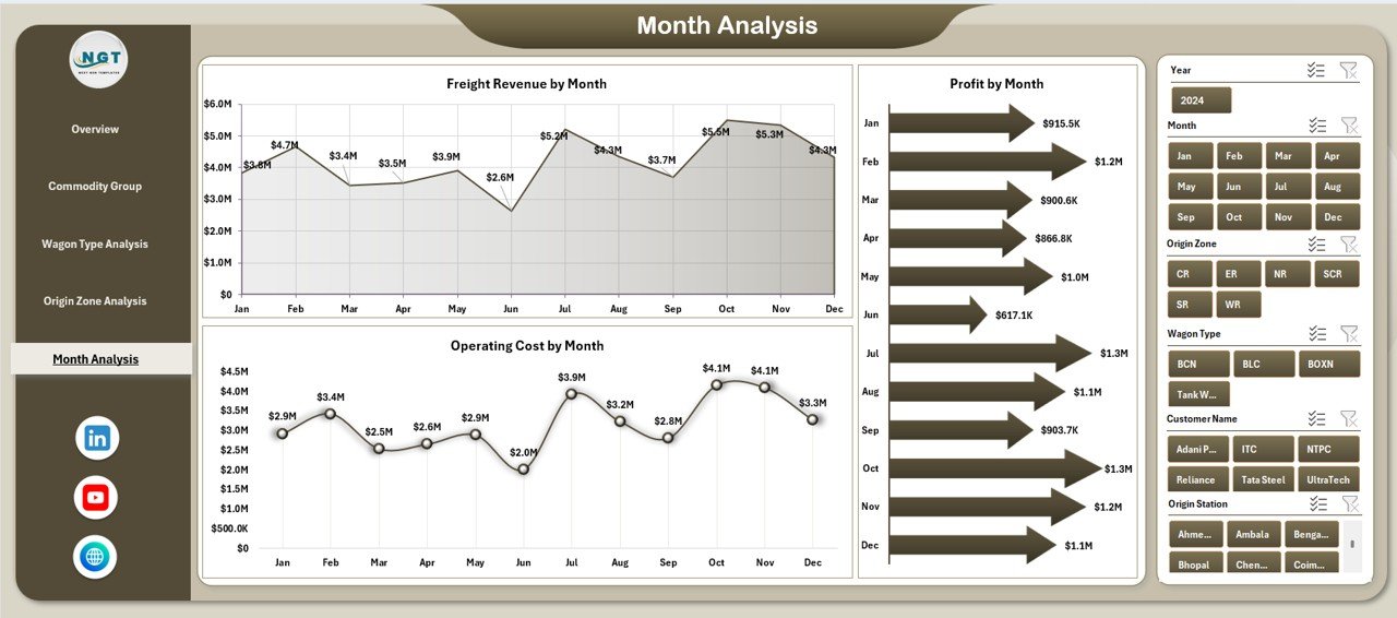
The Month Analysis Page provides time-based performance insights.
Why Monthly Analysis Is Crucial
Monthly analysis helps track seasonality, trends, and operational changes over time. Therefore, it supports better forecasting and planning.
Features of the Month Analysis Page
-
Right-side slicer for month selection
-
Trend-based charts for cost, revenue, and profit
-
Clear visibility into month-to-month performance
As a result, teams can identify peak periods, slow months, and growth opportunities.
Advantages of Railway Cargo Dashboard in Excel
Click to Purchases Railway Cargo Dashboard in Excel
Using a Railway Cargo Dashboard in Excel offers multiple business advantages.
Key Advantages
-
✅ Centralized freight performance tracking
-
✅ Real-time cost, revenue, and profit visibility
-
✅ Improved invoice and payment monitoring
-
✅ Faster decision-making through visual insights
-
✅ Reduced manual reporting effort
-
✅ Easy customization and scalability
-
✅ No dependency on expensive BI tools
Because Excel remains widely used, adoption becomes easy across teams.
Who Can Use a Railway Cargo Dashboard in Excel?
This dashboard supports a wide range of users, including:
-
Railway cargo operators
-
Freight logistics managers
-
Finance and accounts teams
-
Operations planners
-
Supply chain analysts
-
Government railway authorities
Each role benefits from clear, actionable insights.
Best Practices for the Railway Cargo Dashboard in Excel
To get maximum value from the dashboard, follow these best practices.
Maintain Clean and Structured Data
Always use consistent formats for dates, costs, zones, and commodity names. Clean data ensures accurate analysis.
Update Data Regularly
Update cargo, cost, and invoice data frequently. Regular updates keep insights reliable and relevant.
Use Slicers Effectively
Apply slicers to drill down into specific zones, months, or wagon types instead of creating multiple reports.
Review KPIs Periodically
Monitor profit margin, paid invoice %, and operating cost trends regularly to catch issues early.
Align Dashboard with Business Goals
Customize KPIs and charts based on operational and financial objectives.
How Does This Dashboard Improve Decision-Making?
The Railway Cargo Dashboard in Excel supports decision-making by:
-
Highlighting cost leakages
-
Identifying profitable cargo segments
-
Improving invoice collection efficiency
-
Supporting data-driven planning
-
Enhancing operational transparency
As a result, leadership can act quickly and confidently.
Conclusion
A Railway Cargo Dashboard in Excel transforms complex railway freight data into clear, actionable insights. Instead of spending hours on manual reports, teams can instantly monitor costs, revenue, profit margins, and invoice performance across zones, commodities, wagon types, and months.
Because the dashboard remains interactive, visual, and easy to use, it supports better planning, stronger financial control, and improved operational efficiency. For any organization involved in railway cargo operations, this dashboard becomes an essential decision-support tool.
Frequently Asked Questions (FAQs)
What is a Railway Cargo Dashboard in Excel?
A Railway Cargo Dashboard in Excel is a ready-to-use reporting tool that tracks freight revenue, costs, profit margins, invoice status, and operational performance using interactive charts and KPIs.
Can I customize the Railway Cargo Dashboard in Excel?
Yes, you can easily customize KPIs, charts, and slicers based on your business requirements.
Does this dashboard require advanced Excel skills?
No, basic Excel knowledge is enough to use and update the dashboard effectively.
How often should I update the data?
You should update the data daily, weekly, or monthly depending on operational needs.
Can this dashboard handle large datasets?
Yes, Excel can handle large datasets efficiently when data is structured properly.
Who benefits the most from this dashboard?
Railway operators, logistics managers, finance teams, and planners benefit the most from this dashboard.
Visit our YouTube channel to learn step-by-step video tutorials