Railway infrastructure plays a crucial role in transportation, logistics, and economic development. Every day, millions of passengers and tons of cargo move across railway networks. Because of this massive scale, railway authorities must constantly monitor infrastructure performance, operational efficiency, safety standards, and maintenance activities.
However, many railway organizations still rely on scattered reports and manual spreadsheets. As a result, decision-makers often struggle to analyze performance trends, identify operational gaps, and track infrastructure efficiency in real time.
Therefore, organizations increasingly adopt data-driven monitoring systems. One powerful solution is the Railway Infrastructure KPI Dashboard in Power BI. This interactive dashboard allows railway authorities to monitor key performance indicators, compare targets with actual results, analyze trends, and improve operational decision-making.
Instead of reviewing multiple reports, railway managers can analyze all infrastructure KPIs in one centralized and interactive dashboard.
In this comprehensive guide, you will learn:
-
What a Railway Infrastructure KPI Dashboard in Power BI is
-
Why railway organizations need KPI monitoring tools
-
Key features of the dashboard
-
Important railway infrastructure KPIs
-
Advantages of using the dashboard
-
Best practices for implementation
-
Frequently asked questions about railway KPI dashboards
What is a Railway Infrastructure KPI Dashboard in Power BI?
A Railway Infrastructure KPI Dashboard in Power BI is an interactive data visualization tool designed to monitor and analyze key railway performance indicators in real time.
Railway authorities manage a wide range of operational activities such as:
-
Track maintenance monitoring
-
Signal system performance
-
Train punctuality tracking
-
Infrastructure inspection
-
Asset utilization analysis
-
Safety monitoring
-
Maintenance efficiency evaluation
Because these operations generate large volumes of data, railway managers need a structured analytics system.
Therefore, a Power BI KPI dashboard helps organizations convert raw data into clear insights. Managers can instantly track performance metrics, evaluate operational efficiency, and identify improvement opportunities.
Moreover, Power BI dashboards provide interactive filters, visual charts, and automated calculations. As a result, railway authorities can make faster and smarter decisions.
Why Do Railway Authorities Need a KPI Dashboard?
Railway infrastructure operations involve multiple departments, assets, and performance metrics. Therefore, organizations must track several indicators simultaneously.
Without a centralized monitoring system, teams face several challenges:
-
Fragmented performance reports
-
Delayed operational insights
-
Difficulty tracking targets
-
Limited performance visibility
-
Slow decision-making processes
However, a Railway Infrastructure KPI Dashboard in Power BI solves these issues effectively.
Because the dashboard consolidates all important data in one place, managers can monitor performance quickly and accurately.
Key Benefits of KPI Monitoring
-
Centralized infrastructure performance tracking
-
Faster decision-making using real-time insights
-
Improved accountability across departments
-
Better infrastructure planning and maintenance
-
Enhanced operational efficiency
As a result, railway authorities can maintain a reliable and efficient transportation network.
Key Features of the Railway Infrastructure KPI Dashboard in Power BI
The Railway Infrastructure KPI Dashboard in Power BI is a ready-to-use analytics solution designed for infrastructure monitoring. The dashboard uses Excel as the data source and Power BI for visualization and analysis.
The dashboard includes three main pages that help users analyze railway performance effectively.
1. Summary Page – Centralized KPI Monitoring
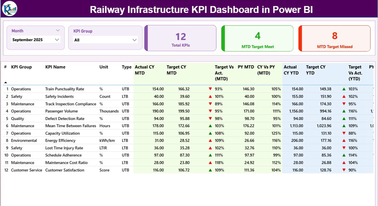
The Summary Page serves as the main dashboard interface. Here, users can quickly review overall KPI performance.
At the top of the page, the dashboard includes two interactive slicers:
-
Month slicer
-
KPI Group slicer
Because of these slicers, users can filter the entire dashboard instantly.
KPI Cards on the Summary Page
The dashboard also displays three key performance cards:
-
Total KPIs Count
-
MTD Target Meet Count
-
MTD Target Missed Count
These KPI cards help decision-makers quickly evaluate performance status.
Detailed KPI Table
Below the KPI cards, the dashboard shows a detailed KPI table that contains the following information.
KPI Number
This column represents the sequence number assigned to each KPI.
KPI Group
This indicates the category of the KPI, such as:
-
Safety KPIs
-
Infrastructure KPIs
-
Operational KPIs
-
Maintenance KPIs
KPI Name
This column shows the name of the performance indicator.
Unit
This represents the unit of measurement used for the KPI, such as:
-
Percentage
-
Hours
-
Kilometers
-
Number of incidents
Type (LTB or UTB)
This indicates the performance type of the KPI.
-
LTB – Lower the Better
-
UTB – Upper the Better
This classification helps managers understand whether a higher or lower value indicates better performance.
MTD (Month-to-Date) Metrics
The dashboard also displays Month-to-Date performance metrics.
Actual CY MTD
This shows the actual KPI value for the current year MTD period.
Target CY MTD
This represents the target value for the same period.
MTD Status Icon
The dashboard displays visual indicators:
-
▲ Green arrow for positive performance
-
▼ Red arrow for negative performance
These icons allow users to instantly identify KPI performance.
Target vs Actual (MTD)
The dashboard calculates the percentage comparison using the formula:
Actual MTD / Target MTD
This helps users measure how close the KPI performance is to the target.
Previous Year MTD (PY MTD)
This column displays the same period performance for the previous year.
Current Year vs Previous Year (MTD)
The dashboard compares current performance with previous year results using the formula:
Current Year MTD / Previous Year MTD
Therefore, managers can quickly identify performance trends.
YTD (Year-to-Date) Metrics
In addition to MTD performance, the dashboard also shows Year-to-Date KPI analysis.
Actual CY YTD
This shows the current year cumulative performance.
Target CY YTD
This represents the annual target value for the KPI.
YTD Status Icon
Just like MTD analysis, the dashboard displays visual indicators to show whether KPIs meet their targets.
Target vs Actual (YTD)
The calculation formula is:
Actual YTD / Target YTD
This percentage indicates overall KPI performance.
Previous Year YTD (PY YTD)
This value represents last year’s performance for the same period.
Current Year vs Previous Year (YTD)
The comparison formula is:
Current Year YTD / Previous Year YTD
This analysis helps railway authorities evaluate long-term performance trends.
2. KPI Trend Page – Performance Trend Analysis

The KPI Trend Page provides detailed trend analysis for selected KPIs.
On the left side of the page, users can select the KPI Name using a slicer.
Once users select a KPI, the dashboard displays two combo charts.
MTD Trend Chart
This chart compares:
-
Current Year Actual
-
Previous Year Actual
-
Target values
As a result, users can track monthly performance trends.
YTD Trend Chart
The second chart shows the cumulative yearly performance comparison between:
-
Current year
-
Previous year
-
Targets
Because of this comparison, managers can evaluate long-term performance improvements.
3. KPI Definition Page – KPI Details and Formulas

The KPI Definition Page provides detailed explanations of KPIs.
This page remains hidden by default and works as a drill-through page.
Users can access it from the Summary Page.
Once users drill through, they can view detailed KPI information such as:
-
KPI Number
-
KPI Group
-
KPI Name
-
Unit of Measurement
-
KPI Formula
-
KPI Definition
-
KPI Type (LTB or UTB)
This page helps teams understand the meaning and calculation logic of each KPI.
To return to the main page, users simply click the Back Button located on the top-left corner.
Excel Data Source Used in the Dashboard
The Railway Infrastructure KPI Dashboard in Power BI uses an Excel file as the data source.
Users must fill three worksheets in the Excel file.
1. Input_Actual Sheet
This worksheet stores the actual KPI performance data.
Users need to enter:
-
KPI Name
-
Month (use the first date of the month)
-
MTD Value
-
YTD Value
Power BI automatically imports this data and updates the dashboard.
2. Input_Target Sheet
This worksheet contains target values for each KPI.
Users must enter:
-
KPI Name
-
Month
-
MTD Target
-
YTD Target
This information allows the dashboard to calculate performance comparisons.
3. KPI Definition Sheet
This worksheet stores KPI metadata and definitions.
Users must fill the following fields:
-
KPI Number
-
KPI Group
-
KPI Name
-
Unit
-
KPI Formula
-
KPI Definition
-
KPI Type (LTB or UTB)
Because of this structured data model, the dashboard can perform accurate calculations and analysis.
Advantages of Railway Infrastructure KPI Dashboard in Power BI
Organizations gain several benefits when they use a KPI dashboard.
Real-Time Performance Monitoring
Managers can instantly monitor infrastructure performance.
Centralized Data Management
All KPI data appears in a single dashboard interface.
Better Decision Making
Visual insights help managers make faster and more informed decisions.
Performance Transparency
Teams can clearly see which KPIs meet targets and which require improvement.
Trend Analysis
Historical comparisons help identify performance improvements or operational issues.
Improved Operational Efficiency
Because managers detect problems early, teams can implement corrective actions quickly.
Best Practices for Railway Infrastructure KPI Dashboard
Organizations should follow these best practices to maximize dashboard effectiveness.
Define Clear KPIs
Select KPIs that align with operational goals and infrastructure performance.
Ensure Data Accuracy
Maintain clean and structured Excel data.
Update Data Regularly
Update KPI data every month to maintain reliable insights.
Train Users
Ensure managers and teams understand how to use the dashboard.
Use Visual Indicators
Visual alerts and icons help users quickly identify performance gaps.
Review KPI Performance Periodically
Regular KPI reviews help organizations maintain operational excellence.
Practical Use Cases of Railway Infrastructure KPI Dashboard
Railway authorities and infrastructure organizations can use this dashboard in many scenarios.
Railway Operations Management
Managers can track infrastructure performance across railway zones.
Maintenance Monitoring
Teams can monitor track maintenance KPIs and equipment reliability.
Infrastructure Planning
Planners can analyze historical data to plan future investments.
Safety Monitoring
Safety teams can track incident-related KPIs.
Government Infrastructure Reporting
Authorities can use the dashboard to present performance reports to stakeholders.
Conclusion
Railway infrastructure management requires continuous monitoring of performance indicators. Without proper analytics tools, organizations struggle to track infrastructure efficiency and operational performance.
However, the Railway Infrastructure KPI Dashboard in Power BI provides a powerful solution. This interactive dashboard centralizes KPI monitoring, improves decision-making, and helps railway authorities analyze performance trends.
Because the dashboard combines Excel data management with Power BI visualization, organizations gain a simple yet powerful infrastructure monitoring tool.
As railway networks continue to expand, data-driven decision-making will become even more important. Therefore, implementing KPI dashboards will play a critical role in improving infrastructure performance and operational efficiency.
Frequently Asked Questions (FAQs)
What is a Railway Infrastructure KPI Dashboard?
A Railway Infrastructure KPI Dashboard is a visual analytics tool that tracks railway infrastructure performance metrics using interactive charts and indicators.
Why is Power BI useful for railway KPI dashboards?
Power BI allows organizations to visualize large datasets, automate calculations, and create interactive dashboards for performance monitoring.
What types of KPIs can railway dashboards track?
Railway dashboards can track KPIs such as:
-
Track maintenance performance
-
Train punctuality
-
Infrastructure utilization
-
Safety incidents
-
Maintenance efficiency
What data source does the dashboard use?
The dashboard uses Excel worksheets as the primary data source for actual performance, target values, and KPI definitions.
Visit our YouTube channel to learn step-by-step video tutorials