Managing railway operations without clear data visibility creates delays, cost overruns, and poor decision-making. Railways handle massive volumes of passengers, freight, routes, trains, and stations every day. Therefore, decision-makers need one centralized system that shows performance clearly and instantly. That is exactly where a Railways Dashboard in Excel becomes a powerful and practical solution.
In this detailed and SEO-friendly guide, you will learn what a Railways Dashboard in Excel is, why it matters, how it works, its page-wise structure, advantages, best practices, and frequently asked questions. Moreover, this article uses simple language, active voice, and real-world explanations so you can apply everything immediately.
Click to Purchases Railways Dashboard in Excel
What Is a Railways Dashboard in Excel?
A Railways Dashboard in Excel is a centralized analytical and reporting tool that tracks, analyzes, and visualizes railway performance metrics in one interactive Excel file. Instead of reviewing multiple static reports, users can instantly monitor operations, revenue, costs, passenger movement, freight volumes, and punctuality.
Because Excel supports charts, pivot tables, slicers, and formulas, the dashboard updates automatically when data changes. As a result, railway managers gain real-time insights without complex BI tools.
In short, a Railways Dashboard in Excel transforms raw railway data into meaningful insights that support faster and smarter decisions.
Why Do Railways Need a Dashboard in Excel?
Railway systems operate at a massive scale. However, data often sits in multiple sheets, departments, or reports. Consequently, leadership teams struggle to see the complete picture.
A Railways Dashboard in Excel solves this challenge because it:
-
Centralizes all key railway data
-
Shows trends, comparisons, and performance gaps visually
-
Reduces manual reporting work
-
Improves operational efficiency and accountability
Therefore, railways use dashboards not just for reporting but also for performance management and strategic planning.
Who Can Use a Railways Dashboard in Excel?
A Railways Dashboard in Excel benefits many roles across the organization, such as:
-
Railway Operations Managers
-
Zonal and Divisional Heads
-
Finance and Cost Controllers
-
Planning and Scheduling Teams
-
Passenger Services Teams
-
Freight and Logistics Managers
-
Government and Regulatory Analysts
Because Excel remains widely used, teams can adopt the dashboard quickly without heavy training.
What Are the Key Features of a Railways Dashboard in Excel?
The Railways Dashboard in Excel includes several powerful features that improve usability and insights.
Page Navigator for Easy Navigation
The dashboard includes a page navigator located on the left side. This navigator allows users to move smoothly between different analytical pages with a single click. As a result, users save time and avoid confusion.
Interactive Slicers for Dynamic Analysis
Each page includes right-side slicers. These slicers filter data by key dimensions such as zone, division, train type, category, or station. Consequently, users can analyze performance instantly without editing formulas.
Multiple Analytical Pages
The dashboard contains five well-structured analytical pages, each focused on a specific aspect of railway operations. Additionally, support and data sheets ensure smooth backend processing.
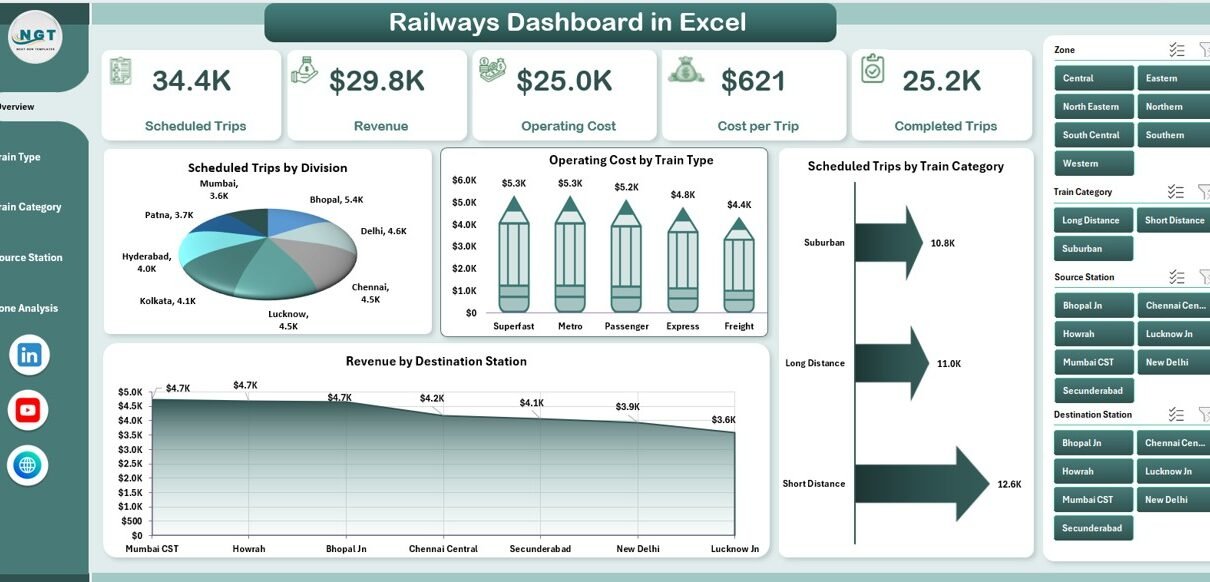
What Is Included in the Overview Page of the Railways Dashboard?
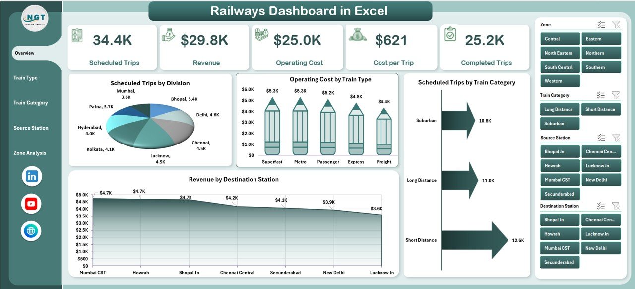
Why Is the Overview Page Important?
The Overview Page acts as the executive summary of the entire dashboard. It provides a high-level snapshot of railway performance at a glance. Therefore, senior management often starts their analysis from this page.
Key Elements of the Overview Page
The Overview Page includes:
KPI Cards
The page displays four KPI cards that highlight critical performance numbers. These cards quickly communicate overall status without detailed analysis.
Charts on the Overview Page
The Overview Page contains four interactive charts, including:
-
Scheduled Trips by Division
This chart shows how many trips each division schedules. It helps compare workload distribution across divisions. -
Operating Cost by Train Type
This chart highlights cost differences across train types. As a result, managers can identify expensive operations. -
Scheduled Trips by Train Category
This chart displays trip volume by category, such as passenger, freight, or express. -
Revenue by Destination Station
This chart reveals which destination stations generate the highest revenue.
Together, these visuals deliver instant clarity about operations, costs, and revenue.
How Does the Train Type Analysis Page Help Decision-Makers?
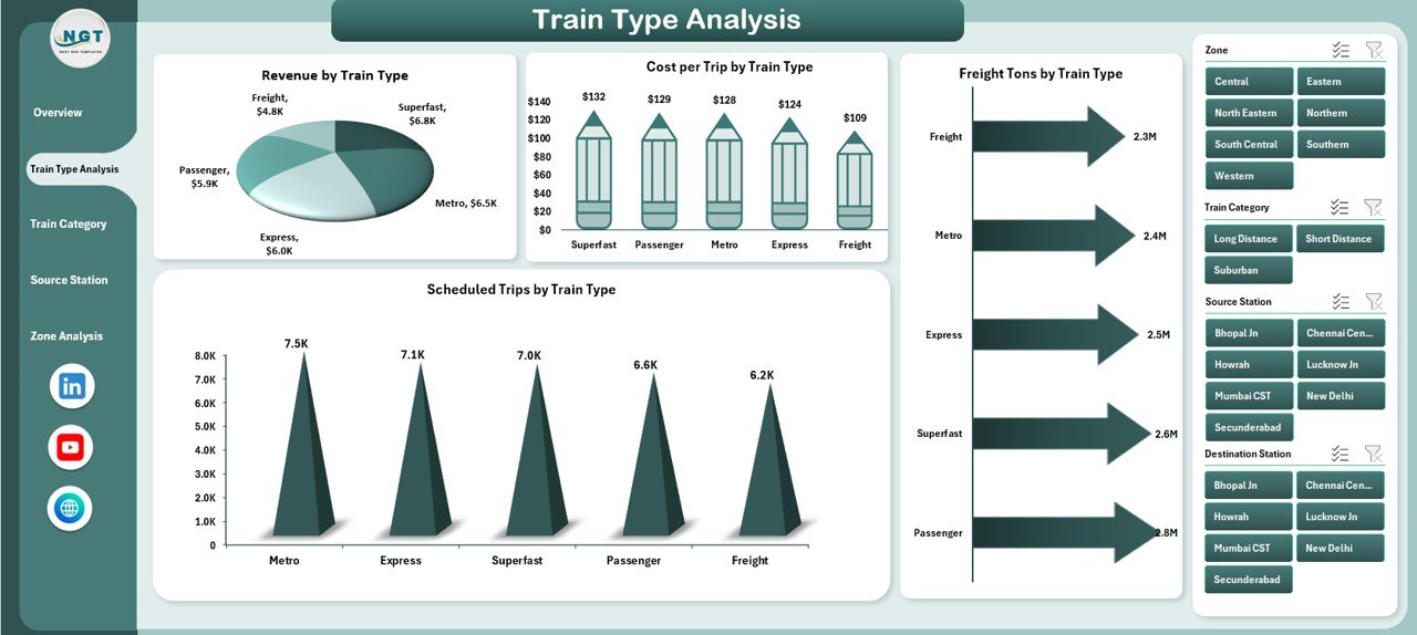
What Is the Purpose of Train Type Analysis?
The Train Type Analysis Page focuses on performance comparison across different train types. Because each train type has unique cost structures and revenue potential, this analysis becomes essential.
Charts on the Train Type Analysis Page
This page includes four powerful charts, such as:
-
Revenue by Train Type
This chart shows which train types generate the most income. -
Cost per Trip by Train Type
This chart highlights efficiency by showing average cost per trip. -
Freight Tons by Train Type
This chart helps freight managers evaluate load distribution. -
Scheduled Trips by Train Type
This chart compares utilization across train types.
By analyzing these visuals together, managers can optimize scheduling, pricing, and resource allocation.
Click to Purchases Railways Dashboard in Excel
Why Is Train Category Analysis Important in Railways?
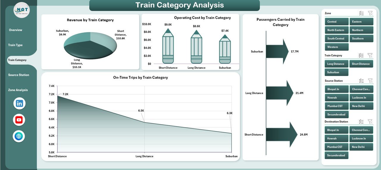
What Does Train Category Analysis Cover?
The Train Category Analysis Page evaluates performance by category, such as passenger, freight, express, or suburban trains. Because each category serves different objectives, this page supports balanced decision-making.
Charts on the Train Category Analysis Page
This page includes four insightful charts:
-
Revenue by Train Category
This chart shows which categories contribute most to income. -
Operating Cost by Train Category
This chart identifies cost-heavy categories. -
Passengers Carried by Train Category
This chart highlights passenger movement patterns. -
On-Time Trips by Train Category
This chart evaluates punctuality and service quality.
As a result, railway leaders can balance profitability with passenger satisfaction.
How Does the Source Station Analysis Improve Station-Level Insights?

Why Analyze Source Stations?
Each source station plays a unique role in railway operations. Therefore, the Source Station Analysis Page helps identify high-performing and underperforming stations.
Charts on the Source Station Analysis Page
This page includes four station-level charts, such as:
-
Operating Cost by Source Station
This chart shows cost distribution across stations. -
Revenue by Source Station
This chart highlights top revenue-generating stations. -
Passengers Carried by Source Station
This chart helps assess passenger demand. -
Completed Trips by Source Station
This chart measures operational execution.
Because of this analysis, managers can improve station planning and infrastructure investment.
Click to Purchases Railways Dashboard in Excel
What Insights Does the Zone Analysis Page Provide?
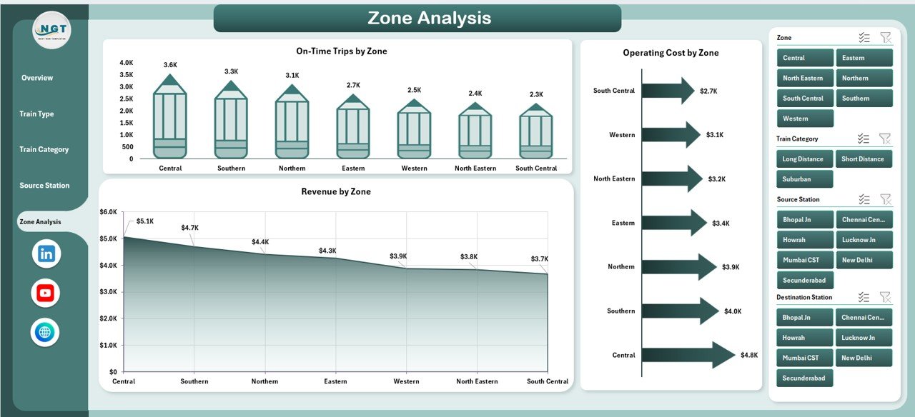
Why Is Zone-Level Analysis Critical?
Railway zones often manage large geographical areas. Consequently, zone-level performance analysis supports policy decisions and funding allocation.
Charts on the Zone Analysis Page
The Zone Analysis Page includes three focused charts:
-
On-Time Trips by Zone
This chart measures punctuality across zones. -
Operating Cost by Zone
This chart compares spending levels. -
Revenue by Zone
This chart highlights financial performance.
Together, these visuals help leadership identify best-performing zones and areas needing improvement.
What Is the Role of Data and Support Sheets?
Why Are Data Sheets Important?
The Data Sheet stores all raw railway data in a structured format. Because pivot tables and charts pull data from this sheet, accuracy and consistency remain critical.
What Does the Support Sheet Do?
The Support Sheet contains helper calculations, lookup tables, and intermediate logic. As a result, the dashboard remains clean, fast, and scalable.
Advantages of a Railways Dashboard in Excel
A Railways Dashboard in Excel offers multiple business and operational benefits.
Key Advantages
-
Improves decision-making speed with visual insights
-
Reduces manual reporting time
-
Enhances transparency across departments
-
Identifies cost-saving opportunities
-
Improves punctuality and service quality
-
Supports data-driven planning
-
Works without expensive BI tools
Therefore, Excel dashboards deliver high value at a low cost.
How Does a Railways Dashboard Improve Operational Efficiency?
A dashboard connects performance data with daily operations. Consequently, managers can:
-
Detect delays early
-
Optimize train schedules
-
Control operating costs
-
Improve asset utilization
-
Enhance passenger satisfaction
Because insights remain visible, teams act faster and more confidently.
What Types of Analysis Can You Perform Using This Dashboard?
The Railways Dashboard in Excel supports multiple analytical perspectives, such as:
-
Trend analysis over time
-
Comparison analysis across divisions, zones, or train types
-
Cost versus revenue analysis
-
Efficiency analysis using cost per trip
-
Service quality analysis using on-time performance
As a result, users gain both strategic and operational insights.
Best Practices for the Railways Dashboard in Excel
To get the most value from your dashboard, follow these proven best practices.
Best Practices You Should Follow
-
Keep raw data clean and standardized
-
Use consistent naming for stations, zones, and train types
-
Update data regularly
-
Limit charts to key insights only
-
Use slicers instead of manual filters
-
Validate numbers before sharing reports
-
Document assumptions and calculations
When teams follow these practices, the dashboard stays reliable and scalable.
What Challenges Can a Railways Dashboard in Excel Face?
Click to Purchases Railways Dashboard in Excel
Although Excel dashboards deliver strong value, some challenges exist, such as:
-
Large datasets may slow performance
-
Manual data entry may cause errors
-
Limited real-time automation without integrations
However, disciplined data management and structured design reduce these challenges significantly.
How Can You Enhance a Railways Dashboard in the Future?
You can enhance the dashboard by:
-
Adding trend lines and YTD analysis
-
Including KPIs for safety and maintenance
-
Automating data updates using Power Query
-
Integrating with Power BI for advanced analytics
Therefore, Excel dashboards also act as a foundation for future BI maturity.
Conclusion: Why Is a Railways Dashboard in Excel a Smart Choice?
A Railways Dashboard in Excel delivers clarity, control, and confidence to railway operations. It converts complex operational data into simple visuals that support faster decisions. Moreover, it remains cost-effective, flexible, and easy to maintain.
Whether you manage divisions, zones, trains, or stations, this dashboard empowers you to track performance, control costs, and improve service quality. As a result, railways move closer to data-driven excellence.
Frequently Asked Questions (FAQs)
What is a Railways Dashboard in Excel used for?
A Railways Dashboard in Excel tracks railway performance, including trips, costs, revenue, passengers, freight, and punctuality.
Can beginners use a Railways Dashboard in Excel?
Yes, beginners can use it easily because it relies on Excel charts, slicers, and simple navigation.
Does the dashboard update automatically?
Yes, charts and KPIs update automatically when users refresh or update the data sheet.
Can this dashboard handle large railway data?
Yes, it can handle large datasets if users structure data properly and use pivot tables efficiently.
Is this dashboard suitable for government railways?
Yes, government railways widely use Excel dashboards for reporting, planning, and performance monitoring.
Can this dashboard integrate with Power BI later?
Yes, Excel dashboards serve as an excellent data source for Power BI integration.
Visit our YouTube channel to learn step-by-step video tutorials