Managing refinery tenders demands precision, speed, and full visibility. Refineries handle high-value contracts, multiple vendors, strict compliance rules, and aggressive timelines. Therefore, decision-makers cannot rely on scattered Excel files or static reports anymore. They need a structured, interactive, and reliable analytics solution.
That is exactly where the Refinery Tender KPI Dashboard in Power BI plays a vital role. This ready-to-use dashboard converts raw tender data into meaningful KPIs, visual indicators, and performance trends. As a result, refinery procurement teams gain complete control over tender performance and make faster, smarter decisions.
In this in-depth and SEO-friendly guide, you will learn what a Refinery Tender KPI Dashboard in Power BI is, how it works, its detailed page structure, KPI logic, Excel data design, advantages, best practices, and frequently asked questions. By the end, you will clearly understand how this dashboard transforms tender monitoring in refinery operations.
What Is a Refinery Tender KPI Dashboard in Power BI?
A Refinery Tender KPI Dashboard in Power BI is a centralized performance monitoring solution designed to track, analyze, and evaluate key performance indicators related to refinery tender processes.
Instead of managing tender data across multiple spreadsheets, this dashboard consolidates all KPIs into one interactive Power BI report. Consequently, procurement managers, contract teams, and refinery leadership gain real-time visibility into tender efficiency, compliance, and financial performance.
Moreover, the dashboard uses Excel as the data source, which ensures flexibility and ease of use. Users only need to update structured Excel sheets, and Power BI automatically refreshes visuals and calculations.
Why Do Refineries Need a Tender KPI Dashboard?
Refinery tender processes involve complex workflows. However, without structured KPI tracking, teams often face cost overruns, missed targets, and delayed decisions.
Here is why a Refinery Tender KPI Dashboard in Power BI becomes essential:
- Refineries manage high-value and high-risk tenders
- Procurement teams deal with multiple vendors and timelines
- Management needs MTD and YTD performance insights
- Compliance teams require clear audit-ready reporting
- Leadership expects fast, data-driven decisions
Therefore, this dashboard bridges the gap between raw tender data and actionable insights.
How Does the Refinery Tender KPI Dashboard in Power BI Work?
The dashboard follows a simple yet powerful workflow:
- Users enter actual and target tender data in Excel
- Power BI reads and models the data
- KPI logic calculates MTD and YTD metrics
- Visual indicators highlight performance status
- Interactive slicers enable deep analysis
As a result, teams can track performance without complex system integrations.
Key Pages of the Refinery Tender KPI Dashboard in Power BI
The dashboard includes three professionally designed pages, each serving a specific analytical purpose.
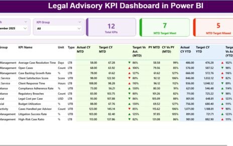
What Does the Summary Page Show?
The Summary Page acts as the main control center of the dashboard. It provides a high-level overview of refinery tender performance.
Top-Level Filters
At the top of the page, you see:
- Month slicer for time-based analysis
- KPI Group slicer for category-wise filtering
These slicers help users focus on specific periods and KPI categories instantly.
KPI Cards on the Summary Page
The summary page displays three important KPI cards:
- Total KPIs Count
- MTD Target Meet Count
- MTD Target Missed Count
These cards provide instant clarity on overall performance.
What Information Appears in the Detailed KPI Table?
Below the KPI cards, the dashboard shows a comprehensive KPI table that includes:
- KPI Number – Unique sequence number
- KPI Group – Category of the KPI
- KPI Name – Name of the KPI
- Unit – Measurement unit
- Type – LTB (Lower the Better) or UTB (Upper the Better)
MTD Performance Columns
- Actual CY MTD – Current year actual MTD value
- Target CY MTD – Current year target MTD value
- MTD Icon – Green ▲ or red ▼ indicator
- Target vs Actual (MTD) – Actual ÷ Target (%)
- PY MTD – Previous year MTD value
- CY vs PY (MTD) – Current ÷ Previous (%)
YTD Performance Columns
- Actual CY YTD – Current year actual YTD value
- Target CY YTD – Current year target YTD value
- YTD Icon – Green ▲ or red ▼ indicator
- Target vs Actual (YTD) – Actual ÷ Target (%)
- PY YTD – Previous year YTD value
- CY vs PY (YTD) – Current ÷ Previous (%)
Therefore, users can evaluate performance from every angle.

How Does the KPI Trend Page Help Analysis?

The KPI Trend Page focuses on performance movement over time.
Visuals on the KPI Trend Page
This page includes two combo charts:
- MTD Actual vs Target vs Previous Year
- YTD Actual vs Target vs Previous Year
These charts clearly show trends, gaps, and improvements.
KPI Selection Slicer
A slicer on the left allows users to select a specific KPI name. As a result, the charts update instantly and show detailed trends for that KPI.
What Is the KPI Definition Page Used For?
The KPI Definition Page acts as a drill-through reference page.
Key Characteristics
- Hidden from normal navigation
- Accessible via drill-through from the summary page
- Displays KPI formula and definition
Why This Page Matters
This page ensures:
- KPI clarity and consistency
- Transparency in calculations
- Better understanding for new users
To return to the summary page, users simply click the Back button on the top-left corner.

How Is Excel Used as the Data Source?
The dashboard uses a structured Excel file as its data source. This design keeps the solution simple and scalable.
What Is Stored in the Input_Actual Sheet?
In the Input_Actual sheet, users enter:
- KPI Name
- Month (first date of the month)
- MTD actual value
- YTD actual value
This sheet captures actual tender performance data.
What Is Stored in the Input_Target Sheet?
In the Input_Target sheet, users enter:
- KPI Name
- Month (first date of the month)
- MTD target value
- YTD target value
This sheet defines expected performance benchmarks.

What Information Goes into the KPI Definition Sheet?
The KPI Definition sheet includes:
- KPI Number
- KPI Group
- KPI Name
- Unit
- Formula
- Definition
- Type (LTB or UTB)
This sheet controls KPI structure and logic.
Advantages of Refinery Tender KPI Dashboard in Power BI
Using a Refinery Tender KPI Dashboard in Power BI delivers measurable benefits.
Key Advantages
- Centralized tender performance monitoring
- Real-time MTD and YTD analysis
- Clear visual status indicators
- Faster decision-making
- Improved compliance visibility
- Easy Excel-based data entry
- Scalable and reusable design
Therefore, refineries gain both operational control and strategic clarity.
How Does This Dashboard Improve Tender Decision-Making?
This dashboard empowers teams to:
- Identify underperforming tenders early
- Compare actual vs target instantly
- Track year-over-year improvement
- Prioritize corrective actions
- Align procurement strategy with refinery goals
As a result, tender management becomes proactive instead of reactive.
Best Practices for the Refinery Tender KPI Dashboard in Power BI
Following best practices ensures maximum value from the dashboard.
Best Practices Checklist
- Maintain clean and consistent Excel data
- Use standardized KPI definitions
- Review MTD performance weekly
- Monitor YTD trends monthly
- Train users on KPI interpretation
- Validate LTB and UTB logic regularly
- Keep targets realistic and measurable
When teams follow these practices, dashboard insights stay accurate and reliable.
Who Should Use a Refinery Tender KPI Dashboard?
This dashboard suits multiple roles:
- Refinery procurement managers
- Tender and contract teams
- Finance and cost-control teams
- Compliance officers
- Refinery leadership and executives
Each role benefits from tailored insights within the same dashboard.
How Does Power BI Add Value Over Traditional Reports?
Unlike static reports, Power BI offers:
- Interactive filtering
- Dynamic calculations
- Visual storytelling
- Drill-through analysis
- Faster insight generation
Therefore, Power BI transforms tender reporting into strategic intelligence.
Conclusion: Why the Refinery Tender KPI Dashboard in Power BI Matters
The Refinery Tender KPI Dashboard in Power BI delivers a powerful, practical, and scalable solution for refinery tender management. It centralizes KPIs, simplifies analysis, and highlights performance gaps clearly.
By combining Excel-based data entry with Power BI analytics, this dashboard ensures flexibility without sacrificing insight quality. As a result, refinery teams gain confidence, control, and clarity in every tender decision.
Frequently Asked Questions (FAQs)
What is a Refinery Tender KPI Dashboard in Power BI?
It is an interactive Power BI report that tracks refinery tender KPIs using Excel as the data source.
Can non-technical users use this dashboard?
Yes. Users only need to update Excel sheets and interact with Power BI visuals.
Does this dashboard support MTD and YTD analysis?
Yes. It calculates and displays both MTD and YTD performance metrics.
Can I customize KPIs for my refinery?
Absolutely. You can modify KPIs through the KPI Definition Excel sheet.
Does the dashboard compare current and previous year performance?
Yes. It includes CY vs PY comparisons for both MTD and YTD.
Is this dashboard suitable for large refineries?
Yes. The design scales easily for large and complex refinery operations.
Visit our YouTube channel to learn step-by-step video tutorials
Watch the step-by-step video tutorial: