In today’s digital era, faith-based organizations are no longer relying solely on manual records or traditional systems to manage their activities, donations, and events. Whether it’s a church, mosque, temple, or charitable ministry, effective data management and analysis are crucial to maintaining transparency, accountability, and engagement within the community.
That’s where the Religious & Faith-Based Organizations Dashboard in Power BI comes in — a powerful, ready-to-use analytics solution designed to help faith leaders and administrators monitor operations, finances, and member engagement all in one place.
This post explores the structure, features, benefits, and best practices for using this Power BI dashboard to transform your organization’s data into actionable insights.
Click to Purchases Religious & Faith-Based Organizations Dashboard in Power BI
What Is a Religious & Faith-Based Organizations Dashboard in Power BI?
A Religious & Faith-Based Organizations Dashboard is a dynamic visual analytics tool built in Microsoft Power BI that allows religious institutions to track and evaluate performance metrics related to their mission, donations, events, and community engagement.
This dashboard consolidates multiple datasets — from event planning and donations to volunteer participation and satisfaction ratings — into a centralized platform. It helps leaders make informed decisions, optimize resource allocation, and identify trends that strengthen their impact.
The dashboard supports interactive slicers, real-time visual updates, and conditional formatting, ensuring that users can visualize their organization’s performance with clarity and confidence.
Structure of the Dashboard
The Religious & Faith-Based Organizations Dashboard in Power BI includes five key pages, each designed to give a unique perspective on your organization’s activities and performance.
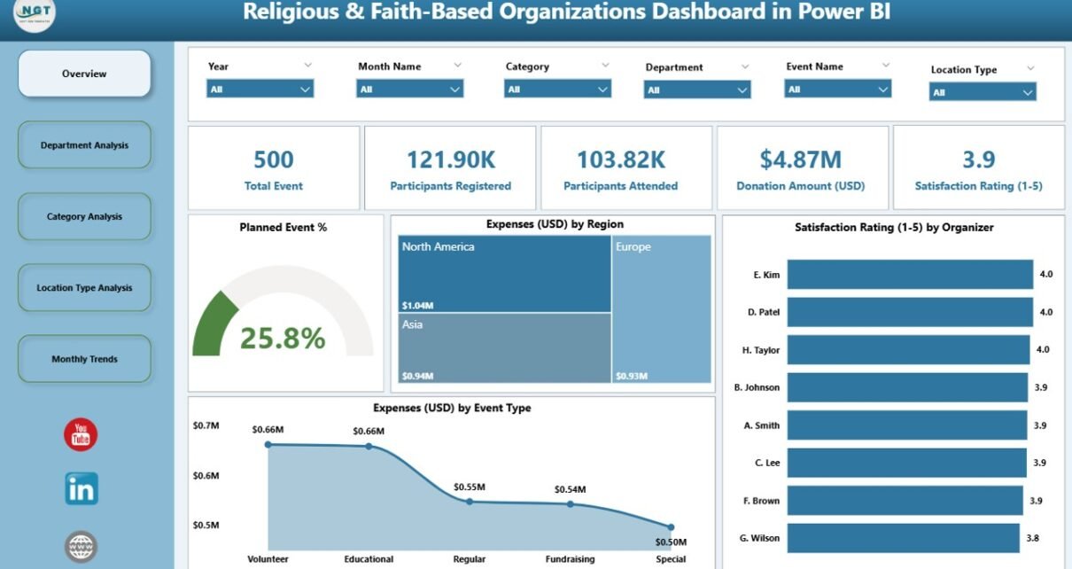
1. Overview Page
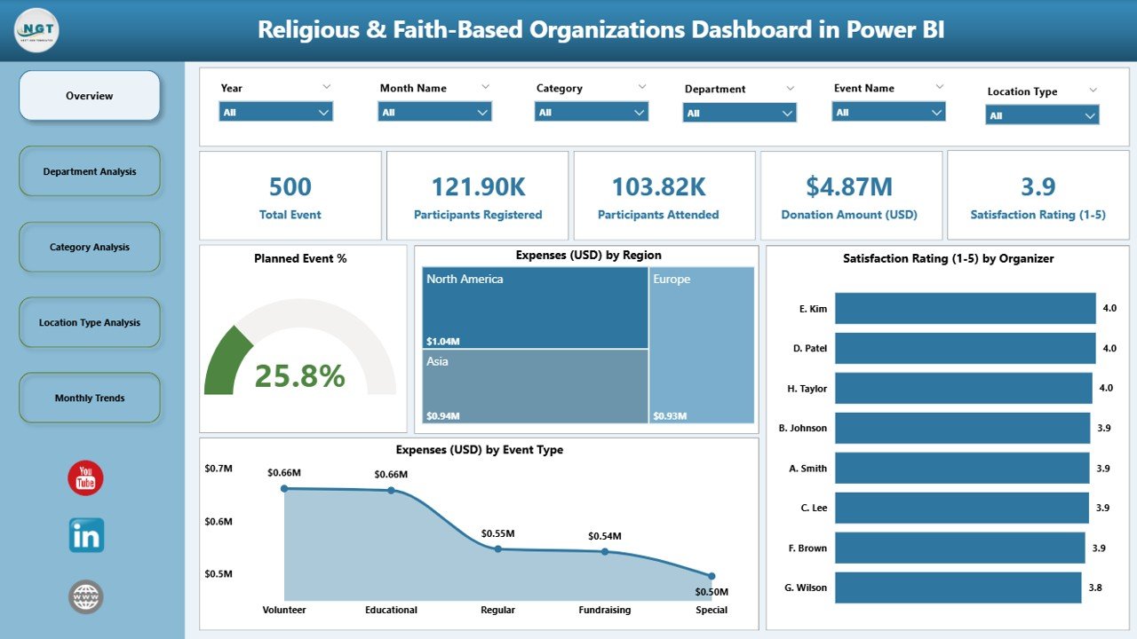
The Overview Page serves as the main visual hub of the dashboard. It provides a high-level summary of the organization’s performance across major KPIs.
Key elements include:
-
Five KPI Cards: Displaying metrics such as Planned Event %, Total Donations, Expenses, and Satisfaction Ratings.
Four Charts:
- Planned Event % – Tracks how well your team adheres to planned activities.
- Expenses (USD) by Region – Shows spending patterns across geographic areas.
- Satisfaction Rating (1–5) by Organizer – Evaluates event success based on attendee feedback.
- Expenses (USD) by Event Type – Analyzes financial distribution by event categories such as charity drives, prayer meetings, or youth programs.
This page helps leadership quickly identify areas of success and those needing attention.
2. Department Analysis Page
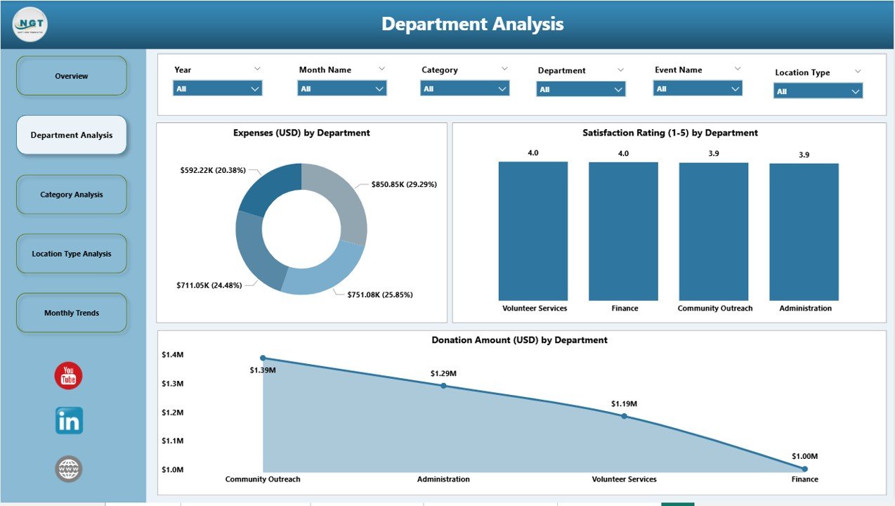
The Department Analysis page allows you to dive deeper into the performance of various departments such as Community Outreach, Youth Ministry, Finance, and Administration.
Key visuals include:
-
Event (USD) by Department – Measures total event-related spending by department.
-
Satisfaction Rating (1–5) by Department – Gauges engagement and participant happiness across departments.
-
Donation Amount (USD) by Department – Highlights how each department contributes to overall fundraising.
By comparing departmental data side-by-side, administrators can balance workloads, allocate funds efficiently, and recognize high-performing teams.
Click to Purchases Religious & Faith-Based Organizations Dashboard in Power BI
3. Category Analysis Page
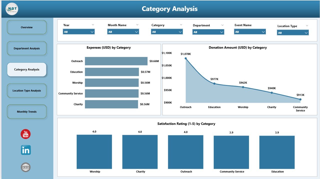
The Category Analysis page segments performance data by event or program categories such as fundraising, volunteer outreach, education, and worship activities.
Charts on this page include:
-
Event (USD) by Category – Displays event expenditures by category type.
-
Satisfaction Rating (1–5) by Category – Monitors feedback trends for specific initiatives.
-
Donation Amount (USD) by Category – Tracks which categories generate the most donations.
This breakdown helps decision-makers understand which programs resonate most with members and where future investments should focus.
4. Location Type Analysis Page
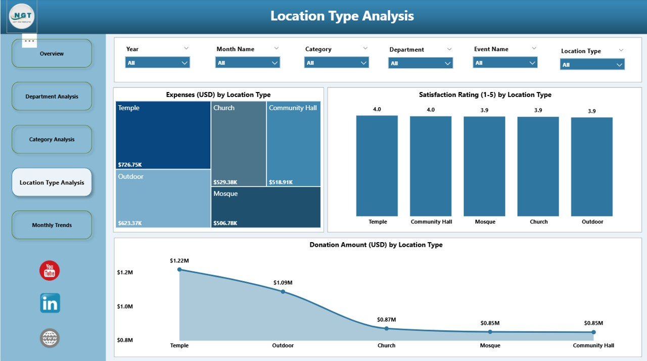
Faith-based organizations often operate in multiple locations — from urban churches to rural community centers. The Location Type Analysis page provides a geographical and contextual overview.
Charts on this page include:
-
Event (USD) by Location Type – Compares event expenditures across types of venues.
-
Satisfaction Rating (1–5) by Location Type – Measures how satisfaction varies by location (for example, central temple vs. local branch).
-
Donation Amount (USD) by Location Type – Evaluates which locations generate the highest donation levels.
This insight helps optimize outreach strategies and ensure equitable support for all branches or congregations.
5. Monthly Trends Page
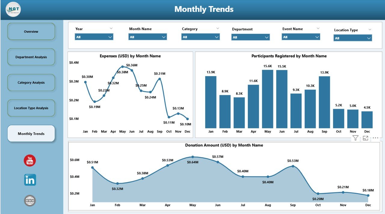
The Monthly Trends page focuses on time-based analytics to uncover seasonal trends and performance changes over months.
Visuals include:
-
Event (USD) by Month – Shows monthly event expenses and financial planning.
-
Donation Amount (USD) by Month – Monitors donation fluctuations over time.
-
Participants Registered by Month – Reveals attendance and engagement trends.
This page provides a powerful overview for annual reviews, planning future activities, and forecasting financial needs.
🌈 Why Use Power BI for Faith-Based Organizations?
Power BI transforms raw data into insightful dashboards, making it the perfect tool for religious and community-based institutions.
Key reasons include:
-
Ease of Use: Power BI’s intuitive interface allows even non-technical users to interact with charts and slicers effortlessly.
-
Automation: Data refreshes automatically, eliminating manual report updates.
-
Data Integration: Connects to multiple data sources like Excel, Google Sheets, or donor management tools.
-
Interactive Visuals: Enables real-time exploration with filters, comparisons, and drill-down capabilities.
-
Accessibility: Dashboards can be shared securely with staff or volunteers across devices.
💡 Advantages of Religious & Faith-Based Organizations Dashboard in Power BI
Implementing this dashboard offers a range of benefits that go beyond just data visualization.
1. Centralized Data Management
Consolidate all data — donations, expenses, event details, and satisfaction scores — in one unified platform. This eliminates the need for multiple spreadsheets or disconnected systems.
2. Enhanced Financial Transparency
Transparent reporting builds trust among donors, members, and external stakeholders. The dashboard provides a clear breakdown of how funds are collected and spent.
3. Improved Decision-Making
Leaders can quickly identify underperforming areas, successful programs, and potential cost savings through easy-to-read visual analytics.
4. Greater Donor Insights
Analyze donor behavior, identify repeat contributors, and track donation trends by region, event, or department.
5. Streamlined Event Management
Plan and track events efficiently with metrics on attendance, expenses, and satisfaction. This helps improve future event organization.
6. Better Community Engagement
Understanding satisfaction scores and participation rates allows organizations to enhance programs that truly resonate with members.
7. Real-Time Performance Monitoring
Power BI’s dynamic updates ensure that data reflects the latest performance indicators, supporting agile decision-making.
How the Dashboard Supports Organizational Growth
Faith-based organizations rely on community trust and efficient operations. This Power BI dashboard provides both by ensuring measurable, data-backed growth.
By continuously monitoring metrics such as Planned Event %, Satisfaction Rating, and Donation Amount, organizations can spot trends early and implement timely improvements. This analytical approach drives not just operational efficiency but also spiritual and social impact.
How to Use the Dashboard Effectively
To make the most out of the Religious & Faith-Based Organizations Dashboard in Power BI, follow these simple steps:
- Import Your Data: Upload data from Excel, Google Sheets, or donor management software.
- Set Filters and Slicers: Use the interactive slicers to view insights by month, category, or region.
- Review KPI Cards: Start from the Overview page to see the big picture.
- Drill Down for Insights: Explore detailed pages like Department or Category Analysis for granular insights.
- Share Reports: Export or publish dashboards securely for your team or board members.
- Monitor Regularly: Refresh data periodically to keep metrics up to date.
Opportunities for Improvement
Even the best dashboards can evolve. Here are a few opportunities to make this Power BI dashboard even more impactful:
-
Add Volunteer Performance Metrics to measure engagement and contribution.
-
Integrate Social Media Analytics to monitor community outreach effectiveness.
-
Include Forecasting Tools for predicting donations and participation trends.
-
Automate Alerts to notify leaders about low engagement or financial discrepancies.
-
Expand KPI Range to include spiritual growth indicators like new memberships or participation in counseling sessions.
🧭 Best Practices for Religious & Faith-Based Organizations Dashboard in Power BI
Click to Purchases Religious & Faith-Based Organizations Dashboard in Power BI
To ensure accuracy, efficiency, and adoption, follow these best practices:
✅ 1. Keep Data Clean and Organized
Ensure all data sources use consistent formats. For example, event names, locations, and departments should match across datasets.
✅ 2. Update Data Regularly
Schedule automatic data refreshes to ensure decisions are based on the latest information.
✅ 3. Customize KPIs
Tailor KPIs to your organization’s mission — focus on metrics that align with your goals, such as outreach participation or volunteer hours.
✅ 4. Secure Sensitive Information
Restrict access to financial and personal data using Power BI’s built-in security settings.
✅ 5. Use Conditional Formatting
Visual cues like color-coded arrows and trend lines make the dashboard more intuitive.
✅ 6. Engage Stakeholders
Share visual insights during meetings to promote transparency and collective decision-making.
✅ 7. Continuously Improve
Collect feedback from users and regularly enhance dashboard visuals, filters, or KPI definitions.
Real-World Applications
Many faith-based organizations use this dashboard to track:
-
Donation Patterns during religious festivals or annual events.
-
Community Program Impact through satisfaction ratings.
-
Expense Distribution across departments and outreach missions.
-
Volunteer Participation Trends throughout the year.
-
Member Retention and Growth via participation analytics.
These insights help leadership teams make strategic decisions that align with their spiritual mission and financial sustainability.
🧠 Conclusion
The Religious & Faith-Based Organizations Dashboard in Power BI is not just a visualization tool — it’s a strategic compass for modern religious institutions. By leveraging data-driven insights, organizations can enhance transparency, strengthen donor relationships, optimize event planning, and deepen community impact.
In a world where technology and faith intersect, this dashboard empowers leaders to make thoughtful, informed, and mission-aligned decisions — ensuring that every dollar spent and every event organized contributes meaningfully to the organization’s purpose.
🙋♀️ Frequently Asked Questions (FAQs)
1. What is the main purpose of a Religious & Faith-Based Organizations Dashboard?
The main purpose is to help faith-based organizations track key performance indicators such as donations, event expenses, and satisfaction ratings in a centralized and visual format.
2. Can non-technical users operate this dashboard?
Yes. The Power BI interface is intuitive and user-friendly, allowing even non-technical staff to interact with visuals and extract insights easily.
3. How can this dashboard improve financial transparency?
It provides detailed breakdowns of income and expenses by department, region, and event type — ensuring accountability and building trust with donors.
4. Can we add more KPIs or pages to this dashboard?
Absolutely. Power BI’s flexibility allows users to add new metrics, visuals, and filters as organizational needs evolve.
5. Is this dashboard compatible with online Power BI services?
Yes. You can publish it online, share it with authorized users, and access it securely from any device.
6. What kind of data sources can we connect to this dashboard?
You can connect Excel sheets, SQL databases, Google Sheets, or any donor management tool that stores structured data.
7. How often should the dashboard data be updated?
It’s best to refresh the data weekly or monthly depending on your event frequency and financial activity.
8. Does the dashboard track volunteer participation?
Currently, it focuses on events, donations, and satisfaction, but you can easily add a volunteer KPI to track engagement.
9. Why choose Power BI over Excel for this type of dashboard?
Power BI offers more dynamic visuals, interactivity, and automation features, making it ideal for ongoing monitoring and multi-user collaboration.
10. Can this dashboard help with annual reports or audits?
Yes. Its structured data presentation makes it easy to generate reports for audits, donor reviews, or annual summaries.
Visit our YouTube channel to learn step-by-step video tutorials
Click to Purchases Religious & Faith-Based Organizations Dashboard in Power BI