In today’s world of innovation and discovery, research institutions generate vast amounts of data daily — from project progress and funding allocation to publication outputs and impact scores. Managing and visualizing all this information can be challenging without the right analytical tool. That’s where the Research Institutions Dashboard in Power BI becomes an indispensable asset.
This article explores everything about this powerful dashboard — what it is, how it works, its structure, advantages, opportunities for improvement, best practices, and frequently asked questions.
Click to Purchases Research Institutions Dashboard in Power BI
What Is a Research Institutions Dashboard in Power BI?
A Research Institutions Dashboard in Power BI is a data visualization and performance monitoring tool designed for universities, research organizations, and funding agencies. It consolidates data from various sources — including Excel files, databases, and funding records — into a single interactive view.
Instead of analyzing data manually, Power BI automates data aggregation and provides visual insights through charts, KPIs, and dynamic slicers. Users can explore metrics such as:
🎯 Impact Score — measuring the influence of projects and publications
💰 Funds Allocated vs. Funds Utilized — ensuring financial efficiency
👩🔬 Researchers by Department — evaluating manpower and productivity
📈 Completed and Delayed Projects — tracking institutional performance
This dashboard allows research administrators, funding managers, and principal investigators to make informed, data-driven decisions that directly enhance project outcomes and strategic planning.
Dashboard Structure Overview
The Research Institutions Dashboard in Power BI is organized into five key pages, each serving a specific analytical purpose.
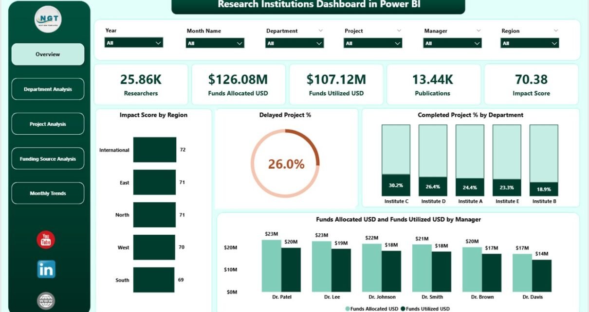
1️⃣ Overview Page
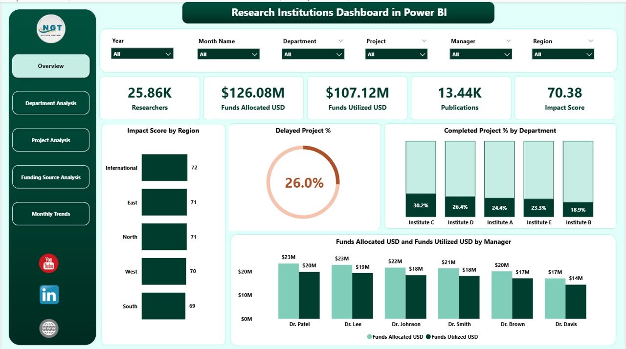
The Overview Page is the primary summary screen. It offers an instant understanding of institutional performance across regions and departments.
Key elements include:
-
5 KPI Cards highlighting Impact Score, Delayed Project %, Completed Project %, Funds Allocated (USD), and Funds Utilized (USD).
Interactive Charts such as:
- Impact Score by Region
- Delayed Project % by Department
- Completed Project % by Department
- Funds Utilized vs. Funds Allocated by Manager
Users can easily select parameters using slicers to filter results by time period, manager, or project group.
2️⃣ Department Analysis Page
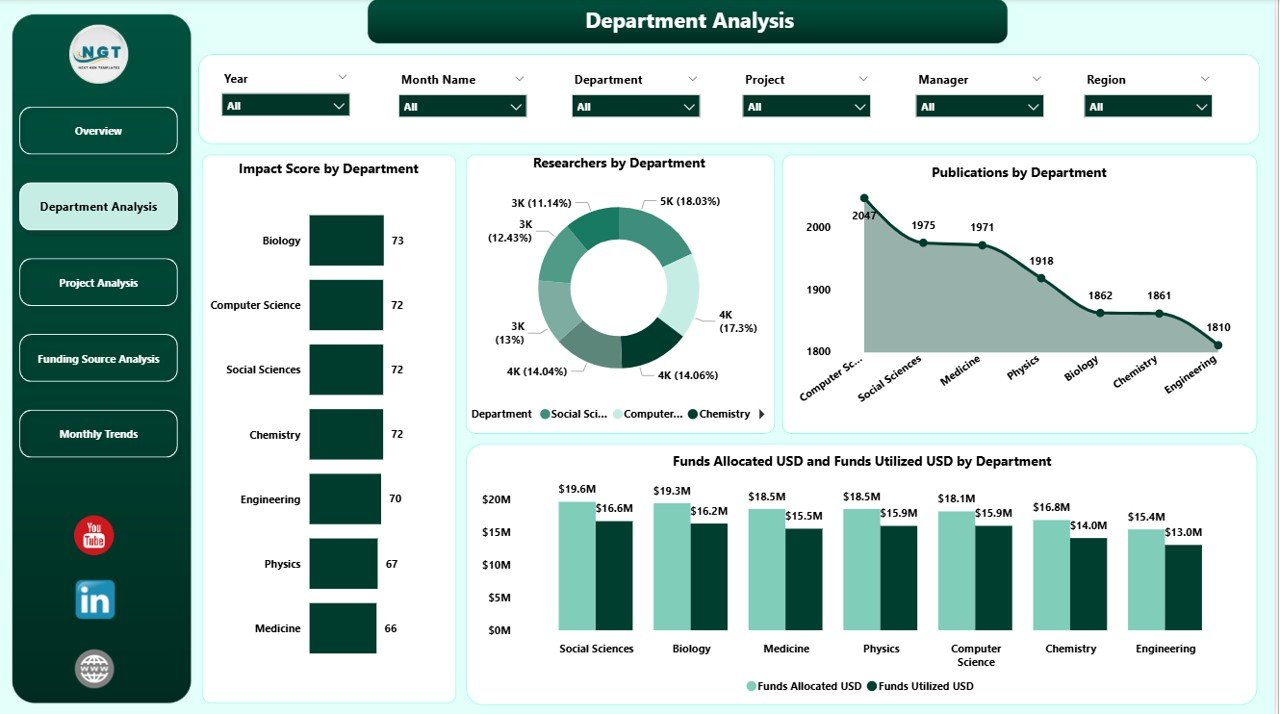
This page provides an in-depth breakdown of each department’s contribution and resource utilization.
Main visuals include:
-
Impact Score by Department
-
Number of Researchers by Department
-
Publications by Department
-
Fund Allocated vs. Utilized (USD)
This helps leadership identify high-performing departments and those requiring additional funding or manpower.
3️⃣ Project Analysis Page
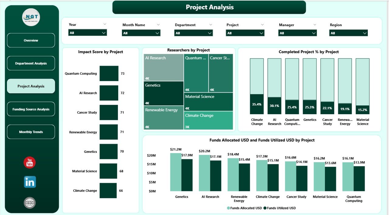
The Project Analysis section evaluates performance at a project level, helping managers track timelines, budgets, and outputs.
Charts on this page include:
-
Impact Score by Project
-
Researchers by Project
-
Completed % by Project
-
Funds Allocated vs. Utilized (USD) by Project
This section is particularly useful for project audits and progress reviews.
Click to Purchases Research Institutions Dashboard in Power BI
4️⃣ Funding Source Analysis Page
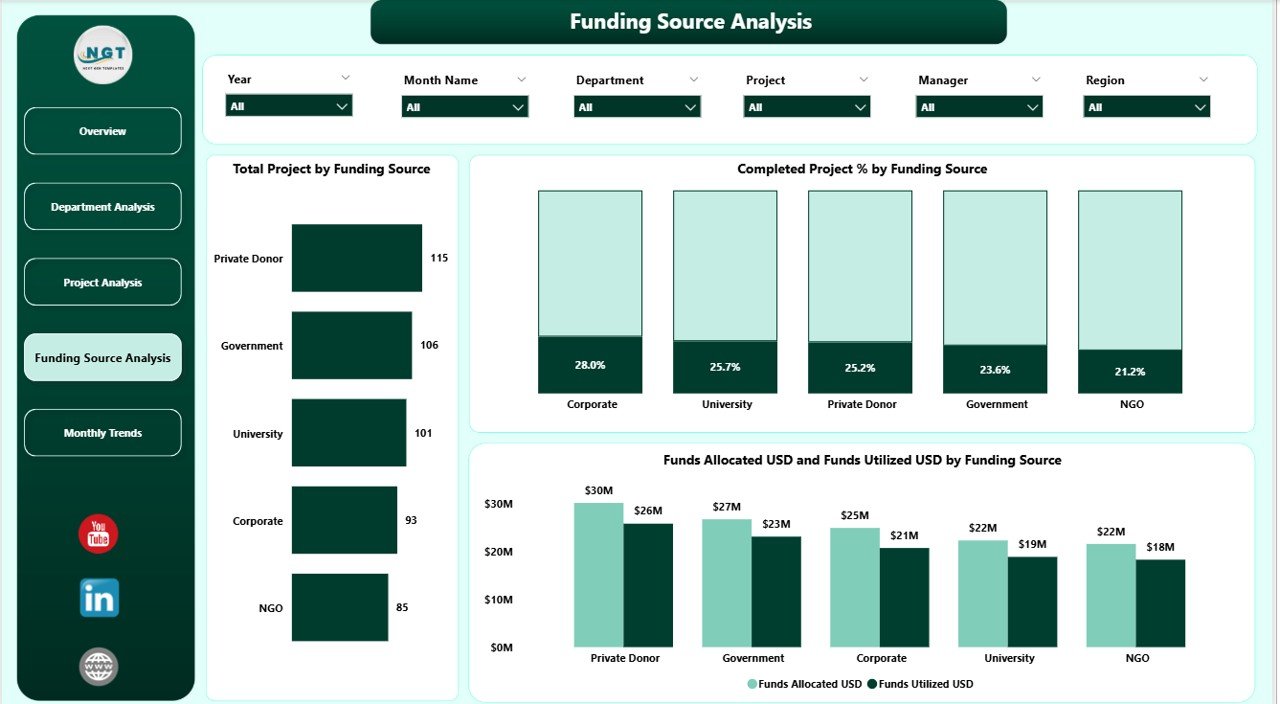
Every research institution relies on multiple funding sources — public, private, and international. This page highlights how each source contributes to ongoing and completed projects.
Visual components include:
-
Total Projects by Funding Source
-
Completed % by Funding Source
-
Funds Allocated vs. Utilized (USD) by Funding Source
By comparing funding effectiveness, institutions can identify which sponsors or grants yield the highest research impact.
5️⃣ Monthly Trends Page
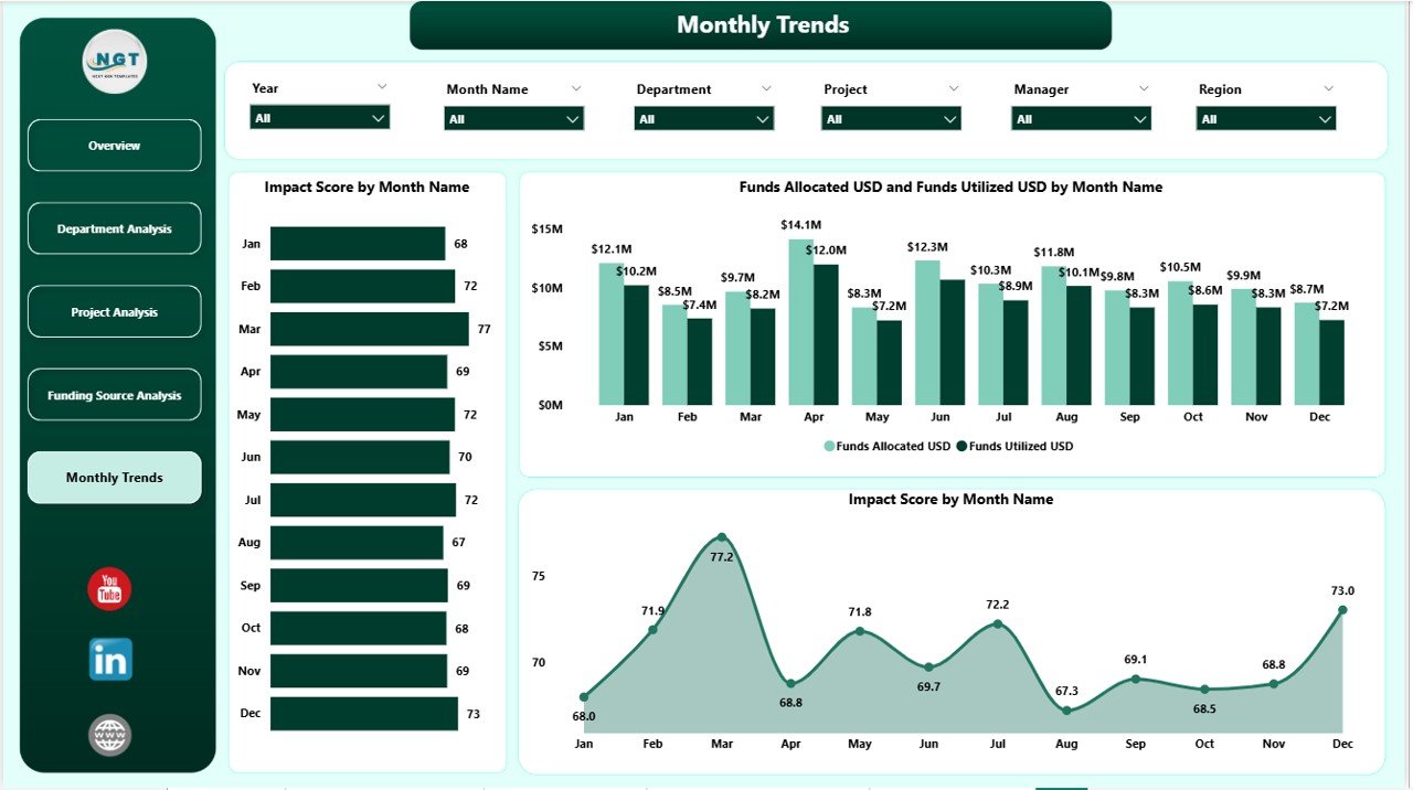
The Monthly Trends page showcases temporal data patterns, helping administrators assess whether progress aligns with annual goals.
Charts on this page include:
-
Impact Score by Month
-
Funds Allocated vs. Funds Utilized (USD) by Month
-
Project Completion Trend
This page enables a time-series comparison, revealing performance peaks and low periods throughout the year.
🎯 Why Research Institutions Need Power BI Dashboards
Traditional research management often involves static Excel sheets or periodic reports that delay decision-making. Power BI transforms this process by enabling real-time visualization, data refresh automation, and user-driven exploration.
Key reasons to use this dashboard include:
-
Centralized view of KPIs across all research domains
-
Instant performance comparisons by project, department, and region
-
Dynamic filtering and interactivity for customized insights
-
Integration with multiple data sources (Excel, SQL, APIs)
-
Visual storytelling through charts and trend lines
Key Features of the Research Institutions Dashboard
Here’s a detailed look at the most notable features that make this dashboard practical and powerful:
📊 Multi-Layered Analytics
Analyze performance from macro (institution-wide) to micro (individual project) levels using drill-through options.
🧮 Automated Data Refresh
When data is captured in Excel or databases, Power BI automatically updates dashboards without manual intervention.
🎛️ Dynamic Filters and Slicers
Users can select managers, projects, departments, or regions through slicers for focused insights.
💵 Financial Tracking
Compare allocated vs. utilized funds to identify efficiency gaps.
🧠 Impact Evaluation
Visualize the relationship between funding levels and research impact to guide future investment.
🧾 Publication Tracking
Monitor publications, patents, and conference outputs department-wise.
Advantages of Research Institutions Dashboard in Power BI
Let’s explore the major benefits this dashboard offers to administrators and researchers alike:
1. Enhanced Decision-Making
Power BI’s visual analytics empower leadership to make quick and informed decisions based on live data rather than static reports.
2. Transparency and Accountability
Departments can transparently showcase their performance, improving trust among stakeholders and sponsors.
3. Time Savings
Automated updates and filters reduce manual report preparation time significantly.
4. Improved Funding Utilization
Tracking fund allocation versus utilization helps identify areas of waste and ensures maximum impact from financial resources.
5. Collaborative Reporting
Multiple users can access the dashboard simultaneously, facilitating teamwork and shared insights.
6. Visual Clarity
Charts, cards, and conditional formatting make it easy to identify high or low-performing KPIs at a glance.
Click to Purchases Research Institutions Dashboard in Power BI
🔍 Opportunities for Improvement
Even though the Research Institutions Dashboard in Power BI offers robust capabilities, there’s always room for enhancement. Here are potential improvement areas:
-
Integration with APIs: Incorporating APIs from Scopus, PubMed, or Google Scholar could automate publication tracking.
-
Predictive Analytics: Adding AI-driven forecasting can help predict project completion or funding needs.
-
Benchmarking Feature: Compare institutional KPIs with global averages for performance benchmarking.
-
Mobile Optimization: Designing mobile-friendly layouts for on-the-go data review.
-
Automated Alerts: Setting email or Teams notifications when KPI thresholds are breached.
Best Practices for Using Research Institutions Dashboard in Power BI
To get maximum value from the dashboard, institutions should follow these best practices:
1️⃣ Maintain Clean and Structured Data
Ensure data sources (Excel, databases) are properly formatted, with consistent naming conventions and no duplicate entries.
2️⃣ Define Clear KPIs
Choose metrics that align with institutional goals — such as Impact Score, Fund Utilization %, or Publication Output.
3️⃣ Automate Data Refresh
Schedule Power BI refresh cycles (daily, weekly, or monthly) to keep your reports updated.
4️⃣ Train Users
Provide basic Power BI training to researchers and administrators for effective navigation and use.
5️⃣ Use Color Coding Wisely
Apply consistent color schemes — green for growth, red for decline — to make trends instantly recognizable.
6️⃣ Secure Sensitive Information
Implement access control and row-level security to ensure only authorized personnel view confidential data.
7️⃣ Monitor Performance
Regularly review dashboard load time and optimize visuals for smoother performance.
How to Build a Research Institutions Dashboard in Power BI
Creating this dashboard involves a series of well-defined steps.
Step 1: Collect and clean data in Excel or a database.
Step 2: Import data into Power BI using “Get Data.”
Step 3: Establish relationships among tables (Projects, Departments, Funding).
Step 4: Build visualizations using charts, cards, and slicers.
Step 5: Add filters and drill-through pages for detailed analysis.
Step 6: Format visuals using conditional formatting and color legends.
Step 7: Publish the dashboard to Power BI Service and share access.
📊 Visualization Ideas for Better Insights
-
Pie Charts for Funding Source distribution
-
Bar Charts for Departmental performance
-
Line Charts for Monthly Trends
-
Card Visuals for KPIs (Impact Score, Funds Utilized %)
-
Stacked Columns for comparing Allocated vs. Utilized Funds
These visuals make the dashboard engaging and easy to interpret.
🧭 Real-Life Use Cases
-
University Research Centers: Tracking publication impact and collaboration success.
-
Government Research Agencies: Monitoring project progress across regions.
-
Non-Profit Organizations: Evaluating grant-funded research effectiveness.
-
Private R&D Labs: Comparing project ROI and resource allocation efficiency.
🏁 Conclusion
The Research Institutions Dashboard in Power BI is more than just a reporting tool — it’s a complete data intelligence system. It enables organizations to monitor performance, enhance accountability, and optimize research impact with real-time analytics.
Whether you’re managing national-level research projects or university departments, this dashboard helps you visualize progress, manage funding effectively, and identify areas for growth.
With Power BI’s interactive features, institutions can transform raw data into strategic insights — ensuring that every research effort contributes meaningfully to innovation and global development.
❓ Frequently Asked Questions (FAQs)
1. What type of data sources can be connected to this dashboard?
You can connect Excel, SQL Server, SharePoint, Access, or even web APIs to feed real-time data into Power BI.
2. Can multiple users access the dashboard simultaneously?
Yes, Power BI allows shared access with role-based permissions and collaboration features.
3. How often can data refresh automatically?
You can schedule data refreshes daily, hourly, or at custom intervals depending on the institution’s needs.
4. Can this dashboard track international collaborations?
Absolutely. With the right dataset, Power BI can analyze collaboration trends by country or region.
5. Is it possible to export visuals or reports from Power BI?
Yes, users can export visuals to PDF, PowerPoint, or Excel for presentations and reports.
6. Do you need coding knowledge to use this dashboard?
No, Power BI uses a drag-and-drop interface, though familiarity with DAX formulas enhances capabilities.
7. Can this dashboard be customized for different research domains?
Yes, you can easily modify visuals and KPIs for any field — from life sciences to engineering research.
Visit our YouTube channel to learn step-by-step video tutorials