In today’s fast-paced retail and e-commerce world, companies compete fiercely not only on product and price but also on the employee experience. After all, motivated and satisfied staff deliver better service, higher sales, and stronger customer loyalty. Consequently, tracking employee satisfaction with precision becomes vital. That’s where a Retail and E-commerce Employee Satisfaction KPI Dashboard in Excel comes into play.
This ready-to-use dashboard provides real-time insights into how your frontline teams feel, helping you spot issues early and act swiftly. Moreover, it offers both month-to-date (MTD) and year-to-date (YTD) comparisons against targets and last year’s performance. As a result, you gain a 360° view of your workforce morale and can drive continuous improvement.
In this article, you’ll discover:
-
What this dashboard includes
-
How each worksheet works
-
Key advantages you’ll enjoy
-
Best practices to follow
-
Answers to frequently asked questions
Let’s dive in and see how you can transform raw data into actionable insights!
Click to Purchases Retail and E-commerce Employee Satisfaction KPI Dashboard in Excel
What Is a Retail and E-commerce Employee Satisfaction KPI Dashboard?
A KPI dashboard in Excel collects, organizes, and visualizes your most important metrics on one screen. Specifically, an Employee Satisfaction KPI Dashboard tracks key indicators that reflect how happy and engaged your store associates, warehouse staff, customer-care agents, and delivery teams feel.
Unlike static reports, this dashboard updates dynamically. Whenever you enter new data, charts and comparisons refresh instantly. Consequently, your HR leaders and store managers can make data-driven decisions without waiting days for monthly reports.
Key Features of This KPI Dashboard
This template consists of seven interlinked worksheets. Each one plays a unique role in capturing, storing, or visualizing your employee satisfaction metrics. Below, you’ll find a clear breakdown of every sheet:
Home Sheet
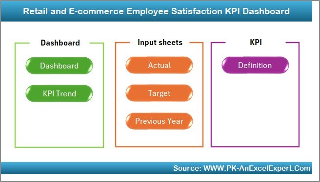
First, the Home sheet acts as the dashboard’s control center. Here’s what it offers:
-
Six navigation buttons—each jumps to a different sheet
-
A clean, uncluttered interface that welcomes users
-
Quick access to input areas and reports
By clicking a button, you land instantly on the relevant tab. In addition, you avoid scrolling and potential errors, saving time and frustration.
Click to Purchases Retail and E-commerce Employee Satisfaction KPI Dashboard in Excel
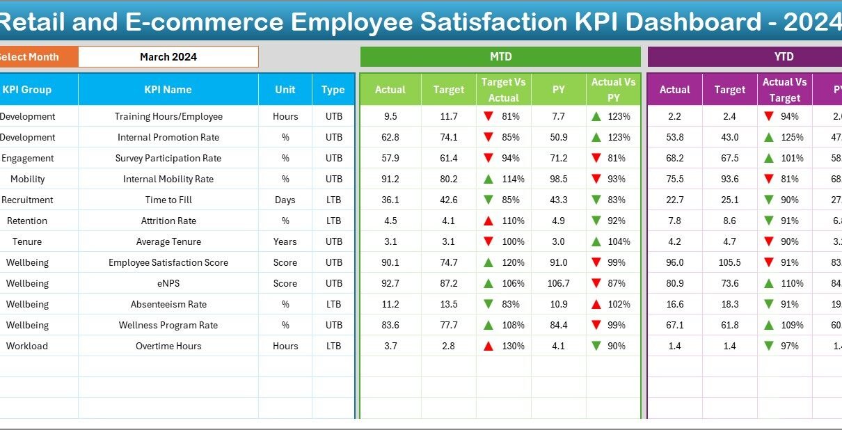
Dashboard Sheet
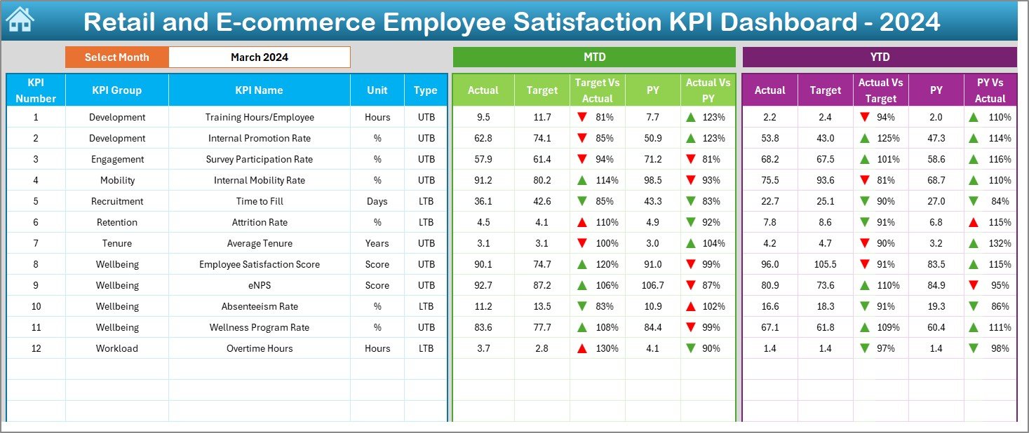
Next, the Dashboard sheet presents a complete snapshot of all KPIs for a chosen month. Key elements on this sheet include:
-
Month selector (cell D3)—picks the month you want to analyze
-
MTD Actual vs. Target vs. Previous Year with up/down arrows
-
YTD Actual vs. Target vs. Previous Year with conditional formatting
-
Clear data tables and visual cues that draw your eye
Because you select the month from a dropdown, Excel recalculates all figures instantly. As a result, you compare current performance against goals and last year’s benchmarks at a glance.
KPI Trend Sheet
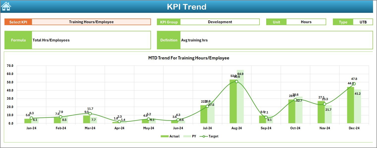
Then, the KPI Trend sheet dives deeper into individual metric behavior over time. On this tab, you will:
-
Choose a KPI from the dropdown in cell C3.
-
See KPI Group, Unit, Type (Lower-the-Better or Upper-the-Better), Formula, and Definition displayed automatically.
-
View MTD and YTD trend charts showing Actual, Target, and PY (Previous Year) values.
Consequently, you track each KPI’s trajectory, spot patterns, and detect anomalies before they become problems.
Actual Numbers Input Sheet
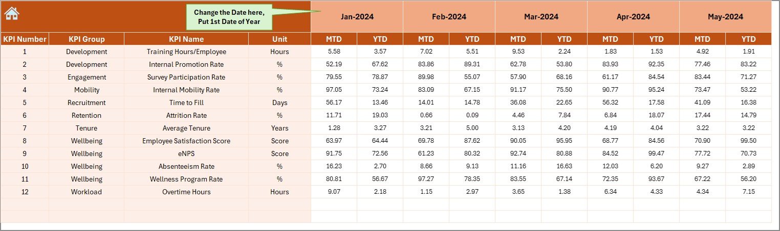
Next, the Actual Numbers Input sheet serves as your data-entry area for MTD and YTD figures:
-
Month selector (cell E1)—enter the first month of your fiscal year
-
YTD and MTD columns—input the raw satisfaction scores collected from surveys or HR systems
-
Data validation ensures you record numbers in the correct format
Because you standardize data entry here, the entire dashboard remains accurate and reliable.
Target Sheet
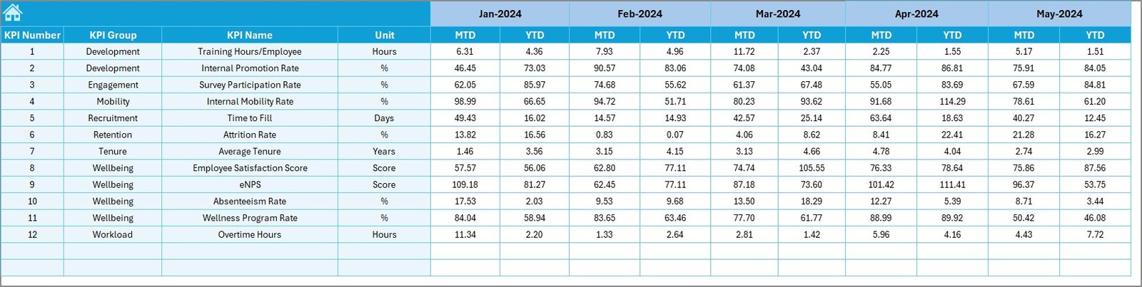
Meanwhile, the Target sheet holds your goal figures for each KPI:
-
MTD targets—monthly satisfaction benchmarks you set
-
YTD targets—cumulative goals for the year
-
Easily adjustable values let you recalibrate objectives whenever needed
In addition, you can set stretch goals to push teams toward higher engagement, then track progress in real time.
Click to Purchases Retail and E-commerce Employee Satisfaction KPI Dashboard in Excel
Previous Year Numbers Sheet
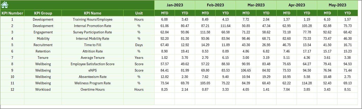
Similarly, the Previous Year Number sheet stores last year’s actuals:
-
Mirror structure to the Actual Numbers Input sheet
-
Enter both MTD and YTD figures from the prior year
-
Serve as a baseline for year-over-year comparisons
Because past performance influences future planning, having PY data readily available proves invaluable.
KPI Definition Sheet
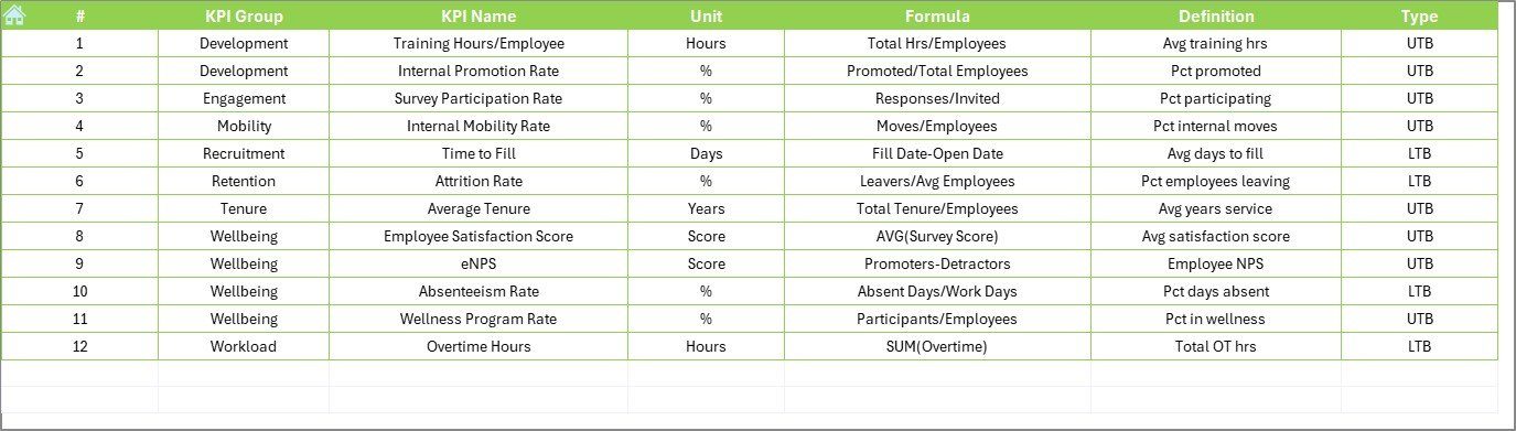
Finally, the KPI Definition sheet documents each metric’s core details:
-
KPI Name
-
KPI Group (e.g., “Work Environment,” “Recognition,” “Work-Life Balance”)
-
Unit (e.g., score out of 5, percentage)
-
Formula (e.g., AVERAGE of survey ratings)
-
Definition (short, clear description)
As a result, any stakeholder can understand what each KPI measures and how to interpret its values.
Advantages of a Retail and E-commerce Employee Satisfaction KPI Dashboard
Implementing this Excel dashboard brings multiple benefits. Below are the top advantages you’ll gain:
-
Instant Visibility
-
You see MTD and YTD performance at a glance.
-
Conditional formatting highlights wins and gaps.
-
-
Improved Decision-Making
-
You pinpoint issues—such as declining morale in a region—fast.
-
You allocate resources (training, rewards, process changes) where they matter most.
-
-
Enhanced Accountability
-
Managers track targets versus actuals with evidence.
-
Clear KPIs help drive ownership among teams.
-
-
Trend Analysis
-
Monthly charts reveal seasonal patterns or sudden shifts.
-
Year-over-year comparisons help gauge long-term progress.
-
-
Cost-Effective Solution
-
You avoid expensive BI licenses—Excel comes with most Microsoft 365 plans.
-
Learning curve stays low—most users already know Excel basics.
-
-
Customizable and Scalable
-
You can add new KPIs or modify existing ones easily.
-
You customize dashboards for different departments or brands.
-
Therefore, this template delivers actionable insights without complexity or high cost.
How to Use This Dashboard Effectively
To maximize results, follow these steps:
-
Prepare Your Data
-
Gather employee satisfaction survey results or HR system exports.
-
Ensure data covers all relevant teams and time periods.
-
-
Set Your Targets
-
Define realistic MTD and YTD benchmarks aligned with business goals.
-
Involve HR and leadership teams in target-setting.
-
-
Populate Sheets
-
Enter actuals on the Actual Numbers Input sheet.
-
Fill targets on the Target sheet.
-
Input last year’s figures in the Previous Year Numbers sheet.
-
Verify definitions on the KPI Definition sheet.
-
-
Review the Dashboard
-
Select a month on the Dashboard sheet.
-
Analyze variances with arrows and conditional formats.
-
Identify top-performers and under-performers.
-
-
Drill into Trends
-
On the KPI Trend sheet, select metrics that need attention.
-
Examine charts for inconsistencies or spikes.
-
-
Act on Insights
-
Share reports with store managers or department heads.
-
Implement recognition programs or training initiatives.
-
Adjust workflows based on feedback loops.
-
By following these six steps, you’ll turn raw satisfaction scores into concrete actions that boost morale—and, ultimately, sales.
Best Practices for the Retail and E-commerce Employee Satisfaction KPI Dashboard
Even the most powerful tool yields little value without the right practices. Keep these guidelines in mind:
-
Standardize Data Collection
-
Use a consistent survey format and schedule (weekly, monthly).
-
Automate data import with Power Query or VBA macros if possible.
-
-
Maintain Data Quality
-
Validate entries to prevent typos or missing values.
-
Audit data monthly to ensure completeness.
-
-
Engage Stakeholders
-
Involve HR, Store Managers, and Team Leads in dashboard reviews.
-
Schedule regular check-ins to discuss outcomes and next steps.
-
-
Keep Dashboards Simple
-
Limit the number of KPIs to the most impactful (10–15).
-
Avoid clutter—use whitespace, clear labels, and concise definitions.
-
-
Use Clear Visual Cues
-
Leverage conditional formatting (arrows, color scales) for quick reads.
-
Choose chart types that match data patterns (line for trends, bar for comparisons).
-
-
Regularly Refresh Targets
-
Update goals quarterly or semi-annually to reflect changing business priorities.
-
Communicate any target changes clearly to all users.
-
-
Train Your Team
-
Provide short tutorials on how to navigate and interpret the dashboard.
-
Create a simple user guide embedded within the Excel file.
-
By implementing these best practices, you ensure that your KPI dashboard remains both accurate and actionable over time.
Click to Purchases Retail and E-commerce Employee Satisfaction KPI Dashboard in Excel
Common Questions About Employee Satisfaction KPI Dashboards
1. Why should I use Excel instead of a specialized BI tool?
Excel offers flexibility, low cost, and widespread familiarity. In addition, Excel’s built-in features (PivotTables, charts, conditional formatting) easily handle most KPI reporting needs without extra licenses.
2. How often should I update my dashboard?
Update monthly at a minimum. However, if your data arrives weekly, consider weekly refreshes to catch issues sooner. As a result, you maintain timely insights and avoid surprises.
3. Can I add more KPIs to this template?
Absolutely. Simply add rows on the KPI Definition, Target, Actual, and Previous Year sheets. Then, adjust your data ranges on the Dashboard and Trend sheets. In addition, update the dropdown lists to include the new metrics.
4. How do I handle missing data?
Use data validation to flag empty cells. If numbers remain missing, highlight those cells with a distinct color. Next, follow up with data owners to fill gaps promptly.
5. Which charts work best for trend analysis?
Line or area charts work best to show trends over time. Furthermore, combine Actual, Target, and PY values on the same chart to highlight variances clearly.
Conclusion
In short, a Retail and E-commerce Employee Satisfaction KPI Dashboard in Excel empowers you to monitor and enhance team morale with precision. By leveraging seven well-structured worksheets, you track MTD and YTD performance, compare results against targets and past years, and drill into trends—all within a familiar Excel environment.
Furthermore, you’ll enjoy benefits such as instant visibility, data-driven decisions, and cost-effective scalability. At the same time, following best practices—like standardizing data collection and engaging stakeholders—ensures your dashboard remains accurate and impactful.
Now, it’s your turn: download the template, tailor the KPIs to your organization, and start transforming employee satisfaction data into concrete actions. When your teams feel heard and valued, they deliver outstanding customer experiences—and that drives your bottom line.
Frequently Asked Questions
Q1: How do I share this Excel dashboard with my team without breaking formulas?
A1: Save a master copy on a shared drive or SharePoint. Then, distribute “View-Only” links or export snapshots as PDFs. For interactive sharing, publish to Power BI after importing your Excel file.
Q2: Can I link this dashboard to an online survey tool?
A2: Yes. Use Power Query to fetch responses from CSV exports or API endpoints (e.g., SurveyMonkey, Google Forms). Then, refresh your Excel workbook to pull new data automatically.
Q3: What if I need to report quarterly instead of monthly?
A3: Adjust the dropdown on the Dashboard sheet to list quarters (Q1, Q2, etc.). Then, compute MTD as quarter-to-date and YTD as year-to-date. Update formulas accordingly.
Q4: How do I add trendlines or forecast projections?
A4: On the KPI Trend sheet, right-click your line chart series and select “Add Trendline.” Choose a linear or exponential fit, then display the forecast for future periods as needed.
Q5: Is it possible to automate the conditional formatting rules?
A5: Yes. Use Excel’s “Use a formula to determine which cells to format” option. Write formulas that compare Actual vs. Target or PY values, then assign your desired icons or color scales.
Q6: How do I protect certain sheets from accidental edits?
A6: Right-click the sheet tab, choose “Protect Sheet,” and set a password. Then, specify which actions (e.g., editing cells, formatting) users can perform.
Q7: Can I combine multiple country-specific dashboards into one file?
A7: You can. Create separate tabs for each region, then add slicers or dropdowns on the Dashboard to switch between country views. Alternatively, duplicate the entire workbook per region and link to a central summary file.
Visit our YouTube channel to learn step-by-step video tutorials
Click to Purchases Retail and E-commerce Employee Satisfaction KPI Dashboard in Excel
Watch the step-by-step video tutorial: