The ride-hailing and mobility industry is one of the fastest-growing sectors in the world. Ride-Hailing & Mobility Apps KPI Dashboard in ExcelFrom on-demand taxis to micro-mobility platforms and delivery fleets, these busine sses handle thousands of daily transactions — making data tracking essential for sustainable growth.
To keep operations efficient and profitable, companies need a system that can track and analyze performance in real time. That’s exactly what the Ride-Hailing & Mobility Apps KPI Dashboard in Excel delivers — a ready-to-use, automated dashboard designed to monitor key performance indicators (KPIs) for every aspect of your business.
Click to Purchases Ride-Hailing & Mobility Apps KPI Dashboard in Excel
What Is a Ride-Hailing & Mobility Apps KPI Dashboard in Excel?
A Ride-Hailing & Mobility Apps KPI Dashboard is a powerful Excel-based tool that provides a centralized view of your company’s operational performance. It consolidates metrics like total rides, active drivers, customer ratings, fuel costs, cancellations, and revenue into one interactive dashboard.
With this dashboard, managers can:
-
Track monthly and yearly performance at a glance.
-
Identify trends in driver efficiency, customer demand, and fleet usage.
-
Compare actual results with targets and previous year data.
-
Make quick, data-driven decisions to improve service quality and profitability.
Why Use Excel for Mobility and Ride-Hailing KPI Tracking?
Excel remains one of the most flexible and affordable platforms for performance management. Here’s why it’s ideal for mobility operators:
-
🧠 Easy Customization: Add or remove KPIs without complex programming.
-
📊 Dynamic Charts and Indicators: Visualize trends instantly.
-
💡 Automation Ready: Built-in formulas calculate variances automatically.
-
💻 No Software Licensing Cost: Run it on any version of Microsoft Excel.
-
🔄 Scalable: Suitable for startups, mid-sized firms, and large ride-hailing networks alike.
By leveraging Excel, mobility businesses gain a cost-effective yet professional analytics tool that’s both powerful and simple to use.
Click to Purchases Ride-Hailing & Mobility Apps KPI Dashboard in Excel
Structure of the Ride-Hailing & Mobility Apps KPI Dashboard in Excel
The dashboard template contains seven interactive worksheet tabs, each serving a specific purpose to streamline your KPI management process.
1️⃣ Home Sheet – Your Navigation Hub
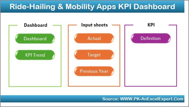
The Home Sheet acts as the command center.
It contains six navigation buttons that allow users to jump to any part of the dashboard with a single click.
Each button links directly to sheets such as Dashboard, KPI Trend, Actual Numbers, Target, Previous Year, and KPI Definition.
This setup makes the entire Excel file feel like a mini-application — clean, structured, and user-friendly.
2️⃣ Dashboard Sheet – Visualize All KPIs in One View
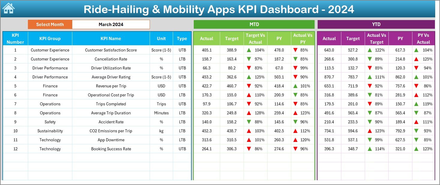
The Dashboard Sheet is the heart of this tool.
At the top (cell D3), users can select the desired month from a dropdown menu. The entire dashboard updates instantly, showing all key metrics for that month.
Displayed Metrics
-
MTD (Month-to-Date): Actual, Target, and Previous Year (PY) data.
-
YTD (Year-to-Date): Actual, Target, and PY data.
Both sections use conditional formatting with up/down arrows to indicate performance status — green arrows for improvement and red arrows for decline.
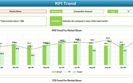
3️⃣ KPI Trend Sheet – Analyze Performance Over Time
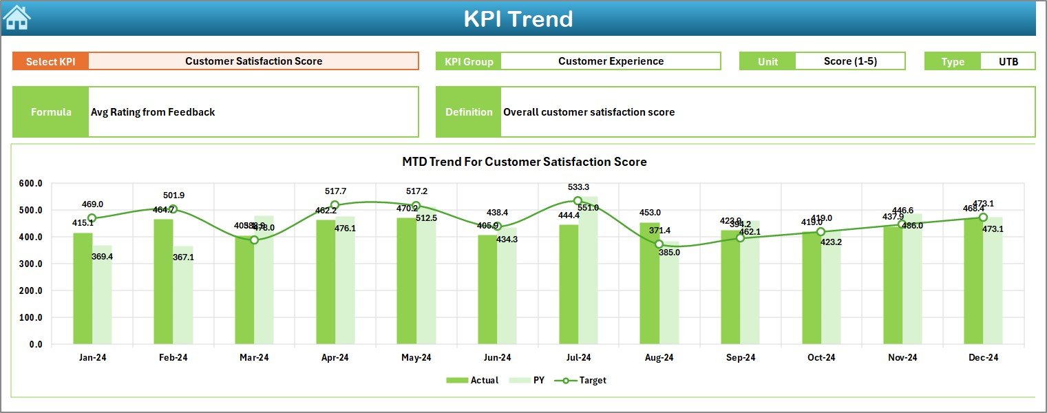
This sheet enables deep-dive analysis for each KPI.
Users can select a KPI from a dropdown (cell C3) to visualize historical performance across months.
Key Features:
-
Displays KPI Group, Unit, Type (UTB/LTB), Formula, and Definition.
-
Shows MTD and YTD trend charts comparing Actual, Target, and Previous Year values.
This view helps managers understand whether performance is improving or declining over time — an essential feature for long-term strategy.
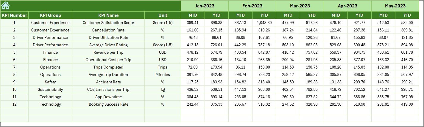
4️⃣ Actual Numbers Input Sheet – Enter Real Performance Data
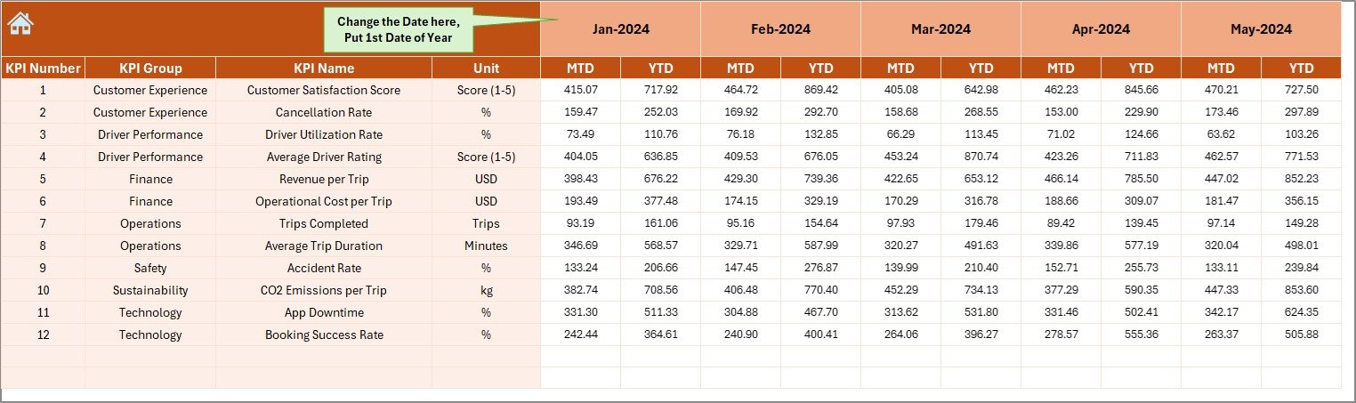
This sheet is where monthly actual results are recorded.
-
The month is selected using cell E1, which holds the first date of the chosen year (e.g., Jan-2025).
-
You’ll enter MTD and YTD values for each KPI.
-
All data automatically feeds into the Dashboard and KPI Trend sheets.
It keeps your dashboard updated without needing manual chart adjustments.
5️⃣ Target Sheet – Define Your Goals
Here, you can set the target values for each KPI.
Both MTD and YTD targets can be entered for every month. This helps compare actual performance against planned objectives and track progress effectively.
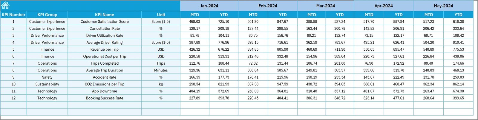
6️⃣ Previous Year Numbers Sheet – Track Historical Data
This sheet stores data for the previous year, structured the same way as the current year input.
It allows quick comparisons and year-over-year growth analysis for each metric — a vital insight for tracking business momentum.
7️⃣ KPI Definition Sheet – Your Reference Guide
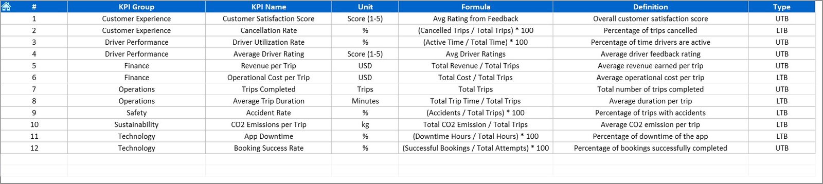
The KPI Definition Sheet acts as your internal documentation hub.
Here you’ll list:
-
KPI Name
-
KPI Group
-
Unit
-
Formula
-
Definition
This ensures everyone — from data entry operators to management — clearly understands how each KPI is defined and measured.
How the Ride-Hailing & Mobility KPI Dashboard Works
Here’s a simple workflow for using the dashboard:
-
Input Data:
Enter your actual MTD and YTD numbers in the “Actual Numbers Input” sheet. -
Add Targets:
Update the “Target Sheet” with monthly and yearly goals. -
Previous Year Data:
Maintain your last year’s data for easy comparisons. -
Auto-Update:
As soon as you change data, all charts and visuals update automatically. -
KPI Trend Analysis:
Use the KPI Trend sheet to monitor long-term performance. -
Navigation:
Use the Home buttons for quick access to any part of the workbook.
This seamless structure ensures accurate reporting and effortless data management.
Click to Purchases Ride-Hailing & Mobility Apps KPI Dashboard in Excel
Advantages of Using the Ride-Hailing & Mobility Apps KPI Dashboard in Excel
1. Centralized Performance Monitoring
All your data — from operations to finance — is visible in one interactive dashboard.
2. Real-Time Updates
As you enter new data, KPIs update automatically. No recalculations or manual chart editing required.
3. Improved Decision-Making
Instantly identify high-performing areas and weak links. Adjust resources or strategy based on data, not guesswork.
4. Easy Customization
Add or remove KPIs based on your app’s operations. Excel formulas make modifications effortless.
5. Visual Indicators for Quick Insights
Green and red arrows simplify interpretation of performance metrics.
6. Budget-Friendly and Accessible
No need for complex BI tools — it runs entirely on Excel.
7. Ideal for Both Startups and Enterprises
Whether you manage 50 rides a day or 50,000, this dashboard scales to your needs.
Best Practices for Managing Ride-Hailing KPIs
-
✅ Define KPIs Clearly: Ensure every metric has a formula and owner.
-
📅 Update Monthly: Refresh your data on a fixed schedule.
-
🎯 Use Conditional Formatting: Automate color-coding for quick visualization.
-
📊 Compare Year-Over-Year: Track how performance evolves over time.
-
🧭 Keep the Dashboard Simple: Focus on 20–30 key KPIs for clarity.
-
🧠 Encourage Cross-Department Collaboration: Share insights between marketing, operations, and finance teams.
-
🔄 Review KPIs Regularly: Adjust targets as your business grows.
Opportunities for Improvement
To elevate your dashboard further, consider:
-
Integrating Power Query for data automation.
-
Adding dynamic slicers for region, driver, or city analysis.
-
Incorporating charts for customer segmentation.
-
Linking with Google Sheets for real-time updates.
-
Adding forecast models using Excel’s trendline tools.
These improvements will make your Excel dashboard more interactive and intelligent.
Click to Purchases Ride-Hailing & Mobility Apps KPI Dashboard in Excel
Conclusion
The Ride-Hailing & Mobility Apps KPI Dashboard in Excel is more than just a spreadsheet — it’s a complete analytical system that helps you make smarter business decisions.
From tracking driver utilization to analyzing customer satisfaction, this dashboard keeps every metric organized, visual, and actionable. Its automation, flexibility, and clarity make it the perfect choice for any mobility company seeking to enhance operational efficiency and profitability.
By using this dashboard, you’ll be able to move from reactive decision-making to data-driven leadership — ensuring your mobility service accelerates toward success.
Frequently Asked Questions (FAQs)
1. What is a Ride-Hailing & Mobility Apps KPI Dashboard?
It’s an Excel-based analytics tool that tracks key performance indicators such as rides, revenue, efficiency, and customer satisfaction.
2. Can I customize the KPIs in this dashboard?
Yes, you can easily add or modify KPIs in the “KPI Definition” sheet to match your business needs.
3. Do I need advanced Excel skills to use this dashboard?
No. It’s fully automated and works with basic Excel knowledge.
4. Is this dashboard suitable for startups?
Absolutely. It’s ideal for startups and large enterprises alike due to its scalable structure.
5. How do I update the data each month?
Simply input the new actual and target numbers in the respective sheets. The dashboard updates automatically.
6. Can I compare performance with previous years?
Yes. Enter previous year data to see year-over-year performance using MTD and YTD comparisons.
7. What are the benefits of using Excel for ride-hailing analytics?
Excel offers cost-effectiveness, flexibility, and automation — making it perfect for KPI management without extra software costs.
Click to Purchases Ride-Hailing & Mobility Apps KPI Dashboard in Excel
Visit our YouTube channel to learn step-by-step video tutorials