The rubber industry runs on precision, efficiency, and quality control. However, many manufacturers still depend on scattered spreadsheets, manual logs, and disconnected reports. As a result, leaders struggle to track defect rates, plant performance, maintenance costs, and revenue in real time.
So, how can rubber manufacturers monitor production health, cost efficiency, and operational performance in one centralized system?
The answer is clear.
Click to Purchases Rubber Industry Dashboard in Power BI
You need a Rubber Industry Dashboard in Power BI.
This powerful, ready-to-use dashboard transforms raw production data into actionable insights. Moreover, it helps plant managers, quality teams, and executives make faster and smarter decisions.
In this detailed guide, you will learn:
-
What a Rubber Industry Dashboard in Power BI is
-
Why rubber manufacturers need it
-
A complete breakdown of all 5 dashboard pages
-
Key metrics you can track
-
Advantages of the Rubber Industry Dashboard
-
Best practices for implementation
-
Frequently asked questions with answers
Let’s explore everything step by step.
What Is a Rubber Industry Dashboard in Power BI?
A Rubber Industry Dashboard in Power BI is a data visualization solution designed specifically for rubber manufacturing companies. It centralizes production, maintenance, cost, and revenue data into interactive reports.
Instead of checking multiple Excel sheets, managers can:
-
Filter data instantly
-
Analyze plant performance
-
Track defect trends
-
Monitor shift productivity
-
Compare product profitability
Furthermore, Power BI allows drill-down analysis. Therefore, leaders can move from a high-level overview to detailed plant or shift insights within seconds.
Why Does the Rubber Industry Need a Power BI Dashboard?
The rubber manufacturing sector faces several operational challenges:
-
High defect rates
-
Equipment maintenance costs
-
Raw material price fluctuations
-
Multi-plant coordination
-
Production inefficiencies
Because of these factors, decision-makers require accurate and real-time insights. Without structured analytics, companies risk:
-
Increased waste
-
Revenue leakage
-
Higher downtime
-
Reduced quality ratings
However, a structured Power BI dashboard solves these problems effectively.
How Is the Rubber Industry Dashboard Structured?
This dashboard contains 5 powerful analytical pages in the Power BI Desktop file. Each page focuses on a different performance area.
Let’s examine each page in detail.
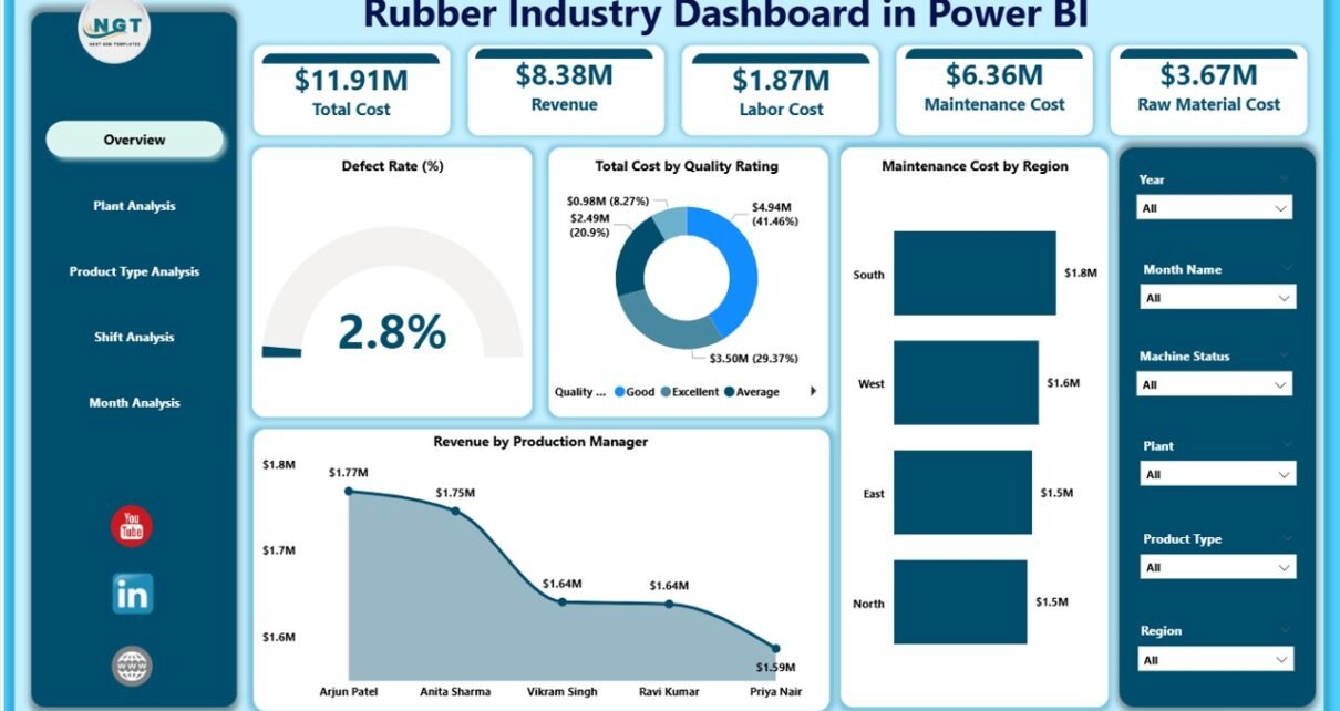
1️⃣ Overview Page – What Does the Executive See First?
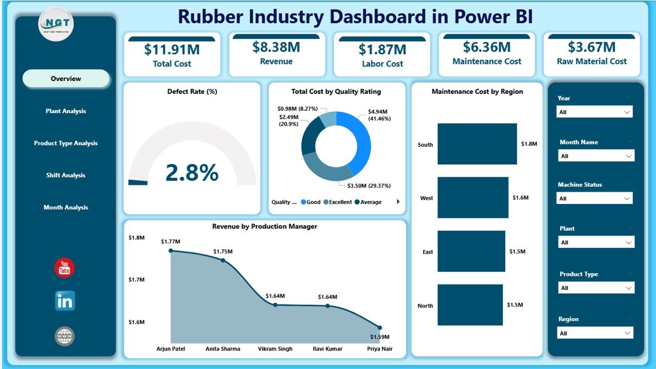
The Overview Page acts as the command center of the dashboard.
It contains slicers (filters) that allow users to filter data by:
-
Plant
-
Product Type
-
Region
-
Shift
-
Month
Key KPI Cards on Overview Page
The dashboard includes 5 important cards:
-
Defect Rate %
-
Total Cost by Quality Rating
-
Maintenance Cost by Region
-
Revenue by Production Manager
-
Overall financial snapshot
Why Is This Page Important?
This page provides a quick health check of operations. For example:
-
If defect rate increases, quality teams can act immediately.
-
If maintenance cost rises in a region, plant managers can investigate.
-
If revenue drops under a production manager, leadership can analyze performance.
Because of these visual KPIs, executives save time and make faster decisions.
2️⃣ Plant Analysis – How Does Each Plant Perform?
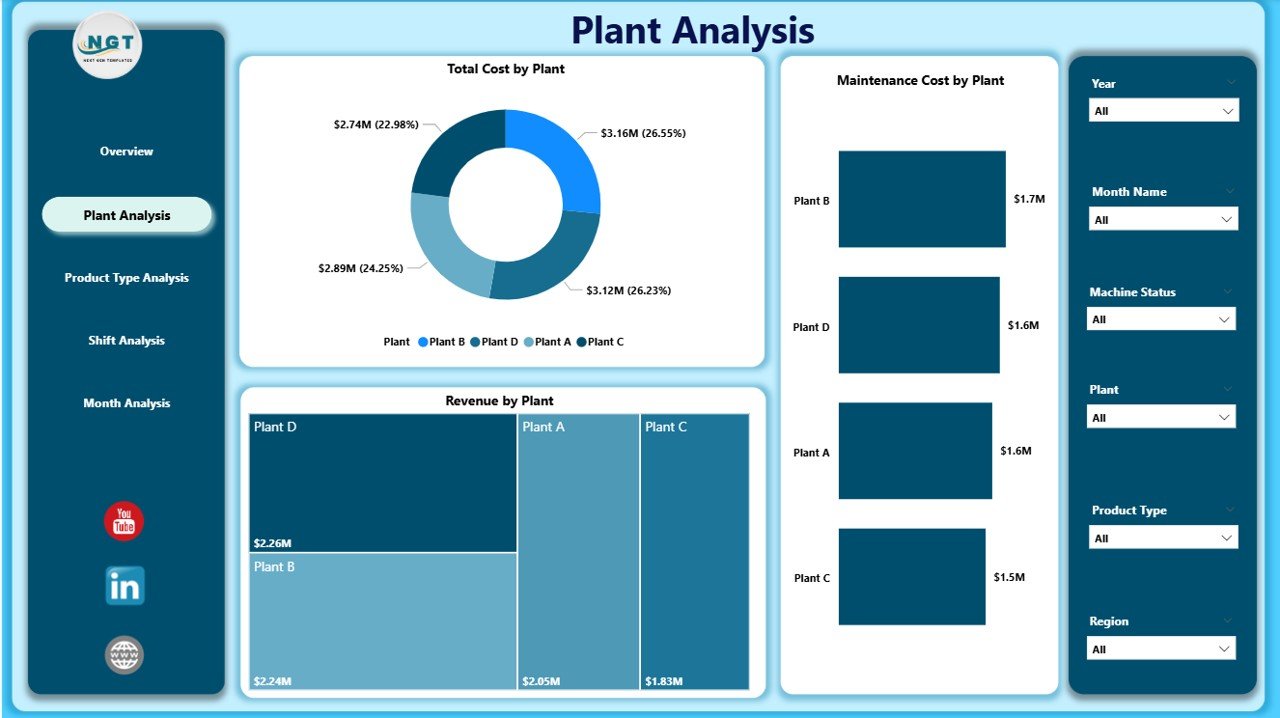
The Plant Analysis Page focuses on plant-level performance.
Charts Included:
-
Total Cost by Plant
-
Maintenance Cost by Plant
-
Revenue by Plant
What Insights Can You Get?
-
Identify the most profitable plant
-
Compare maintenance efficiency
-
Detect high-cost production units
-
Analyze regional performance gaps
For instance, if Plant A shows high maintenance cost but low revenue, management can review machine conditions and workforce efficiency.
Therefore, plant-wise analysis supports operational optimization.
3️⃣ Product Type Analysis – Which Products Drive Profit?
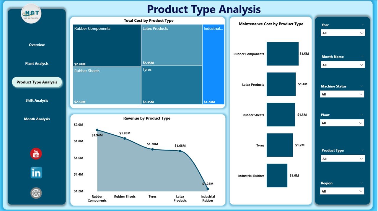
The rubber industry produces multiple product categories such as:
-
Tires
-
Industrial rubber sheets
-
Rubber belts
-
Seals and gaskets
-
Automotive components
The Product Type Analysis Page helps you evaluate profitability and cost efficiency.
Charts Included:
-
Total Cost by Product Type
-
Maintenance Cost by Product Type
-
Revenue by Product Type
Why Is This Important?
Click to Purchases Rubber Industry Dashboard in Power BI
Some products generate higher margins, while others increase operational burden. Therefore, this page helps companies:
-
Identify best-selling products
-
Eliminate low-profit items
-
Optimize production capacity
-
Allocate resources effectively
Because product strategy impacts revenue directly, this page becomes critical for growth planning.
4️⃣ Shift Analysis – Does Productivity Vary by Shift?
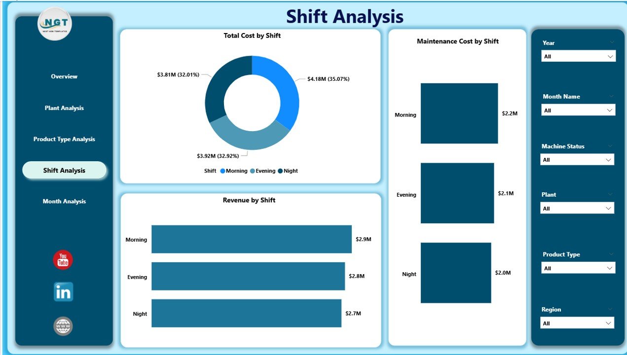
Manufacturing plants operate in multiple shifts:
-
Morning Shift
-
Evening Shift
-
Night Shift
However, shift performance often varies due to:
-
Workforce skill levels
-
Supervision quality
-
Equipment availability
The Shift Analysis Page includes:
-
Total Cost by Shift
-
Maintenance Cost by Shift
-
Revenue by Shift
What Can You Analyze?
-
Which shift produces the highest revenue?
-
Which shift causes more defects?
-
Does night shift increase maintenance cost?
If one shift consistently underperforms, management can train staff or adjust supervision.
Therefore, shift analysis enhances productivity and accountability.
5️⃣ Month Analysis – How Does Performance Change Over Time?
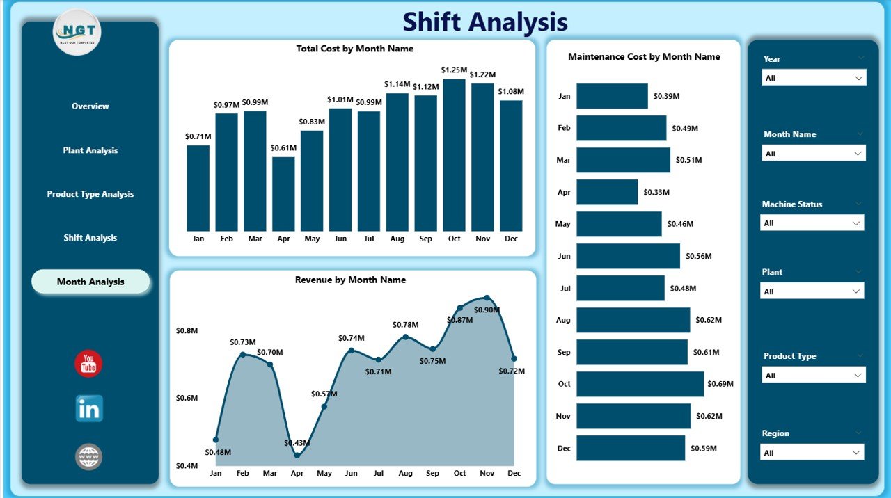
The Month Analysis Page tracks trends over time.
Charts Included:
-
Total Cost by Month
-
Maintenance Cost by Month
-
Revenue by Month
Why Is Monthly Tracking Essential?
Seasonal demand, raw material price changes, and market fluctuations affect performance.
For example:
-
Revenue may increase during peak automotive season.
-
Maintenance cost may spike during monsoon due to machine wear.
Because trends reveal patterns, companies can forecast better and plan budgets efficiently.
Click to Purchases Rubber Industry Dashboard in Power BI
What Key Metrics Should You Track in a Rubber Industry Dashboard?
A high-quality dashboard must include measurable KPIs such as:
-
Defect Rate %
-
Production Volume
-
Maintenance Cost
-
Cost per Unit
-
Revenue per Product Type
-
Downtime Hours
-
Quality Rating Score
-
Yield Percentage
These KPIs help management maintain quality and profitability.
Advantages of Rubber Industry Dashboard in Power BI
Now let’s explore the key benefits.
1️⃣ Real-Time Decision Making
Power BI refreshes data quickly. Therefore, managers can react immediately to performance changes.
2️⃣ Centralized Data Visibility
Instead of scattered files, teams access one unified dashboard.
3️⃣ Improved Cost Control
Maintenance and production costs remain visible. As a result, companies reduce unnecessary expenses.
4️⃣ Better Quality Monitoring
Defect rate tracking improves quality standards and reduces waste.
5️⃣ Increased Accountability
Plant managers and shift supervisors become responsible for performance metrics.
6️⃣ Faster Reporting
Executives no longer wait for manual reports. Instead, they view live dashboards anytime.
7️⃣ Strategic Growth Planning
Product-level insights support expansion and investment decisions.
How Does This Dashboard Improve Operational Efficiency?
This dashboard improves efficiency in several ways:
-
Identifies high-cost areas
-
Detects machine maintenance issues
-
Highlights underperforming shifts
-
Supports predictive analysis
-
Encourages data-driven culture
Moreover, because Power BI allows drill-down functionality, teams analyze root causes faster.
How Can Rubber Manufacturers Implement This Dashboard?
Implementation requires structured steps.
Step 1: Collect Structured Data
Gather data from:
-
ERP systems
-
Production logs
-
Maintenance records
-
Quality inspection sheets
Step 2: Clean and Prepare Data
Ensure accurate entries. Remove duplicates and incorrect values.
Step 3: Design Data Model
Click to Purchases Rubber Industry Dashboard in Power BI
Create relationships between:
-
Plant table
-
Product table
-
Shift table
-
Maintenance table
-
Revenue table
Step 4: Build Visuals
Use:
-
Bar charts
-
Column charts
-
KPI cards
-
Line charts
Step 5: Test and Deploy
Validate calculations and share dashboard with leadership.
Best Practices for the Rubber Industry Dashboard in Power BI
To maximize value, follow these best practices:
✔ Keep Data Updated
Schedule regular data refresh.
✔ Define Clear KPIs
Align KPIs with business goals.
✔ Avoid Overcrowding
Keep visuals clean and easy to read.
✔ Use Slicers Smartly
Allow users to filter by plant, shift, and month.
✔ Train Users
Provide training to managers and supervisors.
✔ Review Monthly
Conduct monthly performance review meetings using dashboard insights.
✔ Ensure Data Accuracy
Audit data entries regularly to maintain reliability.
What Challenges Can This Dashboard Solve?
This dashboard addresses:
-
High defect rates
-
Rising maintenance costs
-
Low shift productivity
-
Revenue inconsistencies
-
Lack of plant visibility
Therefore, companies reduce inefficiencies and increase profitability.
Why Choose Power BI for Rubber Industry Analytics?
Power BI offers several advantages:
-
Interactive visuals
-
Real-time data refresh
-
Strong data modeling
-
Easy sharing
-
Mobile access
Additionally, Power BI integrates with Excel, ERP systems, and cloud databases. Because of this integration, businesses avoid manual reporting.
Conclusion
The rubber industry operates in a competitive and cost-sensitive environment. Therefore, manufacturers must track performance precisely.
A Rubber Industry Dashboard in Power BI provides:
-
Real-time operational visibility
-
Better cost control
-
Improved quality monitoring
-
Enhanced plant accountability
-
Stronger revenue insights
Instead of relying on manual spreadsheets, companies can leverage interactive analytics.
As a result, they improve efficiency, reduce waste, and increase profitability.
If you want smarter manufacturing decisions, this dashboard becomes your operational control center.
Frequently Asked Questions with Answers
1️⃣ What is a Rubber Industry Dashboard in Power BI?
It is a data visualization tool that tracks production cost, maintenance cost, defect rate, and revenue for rubber manufacturing companies.
2️⃣ How many pages does this dashboard include?
This dashboard includes five pages: Overview, Plant Analysis, Product Type Analysis, Shift Analysis, and Month Analysis.
3️⃣ Can this dashboard track defect rates?
Yes. The overview page includes Defect Rate %, which helps quality teams monitor performance.
4️⃣ Is this dashboard suitable for multi-plant operations?
Yes. Plant-level analysis supports companies with multiple manufacturing units.
5️⃣ Does it support product-level profitability analysis?
Yes. The Product Type Analysis page shows cost and revenue by product type.
6️⃣ Can management track shift productivity?
Yes. The Shift Analysis page compares cost and revenue across shifts.
7️⃣ How often should companies update the dashboard?
Companies should update data daily or weekly depending on operational needs.
8️⃣ Does Power BI integrate with ERP systems?
Yes. Power BI connects easily with ERP systems, Excel files, and cloud databases.
Visit our YouTube channel to learn step-by-step video tutorials