The rubber industry plays a critical role in manufacturing, automotive, and industrial supply chains worldwide. However, monitoring production, quality, and financial performance can become complex without a structured approach. That’s where the Rubber Industry KPI Dashboard in Excel comes in.
This ready-to-use Excel tool allows rubber manufacturers, plant managers, and supply chain professionals to track and analyze key performance indicators (KPIs) in real time. It transforms raw data into meaningful insights — helping you optimize production efficiency, improve quality, and drive profitability.
Let’s explore how this dashboard works, what makes it powerful, and how you can use it to streamline performance analysis in your rubber business.
Click to Purchases Rubber Industry KPI Dashboard in Excel
What Is a Rubber Industry KPI Dashboard in Excel?
A Rubber Industry KPI Dashboard is an analytical Excel workbook that tracks operational and financial metrics relevant to rubber manufacturing. It consolidates KPIs like production volume, defect rate, cost per unit, energy consumption, and delivery performance into a single visual interface.
Instead of navigating multiple spreadsheets, this dashboard provides one unified, interactive view of performance. Users can filter data by month, compare targets versus actuals, and monitor Year-to-Date (YTD) and Month-to-Date (MTD) results instantly.
This makes the dashboard a must-have for factory leaders, production planners, and executives who want accurate, data-driven decision-making.
Click to Purchases Rubber Industry KPI Dashboard in Excel
Dashboard Structure and Key Components
This Excel template includes seven key worksheets, each serving a specific function for data management and performance analysis.
1️⃣ Home Sheet
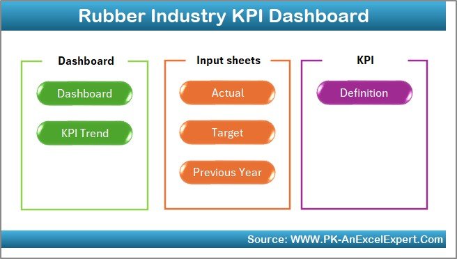
The Home Sheet acts as the index page of the dashboard. It features six navigation buttons, each linked to different worksheets.
These buttons make it simple to move between sheets like Dashboard, KPI Trend, Actual Numbers Input, Target Sheet, Previous Year Numbers, and KPI Definition Sheet. This navigation setup enhances user experience and ensures efficient workflow.
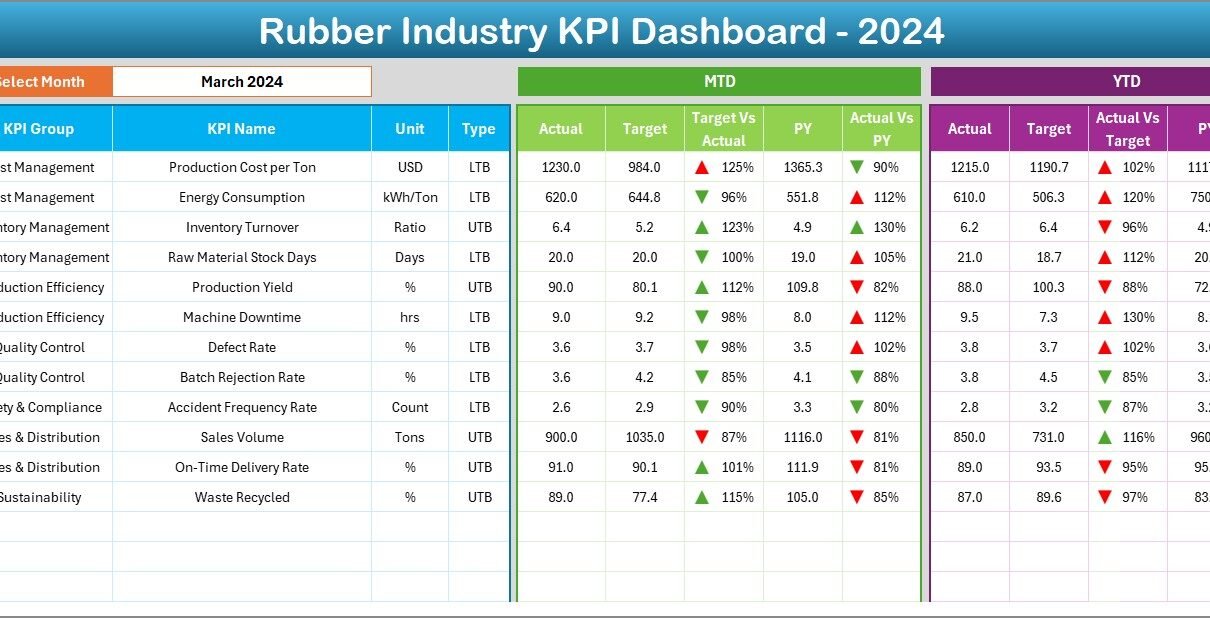
2️⃣ Dashboard Sheet (Main Page)
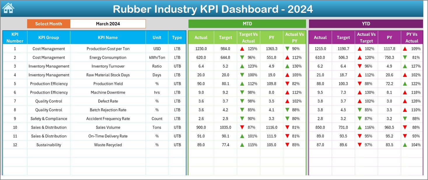
This is the heart of the system — where all major KPIs and insights are displayed.
At the top, users can select a Month using the dropdown menu in cell D3. The entire dashboard automatically updates to show relevant data for that month.
Displayed Metrics:
-
MTD (Month-to-Date):
Shows Actual, Target, and Previous Year (PY) values, along with Target vs Actual and PY vs Actual comparisons. -
YTD (Year-to-Date):
Displays cumulative Actual, Target, and PY figures, again with Target vs Actual and PY vs Actual indicators.
Each comparison includes conditional formatting using green (▲) and red (▼) arrows, instantly highlighting whether performance improved or declined.
This visual approach makes it effortless to identify problem areas and high-performing metrics within seconds.
3️⃣ KPI Trend Sheet
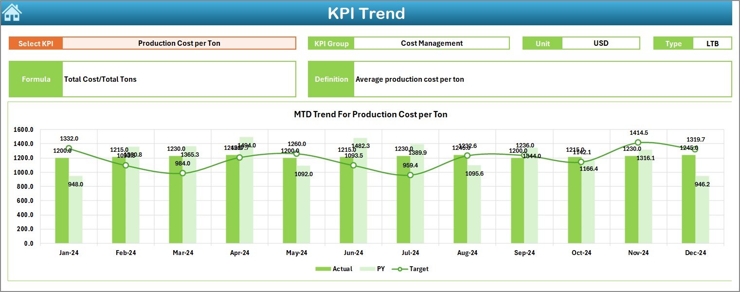
The KPI Trend Sheet offers an analytical view of performance trends for individual KPIs.
Users can select a KPI name from the dropdown in cell C3, and the dashboard automatically shows:
-
KPI Group (e.g., Production, Quality, Safety, Cost, etc.)
-
Unit of Measurement (e.g., Tons, %, Hours)
-
Type: Upper the Better (UTB) or Lower the Better (LTB)
-
Formula used for calculation
-
Definition explaining the KPI’s purpose
Below the details, two trend charts visualize MTD and YTD performance — showing Actual, Target, and Previous Year data side by side.
These visuals make it easier to spot patterns, seasonal changes, and potential bottlenecks.
Click to Purchases Rubber Industry KPI Dashboard in Excel
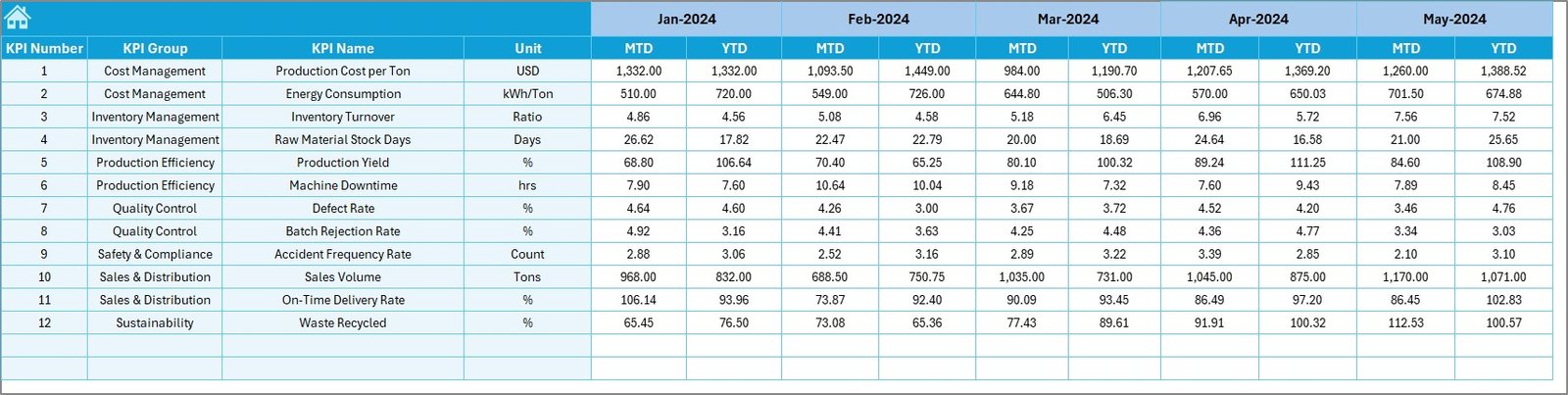
4️⃣ Actual Numbers Input Sheet
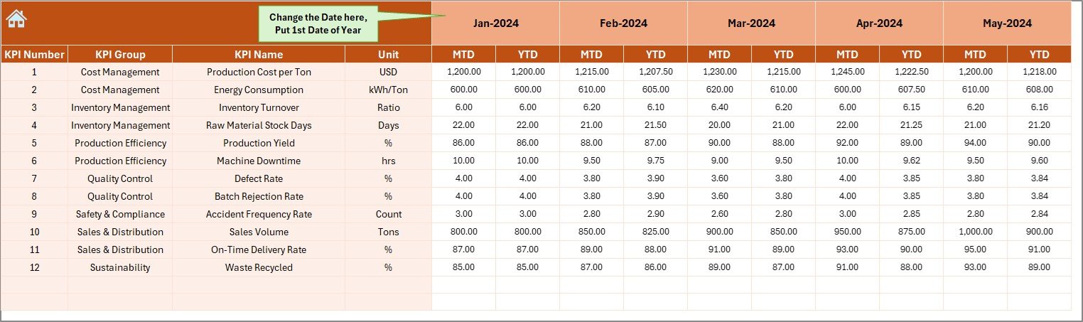
The Actual Numbers Input Sheet is the foundation of data entry.
Here, you enter the real performance data for each KPI. It captures both MTD and YTD values for every month.
To simplify updates, you only need to enter the first month of the year in cell E1. The sheet auto-adjusts to display months accordingly, minimizing setup effort.
5️⃣ Target Sheet Tab
In this tab, you enter your target values for each KPI on a monthly basis.
The dashboard then uses these values to compare performance and calculate metrics such as Target vs Actual and Achievement %.
By maintaining this data regularly, you ensure accurate visual comparisons on the Dashboard and KPI Trend pages.
6️⃣ Previous Year Number Sheet Tab
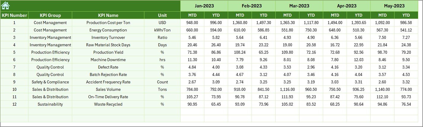
This sheet holds your historical data from the previous year.
It follows the same structure as the Actual and Target sheets, allowing easy comparison between Current Year (CY) and Previous Year (PY) results.
This comparison is critical for evaluating progress, identifying recurring challenges, and setting more realistic future targets.
7️⃣ KPI Definition Sheet Tab
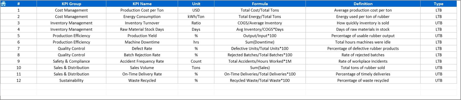
This sheet lists every KPI in your system along with its:
-
KPI Name
-
KPI Group
-
Unit of Measurement
-
Formula
-
Definition
By documenting all metrics clearly, this sheet ensures transparency and consistency across departments — especially useful for audits, management reviews, or employee training.
Click to Purchases Rubber Industry KPI Dashboard in Excel
Common KPIs in the Rubber Industry Dashboard
While every business can customize the dashboard, some standard KPIs commonly tracked include:
Production Efficiency
-
Total Production Volume (Tons)
-
Production Yield (%)
-
Machine Utilization Rate (%)
-
Downtime Hours
-
Batch Rejection Rate (%)
Quality Control
-
Defect Rate (%)
-
Customer Complaints Count
-
Product Return Percentage
-
First-Pass Yield (%)
Cost and Financial KPIs
-
Cost per Unit (USD)
-
Material Cost Ratio (%)
-
Energy Consumption per Ton
-
Production Cost Variance (%)
Safety and Environment
-
Lost Time Injury Frequency Rate (LTIFR)
-
Safety Incidents Reported
-
Scrap Material Generated (Kg)
Supply Chain and Delivery
-
On-Time Delivery (%)
-
Average Order Fulfillment Time (Days)
-
Inventory Turnover Ratio
Tracking these KPIs helps ensure that operations stay efficient, sustainable, and profitable.
Why Excel Is Perfect for Rubber Industry Performance Tracking
Many manufacturing businesses rely on Excel because it offers flexibility and simplicity. The Rubber Industry KPI Dashboard leverages these advantages to deliver professional analytics without the need for complex software.
Here’s why Excel works perfectly:
-
✅ User-Friendly Interface: Anyone can use it without technical expertise.
-
✅ No Extra Software Required: Run it on any computer with Microsoft Excel.
-
✅ Customizable Design: Add or remove KPIs based on your specific operations.
-
✅ Automatic Calculations: Built-in formulas eliminate manual errors.
-
✅ Visual Performance Indicators: Charts and arrows make analysis intuitive.
This makes Excel the ideal tool for small and medium-sized rubber manufacturers looking for an affordable yet powerful solution.
Click to Purchases Rubber Industry KPI Dashboard in Excel
How to Use the Rubber Industry KPI Dashboard
Using this dashboard is straightforward and doesn’t require advanced Excel knowledge.
Step-by-step process:
-
Open the Dashboard File
Launch the Excel file and start from the Home Sheet. -
Enter Actual Data
Go to the Actual Numbers Input Sheet and record your current MTD and YTD numbers. -
Set Targets
Add monthly and yearly targets in the Target Sheet. -
Input Previous Year Data
Update Previous Year Sheet with last year’s metrics for comparison. -
View Results
Navigate to the Dashboard Sheet and select the month in cell D3. The visuals will update instantly. -
Analyze Trends
Visit the KPI Trend Sheet to see graphical representations of each KPI’s progress.
With these simple steps, you can track performance across multiple departments within minutes.
Advantages of the Rubber Industry KPI Dashboard
1️⃣ Centralized Data Management
You no longer need separate files for production, quality, and financial data. Everything is integrated in one Excel file.
2️⃣ Instant Performance Insights
The dashboard updates automatically as soon as you input data, saving time and effort.
3️⃣ Accurate Decision-Making
By comparing Actual vs Target and Current Year vs Previous Year, managers can take corrective action quickly.
4️⃣ Easy Customization
Add new KPIs, modify formulas, or adjust visuals based on your plant’s unique requirements.
5️⃣ Visual Appeal
Color-coded indicators (green for good, red for poor) make performance interpretation intuitive.
6️⃣ Historical Trend Analysis
The KPI Trend page allows you to observe month-over-month growth or decline easily.
7️⃣ Affordable and Scalable
Unlike complex ERP systems, this Excel-based dashboard offers professional insights at a fraction of the cost.
Click to Purchases Rubber Industry KPI Dashboard in Excel
Best Practices for Using the Dashboard
To get maximum value from your Rubber Industry KPI Dashboard, follow these best practices:
1. Define KPIs Clearly
Every team should understand what each KPI measures and how it’s calculated.
2. Maintain Data Consistency
Use consistent formats for units and dates across sheets to prevent errors.
3. Refresh Data Regularly
Update MTD and YTD values monthly to ensure your visuals stay relevant.
4. Keep the Dashboard Simple
Avoid unnecessary visuals or data overload. Focus on KPIs that impact performance directly.
5. Review Trends Monthly
Analyze MTD and YTD charts to detect inefficiencies early.
6. Align KPIs with Business Goals
Ensure that tracked KPIs align with your company’s strategic objectives like reducing waste, improving efficiency, or increasing profits.
7. Back Up Data
Keep periodic backups of your Excel file to protect historical performance records.
Real-World Applications
This Excel dashboard is suitable for different sectors within the rubber industry, such as:
-
Tire Manufacturing Plants – Monitor production yield and quality performance.
-
Industrial Rubber Goods – Track customer orders, raw material costs, and machine uptime.
-
Rubber Recycling Units – Analyze waste reduction, conversion rates, and environmental performance.
-
Rubber Component Suppliers – Measure on-time delivery, defect rates, and productivity.
The dashboard helps all these businesses make faster, smarter decisions using clear visual analytics.
Conclusion
The Rubber Industry KPI Dashboard in Excel is a complete performance management system tailored for manufacturers seeking data-driven decision-making.
By consolidating production, quality, and cost KPIs into a single visual file, it offers a transparent and actionable overview of plant operations.
Whether you run a large manufacturing facility or a small-scale rubber unit, this Excel dashboard will help you track progress, detect inefficiencies, and achieve continuous improvement.
If you want to simplify analysis and transform data into insight — this dashboard is the right starting point.
Frequently Asked Questions (FAQs)
1. What is the Rubber Industry KPI Dashboard in Excel?
It’s a ready-to-use Excel template designed to track and visualize performance metrics like production, quality, and cost efficiency in the rubber industry.
2. Do I need advanced Excel skills to use it?
No. The dashboard is pre-built and fully automated. You only need to input your data.
3. Can I modify the KPIs?
Yes. You can easily edit KPI names, formulas, and targets according to your plant’s needs.
4. How often should I update the data?
You should update data monthly to get accurate MTD and YTD insights.
5. What are the benefits of using this dashboard?
It provides instant visibility into performance, reduces reporting time, and helps management make informed decisions.
6. Is this dashboard suitable for tire manufacturing units?
Yes. It can be customized for any rubber-based manufacturing business, including tire and component production.
7. How is the data displayed visually?
The dashboard uses conditional formatting and trend charts to display improvements and declines with color-coded arrows.
8. Can I compare current and previous year performance?
Absolutely. The dashboard automatically calculates and compares both MTD and YTD results against the previous year.
Click to Purchases Rubber Industry KPI Dashboard in Excel
Visit our YouTube channel to learn step-by-step video tutorials