Sales performance plays a critical role in the overall growth of any business. In today’s fast-paced business environment, you need an efficient way to track your targets, identify gaps, and make smart decisions. That is exactly where a Sales Target Dashboard in Power BI becomes a powerful solution.
In this detailed guide, you will explore what a Sales Target Dashboard actually is, why you need it, how it works, its advantages, best practices, and much more. By the end, you will also find frequently asked questions along with clear answers.
Click to Purchases Sales Target Dashboard in Power BI
What Is a Sales Target Dashboard in Power BI?
A Sales Target Dashboard in Power BI is a visual tool that helps track, analyze, and compare sales targets and actual performance. It allows users to monitor each sales region, product category, and sales representative in a simple and interactive way. You can quickly spot if your team is meeting its sales goals or falling behind.
With the help of cards, charts, and slicers, Power BI displays real-time data pulled from Excel or other data sources. This gives you a detailed view of each area of performance.
Why Do You Need a Sales Target Dashboard?
You need a Sales Target Dashboard to:
-
Track your actual sales vs. monthly or yearly targets
-
Identify trends and seasonal patterns
-
Compare performance across different regions, reps, and product lines
-
React quickly when a target is at risk
-
Gain real-time visibility for better decision making
-
Encourage accountability across the team
With a dashboard, you no longer rely on static reports or manual spreadsheets. You gain dynamic insights that help improve your operational efficiency.
Key Features of the Sales Target Dashboard in Power BI
This dashboard contains five interactive pages, each focusing on a specific dimension of sales performance.
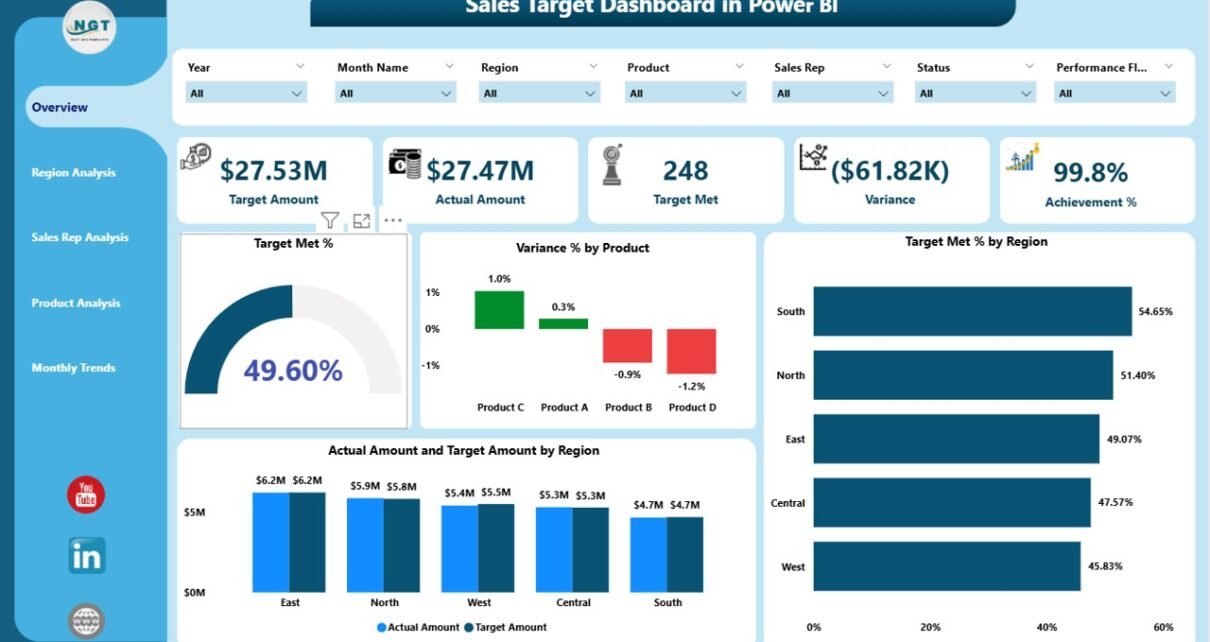
Overview Page
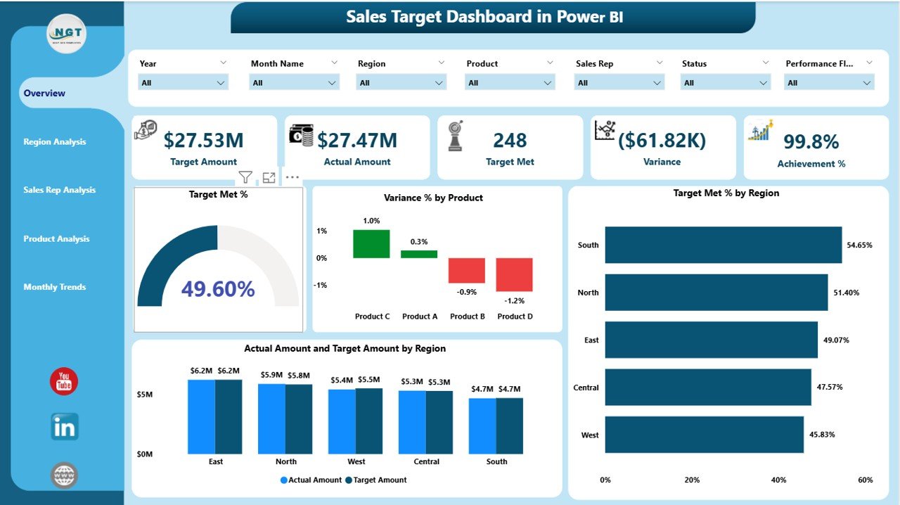
The Overview page serves as the main landing page. It gives a summary of overall performance and contains:
-
5 Cards showing key metrics
4 Charts, including:
- Target Met %
- Variance % by Product
- Target Met % by Region
- Actual Amount vs Target Amount by Region
This page allows users to understand immediate performance results as soon as they open the dashboard.
Region Analysis Page
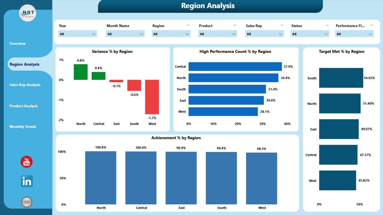
This section focuses on how each sales region is performing. It includes:
-
6 slicers for filtering data
4 visual charts:
- Variance % by Region
- High Performance Count % by Region
- Target Met % by Region
- Achievement % by Region
With these visuals, you can quickly identify high-performing regions and those that need improvement.
Sales Rep Analysis Page
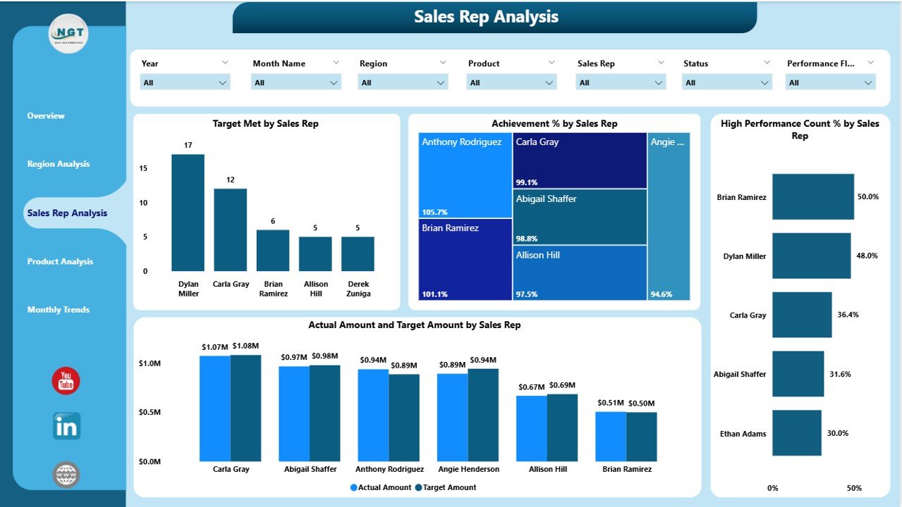
This part of the dashboard analyzes individual sales representatives. It displays:
-
Target Met by Sales Rep
-
Achievement % by Sales Rep
-
High Performance Count % by Sales Rep
-
Actual Amount vs Target Amount by Sales Rep
This helps management understand which reps need more support and which ones are leading the team.
Click to Purchases Sales Target Dashboard in Power BI
Product Analysis Page
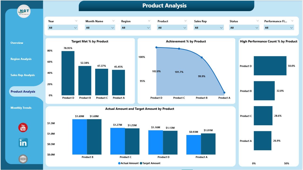
Here, the focus shifts to product performance, giving clarity over which products drive the highest results. It includes:
-
Target Met by Product
-
Achievement % by Product
-
High Performance Count % by Product
-
Actual Amount vs Target Amount by Product
It becomes very easy to see which products are popular and which ones need better marketing focus.
Monthly Trends Page
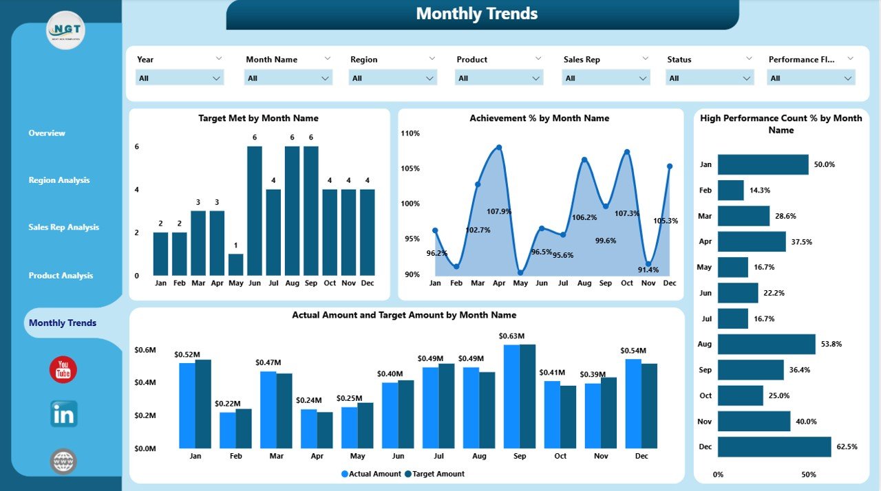
The Monthly Trends page highlights time-based performance. It shows:
-
Target Met by Month
-
Achievement % by Month
-
High Performance Count % by Month
-
Actual Amount vs Target Amount by Month
This type of analysis helps you understand seasonal sales behavior and adjust your strategy for future months.
Advantages of Sales Target Dashboard Power BI
Using a Power BI Sales Target Dashboard comes with several benefits:
-
Real-Time Insights – You get up-to-date information at your fingertips.
-
Better Focus – Track each region, product, and sales rep with detailed visuals.
-
Increased Accountability – Each team member can see their individual impact.
-
Faster Decision Making – Immediate alerts and variance metrics help you take quick action.
-
Improved Transparency – Everyone can access the same information and work toward the same goals.
-
Performance Trends – Easily identify performance patterns that repeat each month or season.
How Does a Sales Target Dashboard Improve Team Performance?
A dashboard aligns the entire sales team with the company’s objectives. With clear visuals, every sales representative can see exactly how far they are from their goals. This leads to:
-
Increased motivation
-
Healthy competition
-
Faster correction when behind schedule
-
Data-driven communication between managers and sales reps
It builds a transparent sales culture that empowers the entire team.
What Metrics Should You Track on a Sales Target Dashboard?
Below are some of the most important metrics to include:
-
Actual vs Target Sales
-
Target Met Percentage
-
Variance Percentage
-
Achievement Percentage
-
High Performance Count
-
Actual Sales by Region
-
Actual Sales by Product
-
Actual Sales by Representative
Tracking these metrics ensures full visibility across your sales process.
Best Practices for the Sales Target Dashboard Power BI
To get the most out of your dashboard, keep the following best practices in mind:
✅ Keep It Simple and Clear
Avoid unnecessary visuals and focus on the most important KPIs. This makes it easier to read and understand.
✅ Use Filters (Slicers) Effectively
Place slicers on top of each page and use them to drill down into the data. This gives users complete control over the analysis.
✅ Use Consistent Colors and Format
Choose a color theme and stick to it. Your dashboard will look consistent and much more professional.
✅ Focus on Actionable Metrics
Track only those KPIs that lead to action and foster real improvement. Remove metrics that do not bring value.
✅ Review and Update Data Regularly
Keep your data sources updated to ensure accuracy and reliability of the insight.
How to Create a Sales Target Dashboard in Power BI – Step by Step
-
Define the KPIs – Decide what you want to measure
-
Prepare the Data – Organize sales and target data in an Excel sheet
-
Load Data into Power BI – Connect your Excel file to Power BI
-
Create Relationships – Link different tables as needed
-
Create Visuals – Add charts, cards, and slicers for each page
-
Arrange Your Pages – Use a logical flow (Overview → Region → Rep → Product → Monthly Trend)
-
Test and Publish – Share the dashboard with your team for feedback and improvements
Common Mistakes to Avoid
-
Tracking too many KPIs
-
Ignoring layout and design
-
Not refreshing data regularly
-
Using inconsistent formats across visuals
-
Overloading a single page with too much information
Avoiding these mistakes will keep your dashboard clean and helpful.
Conclusion
A Sales Target Dashboard in Power BI gives you a powerful way to track and improve your sales performance. With easy-to-read visuals and real-time data, you can quickly identify gaps, boost team performance, and make better business decisions. By following the best practices shared in this article, you will set up a dashboard that delivers value every day.
Because of its simplicity and flexibility, this solution can be used by businesses of any size.
Frequently Asked Questions (FAQs)
Q1. What is the purpose of a Sales Target Dashboard?
A Sales Target Dashboard helps businesses monitor their actual sales against predefined targets. It offers visual insights to support informed decision-making.
Q2. Can I import Excel data into Power BI for this dashboard?
Yes, you can easily import Excel data into Power BI. Most organizations use Excel as the primary data source for this dashboard.
Q3. Do I need advanced Power BI knowledge to use this dashboard?
No. Basic Power BI knowledge is enough. Once you load the data, the dashboard visuals update automatically.
Q4. Can this dashboard track performance by individual sales rep?
Yes. The Sales Rep Analysis page allows you to track target met %, achievement %, and actual vs. target results for each sales representative.
Q5. How often should I update the data in the dashboard?
It is best to update the data daily or weekly, depending on how frequently your sales activities occur.
Q6. Is it possible to share this dashboard with other team members?
Absolutely. You can publish the dashboard to the Power BI Service and share it with other users within your organization.
Visit our YouTube channel to learn step-by-step video tutorials