Science and Technology Parks (STPs) help countries grow their innovation capabilities. They support startups, research institutes, technology companies, and incubation centers. These parks act as engines of economic development because they promote scientific research, new product development, and strategic industry collaboration.
However, managing a Science and Technology Park is not simple. Teams handle many activities such as research support, infrastructure management, innovation services, funding programs, community projects, and business incubation. Because of this complexity, park managers need clear visibility into KPIs, performance trends, target progress, and year-over-year changes.
A Science and Technology Parks KPI Dashboard in Power BI gives this clarity. It turns raw data into meaningful insights that help leaders make better decisions. With this dashboard, you track everything in one place—performance indicators, progress comparisons, trends, targets, and definitions. This helps every department work together with more accuracy and purpose.
In this article, you will learn everything about this dashboard, how it works, what each page shows, why it matters, and how to use it effectively. You will also explore advantages, best practices, and frequently asked questions.
Let’s begin.
Click to Purchases Science and Technology Parks KPI Dashboard in Power BI
What Is a Science and Technology Parks KPI Dashboard in Power BI?
A Science and Technology Parks KPI Dashboard in Power BI is a ready-to-use analytics tool designed to track performance across innovation activities, research programs, incubation services, and operational KPIs. The dashboard connects to an Excel file, reads KPI values, and shows insights instantly through clean visuals.
This dashboard includes three smart pages:
1️⃣ Summary Page
2️⃣ KPI Trend Page
3️⃣ KPI Definition Page (Drill-Through)
Together, these pages give quick access to performance information that leaders need.
Why Do Science and Technology Parks Need a KPI Dashboard?
Science and Technology Parks handle many complex tasks:
✔ Supporting innovation-based companies
✔ Providing incubation and acceleration services
✔ Running research programs
✔ Managing facilities and infrastructure
✔ Offering technology transfer initiatives
✔ Connecting industries with research institutes
Because of these activities, leaders need complete transparency. A KPI dashboard gives that visibility and helps teams measure:
-
Research output
-
Innovation growth
-
Startup performance
-
Economic impact
-
Infrastructure use
-
Financial progress
-
Operational efficiency
With Power BI, park managers get real-time updates and stop relying on scattered spreadsheets.
What Are the Main Pages of the Science and Technology Parks KPI Dashboard?
Let’s explore each page in detail.
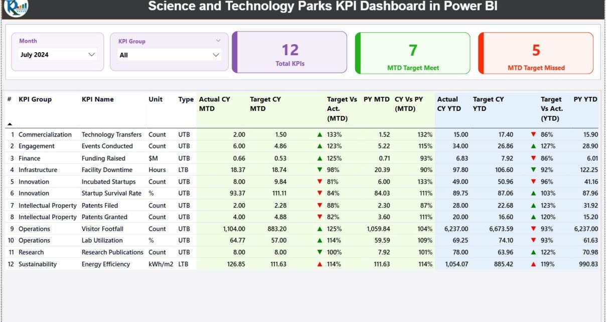
1. Summary Page: What Performance Insights Does It Show?
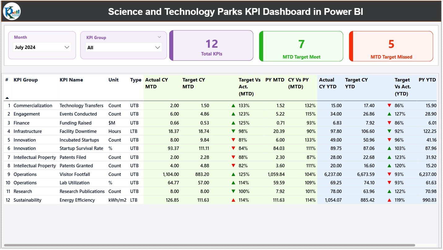
The Summary Page acts as the main control panel. It shows all key performance indicators in one place and allows you to filter them with:
-
Month slicer
-
KPI Group slicer
These filters help users analyze results for a specific period or department.
✔ Top KPI Cards
At the top, you see three KPI cards:
-
Total KPIs Count
-
MTD Target Met Count
-
MTD Target Missed Count
These numbers show overall progress quickly. Managers can see if KPIs move in the right direction or need improvement.
✔ Detailed KPI Table
Below the cards, the dashboard shows a detailed table that provides complete insight into each KPI. It includes the following fields:
-
KPI Number
-
KPI Group
-
KPI Name
-
Unit of Measurement
-
Type (LTB or UTB)
-
Actual CY MTD
-
Target CY MTD
-
MTD Icon (▲ or ▼)
-
Target vs Actual (MTD) → Actual / Target
-
PY MTD
-
CY vs PY (MTD) → CY MTD / PY MTD
-
Actual CY YTD
-
Target CY YTD
-
YTD Icon (▲ or ▼)
-
Target vs Actual (YTD) → Actual / Target
-
PY YTD
-
CY vs PY (YTD) → CY YTD / PY YTD
This single table gives a complete picture of:
✔ monthly performance
✔ yearly performance
✔ comparisons with previous year
✔ KPI status indicators
✔ target monitoring
Because of this detailed information, park managers get everything they need on one screen.
Click to Purchases Science and Technology Parks KPI Dashboard in Power BI
2. KPI Trend Page: How Does It Help Track Performance Over Time?
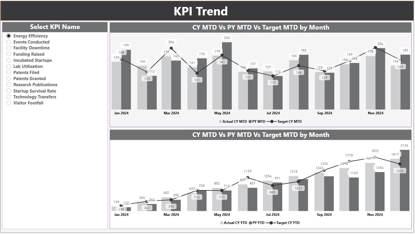
The KPI Trend Page helps users see trends clearly. Trends matter because they show direction—not just numbers.
This page includes:
✔ Two Combo Charts
-
MTD Trend Chart – CY Actual, PY Actual, CY Target
-
YTD Trend Chart – CY Actual, PY Actual, CY Target
✔ KPI Slicer (Left Side)
Users select any KPI and instantly view its trend.
This page answers important questions like:
-
Is performance improving this month?
-
Does this KPI show positive growth year over year?
-
Do actuals stay aligned with targets?
-
Which KPIs need attention or improvement?
Clear trends support better planning and faster decisions.
3. KPI Definition Page: How Does It Bring Clarity?

The KPI Definition Page works as a drill-through page. Users select any KPI from the Summary Page and view its details such as:
-
KPI Group
-
KPI Name
-
Formula
-
KPI Definition
-
Unit
-
KPI Type
This helps everyone understand what each KPI means and how to measure it correctly. With the Back button, users return to the Summary Page easily.
Clarity in KPIs ensures accuracy in reporting and consistency across departments.
What Excel File Powers the Dashboard?
The dashboard uses an Excel file as its backend data source. It contains three sheets that users update:
✔ 1. Input_Actual Sheet
You enter:
-
KPI Name
-
Month (first day of month)
-
MTD Actual
-
YTD Actual
✔ 2. Input_Target Sheet
You enter:
-
KPI Name
-
Month
-
MTD Target
-
YTD Target
✔ 3. KPI Definition Sheet
You enter:
-
KPI Number
-
KPI Group
-
KPI Name
-
Unit
-
Formula
-
Definition
-
KPI Type (UTB or LTB)
Because of this simple structure, updating the dashboard takes only a few seconds. Refresh Power BI and see fresh insights instantly.
Click to Purchases Science and Technology Parks KPI Dashboard in Power BI
Advantages of a Science and Technology Parks KPI Dashboard in Power BI
This dashboard brings many benefits to innovation parks. Let’s explore the biggest advantages.
⭐ 1. Instant Visibility of Performance
Managers check KPI updates immediately and track progress without delay.
⭐ 2. Better Control Over Innovation Activities
Team leaders monitor incubation outcomes, research support, and startup performance clearly.
⭐ 3. Clear Target Monitoring
MTD and YTD indicators show where performance meets or misses expectations.
⭐ 4. Accurate Year-Over-Year Comparisons
Leaders understand growth by comparing CY with PY values.
⭐ 5. Data-Driven Decision Making
Park directors plan resources, budgets, and operations with confidence.
⭐ 6. Strong Trend Insights
Trend charts help identify patterns early and act quickly.
⭐ 7. Error-Free Reporting
Power BI automates calculations and reduces manual mistakes.
⭐ 8. Transparent KPI Definitions
Everyone sees the same meaning and formula, which removes confusion.
⭐ 9. Simple Data Entry Through Excel
Teams update data without technical knowledge.
⭐ 10. Better Collaboration Across Departments
Shared dashboards improve alignment across research, incubation, admin, and operations teams.
How Does This Dashboard Support Innovation Growth?
Science and Technology Parks grow when they track:
-
Startup outcomes
-
Research success
-
Technology transfer activities
-
Industry partnerships
-
Infrastructure use
-
Revenue generated
-
Scientific output
This dashboard helps managers monitor these changes regularly. It shows strengths, highlights gaps, and supports strategic planning. When teams look at KPIs clearly, they improve their innovation impact.
Click to Purchases Science and Technology Parks KPI Dashboard in Power BI
Best Practices for Using a Science and Technology Parks KPI Dashboard
Follow these important practices to get maximum value:
✔ 1. Update Excel Sheets on Time
Regular updates keep the dashboard accurate.
✔ 2. Keep KPI Definitions Clear and Simple
Short definitions help teams understand KPIs instantly.
✔ 3. Track Both MTD and YTD Insights
Monthly and yearly views together give deeper understanding.
✔ 4. Compare With Previous Year Values
This shows long-term growth patterns.
✔ 5. Use the KPI Group Filter
This filter helps you study performance department-wise.
✔ 6. Review Trend Charts Every Week
Trends highlight early signals that teams must act on.
✔ 7. Share the Dashboard Across Teams
More visibility improves coordination and performance.
✔ 8. Add New KPIs When Needed
Park activities evolve, so KPIs should evolve too.
✔ 9. Avoid Over-complicating Visuals
Clean and simple visuals work best for decision-making.
Conclusion
A Science and Technology Parks KPI Dashboard in Power BI gives a complete, clear, and fast way to track performance. It helps leaders measure innovation growth, departmental progress, startup performance, and research outcomes. This dashboard includes Summary, Trend, and KPI Definition pages to support deep insights.
Once users update the Excel file, Power BI refreshes the entire report. Because of this automation, parks save time and get accurate insights instantly. The dashboard supports better planning, faster decision-making, and stronger innovation impact.
Science and Technology Parks improve research, entrepreneurship, and technology development. This dashboard strengthens their ability to manage performance with confidence.
Click to Purchases Science and Technology Parks KPI Dashboard in Power BI
Frequently Asked Questions (FAQs)
1. Who can use this KPI dashboard?
Park managers, incubator heads, research teams, admin staff, finance teams, and strategy leaders can use it.
2. Can I customize KPIs?
Yes. You can modify KPI names, formulas, groups, and units in the Excel file.
3. Does this dashboard support data refresh?
Yes. Refresh Power BI and all visuals update instantly.
4. Can I add more KPI groups?
Yes. You can add unlimited KPI groups such as research, operations, finance, incubation, or partnerships.
5. Does it compare performance with previous year?
Yes. Both MTD and YTD comparisons show CY vs PY clearly.
6. Do I need Power BI expertise to use it?
No. You only update Excel. The dashboard works automatically.
7. Can I share this dashboard with stakeholders?
Yes. Publish it to Power BI Service and share access easily.
Click to Purchases Science and Technology Parks KPI Dashboard in Power BI
Visit our YouTube channel to learn step-by-step video tutorials