Managing a Scrum team becomes easier when you understand your KPIs clearly. Every sprint includes several activities such as backlog refinement, sprint planning, daily stand-ups, development tasks, reviews, and retrospectives. Because teams work at a fast pace, leaders need real-time data to make smart decisions. However, manual tracking slows down the process and creates confusion. Therefore, a Scrum Team KPI Dashboard in Power BI helps you analyze sprint performance quickly and accurately.
In this detailed guide, you will learn what this dashboard is, how it works, what each page contains, and how it helps Scrum teams perform better. You will also explore the key advantages, best practices, and frequently asked questions at the end.
Click to Purchases Scrum Team KPI Dashboard in Power BI
What Is a Scrum Team KPI Dashboard in Power BI?
A Scrum Team KPI Dashboard in Power BI is a ready-to-use performance-tracking tool that shows all Scrum KPIs in one visual dashboard. It pulls the KPI data from an Excel file and converts the numbers into clear charts, slicers, tables, and cards. As a result, Scrum Masters, Product Owners, Agile Coaches, and Development Teams get a complete view of sprint progress.
This dashboard tracks Month-to-Date (MTD) and Year-to-Date (YTD) performance for every KPI. It also compares each KPI with targets and previous year values. Because of this, teams get all the insights they need to improve speed, quality, and collaboration.
Why Do Scrum Teams Need a KPI Dashboard?
Scrum teams must move fast. They plan sprints, deliver product increments, fix defects, and manage multiple tasks. Without a dashboard, team members struggle to see:
-
Sprint progress
-
KPI trends
-
Target achievements
-
Year-to-year comparisons
-
Areas that require attention
A KPI dashboard solves all these issues by presenting the data in one place. It also saves time and improves decision-making because the team always sees real-time insights.
Key Features of the Scrum Team KPI Dashboard in Power BI
This dashboard includes three powerful pages inside the Power BI file. Each page has a specific purpose, and together they give a complete view of Scrum performance. Below is the detailed explanation of each page.
1. Summary Page – How Does It Help?
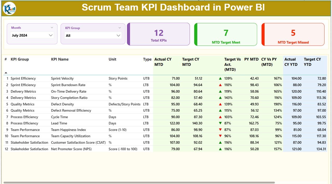
The Summary Page works as the main screen of this dashboard. You view the most important KPIs on this page. Since this is the first page, you get a clear overview before moving to detailed pages.
Slicers on Top
You get two slicers on the top:
-
Month
-
KPI Group
When you change these slicers, the entire dashboard updates instantly. This helps you analyze MTD and YTD performance easily.
KPI Cards
Below the slicers, the dashboard displays three important cards:
-
Total KPIs Count
-
MTD Target Met Count
-
MTD Target Missed Count
These cards work like health indicators. You understand the overall performance at a glance.
Detailed KPI Table
The lower section shows a detailed KPI table. This table includes all important columns such as:
-
KPI Number
-
KPI Group
-
KPI Name
-
Unit
-
Type (UTB or LTB)
-
Actual CY MTD
-
Target CY MTD
-
MTD Icon (▲ / ▼)
-
Target vs Actual (MTD %)
-
PY MTD
-
CY vs PY MTD %
-
Actual CY YTD
-
Target CY YTD
-
YTD Icon (▲ / ▼)
-
Target vs Actual (YTD %)
-
PY YTD
-
CY vs PY YTD %
These fields help your team understand whether each KPI meets its target. The icons create a clear visual signal, so you see where improvements are needed.
2. KPI Trend Page – What Insights Does It Provide?
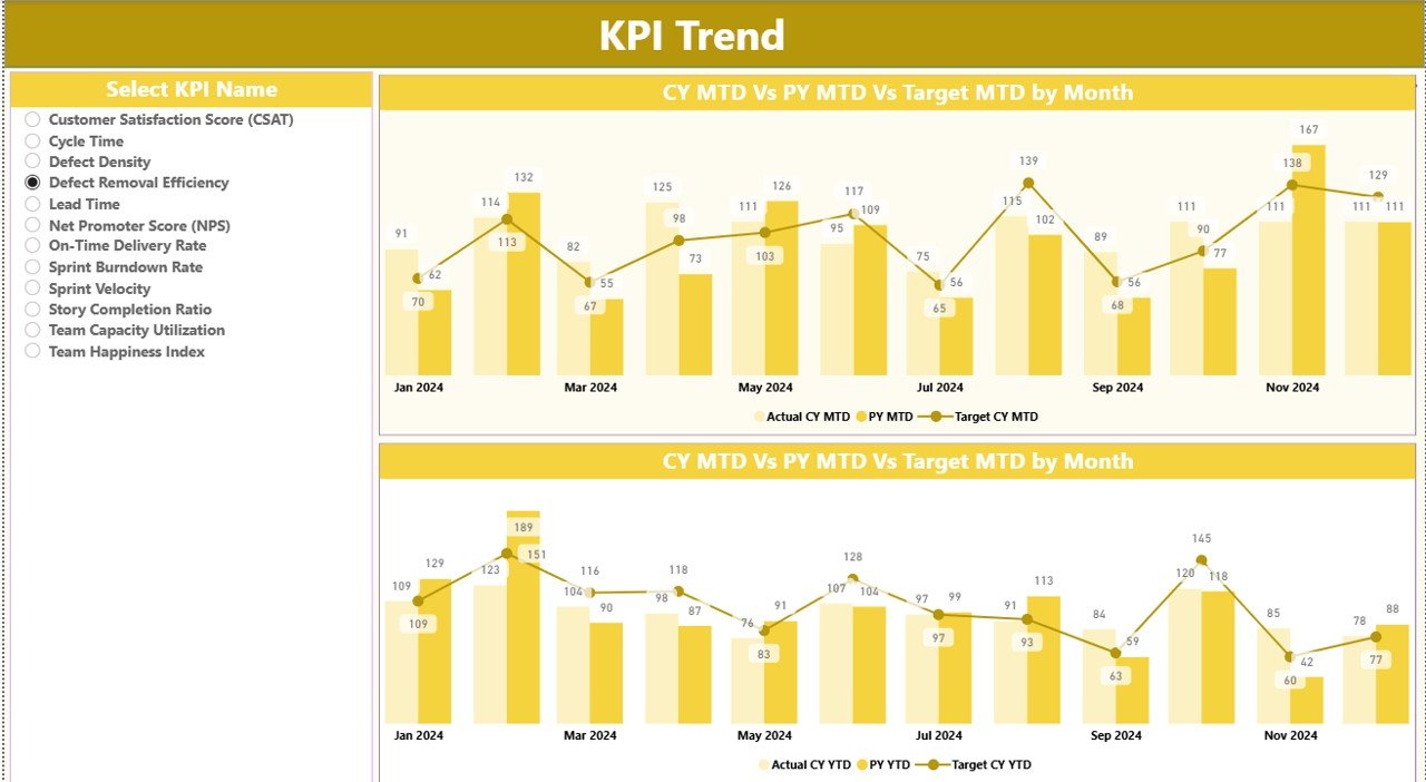
The KPI Trend Page helps you monitor the trend of each KPI closely. Instead of looking at only one number, you see the full performance pattern across months.
KPI Selection Slicer
A slicer on the left allows you to select the KPI name. Once selected, both combo charts update instantly.
Combo Charts on This Page
There are two combo charts:
-
MTD Chart – Shows Actual Numbers (CY), Previous Year (PY), and Targets
-
YTD Chart – Shows Actual Numbers (CY), Previous Year (PY), and Targets
These charts help you:
-
Track performance changes
-
Compare with previous year trends
-
Check target alignment
-
Identify improvement opportunities
Because this page shows historical movement, Scrum teams can use it for sprint reviews and retrospectives.
3. KPI Definition Page – What Does It Show?
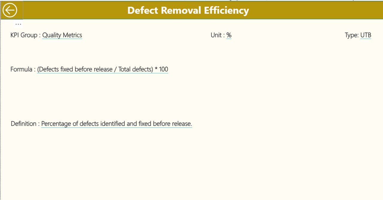
The KPI Definition Page works as a drill-through page. It remains hidden by default. When you right-click a KPI on the Summary Page and choose “Drill Through,” you land on this page.
This page shows:
-
KPI Number
-
KPI Group
-
KPI Name
-
Unit
-
Formula
-
Definition
-
Type (UTB or LTB)
This page helps team members understand the calculation logic behind the KPI. Whenever someone needs clarity, they can open this page. To return to the main page, you click the Back Button on the top-left corner.
What Is the Data Source for This Dashboard?
Click to Purchases Scrum Team KPI Dashboard in Power BI
The entire dashboard uses an Excel file as the data source. The Excel workbook includes three worksheets:
1. Input_Actual Sheet
In this sheet, you enter:
-
KPI Name
-
Month (first date of every month)
-
MTD Actual
-
YTD Actual
This sheet stores real numbers from your Scrum team’s performance.
2. Input_Target Sheet
In this sheet, you enter:
-
KPI Name
-
Month
-
MTD Target
-
YTD Target
This helps you compare actual performance against targets.
3. KPI Definition Sheet
This sheet includes:
-
KPI Number
-
KPI Group
-
KPI Name
-
Unit
-
Formula
-
Definition
-
Type (LTB or UTB)
You fill this once. It acts as the benchmark for calculating KPIs.
What KPIs Should Scrum Teams Track?
Scrum teams track several types of KPIs depending on sprint goals. Below are some common KPIs:
-
Sprint Velocity
-
Sprint Burndown
-
Sprint Completion Rate
-
Defect Count
-
Cycle Time
-
Lead Time
-
Planned vs Actual Story Points
-
Defect Leakage
-
Customer Satisfaction Score
-
Deployment Frequency
Each Scrum team can also add custom KPIs based on their product goals.
How Does This Dashboard Help Scrum Masters and Teams?
This dashboard empowers Scrum teams because it:
-
Shows MTD and YTD progress
-
Displays target comparisons
-
Highlights improvement areas
-
Provides year-over-year analysis
-
Gives quick visual signals through icons
-
Helps during sprint reviews
-
Supports retrospective discussions
-
Improves team accountability
Because all data stays in one place, teams save time and focus on improvement rather than manual reporting.
Advantages of Scrum Team KPI Dashboard in Power BI
Below are the major benefits of using this dashboard:
1. Real-Time Visibility
You understand the sprint performance immediately because the dashboard updates the moment you load new Excel data.
2. Fast Decision-Making
You make decisions quickly because you have clear charts and tables.
3. Improved Team Collaboration
Teams stay aligned because everyone views the same KPIs.
4. Accurate Performance Tracking
The dashboard shows the right numbers for MTD, YTD, Targets, and Previous Year values.
5. Better Sprint Planning
Teams plan new sprints more effectively because they know their strengths and weaknesses.
6. Clear KPI Definitions
Every KPI has a formula and definition, so there is no confusion.
7. Useful for Reviews and Retrospectives
You use trend charts during sprint reviews to analyze performance and find improvement opportunities.
Best Practices for Scrum Team KPI Dashboard in Power BI
Click to Purchases Scrum Team KPI Dashboard in Power BI
Below are the best practices for using this dashboard effectively:
1. Update Excel Data Regularly
Always update your Actual and Target sheets before analyzing.
2. Review KPIs at the End of Every Sprint
Make KPI review a regular sprint activity.
3. Maintain Clear KPI Definitions
Keep formulas simple and update them when your team evolves.
4. Use Slicers for Better Insights
Analyze by different KPI groups or months for deeper understanding.
5. Involve the Entire Team
Discuss the results with developers, QA engineers, and product owners.
6. Track Both MTD and YTD
Use both metrics for short-term and long-term insights.
7. Compare with Previous Year Trends
Always compare with PY values to understand growth.
8. Keep Targets Realistic
Set achievable goals to motivate the team.
Conclusion
A Scrum Team KPI Dashboard in Power BI transforms the way Scrum teams work. It brings all your KPIs into one interactive dashboard. With slicers, cards, tables, and combo charts, you get a complete view of performance. Because the dashboard uses a simple Excel file as a data source, anyone can update it easily.
Scrum Masters, Product Owners, and Agile Coaches get the clarity they need to plan better sprints, improve collaboration, and boost team productivity. When you follow best practices and track the right KPIs, your team moves toward consistent improvement.
Frequently Asked Questions (FAQs)
1. What is the purpose of a Scrum Team KPI Dashboard?
It helps Scrum teams track MTD, YTD, Targets, and Previous Year values in one place.
2. Can I add custom Scrum KPIs?
Yes, you can add new KPIs by updating the KPI Definition sheet.
3. Is Excel the only data source?
In this dashboard, yes. But Power BI also supports multiple sources if needed.
4. Can beginners use this dashboard easily?
Yes, because the dashboard layout is simple, visual, and easy to understand.
5. How often should I update the Actual numbers?
Update them after every sprint or weekly, based on your process.
6. What skills do I need to use this dashboard?
Basic Excel and Power BI knowledge are enough.
7. Does the dashboard support drill-through?
Yes, you can drill through to the KPI Definition page from the Summary Page.
8. Can this dashboard improve sprint planning?
Yes, because the dashboard shows performance gaps clearly.
Visit our YouTube channel to learn step-by-step video tutorials
Click to Purchases Scrum Team KPI Dashboard in Power BI