Shipping companies handle thousands of containers, multiple shipping lines, complex freight costs, and constantly changing operational expenses. Because everything moves fast in logistics, managers need real-time visibility. They must track shipment status, cargo performance, cost trends, and profit margins without digging into long spreadsheets.
A Shipping & Cargo Dashboard in Excel solves this problem. It brings every shipping KPI into one place, shows meaningful visuals, and helps managers make quick and informed decisions. You get a clear overview of container movement, cargo type performance, monthly cost patterns, and port-wise shipment data. Moreover, you navigate through multiple analytical pages using a simple page navigator.
In this detailed guide, you will learn everything about this dashboard — how it works, why it matters, what pages it includes, and how logistics teams can benefit from using it every day.
Click to Purchases Shipping & Cargo Dashboard in Excel
What Is a Shipping & Cargo Dashboard in Excel?
A Shipping & Cargo Dashboard in Excel is a ready-to-use template that gives logistics teams a complete view of shipping operations. It allows you to track freight cost, operational cost, net revenue, cargo type performance, port analytics, and in-transit shipment percentages. You can use it to monitor shipping profitability, container movement, and month-wise business trends.
Unlike manual spreadsheets, this dashboard shows data visually. You click the slicers, choose a port, select a cargo type, or filter by month. Then the entire dashboard updates instantly. Because of this, teams can review performance quickly and avoid guesswork.
Companies use this dashboard to analyze:
-
Shipment counts
-
Freight cost trends
-
Profit margins
-
Cargo type contribution
-
Origin port performance
-
Monthly operational patterns
-
In-transit shipment percentages
And they do all this inside a clean, user-friendly Excel file.
Why Do Shipping Companies Need This Dashboard?
Shipping companies deal with multiple challenges every day. They manage vessel schedules, track cargo loading and unloading activities, calculate costs, and maintain profit margins. Because of this complexity, Excel reports usually become lengthy and confusing.
A Shipping & Cargo Dashboard in Excel simplifies everything.
It helps teams:
-
View summary metrics in one glance
-
Analyze cargo performance using visual charts
-
Monitor port-wise revenue and cost
-
Compare net revenue vs operational expenses
-
Track month-wise profitability
-
Understand in-transit shipment delays
Additionally, the dashboard reduces the manual workload, saves time, and helps teams plan better.
Key Features of the Shipping & Cargo Dashboard in Excel
This dashboard comes with multiple analytical pages. Each page focuses on a specific area of operations. You use the Page Navigator on the left side to jump between these pages. Every page has right-side slicers that allow you to filter the data instantly.
Below is a detailed breakdown of each page.
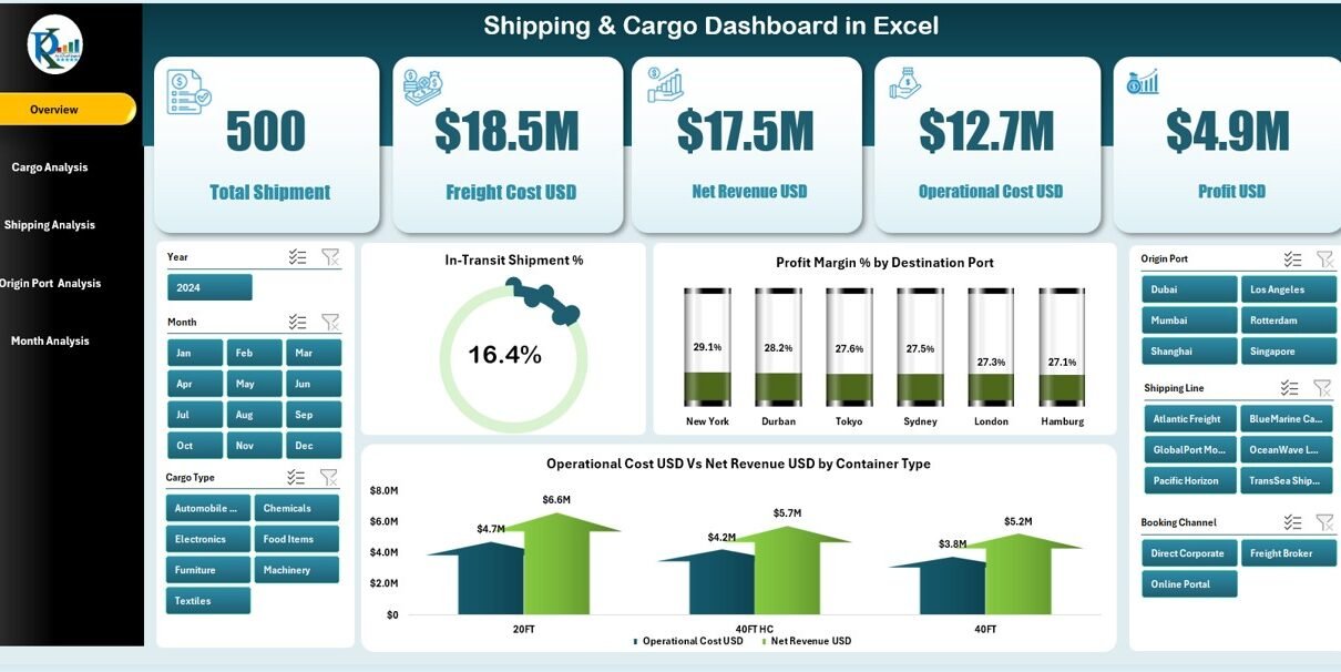
1. Overview Page
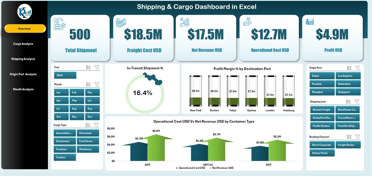
The Overview Page gives you a complete summary of your logistics operation. You see five KPI cards that highlight the most important metrics of your shipping business. These include shipment performance, profit margin, cost behavior, and in-transit shipment percentages.
Additionally, the page displays four meaningful charts:
-
In-Transit Shipment %
-
Profit Margin % by Destination Port
-
Operation Cost USD vs Net Revenue USD by Container Type
These visuals help managers quickly understand performance patterns and take action when needed. Because everything updates with slicers, decision-making becomes faster and more accurate.
2. Cargo Analysis Page
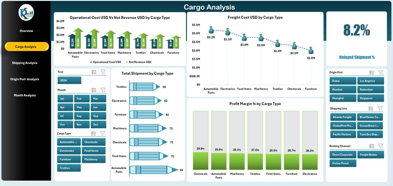
The Cargo Analysis Page focuses on performance by cargo type. It helps businesses compare different cargos and identify high-value or high-cost categories.
This page includes four powerful charts:
-
Operation Cost USD vs Net Revenue USD by Cargo Type
-
Freight Cost USD by Cargo Type
-
Total Shipment by Cargo Type
-
Profit Margin % by Cargo Type
With these visuals, companies can see which cargo types contribute the most revenue, which items require higher operational cost, and where profit margins drop.
3. Shipping Analysis Page
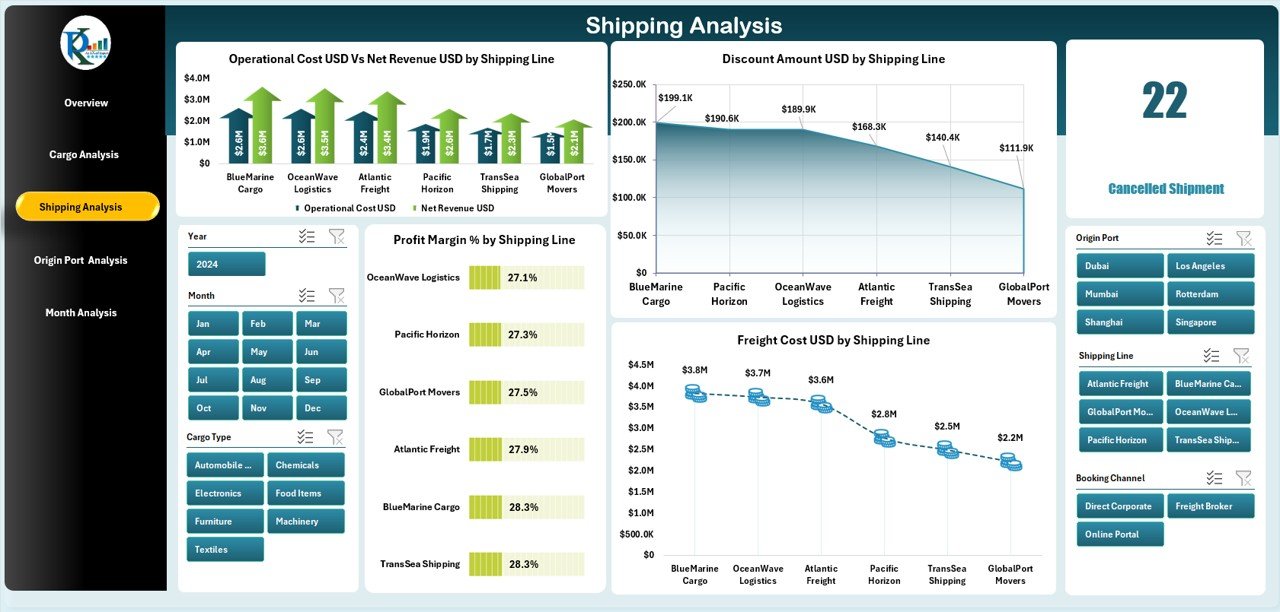
The Shipping Analysis Page breaks down performance by shipping line. This is useful when you work with multiple carriers and want to compare cost efficiency.
This page includes four charts:
-
Operation Cost USD vs Net Revenue USD by Shipping Line
-
Freight Cost USD by Shipping Line
-
Profit Margin % by Shipping Line
-
Discount Amount USD by Shipping Line
These charts help you find the most profitable shipping partners, understand which lines offer better discounts, and identify high-cost carriers.
4. Origin Port Analysis Page
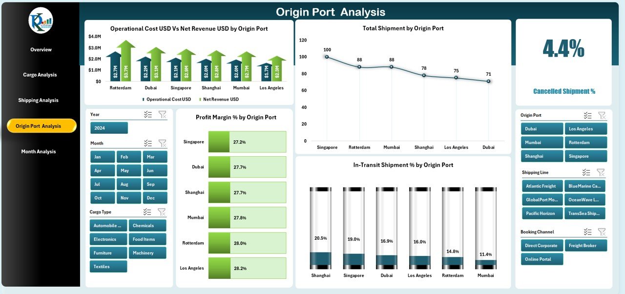
Shipping performance often varies by port. Operational cost, profit margins, and shipment volumes change based on location. The Origin Port Analysis Page helps managers study these patterns.
This page includes the following four charts:
-
Operation Cost USD vs Net Revenue USD by Origin Port
-
Profit Margin % by Origin Port
-
Total Shipment by Origin Port
-
In-Transit Shipment % by Origin Port
This section helps companies identify high-performing ports, understand route profitability, and plan shipping schedules effectively.
5. Month Analysis Page
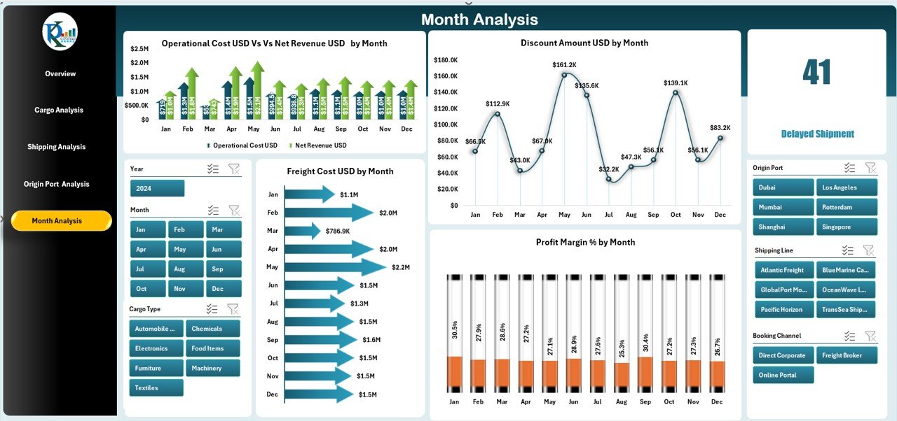
Shipping activities change month by month. Seasonal demand, cost fluctuations, and promotional discounts affect performance. The Month Analysis Page helps teams understand monthly behavior.
It contains four detailed charts:
-
Operation Cost USD vs Net Revenue USD by Month
-
Profit Margin % by Month
-
Discount Amount USD by Month
-
Freight Cost USD by Month
These visuals help managers plan budgets, analyze seasonal patterns, and make more accurate forecasts.
Click to Purchases Shipping & Cargo Dashboard in Excel
Support Sheets & Data Sheet
The template includes a Support Sheet and a Data Sheet.
You use the Data Sheet to enter raw shipment data such as cargo type, container type, cost, revenue, month, port details, and shipping line.
The dashboard reads this data automatically and updates all pages without any manual formatting.
Advantages of Shipping & Cargo Dashboard in Excel
A well-designed dashboard gives powerful benefits. It saves time, improves accuracy, and provides better insights. Here are the major advantages:
1. Quick Visibility Across All Shipping Operations
You do not search multiple sheets or create new formulas. The dashboard displays everything on clean pages with charts and KPIs.
2. Improved Cost & Revenue Analysis
You compare operational cost vs net revenue instantly. Because of this, managers make faster decisions and control expenses better.
3. Accurate Profit Margin Tracking
The dashboard shows profit margins across cargo types, shipping lines, ports, and months. Companies understand where profit increases or drops.
4. Faster Decision-Making with Ready Visuals
All charts update automatically when you select filters or months. Teams respond to issues quickly and avoid delays.
5. Easy Data Entry & Automated Reporting
You only update the Data Sheet. The dashboard handles calculations, visuals, and formatting.
6. Better Forecasting and Planning
Month-wise charts help you study performance trends. You use this data to forecast shipping volume, cost, and demand.
7. Enhanced Collaboration Across Departments
Finance, operations, sales, and warehouse teams all view the same reports. This builds clarity and reduces communication gaps.
Best Practices for Using the Shipping & Cargo Dashboard in Excel
To get the best results, you must follow some simple practices. These improve accuracy and help teams manage data properly.
1. Update Data Regularly
Enter new shipment and financial data each day or week. Frequent updates give more accurate performance visibility.
2. Use Consistent Data Formats
Keep date formats, currency formats, and cargo names consistent. This prevents errors and improves report accuracy.
3. Review Monthly Trends Before Making Decisions
Always check month-wise cost and revenue before planning new shipments or routes. It helps you control cost effectively.
4. Compare Cargo Types Often
Some cargo types bring higher margins while others increase costs. Frequent analysis helps improve profitability.
5. Track Port Performance Routinely
Ports change in efficiency. Use port-wise charts to choose better routes and avoid high-delay locations.
6. Evaluate Shipping Line Discounts
The Shipping Analysis Page shows discount amounts clearly. Compare carriers and choose the most cost-effective options.
7. Keep the Dashboard Clean
Do not add unnecessary columns or formulas. Follow the structure provided to maintain dashboard performance.
Conclusion
A Shipping & Cargo Dashboard in Excel is one of the most valuable tools for logistics teams. It helps you track shipment performance, analyze cost and revenue, monitor profit margins, and study port-wise or cargo-wise trends. Because it includes five powerful analytical pages, managers get complete visibility into the logistics operation.
The dashboard reduces manual work, speeds up decision-making, and makes reporting simple. Whether you manage a shipping company, freight forwarding service, logistics department, or warehouse operations, this dashboard can improve your accuracy and efficiency.
Frequently Asked Questions (FAQs)
1. What is a Shipping & Cargo Dashboard in Excel?
It is a ready-to-use Excel template that tracks shipping cost, revenue, shipment volume, cargo type performance, and port analytics using visuals and slicers.
2. Who can use this dashboard?
Shipping companies, freight forwarders, logistics teams, port operators, finance managers, and warehouse supervisors use this dashboard.
3. Do I need advanced Excel skills to use it?
No. You only update the Data Sheet. The dashboard updates automatically.
4. Can I customize the charts?
Yes. You can modify colors, labels, filters, or chart types based on your business need.
5. Does the dashboard support monthly analysis?
Yes. It includes a full Month Analysis Page with revenue, cost, margin, discount, and freight cost visuals.
6. Can I analyze performance by shipping line?
Yes. The Shipping Analysis Page shows cost, revenue, discounts, and margins by shipping line.
7. Can I compare ports and cargo types?
Absolutely. Dedicated pages show revenue, cost, shipment count, and in-transit percentages for each port and cargo type.
8. How often should I update the data?
Update your data daily or weekly to maintain accuracy in the dashboard.
Visit our YouTube channel to learn step-by-step video tutorials