In the shipping and logistics industry, efficiency and accuracy are the backbone of success. Every shipment, route, and customer delivery depends on the seamless flow of information. However, managing performance and identifying bottlenecks in shipping operations is often challenging when relying on manual tracking or scattered reports.
This is where a Shipping KPI Dashboard in Excel becomes a game changer. By consolidating all shipping-related data into a single platform, managers gain a clear view of key performance indicators (KPIs), enabling smarter decisions, improved customer satisfaction, and reduced operational costs.
In this article, you will learn everything about the Shipping KPI Dashboard in Excel—its structure, features, advantages, best practices, and real-world applications. By the end, you will understand how this ready-to-use Excel tool can transform shipping operations for logistics companies, freight forwarders, and supply chain managers.
Click to Purchases Shipping KPI Dashboard in Excel
What Is a Shipping KPI Dashboard in Excel?
A Shipping KPI Dashboard in Excel is a centralized performance monitoring tool built to track shipping metrics in real time. It provides a visual representation of how shipping operations perform against targets, previous year benchmarks, and industry standards.
Instead of reviewing multiple spreadsheets, managers can view all critical KPIs in a single, interactive dashboard. This allows quick identification of delays, cost overruns, or service issues, making it easier to take corrective actions.
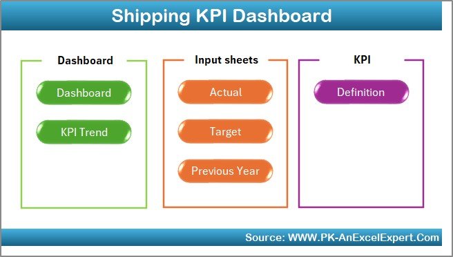
Structure of the Shipping KPI Dashboard
The dashboard is designed with seven structured worksheet tabs that organize data input, trend analysis, and performance visualization. Each tab serves a unique purpose:
1. Home Sheet
-
Works as the index sheet.
-
Provides six clickable buttons for easy navigation to other sheets.
-
Ensures smooth movement across the dashboard without manual searching.
2. Dashboard Sheet Tab
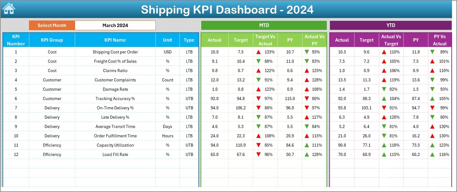
-
The central hub of the template.
-
Drop-down menu (Cell D3) lets users select a month to view KPIs.
-
Displays:
-
MTD (Month-to-Date) Actual, Target, and Previous Year data.
-
YTD (Year-to-Date) Actual, Target, and Previous Year data.
-
Variance Analysis: Target vs Actual and Previous Year vs Actual.
-
Conditional Formatting: Green upward arrow for improvement and red downward arrow for decline.
-
-
Gives a snapshot of shipping performance in one glance.
3. KPI Trend Sheet Tab
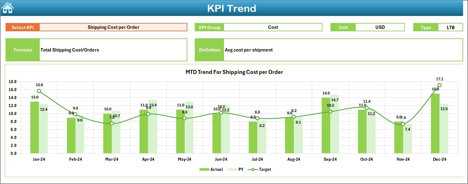
-
Drop-down (Cell C3) allows selection of a specific KPI.
-
Displays:
-
KPI Group, Unit, and Type (UTB = Upper the Better, LTB = Lower the Better).
-
Formula and Definition for clear understanding.
-
-
Shows trend charts comparing Actual, Target, and Previous Year values for both MTD and YTD.
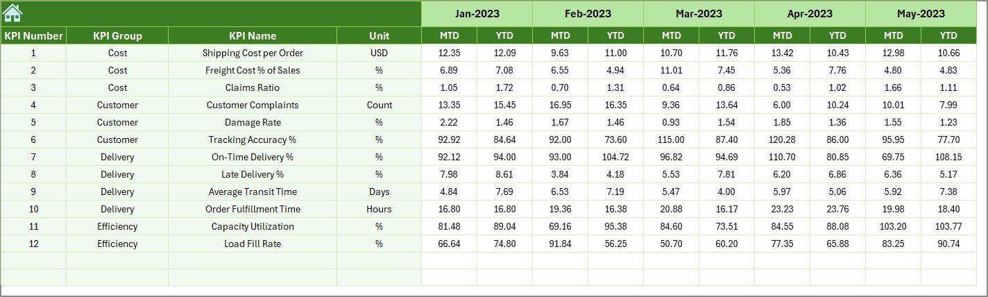
4. Actual Numbers Input Sheet
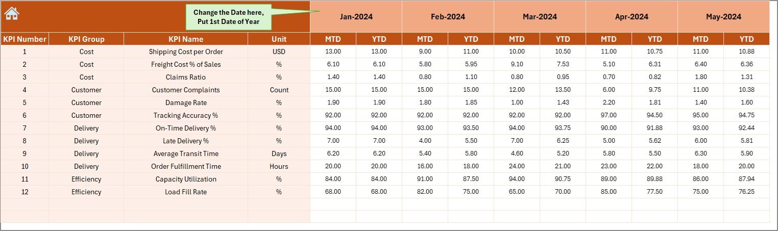
-
Designed for data entry.
-
Enter monthly actual numbers for both MTD and YTD.
-
Allows flexibility by changing the first month of the year from Cell E1.
5. Target Sheet Tab
-
Contains planned numbers for each KPI.
-
Input both MTD and YTD targets to compare with actuals later.
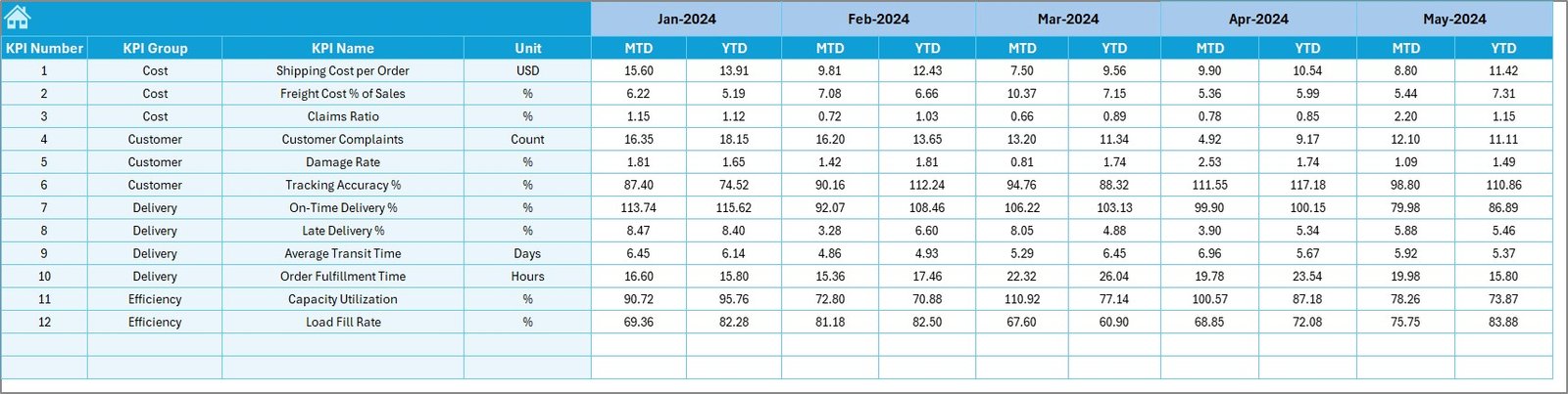
6. Previous Year Numbers Sheet Tab
-
Stores last year’s KPI values for MTD and YTD.
-
Helps in historical comparison and trend analysis.
7. KPI Definition Sheet Tab
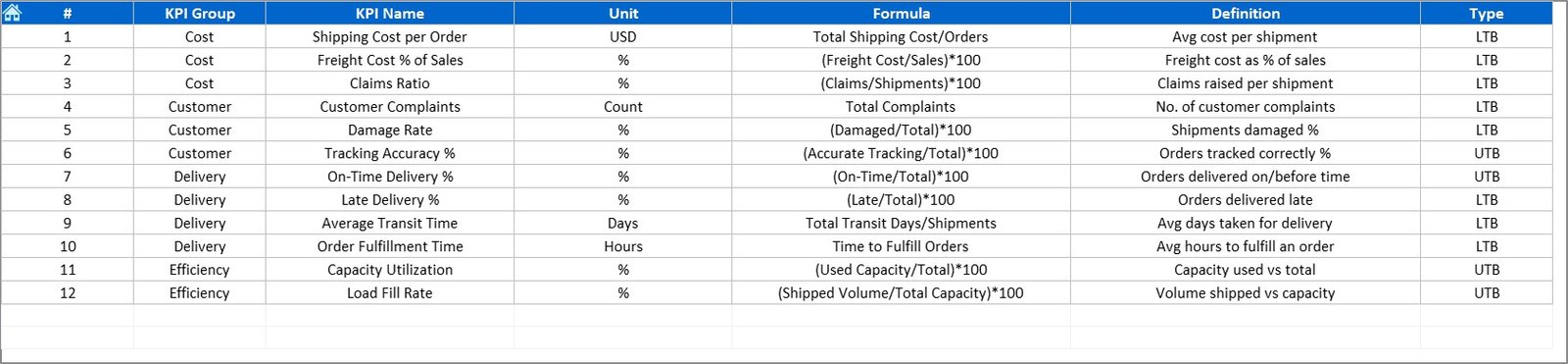
-
Stores details about each KPI:
-
Name, Group, Unit, Formula, and Definition.
-
-
Functions as the reference library for the dashboard.
Why Use a Shipping KPI Dashboard in Excel?
Managing shipments without a structured performance dashboard often leads to:
-
Poor visibility into shipping costs.
-
Missed delivery deadlines.
-
Inefficient route planning.
-
Rising customer complaints.
By using a KPI dashboard, organizations get:
-
Real-time performance tracking.
-
Accurate variance analysis to identify gaps.
-
Historical comparisons to measure improvements.
-
Data-driven decisions to boost efficiency.
Key KPIs Tracked in the Shipping Dashboard
A Shipping KPI Dashboard covers a wide range of performance indicators. Common examples include:
-
On-Time Delivery Rate – % of shipments delivered within promised time.
-
Shipping Cost per Unit – Cost of shipping each unit of product.
-
Order Accuracy Rate – % of orders shipped without errors.
-
Transit Time – Average time taken to deliver shipments.
-
Freight Claim Rate – % of shipments with claims due to damage or loss.
-
Fuel Efficiency – Shipping cost relative to fuel consumption.
-
Customer Complaints per Shipment – Service quality measurement.
-
Warehouse-to-Dispatch Time – Efficiency in preparing shipments.
These KPIs give a 360-degree view of shipping performance.
Advantages of a Shipping KPI Dashboard in Excel
Using a ready-to-use Excel dashboard comes with several benefits:
1. Centralized Information
All shipping data is stored in one place, reducing the need for multiple spreadsheets.
2. Interactive Visuals
Charts, conditional formatting, and arrows make the dashboard easy to interpret.
3. Customizable
KPIs, targets, and definitions can be adjusted to fit business needs.
4. Cost-Effective
Built in Excel—no need for expensive BI tools.
5. Improved Decision-Making
Managers can spot underperformance quickly and take immediate action.
6. Time-Saving
Automation through drop-downs and formulas minimizes manual effort.
Opportunities for Improvement
While the Excel-based dashboard is powerful, organizations can explore improvements:
-
Integration with ERP or CRM systems for real-time updates.
-
Automation of data entry using Power Query or APIs.
-
Adding predictive analytics for forecasting shipment delays.
-
Expanding KPI library for more detailed monitoring.
-
Enhanced visualization with Power BI integration.
Best Practices for the Shipping KPI Dashboard
To maximize results, follow these practices:
-
Keep KPIs clear and relevant – Avoid overcrowding with too many indicators.
-
Update data regularly – Enter actual numbers monthly for accurate tracking.
-
Use variance analysis – Compare with targets and last year’s data consistently.
-
Ensure data accuracy – Cross-check inputs before analysis.
-
Leverage conditional formatting – Use arrows, colors, and charts for quick insights.
-
Train staff to use the dashboard – Ensure teams understand KPI definitions.
Real-World Applications of the Dashboard
The Shipping KPI Dashboard is versatile and applicable across industries:
-
E-commerce companies – To track delivery timelines and reduce costs.
-
Logistics providers – To monitor carrier performance and route efficiency.
-
Manufacturers – To measure shipping cost per unit and delivery success.
-
Freight forwarders – To manage transit times and claim rates.
-
Retailers – To analyze customer satisfaction and minimize complaints.
Conclusion
A Shipping KPI Dashboard in Excel is more than a reporting tool—it is a performance improvement system. With its structured worksheets, variance analysis, and trend charts, this dashboard provides logistics managers with actionable insights.
By adopting this tool, organizations can reduce shipping costs, improve delivery timelines, and ensure customer satisfaction. In a competitive shipping landscape, the ability to make data-driven decisions is no longer optional—it is essential.
Click to Purchases Shipping KPI Dashboard in Excel
Frequently Asked Questions (FAQs)
1. What is a Shipping KPI Dashboard in Excel?
It is an Excel-based tool designed to track, analyze, and report key performance indicators related to shipping and logistics.
2. Which KPIs should be tracked in shipping operations?
Common KPIs include on-time delivery rate, shipping cost per unit, transit time, freight claim rate, and order accuracy.
3. Who can use this dashboard?
Logistics managers, supply chain analysts, e-commerce businesses, freight forwarders, and manufacturers.
4. Can the dashboard be customized?
Yes. You can modify KPIs, targets, and formulas according to business needs.
5. How often should data be updated?
It is best to update the dashboard monthly with actual numbers for both MTD and YTD.
6. What makes this dashboard better than manual reports?
It consolidates all performance indicators in one place, uses visual charts, and saves time with automation.
7. Can this dashboard integrate with Power BI?
Yes. Data from this Excel dashboard can be imported into Power BI for advanced visualizations and analytics.
Visit our YouTube channel to learn step-by-step video tutorials
Click to Purchases Shipping KPI Dashboard in Excel