Smart city projects demand clarity, speed, and accountability. However, many organizations still rely on scattered spreadsheets, delayed reports, and manual calculations. As a result, decision-makers struggle to track performance, control budgets, and meet project timelines. Therefore, a Smart Cities Project KPI Dashboard in Excel becomes a powerful and practical solution for modern urban governance.
In this detailed and SEO-friendly guide, you will learn everything about the Smart Cities Project KPI Dashboard in Excel. Moreover, you will understand what it is, why it matters, how it works, its worksheet structure, advantages, best practices, and real-world applications. Additionally, this article explains how Excel transforms complex project data into clear, visual, and actionable insights without expensive BI tools.
Click to buy Smart Cities Project KPI Dashboard in Excel
What Is a Smart Cities Project KPI Dashboard in Excel?
A Smart Cities Project KPI Dashboard in Excel is a structured and interactive Excel-based reporting tool designed to track, analyze, and monitor key performance indicators related to smart city projects.
These projects often include:
- Infrastructure development
- Smart transportation systems
- Energy and utilities modernization
- Digital governance initiatives
- Environmental sustainability programs
Instead of managing multiple Excel files and manual reports, this dashboard consolidates all KPIs into one centralized workbook. Consequently, project managers and city officials gain real-time visibility into project health.
Why Do Smart City Projects Need KPI Dashboards?
Smart city projects involve multiple stakeholders, budgets, timelines, and risks. Therefore, teams need a structured way to measure performance.
Key challenges without a KPI dashboard:
- Lack of performance visibility
- Delayed decision-making
- Budget overruns
- Missed deadlines
- Poor accountability
However, when organizations use a Smart Cities Project KPI Dashboard in Excel, they gain control, transparency, and confidence in project execution.
How Does a Smart Cities Project KPI Dashboard in Excel Work?
This dashboard works on a simple yet powerful principle: structured data + automated analysis + visual insights.
Here is how it functions step by step:
- First, users define KPIs in a dedicated definition sheet
- Next, they enter actual, target, and previous year data
- Then, Excel formulas and pivot tables calculate performance
- Finally, interactive charts and KPIs update automatically
As a result, decision-makers see accurate performance data instantly.
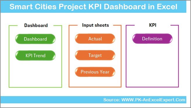
What Are the Key Features of the Smart Cities Project KPI Dashboard in Excel?
This dashboard includes 7 well-structured worksheets, each designed for a specific purpose.
Summary Page – Why Is It Important?
The Summary Page works as an index and navigation hub.
Key highlights:
- Acts as the landing page of the dashboard
- Contains 6 navigation buttons
- Allows instant access to other worksheets
- Improves usability and user experience
Because of this structure, users move across the dashboard effortlessly.
Click to buy Smart Cities Project KPI Dashboard in Excel
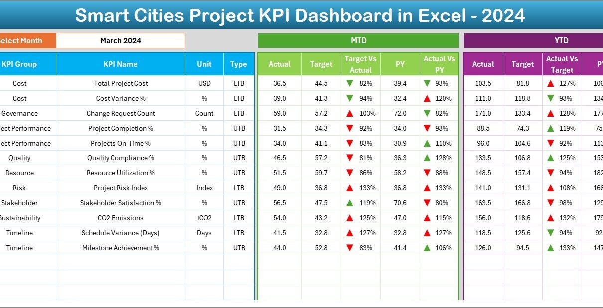
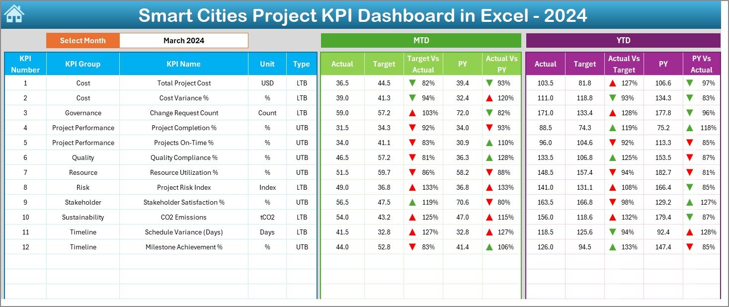
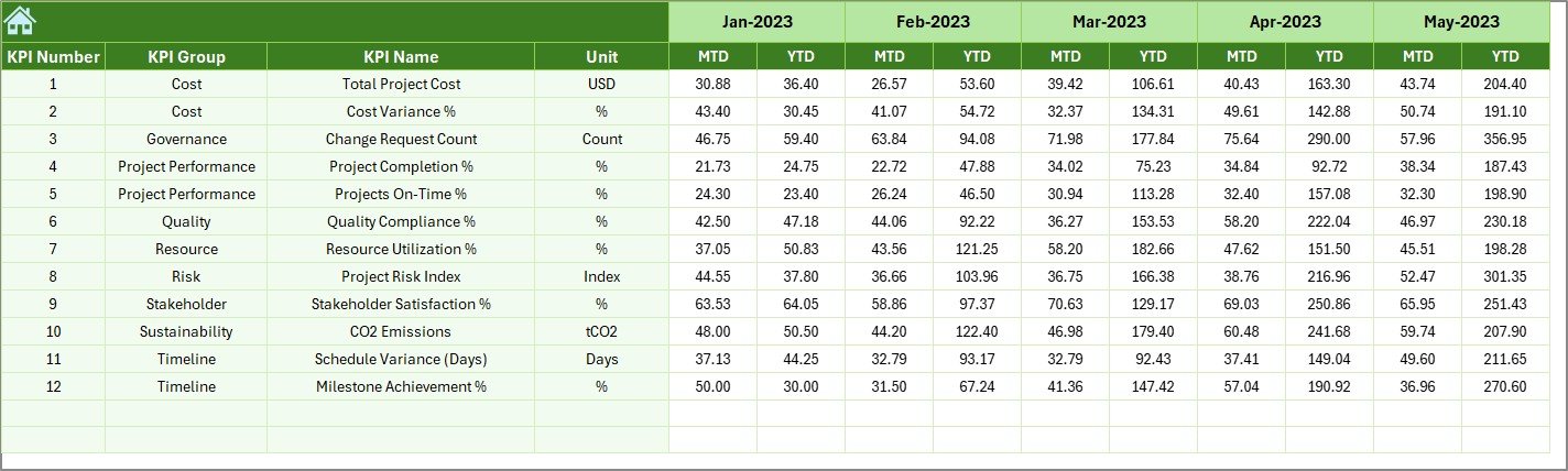
Dashboard Sheet – What Does It Show?
The Dashboard Sheet is the heart of the Smart Cities Project KPI Dashboard.
Key functionalities:
- Displays all KPIs in a single view
- Month selection available in cell D3
- Automatically updates data based on the selected month
KPI metrics displayed:
- MTD Actual, Target, Previous Year
- Target vs Actual variance
- Previous Year vs Actual variance
- Conditional formatting with up/down arrows
YTD analysis:
- YTD Actual, Target, and PY values
- Variance calculations with visual indicators
Therefore, users instantly identify performance gaps and achievements.
Click to buy Smart Cities Project KPI Dashboard in Excel
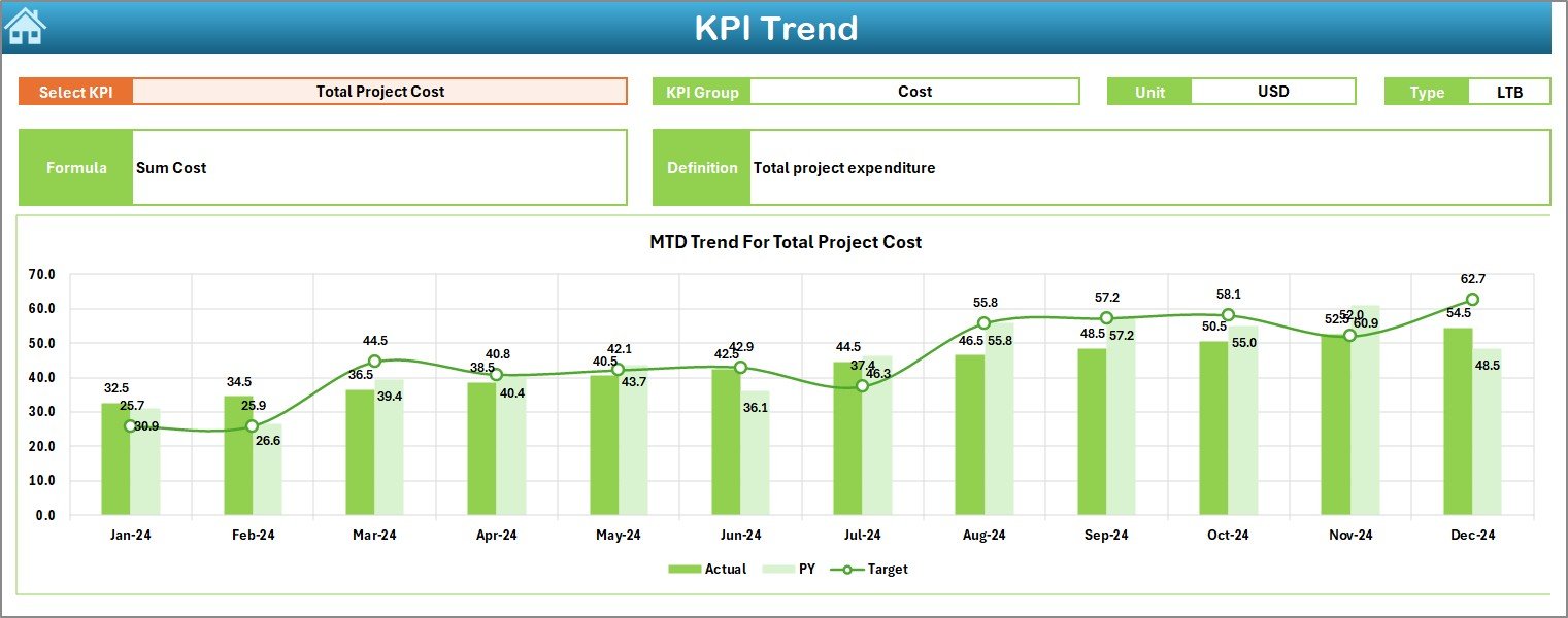
Trend Sheet – How Does Trend Analysis Help?
The Trend Sheet focuses on KPI-level analysis.
Key features:
KPI selection dropdown in cell C3
Displays:
KPI Group
Unit of KPI
KPI Type (Lower is Better / Upper is Better)
KPI Formula
KPI Definition
Visual insights:
- MTD trend chart for Actual, Target, and PY
- YTD trend chart for Actual, Target, and PY
As a result, teams identify patterns, risks, and improvement areas early.
Click to buy Smart Cities Project KPI Dashboard in Excel
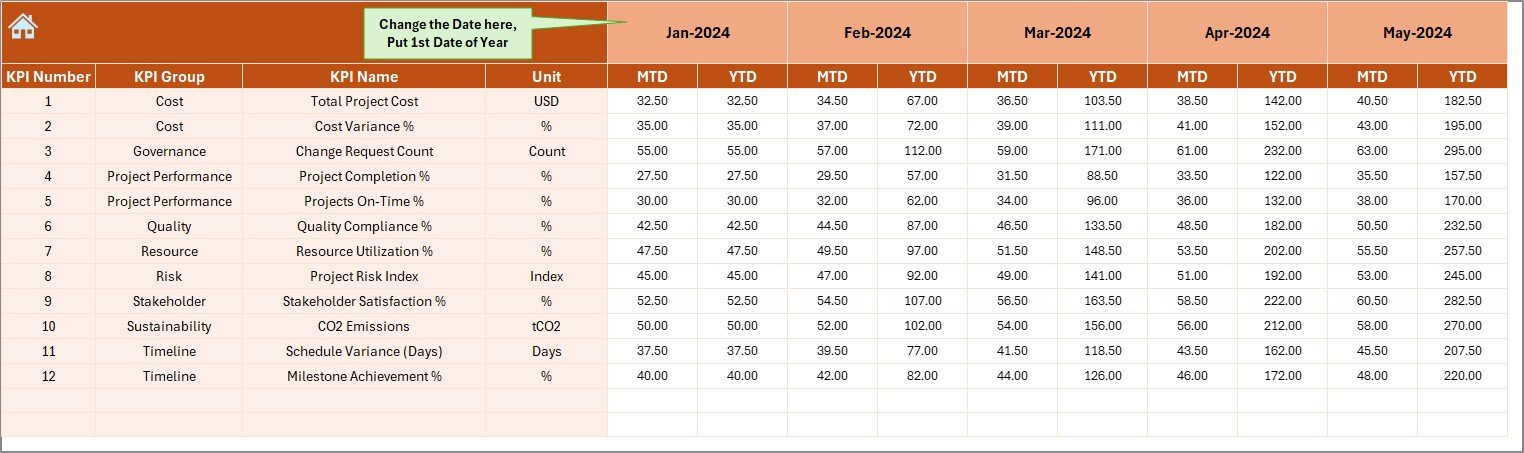
Actual Numbers Input Sheet – Why Is It Crucial?
The Actual Numbers Input Sheet serves as the data entry backbone.
How it works:
- Users enter MTD and YTD actual values
- Month selection available in cell E1
- First month of the year drives calculations
Because data entry remains structured, errors reduce significantly.
Target Sheet – How Are Goals Managed?
The Target Sheet defines performance expectations.
Key points:
- Users enter monthly MTD targets
- YTD targets auto-calculate or update accordingly
- KPI-wise target planning becomes easy
Therefore, organizations align project goals with measurable outcomes.
Previous Year Number Sheet – Why Compare with History?
The Previous Year Sheet enables year-over-year analysis.
Benefits:
- Enter last year’s MTD and YTD values
- Compare current performance with historical benchmarks
- Identify long-term improvement or decline
Consequently, decision-makers gain strategic insights.
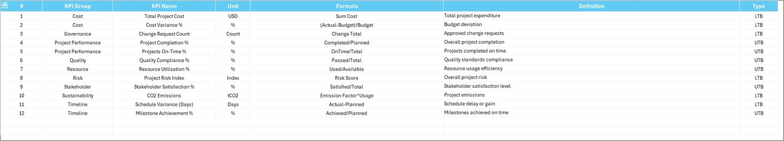
KPI Definition Sheet – How Does It Improve Clarity?
The KPI Definition Sheet acts as a reference guide.
Included fields:
- KPI Name
- KPI Group
- Unit of Measurement
- KPI Formula
- KPI Definition
Because of this clarity, all stakeholders interpret KPIs consistently.
What KPIs Can You Track in Smart City Projects?
A Smart Cities Project KPI Dashboard in Excel supports multiple KPI categories.
Common KPI groups:
- Project Timeline KPIs
- Financial & Budget KPIs
- Infrastructure Completion KPIs
- Sustainability KPIs
- Service Delivery KPIs
- Citizen Impact KPIs
Thus, the dashboard adapts easily to different project needs.
Advantages of Smart Cities Project KPI Dashboard in Excel
Using this dashboard delivers measurable benefits.
Centralized performance monitoring
- One file for all KPIs
- No scattered reports
Cost-effective solution
- No expensive BI tools
- Uses existing Excel skills
Faster decision-making
- Real-time KPI visibility
- Automated calculations
Improved accountability
- Clear targets and ownership
- Transparent reporting
Scalability and flexibility
- Easy to add new KPIs
- Works for small and large projects
How Does This Dashboard Support Smart City Governance?
Smart governance requires data-driven decisions.
This dashboard helps by:
- Monitoring project health continuously
- Ensuring budget discipline
- Tracking delivery timelines
- Supporting compliance and audits
As a result, city administrators maintain control and transparency.
Best Practices for the Smart Cities Project KPI Dashboard in Excel
To maximize value, follow these best practices.
Define KPIs clearly
- Use measurable and relevant KPIs
- Avoid vague metrics
Maintain data consistency
- Use standardized units
- Validate data regularly
Update data frequently
- Enter actuals monthly
- Review trends quarterly
Use visual indicators wisely
- Highlight exceptions
- Avoid cluttered dashboards
Train stakeholders
- Explain KPI definitions
- Ensure consistent interpretation
Who Should Use a Smart Cities Project KPI Dashboard in Excel?
This dashboard suits multiple stakeholders.
Ideal users include:
- Smart city project managers
- Urban development authorities
- Government planning departments
- Infrastructure consultants
- Program management offices (PMOs)
Therefore, it fits both public and private sector projects.
Real-World Use Cases of Smart Cities Project KPI Dashboards
Urban Infrastructure Development
Track road, metro, and utility projects effectively.
Sustainability Initiatives
Monitor energy efficiency, emissions, and waste reduction.
Smart Mobility Programs
Analyze transport efficiency and service quality.
Digital Governance Projects
Measure adoption, uptime, and service delivery KPIs.
Why Excel Remains Ideal for Smart City KPI Dashboards?
Excel remains popular because:
- Most organizations already use it
- It supports formulas, pivot tables, and charts
- It allows customization without coding
- It integrates easily with other systems
Therefore, Excel delivers enterprise-level reporting without complexity.
Conclusion: Is a Smart Cities Project KPI Dashboard in Excel Worth It?
Absolutely. A Smart Cities Project KPI Dashboard in Excel transforms raw project data into meaningful insights. Moreover, it improves transparency, accountability, and decision-making. Because it combines structure, automation, and visualization, it becomes an essential tool for smart city success.
If you want better control, faster reporting, and data-driven governance, this dashboard delivers exactly that.
Frequently Asked Questions (FAQs)
What is a Smart Cities Project KPI Dashboard in Excel?
It is an Excel-based tool that tracks and analyzes KPIs for smart city projects using structured data and visual dashboards.
Can I customize KPIs in this dashboard?
Yes. You can easily add, modify, or remove KPIs using the KPI Definition sheet.
Does this dashboard support MTD and YTD analysis?
Yes. It supports both Month-to-Date and Year-to-Date analysis for actuals, targets, and previous year values.
Is this dashboard suitable for government projects?
Yes. It works perfectly for public sector, municipal, and smart city initiatives.
Do I need advanced Excel skills to use it?
No. Basic Excel knowledge is sufficient to operate and maintain the dashboard.
Visit our YouTube channel to learn step-by-step video tutorials
Watch the step-by-step video tutorial:
Click to buy Smart Cities Project KPI Dashboard in Excel