Managing tenders in smart city projects demands accuracy, transparency, and speed. However, many organizations still struggle with scattered spreadsheets, delayed reports, and unclear performance tracking. As a result, decision-makers often miss risks, trends, and opportunities. That is exactly why a Smart Cities Tender KPI Dashboard in Excel becomes a powerful and practical solution.
In this in-depth article, you will learn everything about the Smart Cities Tender KPI Dashboard in Excel. Moreover, you will understand its purpose, structure, worksheets, advantages, best practices, and real-world use cases. Additionally, this guide explains how Excel dashboards transform complex tender data into clear, visual, and actionable insights—without expensive software or complex systems.
Click to buy Smart Cities Tender KPI Dashboard in Excel
What Is a Smart Cities Tender KPI Dashboard in Excel?
A Smart Cities Tender KPI Dashboard in Excel is a structured and interactive reporting tool designed to track, analyze, and monitor key performance indicators related to smart city tenders. These tenders often involve infrastructure, utilities, technology, transportation, energy, and public services. Therefore, they require continuous monitoring across multiple parameters.
Instead of managing dozens of Excel files and manual calculations, this dashboard consolidates all tender-related KPIs into one centralized Excel file. Consequently, procurement teams, project managers, consultants, and government stakeholders gain instant visibility into performance.
Because Excel supports formulas, pivot tables, charts, slicers, and conditional formatting, this dashboard delivers strong insights while remaining easy to use.
Why Do Smart City Projects Need a Tender KPI Dashboard?
Smart city tenders involve high budgets, strict timelines, regulatory compliance, and multiple stakeholders. Therefore, manual tracking quickly becomes inefficient. Moreover, errors in tender evaluation can lead to financial losses and project delays.
A Smart Cities Tender KPI Dashboard in Excel solves these challenges by offering structured performance tracking.
Key reasons why this dashboard matters
- It improves transparency across tender activities
- It enables faster and data-driven decisions
- It reduces manual errors and reporting delays
- It standardizes KPI tracking across projects
- It supports audits and compliance reviews
As a result, organizations gain control, clarity, and confidence.
How Does a Smart Cities Tender KPI Dashboard in Excel Work?
The dashboard works by separating data entry, KPI logic, and visual reporting into structured worksheets. Because of this design, users can update data easily while keeping calculations secure.
Once you enter monthly data, the dashboard automatically updates all KPIs, comparisons, trends, and visuals. Moreover, dropdown selections allow users to change the month or KPI instantly.
This approach ensures accuracy, consistency, and flexibility.
What Are the Key Features of the Smart Cities Tender KPI Dashboard in Excel?
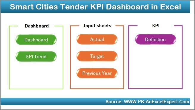
In this dashboard, we have created 7 well-structured worksheets. Each worksheet plays a specific role and together they form a complete performance system.
Let us explore each worksheet in detail.
Summary Page: Why Is It the Control Center?
The Summary Page acts as an index and navigation hub for the entire dashboard. Instead of scrolling through tabs, users can move instantly between sheets.
What does the Summary Page include?
- Clear layout with professional design
- 6 navigation buttons to jump to key sheets
- Easy access for non-technical users
Because of this design, the dashboard feels intuitive and user-friendly.
Click to buy Smart Cities Tender KPI Dashboard in Excel
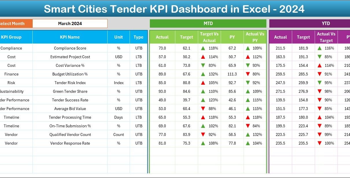
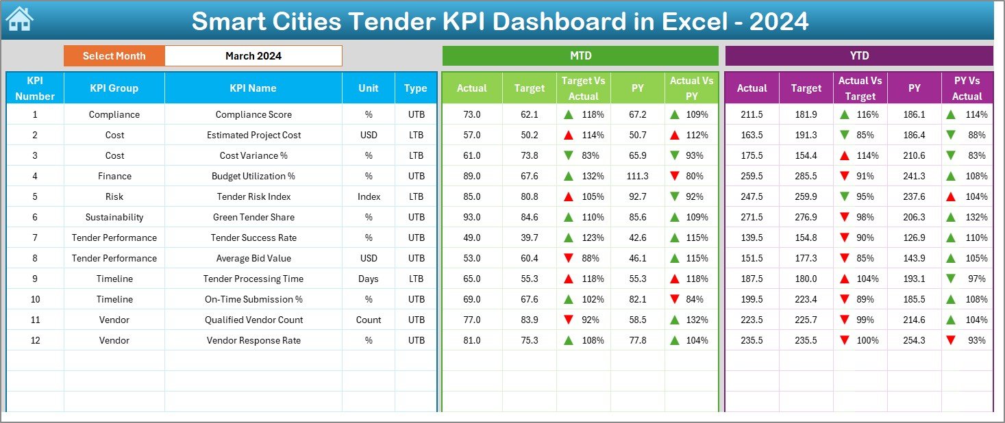
Dashboard Sheet: How Does It Show KPI Performance?
The Dashboard Sheet is the heart of the Smart Cities Tender KPI Dashboard in Excel. Here, you can view all KPIs in one consolidated view.
Key functionality of the Dashboard Sheet
- Month selection dropdown at cell D3
- Automatic refresh of all KPIs based on selected month
- Clean and executive-ready visuals
KPIs displayed on the dashboard
- MTD Actual, Target, and Previous Year values
- Target vs Actual comparison
- Previous Year vs Actual comparison
- YTD Actual, Target, and Previous Year values
Moreover, the dashboard uses conditional formatting with up and down arrows. Therefore, users can instantly identify good or poor performance.
As a result, leadership teams can take quick action without reading lengthy reports.
Click to buy Smart Cities Tender KPI Dashboard in Excel
Trend Sheet: How Can You Analyze KPI Trends?
The Trend Sheet helps users understand how performance changes over time. Instead of looking only at current values, this sheet highlights patterns and movements.
How does the Trend Sheet work?
KPI selection dropdown at cell C3
Automatic display of KPI details such as:
KPI Group
Unit of KPI
KPI Type (Lower the Better or Upper the Better)
Formula
Definition
Visual trend analysis
- MTD trend chart for Actual, Target, and Previous Year
- YTD trend chart for Actual, Target, and Previous Year
Because of these visuals, users can easily spot rising risks, improving performance, or recurring issues.

Click to buy Smart Cities Tender KPI Dashboard in Excel
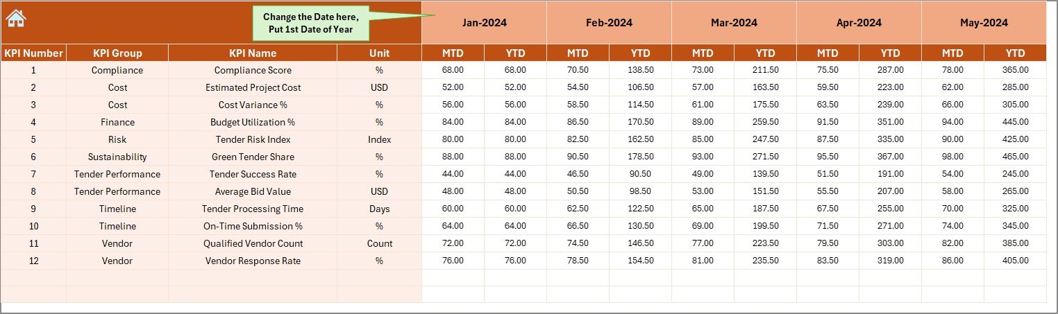
Actual Numbers Input Sheet: Where Do You Enter Data?
The Actual Numbers Input Sheet allows users to enter real performance data. This sheet keeps raw data separate from calculations.
Key features of this sheet
- Month selection at cell E1
- Entry fields for MTD and YTD actual values
- Simple and clean data layout
You only need to enter the first month of the year in cell E1. After that, the dashboard aligns all calculations automatically.
Therefore, data entry becomes faster and less error-prone.
Click to buy Smart Cities Tender KPI Dashboard in Excel
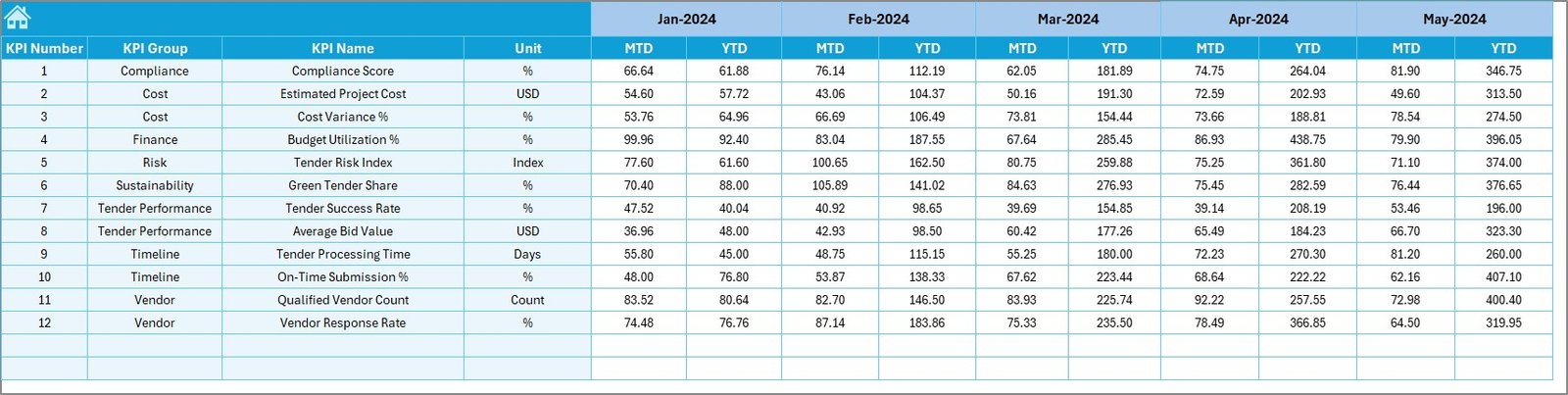
Target Sheet: How Do You Track Goals?
The Target Sheet stores planned or benchmark values for each KPI. These targets help teams measure success objectively.
What does the Target Sheet include?
- Monthly MTD targets
- Monthly YTD targets
- Structured format aligned with KPI definitions
Once you enter targets, the dashboard instantly calculates variances. As a result, teams can see whether they meet expectations or not.
Click to buy Smart Cities Tender KPI Dashboard in Excel
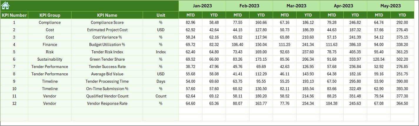
Previous Year Number Sheet: Why Is Year-Over-Year Comparison Important?
The Previous Year Number Sheet stores historical performance data. This data allows users to compare current performance with past results.
Benefits of this sheet
- Enables year-over-year analysis
- Highlights improvement or decline
- Supports long-term planning
Because the structure matches current year data, comparisons remain consistent and reliable.
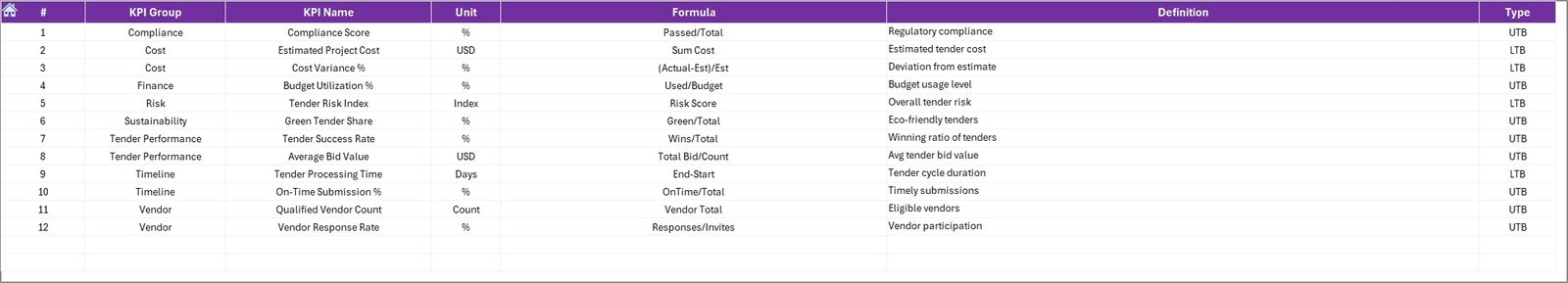
KPI Definition Sheet: Why Does KPI Clarity Matter?
The KPI Definition Sheet acts as a reference guide for all KPIs used in the dashboard.
What information does this sheet include?
- KPI Name
- KPI Group
- Unit
- Formula
- KPI Definition
This sheet ensures that everyone interprets KPIs in the same way. Consequently, misunderstandings and reporting conflicts reduce significantly.
What KPIs Can You Track in a Smart Cities Tender KPI Dashboard?
Although KPIs may vary by project, this dashboard supports a wide range of tender-related KPIs.
Common KPI examples
- Number of tenders published
- Tender evaluation cycle time
- Bid participation rate
- Tender success ratio
- Cost variance
- Compliance score
- On-time award percentage
- Dispute resolution rate
Because the dashboard works as a template, you can easily adapt it for other procurement or project KPIs.
Advantages of Smart Cities Tender KPI Dashboard in Excel
A well-designed dashboard delivers value beyond reporting. Let us explore its key advantages.
- Centralized Performance Tracking
- The dashboard consolidates all tender KPIs into one Excel file. Therefore, users avoid managing multiple spreadsheets.
- Improved Decision-Making
- Clear visuals and comparisons help leaders take faster and better decisions.
- Time and Cost Savings
- Because Excel is widely available, organizations avoid costly BI tools.
- High Flexibility
- You can modify KPIs, targets, and formulas without technical dependency.
- Enhanced Transparency
- Stakeholders can clearly see how tenders perform against targets.
How Does This Dashboard Support Smart City Governance?
Smart city projects require accountability, audit readiness, and performance transparency. This dashboard supports governance in several ways.
- It provides traceable KPI logic
- It supports performance reviews and audits
- It enables consistent reporting formats
- It improves inter-department coordination
As a result, governance becomes data-driven rather than assumption-based.
Best Practices for the Smart Cities Tender KPI Dashboard in Excel
To get maximum value, you should follow proven best practices.
- Define KPIs Clearly Before Implementation
Always finalize KPI definitions before data entry. This approach avoids confusion later.
- Keep Data Entry Restricted
Limit access to input sheets only. Therefore, you protect formulas and visuals.
- Update Data Regularly
Schedule monthly updates to keep insights relevant.
- Review Trends, Not Just Numbers
Always analyze trend charts to understand performance behavior.
- Align KPIs With Project Goals
Ensure KPIs reflect actual smart city objectives, not just activity counts.
Who Should Use a Smart Cities Tender KPI Dashboard in Excel?
This dashboard serves multiple stakeholders.
- Government procurement teams
- Smart city project management offices
- Consultants and advisors
- Infrastructure planning departments
- Audit and compliance teams
Because of its simplicity, even non-technical users can use it confidently.
How Does This Dashboard Compare With BI Tools?
Many organizations consider Power BI or other tools. However, Excel dashboards offer unique advantages.
- No additional software cost
- Faster deployment
- Easier customization
- Offline accessibility
Therefore, Excel remains an excellent choice for structured KPI tracking.
Conclusion: Is a Smart Cities Tender KPI Dashboard in Excel Worth Using?
Absolutely yes. A Smart Cities Tender KPI Dashboard in Excel delivers clarity, control, and confidence in tender management. It transforms raw tender data into meaningful insights that support better decisions.
Because the dashboard uses a structured worksheet approach, it remains scalable, flexible, and user-friendly. Moreover, it supports transparency, governance, and continuous improvement.
If you want to manage smart city tenders professionally, this dashboard becomes an essential tool.
Frequently Asked Questions (FAQs)
What is a Smart Cities Tender KPI Dashboard in Excel?
It is an Excel-based tool that tracks and visualizes key performance indicators related to smart city tenders.
Can I customize KPIs in this dashboard?
Yes, you can easily add, remove, or modify KPIs using the KPI Definition Sheet.
Does this dashboard require advanced Excel skills?
No, basic Excel knowledge is enough to use and maintain it.
How often should I update the dashboard?
You should update it monthly for accurate insights.
Can this dashboard support multiple smart city projects?
Yes, you can adapt it for different projects by adjusting KPIs and data.
Is this dashboard suitable for audits?
Yes, it supports transparent KPI definitions and historical comparisons, which help during audits.
Visit our YouTube channel to learn step-by-step video tutorials
Watch the step-by-step video tutorial:
Click to buy Smart Cities Tender KPI Dashboard in Excel