Space research agencies operate in a high-precision environment. They manage satellite launches, deep space missions, technology development, scientific research, and international collaborations. However, while missions aim beyond Earth, performance tracking often remains stuck in static reports.
Many agencies still consolidate data manually in Excel files. As a result, leadership spends valuable time reviewing scattered reports. Moreover, stakeholders expect measurable progress and transparent reporting. At the same time, mission managers need real-time visibility into targets and results.
So, how can space research agencies track KPIs, compare performance, and analyze trends in a structured and interactive way?
The solution is simple.
You need a Space Research Agencies KPI Dashboard in Power BI.
This ready-to-use Power BI dashboard converts Excel data into dynamic visuals, performance comparisons, and trend analysis. Instead of preparing manual summaries, you can review mission KPIs, MTD and YTD performance, and previous year comparisons instantly.
In this detailed guide, you will learn:
-
What a Space Research Agencies KPI Dashboard in Power BI is
-
Why space agencies need it
-
A complete explanation of all 3 dashboard pages
-
How the Excel data structure works
-
Key KPIs space agencies can track
-
Advantages of the dashboard
-
Best practices for implementation
-
Frequently Asked Questions
Let’s explore everything step by step.
Click to Purchases Space Research Agencies KPI Dashboard in Power BI
What Is a Space Research Agencies KPI Dashboard in Power BI?
A Space Research Agencies KPI Dashboard in Power BI is an interactive performance monitoring tool designed to track mission success, research output, financial efficiency, and operational reliability.
Unlike static spreadsheets, this dashboard provides:
-
Dynamic slicers
-
KPI performance icons
-
MTD and YTD comparisons
-
Current Year vs Previous Year analysis
-
Drill-through KPI definitions
-
Combo charts for trend analysis
Therefore, leadership teams gain instant clarity. Moreover, they identify risks before they escalate.
Why Do Space Research Agencies Need a Power BI Dashboard?
Space missions require strict monitoring. Every delay, cost overrun, or technical failure impacts mission outcomes. However, without structured visualization, agencies struggle to analyze performance efficiently.
Here’s why Power BI makes a difference:
-
You centralize KPI tracking in one place
-
You reduce manual reporting time
-
You improve decision-making speed
-
You enhance transparency
-
You strengthen accountability
Furthermore, interactive visuals improve executive presentations and stakeholder communication.
As a result, agencies operate with greater precision and confidence.
Complete Explanation of All 3 Power BI Pages
Now let’s break down how this Space Research Agencies KPI Dashboard works inside Power BI.
Click to Purchases Space Research Agencies KPI Dashboard in Power BI
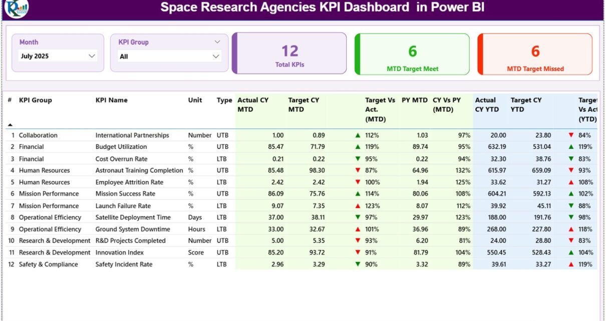
1️⃣ Summary Page – The Mission Control Overview
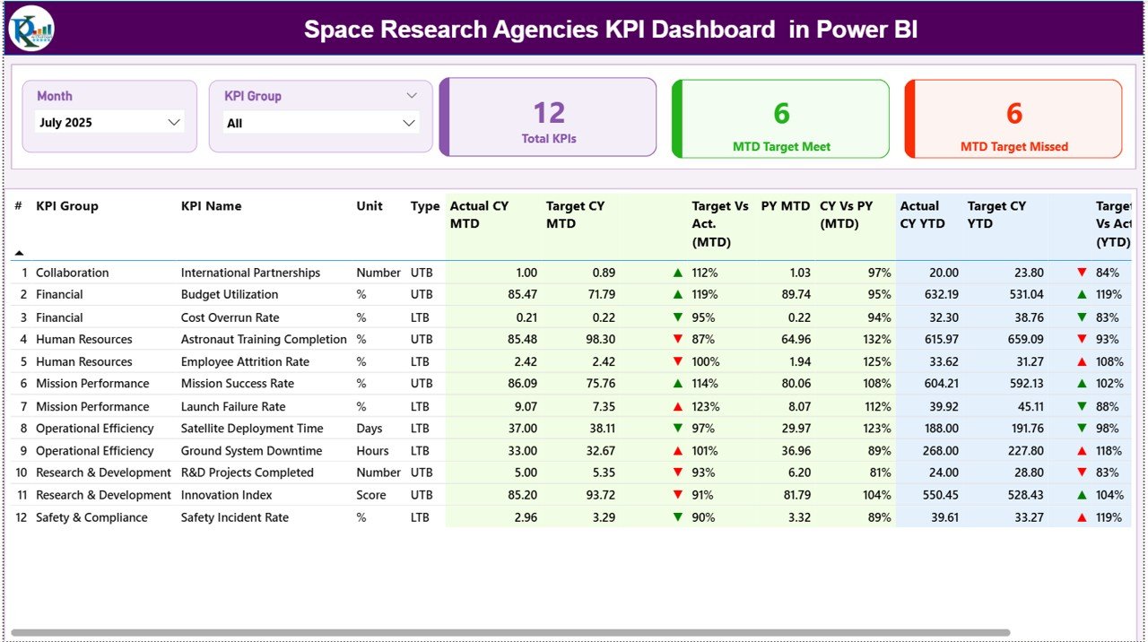
The Summary Page serves as the main control center of the dashboard.
Top Section – Slicers and KPI Cards
At the top, you see:
-
Month Slicer
-
KPI Group Slicer
-
3 KPI Cards:
-
Total KPIs Count
-
MTD Target Meet Count
-
MTD Target Missed Count
-
Because of slicers, you can filter data instantly by month and KPI category.
Therefore, the entire dashboard updates dynamically.
Detailed KPI Performance Table
Below the cards, you see a structured KPI table containing:
KPI Identification Fields:
-
KPI Number
-
KPI Group
-
KPI Name
-
Unit
-
Type (LTB – Lower the Better / UTB – Upper the Better)
MTD Performance Section:
-
Actual CY MTD
-
Target CY MTD
-
MTD Icon (▲ Green / ▼ Red)
-
Target vs Act. (MTD %)
-
PY MTD
-
CY vs PY (MTD %)
YTD Performance Section:
-
Actual CY YTD
-
Target CY YTD
-
YTD Icon (▲ Green / ▼ Red)
-
Target vs Act. (YTD %)
-
PY YTD
-
CY vs PY (YTD %)
Calculation Logic Used:
-
Target vs Actual = Actual ÷ Target
-
CY vs PY = Current Year ÷ Previous Year
Because of color-coded indicators, leaders instantly recognize which KPIs meet or miss targets.
As a result, they act quickly.
Click to Purchases Space Research Agencies KPI Dashboard in Power BI
2️⃣ KPI Trend Page – Analyze Performance Over Time
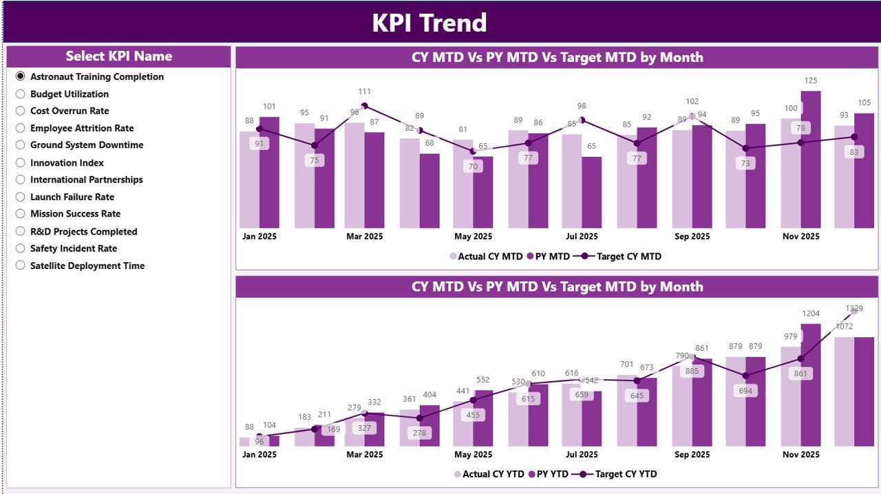
While the Summary page shows performance snapshots, the KPI Trend page shows patterns.
What This Page Includes:
-
KPI Name slicer on the left
-
Two Combo Charts:
-
MTD Actual vs Target vs Previous Year
-
YTD Actual vs Target vs Previous Year
-
These combo charts allow you to:
-
Identify mission performance trends
-
Compare historical data
-
Detect seasonal variations
-
Evaluate long-term growth
For example:
-
Has the satellite launch success rate improved compared to last year?
-
Are R&D milestones progressing steadily?
-
Is budget utilization aligned with targets?
Because Power BI refreshes instantly, every slicer selection updates the visuals immediately.
3️⃣ KPI Definition Page – Drill-Through Insights
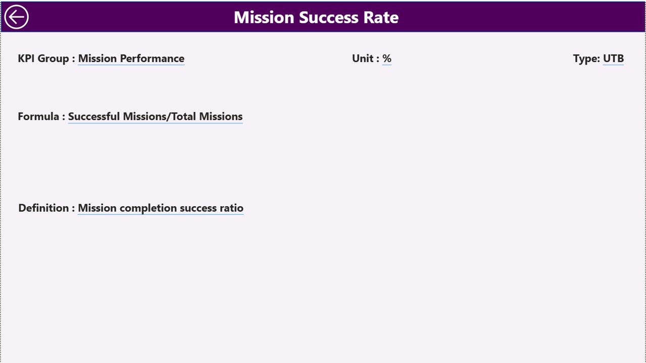
The KPI Definition page remains hidden by default. However, you can drill through from the Summary page.
This page displays:
-
KPI Formula
-
KPI Definition
-
KPI Group
-
Unit of Measurement
-
KPI Type (LTB or UTB)
Therefore, stakeholders understand KPI logic clearly.
To return to the Summary page, simply click the back button located at the top left corner.
This feature improves transparency and eliminates confusion during reviews.
Excel Data Structure – The Foundation of the Dashboard
Although Power BI handles visualization, Excel stores the source data.
You must maintain three worksheets in the Excel file.
1️⃣ Input_Actual Sheet
In this sheet, enter:
-
KPI Name
-
Month (Use first date of month)
-
MTD Number
-
YTD Number
Ensure consistency in month formatting to maintain proper reporting.
2️⃣ Input_Target Sheet
Here, enter:
-
KPI Name
-
Month
-
MTD Target
-
YTD Target
Clear targets create measurable accountability.
3️⃣ KPI Definition Sheet
In this sheet, define:
-
KPI Number
-
KPI Group
-
KPI Name
-
Unit
-
Formula
-
Definition
-
Type (LTB or UTB)
Because this sheet supports drill-through functionality, you must maintain accurate definitions.
What KPIs Can Space Research Agencies Track?
Space agencies typically monitor KPIs across mission, research, financial, and operational categories.
Click to Purchases Space Research Agencies KPI Dashboard in Power BI
Mission Performance KPIs
-
Launch Success Rate
-
Satellite Deployment Count
-
Mission Completion Rate
-
On-Time Launch Percentage
Research & Development KPIs
-
R&D Milestone Achievement Rate
-
Patent Filing Count
-
Research Publication Output
-
Technology Readiness Level Progress
Financial KPIs
-
Budget Utilization Rate
-
Cost per Mission
-
Project Cost Overrun Percentage
-
Funding Allocation Efficiency
Operational KPIs
-
Equipment Downtime Rate
-
Testing Cycle Time
-
System Reliability Score
-
Resource Utilization Rate
When you track these KPIs visually, you strengthen mission planning and risk management.
Click to Purchases Space Research Agencies KPI Dashboard in Power BI
Advantages of Space Research Agencies KPI Dashboard in Power BI
Now let’s explore the key benefits.
1️⃣ Real-Time Data Visibility
Power BI updates visuals instantly. Therefore, leadership sees accurate performance metrics without delays.
2️⃣ Enhanced Strategic Decision-Making
Trend analysis supports better planning and mission alignment.
3️⃣ Stronger Financial Control
Budget comparisons highlight overspending quickly.
4️⃣ Improved Stakeholder Reporting
Interactive visuals improve executive presentations.
5️⃣ Increased Accountability
Target vs Actual comparisons clearly show responsibility areas.
6️⃣ Scalable and Flexible Design
You can add new KPIs as missions expand.
Click to Purchases Space Research Agencies KPI Dashboard in Power BI
Best Practices for the Space Research Agencies KPI Dashboard in Power BI
To maximize effectiveness, follow these best practices.
1️⃣ Maintain Clean Data
Ensure consistent month formatting in Excel.
2️⃣ Define Clear KPI Ownership
Assign department heads for each KPI.
3️⃣ Review Monthly Performance
Conduct regular KPI review meetings.
4️⃣ Align KPIs with Strategic Goals
Track metrics that directly impact mission success.
5️⃣ Train Leadership on Dashboard Usage
Teach users how to use slicers and drill-through features.
6️⃣ Use Dashboard During Executive Reviews
Replace static reports with interactive visuals.
How Does This Dashboard Improve Space Agency Performance?
When agencies implement structured KPI tracking:
-
They identify risks early
-
They improve mission execution
-
They control budgets effectively
-
They align departments efficiently
-
They enhance stakeholder confidence
Moreover, they transition from manual reporting to intelligent analytics.
Conclusion
Space research agencies operate in a high-risk and high-investment environment. Therefore, performance monitoring must remain accurate, structured, and transparent.
The Space Research Agencies KPI Dashboard in Power BI provides:
-
Interactive KPI monitoring
-
MTD and YTD comparisons
-
Current vs Previous Year analysis
-
Trend visualization
-
Drill-through KPI definitions
As a result, agencies strengthen mission control, improve operational efficiency, and support data-driven decision-making.
If you want to elevate performance tracking and manage space missions with precision, this dashboard offers a powerful solution.
Click to Purchases Space Research Agencies KPI Dashboard in Power BI
Frequently Asked Questions (FAQs)
1️⃣ What is the main purpose of this KPI Dashboard?
It helps space agencies track mission, financial, and operational KPIs in an interactive format.
2️⃣ Do I need advanced Power BI skills?
No. You only need basic knowledge to update Excel data and refresh the dashboard.
3️⃣ How often should agencies update data?
You should update the Excel data monthly for accurate reporting.
4️⃣ What does LTB and UTB mean?
LTB means Lower the Better. UTB means Upper the Better.
5️⃣ Can this dashboard improve executive reporting?
Yes. It enhances clarity and presentation impact significantly.
6️⃣ Why compare Current Year with Previous Year?
Because historical comparison reveals growth trends and performance improvement.
7️⃣ Can this dashboard scale with new KPIs?
Yes. You can add additional KPIs as programs expand.
Click to Purchases Space Research Agencies KPI Dashboard in Power BI
Visit our YouTube channel to learn step-by-step video tutorials