Space technology organizations operate in one of the most complex, data-driven, and high-risk environments in the world. Every mission, satellite launch, research program, and operational activity depends on measurable performance outcomes. Therefore, leaders must track the right metrics at the right time. That is exactly where a Space Technology KPI Dashboard in Power BI becomes a strategic necessity.
In this in-depth guide, you will learn what a Space Technology KPI Dashboard in Power BI is, how it works, why space organizations need it, and how each dashboard page supports faster and smarter decisions. Moreover, you will explore the advantages, best practices, and frequently asked questions related to this dashboard in a simple and practical way.
Click to buy Space Technology KPI Dashboard in Power BI
What Is a Space Technology KPI Dashboard in Power BI?
A Space Technology KPI Dashboard in Power BI is a ready-to-use performance monitoring solution designed to track, analyze, and visualize key performance indicators related to space missions, research activities, satellite operations, system reliability, and operational efficiency.
Instead of working with scattered Excel files or static reports, teams can view all critical KPIs in one centralized and interactive dashboard. As a result, decision-makers gain clarity, control, and confidence.
Because this dashboard is built in Power BI, it delivers:
- Interactive visuals
- Dynamic slicers
- Automated calculations
- Clear KPI status indicators
At the same time, it uses Excel as a data source, which makes data entry simple and familiar for most teams.
Why Do Space Technology Organizations Need KPI Dashboards?
Space programs involve massive investments, long timelines, and zero tolerance for errors. Therefore, performance visibility must remain accurate and timely.
However, many organizations still rely on:
- Manual spreadsheets
- Static monthly reports
- Disconnected data sources
As a result, leaders struggle to identify risks early and take corrective actions.
A Space Technology KPI Dashboard in Power BI solves these challenges by offering a real-time, visual, and structured performance view.
Key Problems It Solves
- Lack of KPI transparency
- Delayed performance insights
- Manual tracking errors
- Poor comparison with targets and previous years
How Does the Space Technology KPI Dashboard in Power BI Work?
This dashboard connects Power BI with a structured Excel file. You only need to update KPI data in Excel, and Power BI automatically refreshes all visuals.
Because of this setup:
- Business users avoid complex systems
- Analysts save reporting time
- Leaders get instant insights
The dashboard consists of three carefully designed pages, each serving a specific analytical purpose.
What Are the Key Features of the Space Technology KPI Dashboard in Power BI?
This ready-to-use dashboard focuses on clarity, comparison, and control. Let us explore its core features in detail.
Three Interactive Power BI Pages
Excel-Based Data Input
MTD and YTD Performance Tracking
Target vs Actual Comparison
Current Year vs Previous Year Analysis
Visual Status Indicators with Icons
Drill-Through KPI Definitions
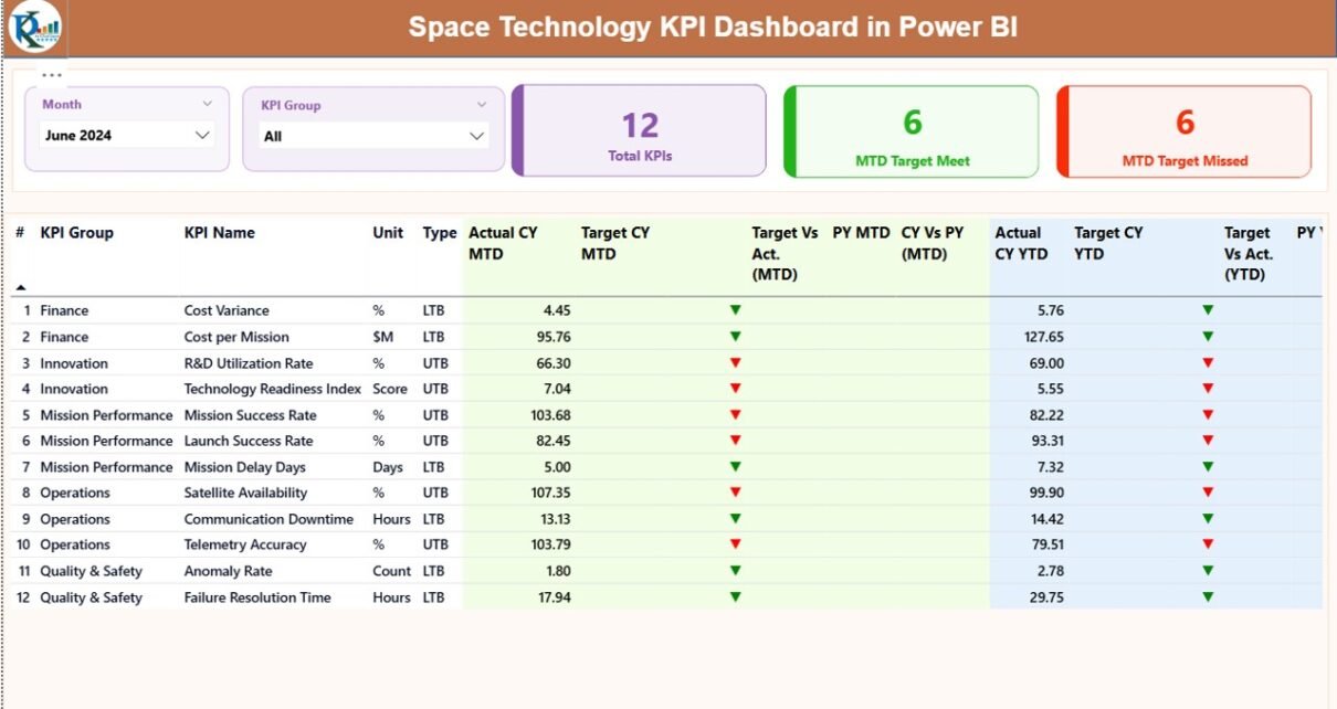
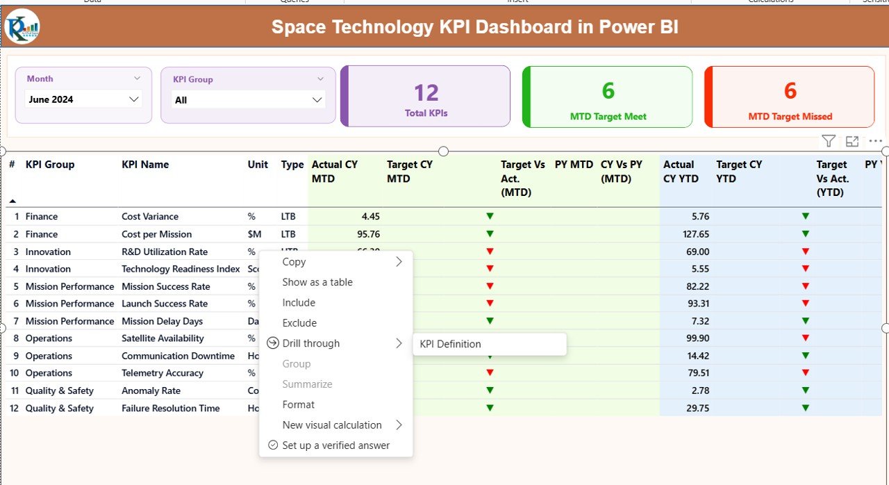
What Does the Summary Page Show?
The Summary Page acts as the command center of the Space Technology KPI Dashboard in Power BI.
Top Section: Filters and KPI Cards
At the top of the page, you can use:
- Month Slicer – Select any reporting month
- KPI Group Slicer – Filter KPIs by category
Just below the slicers, three KPI cards instantly summarize performance:
- Total KPIs Count
- MTD Target Met Count
- MTD Target Missed Count
As a result, leadership can quickly understand overall performance status.
Detailed KPI Performance Table
Below the cards, the dashboard displays a comprehensive KPI table with the following columns:
- KPI Number – Sequence number of the KPI
- KPI Group – Category or functional area
- KPI Name – Name of the performance metric
- Unit – Measurement unit
- Type – LTB (Lower the Better) or UTB (Upper the Better)
MTD Performance Columns
- Actual CY MTD – Current year actual MTD value
- Target CY MTD – Current year target MTD value
- MTD Icon – ▲ or ▼ with green or red color
- Target vs Actual (MTD) – Actual ÷ Target (%)
- PY MTD – Previous year MTD value
- CY vs PY (MTD) – CY ÷ PY (%)
YTD Performance Columns
- Actual CY YTD – Current year actual YTD value
- Target CY YTD – Current year target YTD value
- YTD Icon – ▲ or ▼ indicator
- Target vs Actual (YTD) – Actual ÷ Target (%)
- PY YTD – Previous year YTD value
- CY vs PY (YTD) – CY ÷ PY (%)
Because of this structure, users can compare performance across time, targets, and trends in one view.

Click to buy Space Technology KPI Dashboard in Power BI
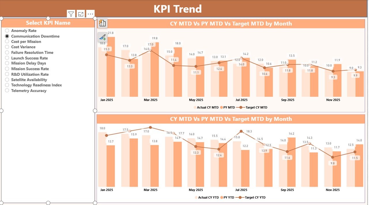
KPI Trend Page
The KPI Trend Page focuses on historical and comparative analysis.
What Does This Page Show?
- Two combo charts for:
MTD trends
YTD trends
Each chart displays:
- Current Year Actual
- Previous Year Actual
- Target values
Interactive KPI Selection
A KPI Name slicer on the left allows users to select any KPI. Once selected, the charts update instantly.
As a result:
- Analysts identify performance patterns
- Managers spot early warning signs
- Teams evaluate improvement initiatives
Click to buy Space Technology KPI Dashboard in Power BI
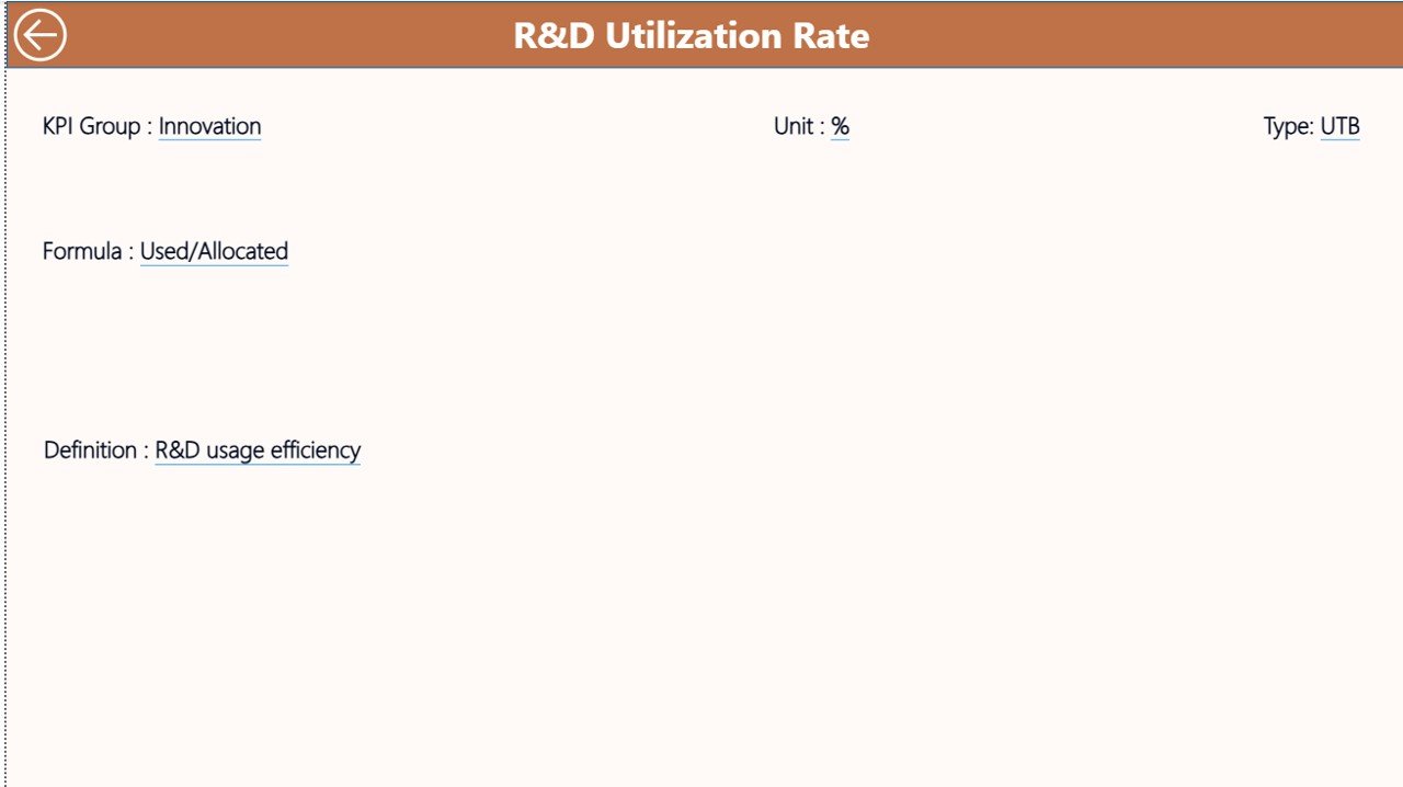
KPI Definition Page
The KPI Definition Page supports clarity and standardization.
Key Highlights
- This page remains hidden by default
- Users access it through drill-through from the Summary Page
- It displays:
KPI Formula
KPI Definition
Unit and Type
To return to the main dashboard, users simply click the Back button on the top left corner.
Therefore, everyone interprets KPIs consistently across the organization.
Click to buy Space Technology KPI Dashboard in Power BI
How Is Excel Used as the Data Source?
The Space Technology KPI Dashboard in Power BI uses a structured Excel file with three worksheets.
Input_Actual Sheet
Here, you enter:
- KPI Name
- Month (use the first date of the month)
- MTD Actual value
- YTD Actual value
Click to buy Space Technology KPI Dashboard in Power BI
Input_Target Sheet
Here, you enter:
- KPI Name
- Month
- MTD Target value
- YTD Target value
KPI Definition Sheet
Here, you maintain:
- KPI Number
- KPI Group
- KPI Name
- Unit
- Formula
- Definition
- Type (LTB or UTB)
Because Excel remains simple and flexible, teams can update data without technical expertise.
Advantages of Space Technology KPI Dashboard in Power BI
A Space Technology KPI Dashboard in Power BI delivers measurable value across all levels of the organization.
Strategic Advantages
- Improves decision speed
- Enhances performance transparency
- Aligns teams with mission goals
Operational Advantages
- Tracks MTD and YTD performance accurately
- Highlights risks using visual icons
- Enables fast root-cause analysis
Management Advantages
- Reduces manual reporting effort
- Ensures consistent KPI definitions
- Supports data-driven leadership
Who Should Use a Space Technology KPI Dashboard?
This dashboard supports a wide range of roles, including:
- Space agency leadership
- Mission control teams
- R&D managers
- Operations analysts
- Program management offices
Because of its flexibility, both technical and non-technical users benefit equally.
Best Practices for the Space Technology KPI Dashboard in Power BI
To maximize value, follow these best practices.
Define KPIs Clearly
Always document KPI formulas and definitions in the KPI Definition sheet.
Update Data Regularly
Maintain a fixed schedule for updating actual and target values.
Use KPI Groups Wisely
Group KPIs by mission, system, or function for better analysis.
Review Trends Monthly
Analyze both MTD and YTD trends to avoid short-term bias.
Validate Data Before Refresh
Ensure Excel data accuracy before refreshing Power BI.
How Does This Dashboard Support Continuous Improvement?
Because the dashboard compares:
- Target vs Actual
- Current Year vs Previous Year
Teams can:
- Identify underperforming KPIs
- Investigate root causes
- Apply corrective actions
- Track improvement results
As a result, performance management becomes proactive instead of reactive.
Conclusion: Why Is a Space Technology KPI Dashboard in Power BI Essential?
A Space Technology KPI Dashboard in Power BI transforms complex performance data into clear, actionable insights. Instead of chasing numbers across spreadsheets, organizations gain a single source of truth.
Moreover, the combination of Power BI visuals and Excel data input delivers the perfect balance between sophistication and simplicity. Therefore, space technology organizations can monitor performance, manage risks, and drive success with confidence.
Frequently Asked Questions (FAQs)
What is the main purpose of a Space Technology KPI Dashboard in Power BI?
The main purpose is to track, analyze, and visualize space-related KPIs in one centralized and interactive platform.
Do I need technical skills to use this dashboard?
No. You only need basic Excel knowledge to update data. Power BI handles all calculations and visuals.
Can I add new KPIs to the dashboard?
Yes. You can add new KPIs by updating the Excel input and KPI definition sheets.
Does the dashboard support year-over-year comparison?
Yes. It compares current year performance with previous year values for both MTD and YTD.
Can I customize visuals and KPI groups?
Yes. Power BI allows full customization of visuals, slicers, and KPI groupings.
Visit our YouTube channel to learn step-by-step video tutorials
Watch the step-by-step video tutorial:
Click to buy Space Technology KPI Dashboard in Power BI